
Set up the cart: drawer, page or popup
Choose what shows up when a customer adds a product (drawer, cart page or popup), then set its look and content block by block.
When a customer adds a product, Story Theme can open a cart that slides in from the side (the drawer), take them to the cart page, or show a small confirmation window. You choose this behavior with one setting, then build the cart's content with blocks, like the rest of the theme.
Choose the cart type
- In the editor, click the gear icon Theme settings in the left sidebar.
- Open the Cart group.
- In Cart type, choose:
- Drawer: the cart slides in from the edge of the screen and the customer stays on the page. This is the setting the theme ships with.
- Page: the customer lands on the cart page after each add.
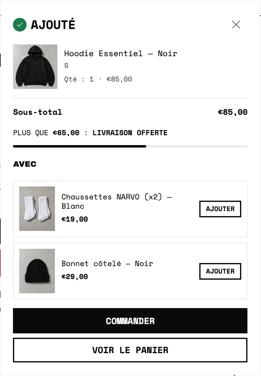
- Popup notification: a small window confirms the add and offers to go to checkout or view the cart.
- Click Save.
In the same Cart group, you'll also find:
- Cart icon: Bag or Cart;
- Empty cart url: the page the empty cart button leads to (for example your main collection);
- Price font: the headings font or the body font;
- Product image flies to the cart: a small animation toward the cart icon, useful when the drawer doesn't open on its own.
Set up the cart drawer
- With Cart type set to Drawer, find the Cart drawer section in the list of sections in the left sidebar.
- To see the drawer in the preview, add a product to the cart from the preview, then click the cart icon.
- Click Cart drawer to show its settings:
- Width on desktop, Position (Right or Left) and Position on mobile (Side or Bottom sheet);
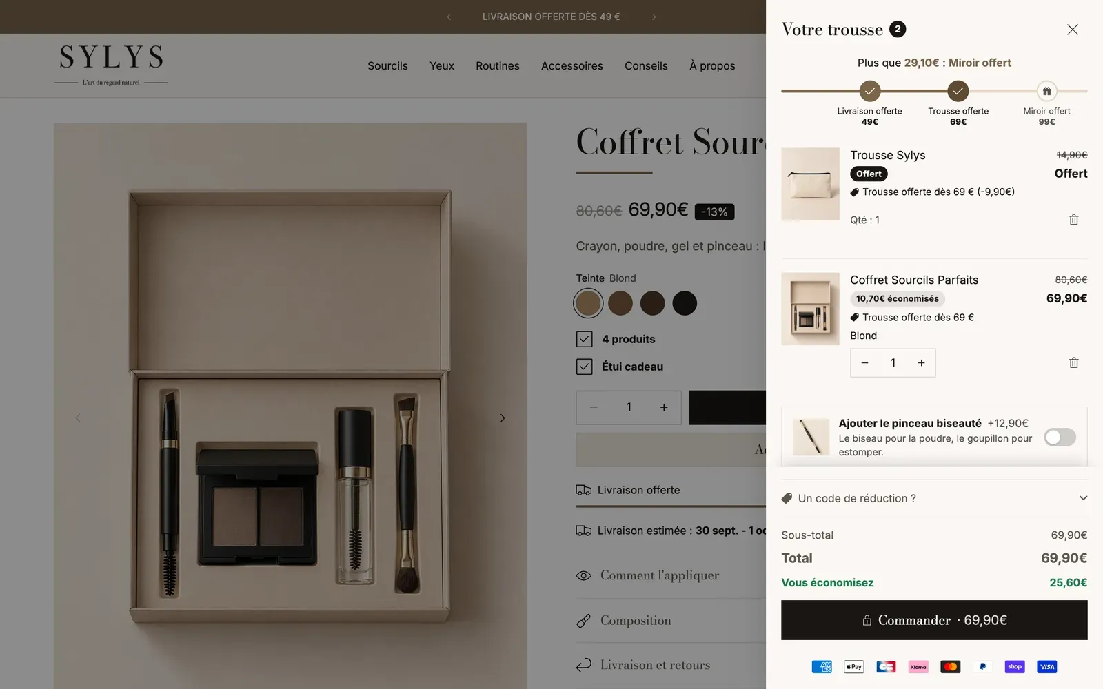
- Style: Attached to the edge or Floating (a drawer detached from the edge, with rounded corners);
- Page behind: Dimmed, Blurred, Unchanged or Theme setting;
- Open after adding a product: uncheck it if you'd rather only update the cart counter.
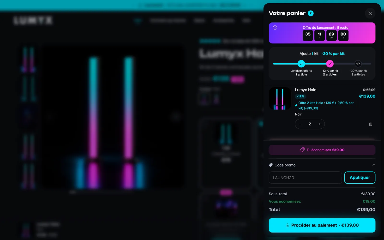
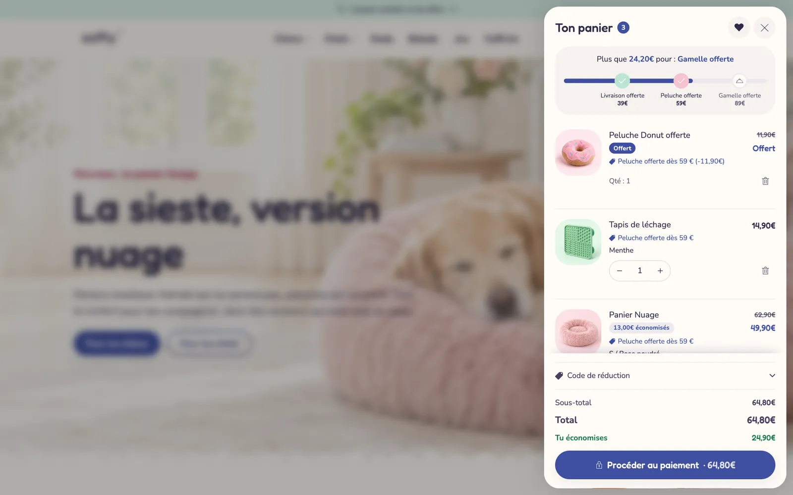
The same drawer looks different depending on these settings. On the Darly demo store, it's attached to the right edge of the screen, at full height; on the Lumyx demo store (above), it's floating, with rounded corners and space around it.
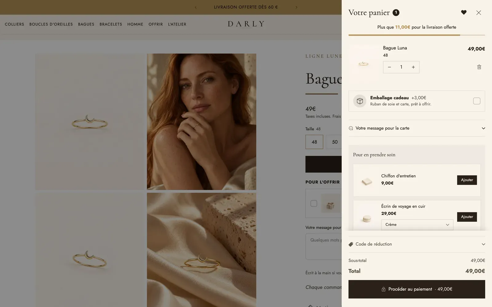
The drawer is split into four zones, shown under Cart drawer in the left sidebar:
| Zone | What it contains at first | What you can put in it |
|---|---|---|
| Header | The heading, the item count, the free shipping bar | Tiers, countdown, short messages |
| Content | The items and recommendations | Almost every cart block |
| Footer | Discount code, order summary, checkout button | Order summary, terms, order note… |
| Empty cart | A message, a button and recommendations | Recommendations, product or collection list |
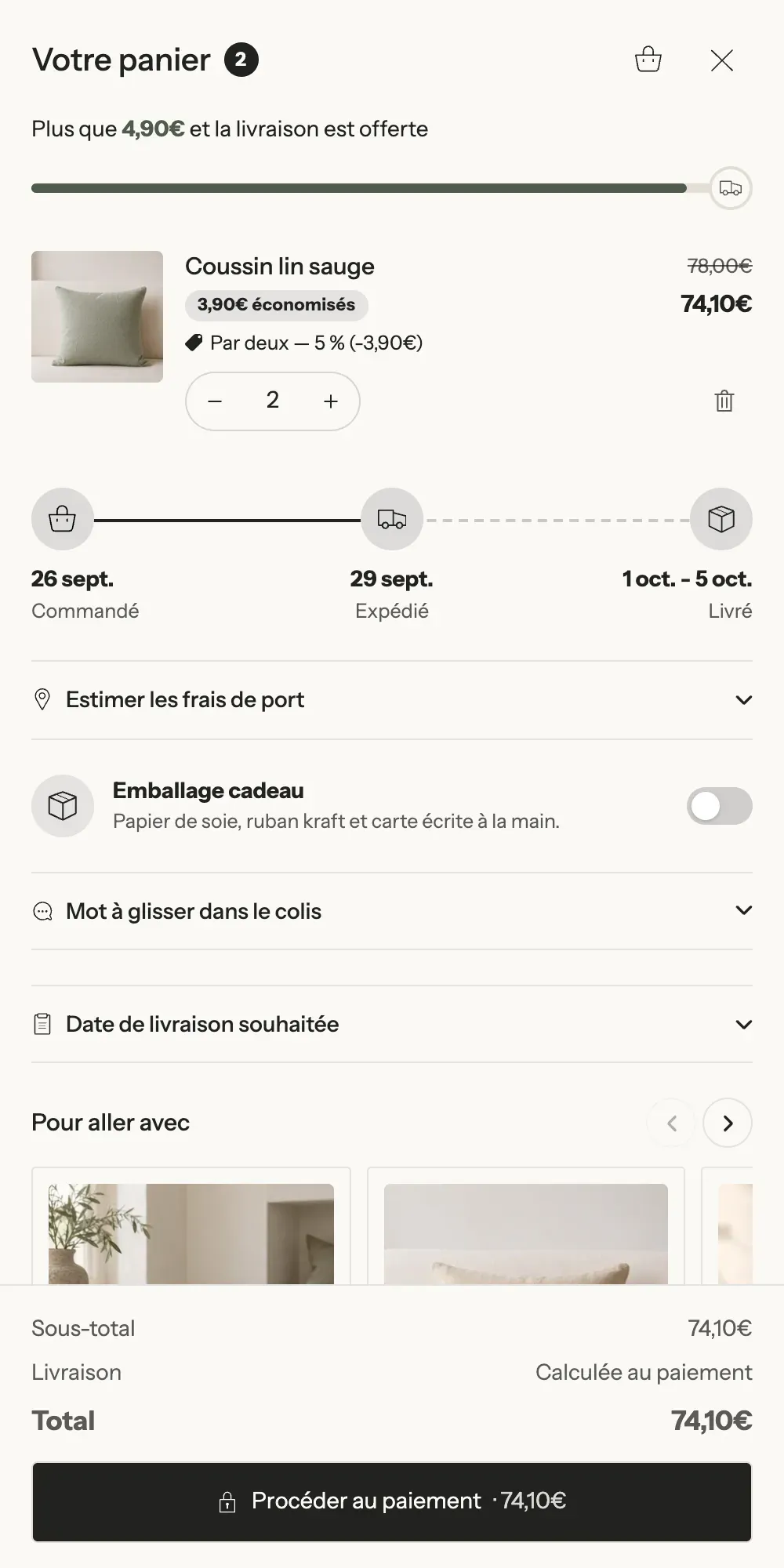
In Footer, leave Keep at the bottom checked: the total and the checkout button stay visible even when the customer scrolls through a long list of items. To work on the empty state without emptying your cart, check Preview empty cart in the Cart drawer section (only visible in the editor).

Set up the cart page
The cart page always exists, even with the drawer: that's where a customer lands if they type the /cart address or click a link to the cart.
- In the dropdown menu at the top of the editor, choose the Cart template.
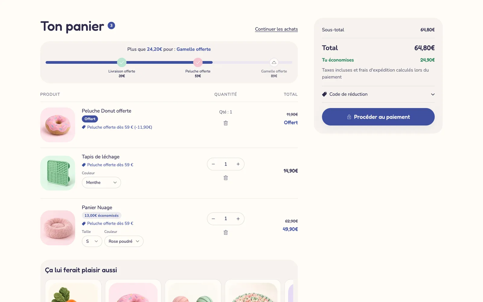
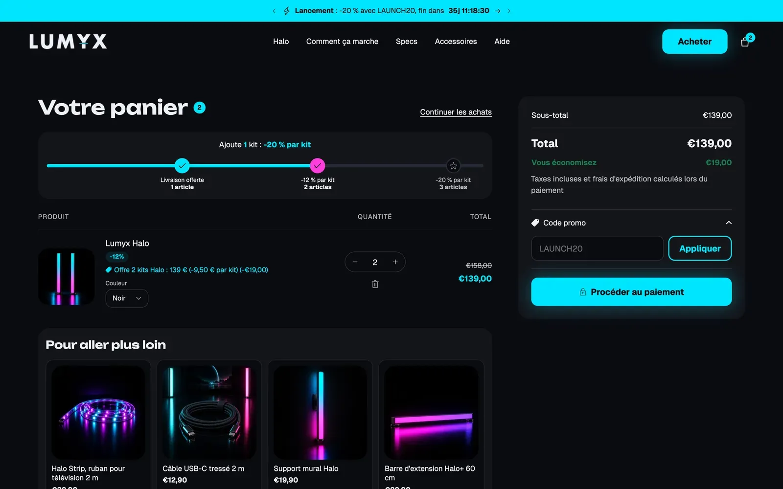
- Click the Cart section. In Columns, choose how the space is split between the items and the summary: Wide items (66/33), Balanced (60/40) or Equal (50/50).
- Check Show the summary first on mobile if you want the total to appear before the list of items on phones.
- Add your blocks in Main column (heading, tiers, items, recommendations) and in Summary column (order summary, discount code, checkout buttons). In Summary column, Keep visible while scrolling keeps the total on screen.
Set up the added to cart popup
With Cart type set to Popup notification, the Added to cart popup section appears in the left sidebar.
- Set its Position (Top right, Bottom right or Center) and its Position on mobile.
- Choose the buttons: Show checkout button, Show view cart button, Show continue shopping link.
- In Close after, enter how many seconds before it closes on its own. 0 keeps it open until the customer closes it.
- Add blocks (tiers, recommendations, checkbox product, delivery estimate…) and choose where they appear with Blocks position.
Add, move or hide a block
The drawer, the cart page and the popup use the same blocks.
- Under the zone you want, click Add block and choose it in the Cart category.
- Drag it to change its order.
- Click the eye icon to hide it without deleting it.
Each cart block also has a Display rules group. In Show this block, choose Only when the conditions are met, then fill in, for example, Cart total from, Countries or Cart contains a product from these collections. Every condition you fill in must be met. In the editor, a block hidden by its rules stays visible, grayed out, so you can still set it up.
Each block is covered in detail in Cart blocks.
Frequently asked questions
The drawer doesn't open when I add a product
Check that Cart type is set to Drawer and that Open after adding a product is checked in the Cart drawer section. If a cart app is installed, it may take over: turn it off to test.
My drawer changes don't show up in the preview
The drawer only appears with an item in the cart. Add a product from the preview, or check Preview empty cart to set up the empty state.