Cart blocks: line items, reward tiers, upsells and checkout
Every block of the Story Theme cart drawer, cart page and added-to-cart popup, with their settings, display rules and real examples.
The Story Theme cart is made of blocks, just like a page: line items, reward tiers bar, upsells, gift wrap, discount code, order summary, checkout button… You choose which ones to show, in what order, and even under which conditions.
Where to find these blocks
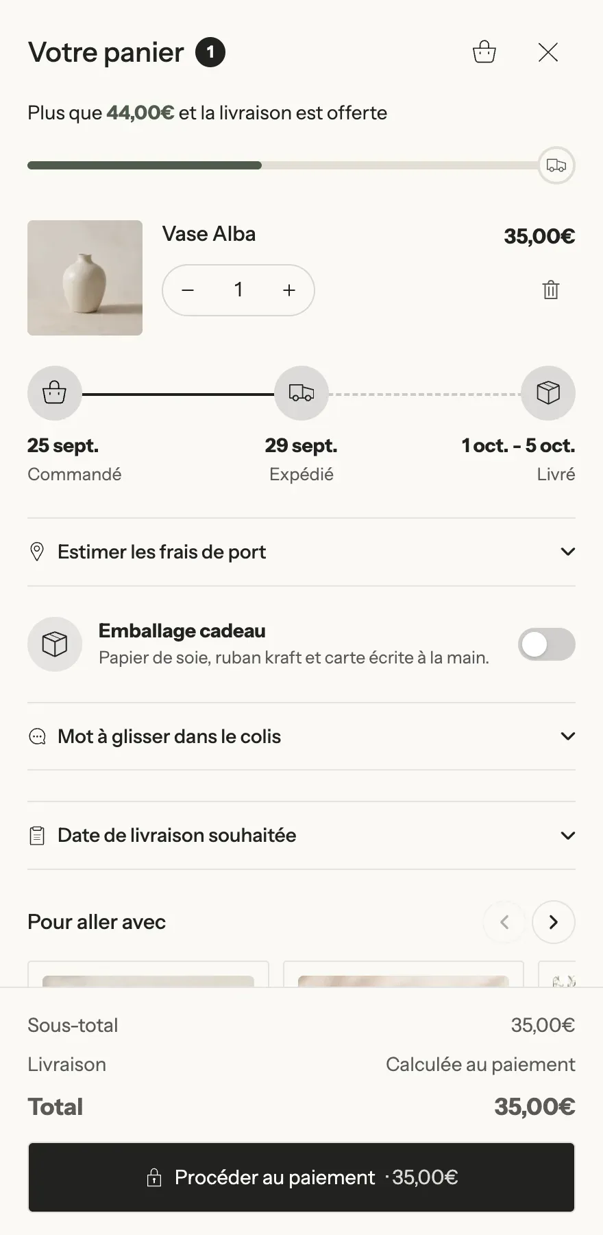
The cart comes in three forms, chosen in Theme settings > Cart > Cart type: Drawer (the default), Page or Popup notification. Each one has its own section and zones:
| Cart | Where to set it up | Zones that accept blocks |
|---|---|---|
| Drawer | Edit theme, any page > Cart drawer section | Header, Content, Footer, Empty cart |
| Cart page | Edit theme > Cart > Cart section | Main column, Summary column, Empty cart |
| Added to cart popup | Edit theme > Added to cart popup section | directly in the section |
- Open the section for the cart you want, then expand a zone (for example Content).
- Click Add block: the Cart category lists the blocks for this page; zones also accept generic blocks (Group, Heading, Text, Image, Button, Badge, Checklist, Countdown, Trust badges, Payment icons, Accordion, Liquid, apps).
- Drag the block into place, then click Save.
All section settings (width, position, floating style, open after adding…) are covered in Cart page and cart drawer sections.
What all cart blocks share
On top of their own settings, every cart content block has two groups of settings:
- [Appearance] Background (Default, Color, Gradient, None), Text, Highlight, Corners, Inner spacing, Text size, Show a border, Full width, Stick to the edge of the zone, space above and below.
- [Display rules] Show this block: Always, Only when the conditions are met, or Except when… Available conditions: Cart total from / Cart total below, At least this many items, Customers (Everyone, Logged in, Not logged in), Customer tags, Countries, Markets, Cart contains one of these products, Cart contains a product from these collections. Every condition you fill in must be met.
The zones
- Header (drawer): Show title and Title, Show item count, Close button (Icon, Round, Text), Link to the cart page, Link to the wishlist, Hide these blocks when the cart is empty. Accepts reward tiers, timers and messages, among others.
- Content (drawer): margins, space between blocks, color palette.
- Footer (drawer): Keep at the bottom (on by default: the total and checkout button stay visible while the items scroll), Shadow above, Show divider.
- Main column and Summary column (page): the latter has a Style (Card / Plain) and Keep visible while scrolling.
- Empty cart: see below.

Line items
The list of products in the cart.
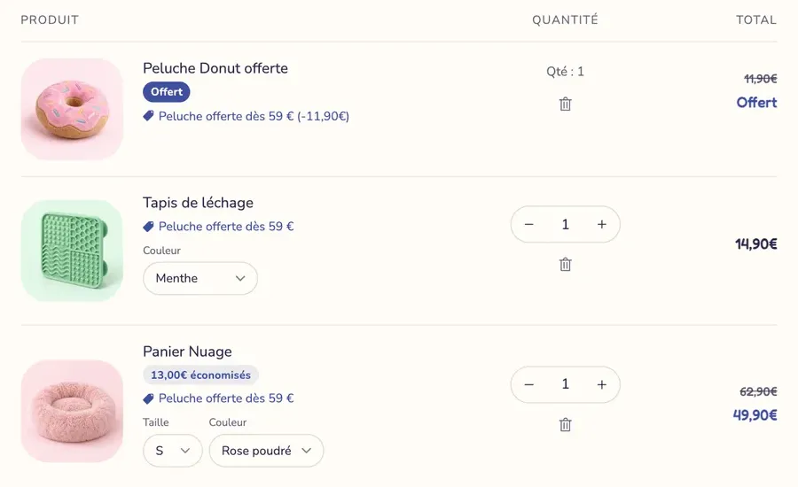
- [Image] Image width, Image ratio, Image fit, Link to the product page.
- [Content] Show vendor, Show the SKU, Title size, Variant options (Editable lists: customers change their size or color without leaving the cart; With labels; On one line; Hidden), Show personalisation fields, Show subscription name, Let customers change their subscription, Gift badge, Hide checkbox products from the list, Low stock alert.
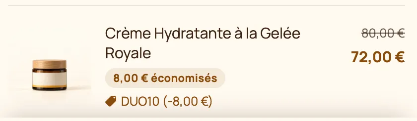
- [Price] position and size, Show compare-at price, Show unit price, Show savings badge (Percentage / Amount, text and colors).
- [Controls] Show quantity selector and its style (Outline, Rounded, Solid), Remove button (Icon, Text, Hidden), Offer to undo a removal.
- [Layout] Order, space between items, dividers, Show column headings (cart page).
Cart title
For the cart page: Title, Heading level (H1 by default), Title size, Heading style, Alignment, Show item count, Show continue shopping link.
Rewards progress
A bar that shows progress toward free shipping, a discount or a gift, and can add the gift automatically.
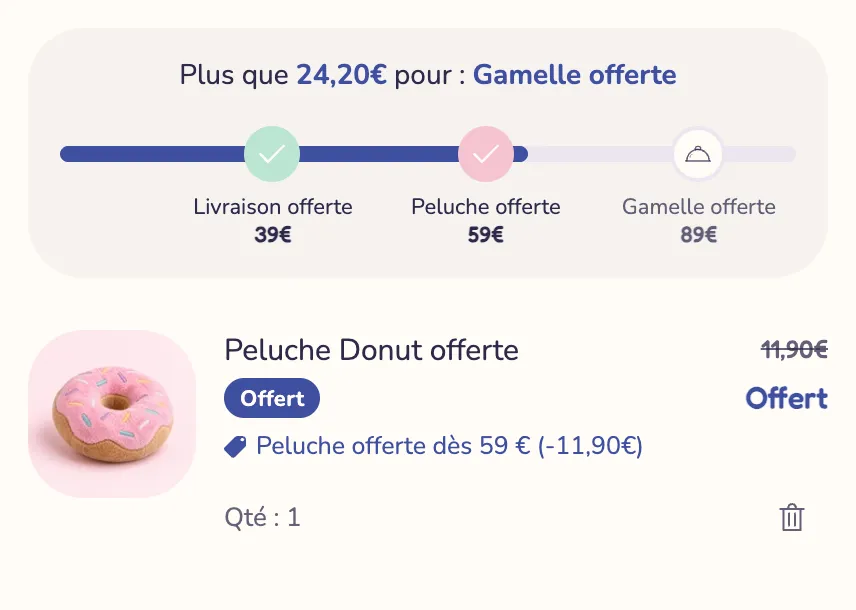

- Progress based on (Cart subtotal / Number of items), Count only one collection, Don't count gifts and add-ons.
- [Tier 1] to [Tier 4]: Threshold (0 turns the tier off), Reward (Free shipping, Discount, Free gift, Other), Label, Icon, Color once reached, Gift products (added automatically at the threshold, removed below it; with several products, the customer chooses).
- [Messages] Progress message (
[amount],[reward]), Message once everything is unlocked, alignment. - [Progress bar] Display (Bar with labels, Bar with icons, Minimal bar, Message only), Show thresholds, Style, thickness, colors, Unlock animation (Bounce, Glow, None), Hide the bar once every tier is reached.
- [Other currencies] Thresholds per currency (for example
USD:60,120;GBP:50,100).
Upsells
Products customers can add in one click from the cart. Two presets: Upsells and Compact recommendation (better suited to the drawer's sticky footer).
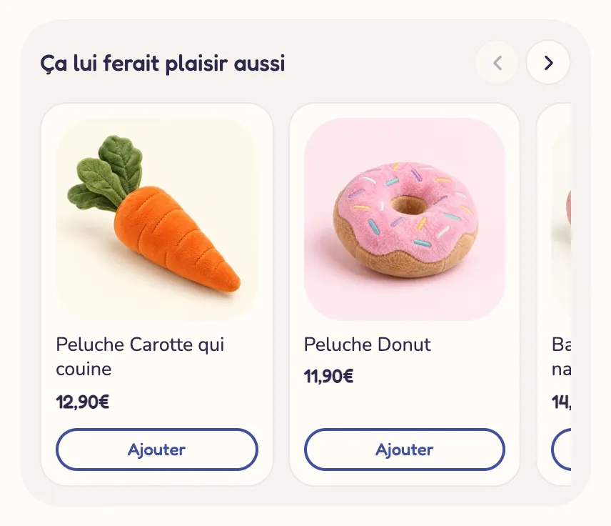
- Title, size and alignment; Source (Shopify recommendations, Collection, Chosen products, Product metafield); Recommendation type (Complementary then related, Complementary, Related); fallback Collection; Metafield (
custom.cart_upsellsby default); Number of products; Hide products already in the cart. - Presentation: Layout (Carousel, List, Grid), Visible cards and Visible cards on wide spaces, Auto-scroll every, Style, image ratio and fit, Show variant selector, Show compare-at price, Discount badge, button text, style and size.
Complementary products are set in Shopify's Search & Discovery app. See Cart upsells.
Checkbox product
An option customers turn on in one tap: gift wrap, shipping protection.


- Type: Product (adds a real line to the cart) or Cart attribute (saves a yes or no on the order, under an Attribute name).
- Product (use a product with a single variant, hidden from your collections if needed), Title, Description, Show price, Show variant selector, Pre-selected.
- Control (Switch / Checkbox), Visual (Icon, Product image, Custom image, None), Style (Card / Plain).
Order note and Order field
The Order note is free text from the customer (a message, a delivery instruction). The Order field asks for a specific piece of information, saved on the order under its own name.
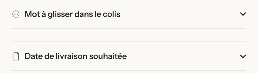
- Order note: Display (Collapsed, Open by default, Always visible), Title, Icon, Placeholder, Height (lines), Maximum length.
- Order field: Field (Short text, Long text, Dropdown list, Date, Checkbox), Attribute name (shown on the order), Title, Icon, Choices (comma-separated), earliest and latest dates, Days that cannot be chosen (Sundays, Weekends), Help text, Required (blocks checkout while the field is empty), Display.
Discount code
The field where customers enter their promo code.
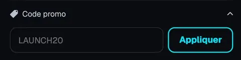
- Display (Collapsed by default, Open by default, Always visible), Title, Icon, Placeholder, Button text, Button style.
Shipping estimate
Customers pick a country, a region and a postal code to see your shipping rates.

- Title, Icon, Display (Collapsed, Open by default, Always visible), Ask for the postal code, Layout (Stacked / Postal code and button on one line), button text, style, width and size.
Delivery estimate
Shipping and delivery dates, calculated the same way as the Delivery date block on the product page.
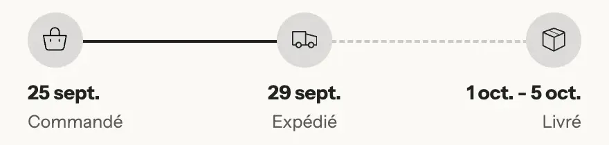
- [Display] Style (Card / Plain), Layout (Steps / One line), Icon style.
- One step per label and icon, then [Dates]: Days to prepare order, shortest and longest delivery times, Don't count weekends, Closed days, Cut-off time, Show the time left before the cut-off, Date format.
Cart countdown
Counts down to a real deadline: the end of an offer, or today's shipping cut-off time.
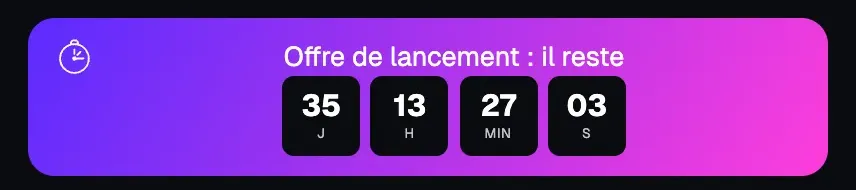
- Count down to: A date and time (End date in YYYY-MM-DD format, End time) or A cut-off time every day (Cut-off time, Monday to Friday only).
- Text (
[timer]), When it ends (Hide the timer / Show a message), Timer style (Cards, Outline, Inline with labels, Minimal), digit size and colors, unit labels, Style (Banner / Plain), Icon.
The time is your store's time, the same for every visitor.
Reservation timer
A countdown of a few minutes, per visitor, such as "Your cart is reserved for [time]".
- Text (
[time]), Duration (1 to 60 min, 10 by default), Restart when a product is added, When it ends (Show a message, Start again, Hide the timer), Message once it ends, Style, Icon.
The timer never empties the cart: when it ends, the items stay where they are.
Urgency message
A message based on real stock, a metafield or a number.

- Show when: An item is running low (with Running low at or below), A product has a number in its metafield (Product metafield, for example
custom.recent_sales), The cart holds a product with untracked stock, or Always. - Text for each case (
[quantity],[count],[product]), Minimum random number / Maximum random number for[nbr], Style, Icon.
You create the recent sales metafield and keep it up to date yourself (Shopify Flow or an app). A random number isn't tied to anything: only use it for an honest message. See Cart messages and reassurance.
Savings banner
Reminds customers how much they're saving.
- Text (
[amount],[percent]), Savings format (Amount / Percentage), Show from, Style (Banner / Plain), Icon.
Terms checkbox
A checkbox before checkout, for example "I agree to the terms and conditions".
- Text (can include a link to your terms), Error message, Remember the choice (the box stays checked for the rest of the visit).
Checkout stays blocked until the box is checked.
Order summary
The Order summary block groups the total lines. The preset contains Subtotal, Order discounts, Total and Total savings; you can add the others.
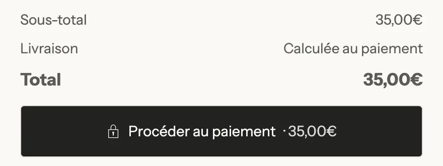
The lines (each with Line above):
- Subtotal: Label.
- Order discounts: Only show when there is a discount.
- Shipping: Label and Shipping text.
- Total: Label, Show item count, Show currency code.
- Total savings: Label, Only show when there are savings.
- Taxes and shipping note and Installments: Alignment.
- Custom text: free Text and its alignment.
Checkout buttons
The button that leads to checkout, along with express checkout.
- Text above the button (alignment, size), Button text, Second line (for example "Secure checkout"), Button style, Button size, Button width (Fill / Fit content), Icon (Lock by default, Arrow…).
- Show total in the button, Show express checkout (Shop Pay, Apple Pay, Google Pay or PayPal if they're turned on in your payment settings), Show view cart link, Show continue shopping link.
Empty cart
What customers see when their cart is empty: an icon, a title, a text and a button, followed by any blocks you choose (upsells, reward tiers, product list, collection list…).
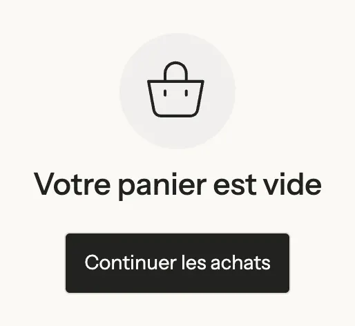
- Icon, size, color and Circle behind the icon; Title and its size; Text; Show button, Button text, Button link, Button style; Show login link; Alignment and Center vertically.
In the editor, check Preview empty cart on the section to work on this state without emptying your cart.
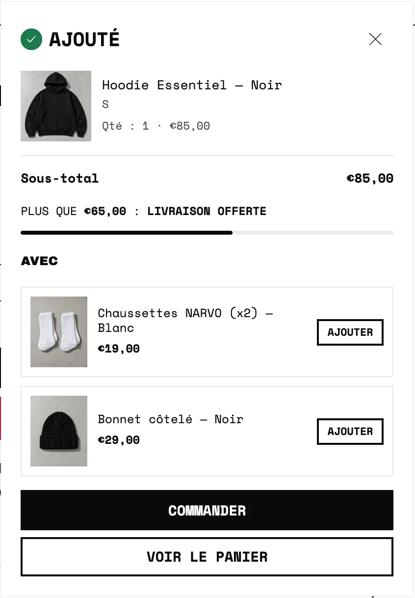
The added-to-cart popup
With the Popup notification cart type, a window confirms the item was added. It also accepts blocks (reward tiers, upsells, checkbox product, timers, delivery estimate, savings, urgency, product list…), placed according to Blocks position: under the title, above or under the buttons.