
Cart, Cart drawer and Added to cart popup sections
The three forms of the Story Theme cart, the Cart page, the Cart drawer and the Added to cart popup: where to set them up, their areas and their settings.
The Story Theme cart comes in three forms: the Cart page, the Cart drawer that slides in from the side, and the Added to cart popup that confirms an addition without leaving the page. All three are built with the same blocks (line items, reward tiers, upsells, summary, checkout buttons…), arranged in areas.
Choose the cart type
The cart type is chosen once for the whole store:
- Open Online Store > Themes > Edit theme, then the Theme settings icon.
- Open Cart and choose the Cart type: Drawer (shipped), Page or Popup notification.
| Cart type | What happens after an addition | Section to set up |
|---|---|---|
| Drawer | The drawer opens from the side. | Cart drawer |
| Page | The customer goes to the cart page. | Cart |
| Popup notification | A small window confirms the addition. | Added to cart popup |
The cart page (/cart) exists in every case: set it up too.
Cart drawer
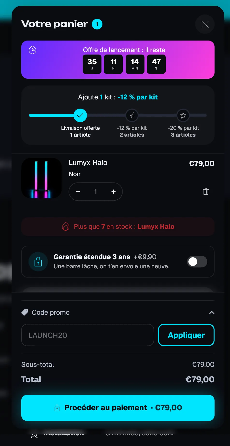
The Cart drawer is on every page. In the editor, select it in the sidebar and open the cart in the preview to see your changes.
The areas
- Header: title, item count, Close button (Icon, Circle, Text), links to the cart page and the wishlist, Hide these blocks when the cart is empty. Accepts, for example, Rewards progress, Reservation timer, Cart countdown.
- Content: the line items and the blocks that go with them (upsells, checkbox product, urgency message…).
- Footer: summary and checkout; Keep at the bottom (on by default) keeps the total and the button visible while scrolling.
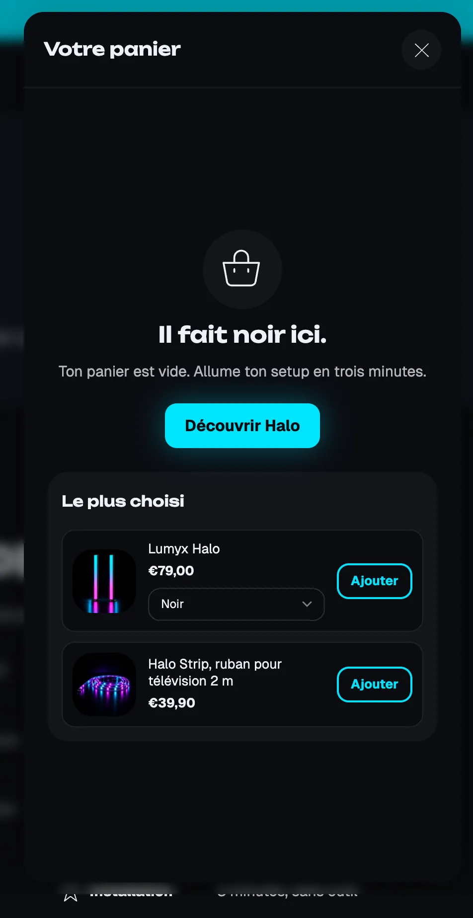
- Empty cart: icon, title, text, button and its link, Show login link; also accepts Upsells, Product list or Collection list.
Lumyx fills its empty cart with a button and a product selection:
The settings
- [Layout] Width on desktop (440 px by default), Position (Right or Left), Position on mobile (Side or Bottom sheet), Style (Attached to the edge or Floating, Lumyx's choice), Distance from edges, Corner radius, Shadow.
- [Colors] Color palette, Page behind (Theme setting, Dimmed, Blurred, Unchanged), overlay color and opacity.
- [Behavior] Open after adding a product (otherwise, only the counter updates), Close when clicking outside, Swipe to close on touch screens.
- [Theme editor] Preview empty cart: shows the empty state in the editor only.
Cart (the cart page)
To set it up: Edit theme, then choose Cart in the dropdown at the top. The Cart section has two columns and an area for the empty cart.
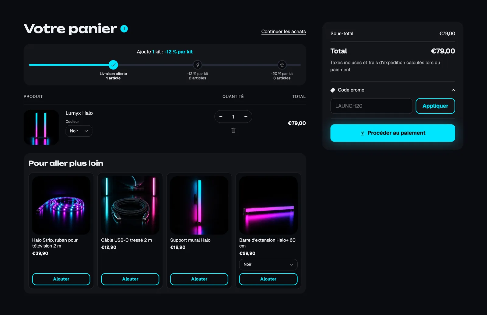
- Main column: Cart title, Rewards progress, Line items, Upsells, and every content block.
- Summary column: Order summary, Taxes and shipping note, Discount code, Checkout buttons, Payment icons; Style (Card or Plain) and Keep visible while scrolling.
- Empty cart: same as in the drawer.
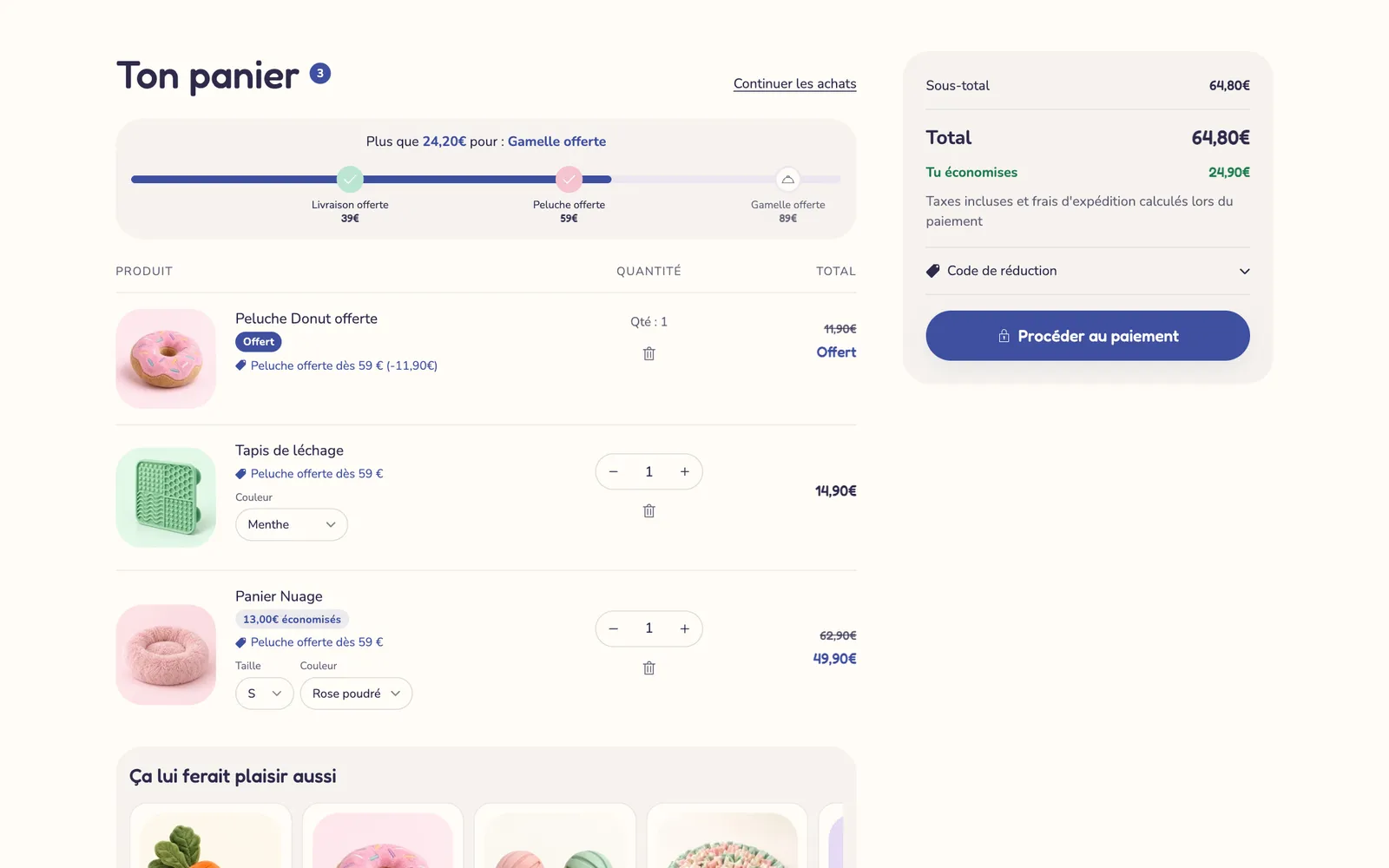
Section settings: Columns (Wide items (66/33), Balanced (60/40), Equal (50/50)), Show the summary first on mobile, Color palette, Preview empty cart.
A different mood on the Softy demo: tiers with gifts, a free item and the savings shown.
Added to cart popup
Active when the Cart type is Popup notification. It confirms the addition, shows the product and offers to check out or view the cart. The Narvo demo uses it with a free shipping bar and two recommendations:
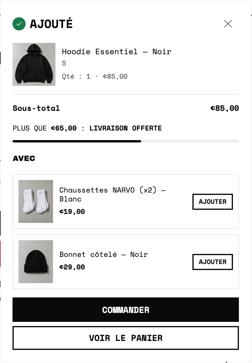
Settings:
- [Layout] Position (Top right, Bottom right, Center), Position on mobile (Bottom or Top), Width on desktop (400 px by default), Inner spacing, Corners, Shadow.
- [Header] Title, Show check icon, Show close button.
- [Product] Image width, Show variant, Show price, Show subtotal.
- [Buttons] Layout (Stacked or Side by side), Show checkout button, Show view cart button, Show continue shopping link, with the style and text of each button.
- [Behavior] Blocks position (Under the title, Above the buttons, Under the buttons) and Close after (6 s by default; 0 keeps it open until the customer closes it).
It accepts the Rewards progress, Upsells, Checkbox product, Reservation timer, Cart countdown, Delivery estimate, Savings banner, Urgency message and Product list blocks, plus the general blocks.
The cart blocks
The blocks are the same in all three forms, with display rules (by amount, item count, country, customers…). They're detailed in Cart blocks. The most used: Line items, Rewards progress, Upsells, Checkbox product, Discount code, Order summary, Checkout buttons.
The common section frame (palette, margins) is explained in Understand the theme editor.
Tips and pitfalls
- The tiers, gifts and discounts shown in the cart don't create anything in Shopify: create the free shipping, the discount or the 100% gift discount in Discounts or Shipping and delivery, otherwise the customer pays full price.
- Offer the same tiers and gifts in the drawer and on the cart page, so the customer sees the same thing everywhere.
- In the Footer pinned to the bottom, prefer the Compact recommendation preset: a large product list takes up too much room there.
- In the European Union, a paid option (warranty, shipping protection) must not be checked by default.
- Blocks hidden by their display rules stay visible, grayed out, in the editor: check the result on the storefront.