
Understand the theme editor: sections, blocks and templates
Open the Shopify theme editor, choose a page to edit, add, move or hide sections and blocks, check mobile and save.
The whole Story Theme layout is set up in Shopify's theme editor, without a single line of code. This article gives you the four concepts to know (template, section, block, theme settings) and the actions you'll repeat every day.
Open the editor
- In your Shopify admin, open Online Store > Themes.
- Click Edit theme next to the Story Theme (or its copy).
- The editor opens: the store preview in the center, the list of the page's elements on the left, the settings of the selected element on the right.
The four concepts to know
| Concept | What it is | Example |
|---|---|---|
| Template | The layout of a type of page. All products that use the same template share the same layout. | Home page, Products > Default product, Collections > Default collection |
| Section | A large horizontal band of the page. | A banner, a product list, an FAQ |
| Block | An element inside a section. | A heading, a text, a button, an image |
| Theme settings | The settings shared by the whole store. | Colors, fonts, buttons, rounded corners |
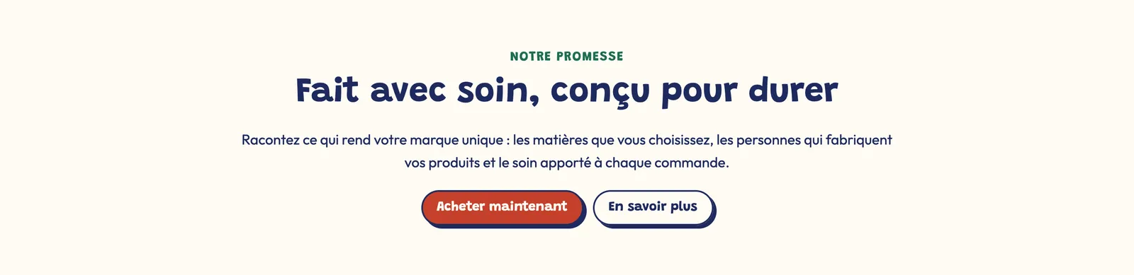
In the Story Theme, almost every section is a frame you fill with blocks. An "Image with text" section is only a starting point: you can add any block from the theme (a button, stars, a checklist…) or remove some. The Group block lets you arrange several blocks side by side or stacked.
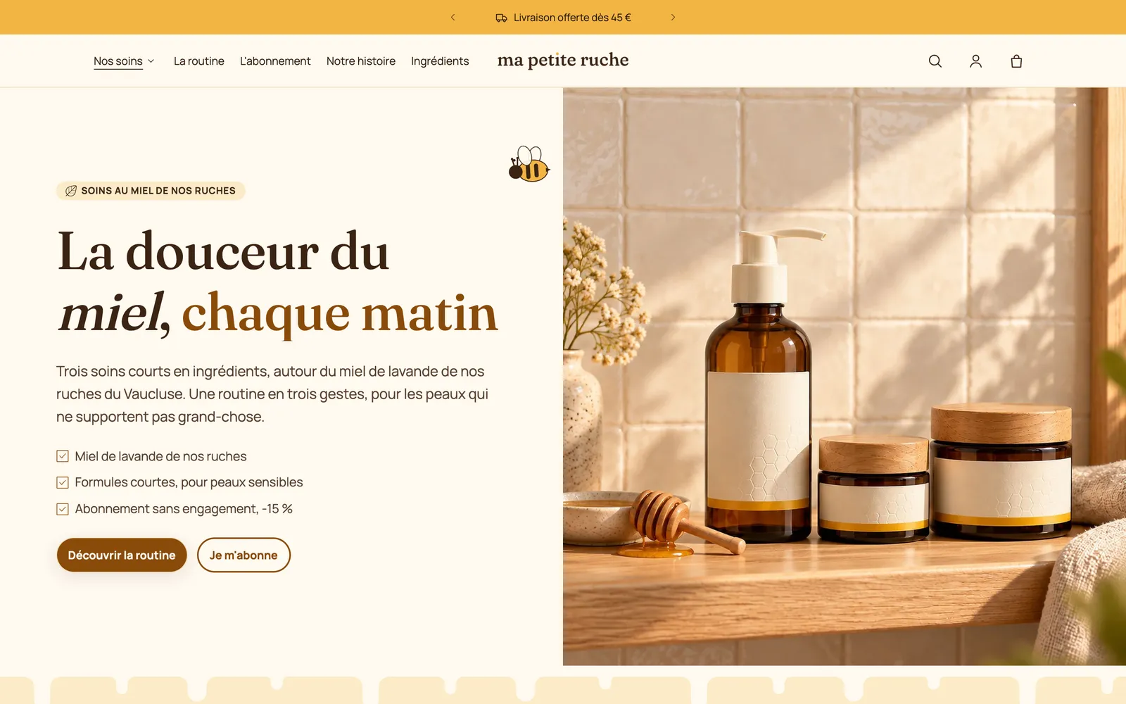
In the screenshot above, the band containing the heading and the photo is one section (a Banner); the small badge, the heading, the paragraph, the checklist and the two buttons are its blocks. Each one can be edited, moved or deleted separately.
The Header (including the announcement bar) and the Footer are shared by every page: what you change there applies everywhere.
Choose the page to edit
The dropdown menu at the top of the editor (it shows Home page when it opens) lets you switch templates: Products > Default product, Collections > Default collection, Pages, Cart… You can also click a link in the preview: the editor follows your navigation.
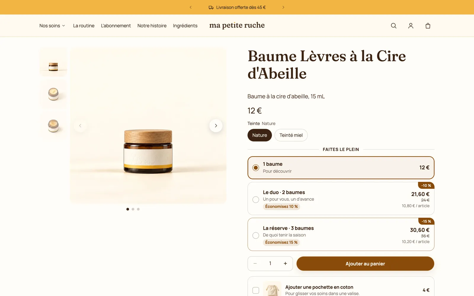
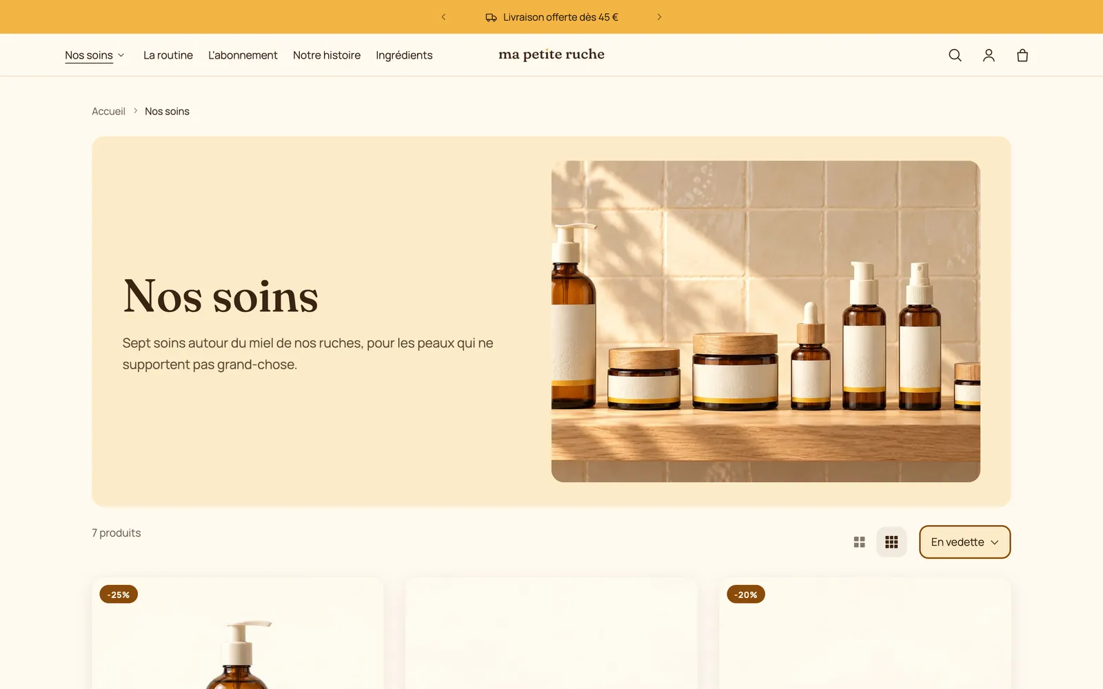
Each template has its own layout. On the same store, the product page and the collection page look nothing like the home page, but they share the header, the announcement bar and the colors:
Add a section
- In the list on the left, click Add section where you want it.
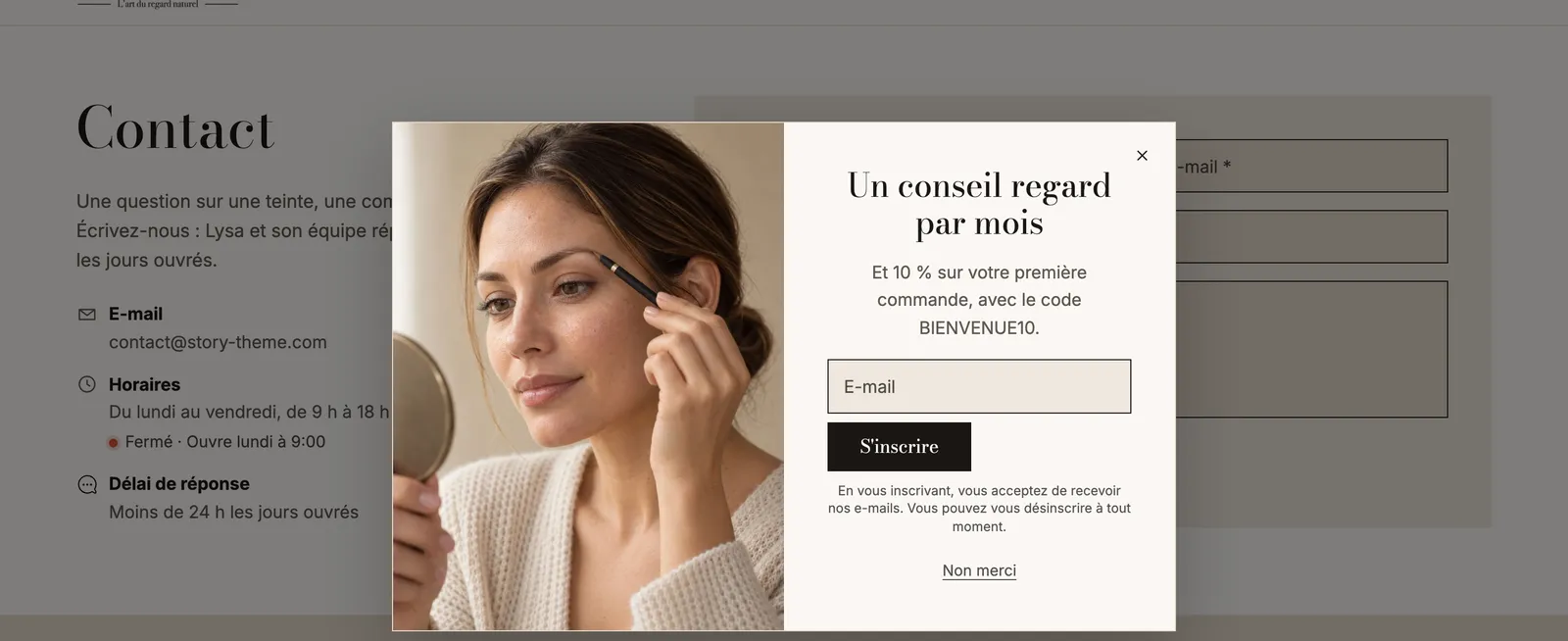
- Browse the categories (Banners, Products, Image and text, Reviews and trust, Scroll effects, Popups…) or type a word in the search.
- Choose a ready-made preset, for example Split banner or Product carousel. It comes with blocks already in place, which you then edit.
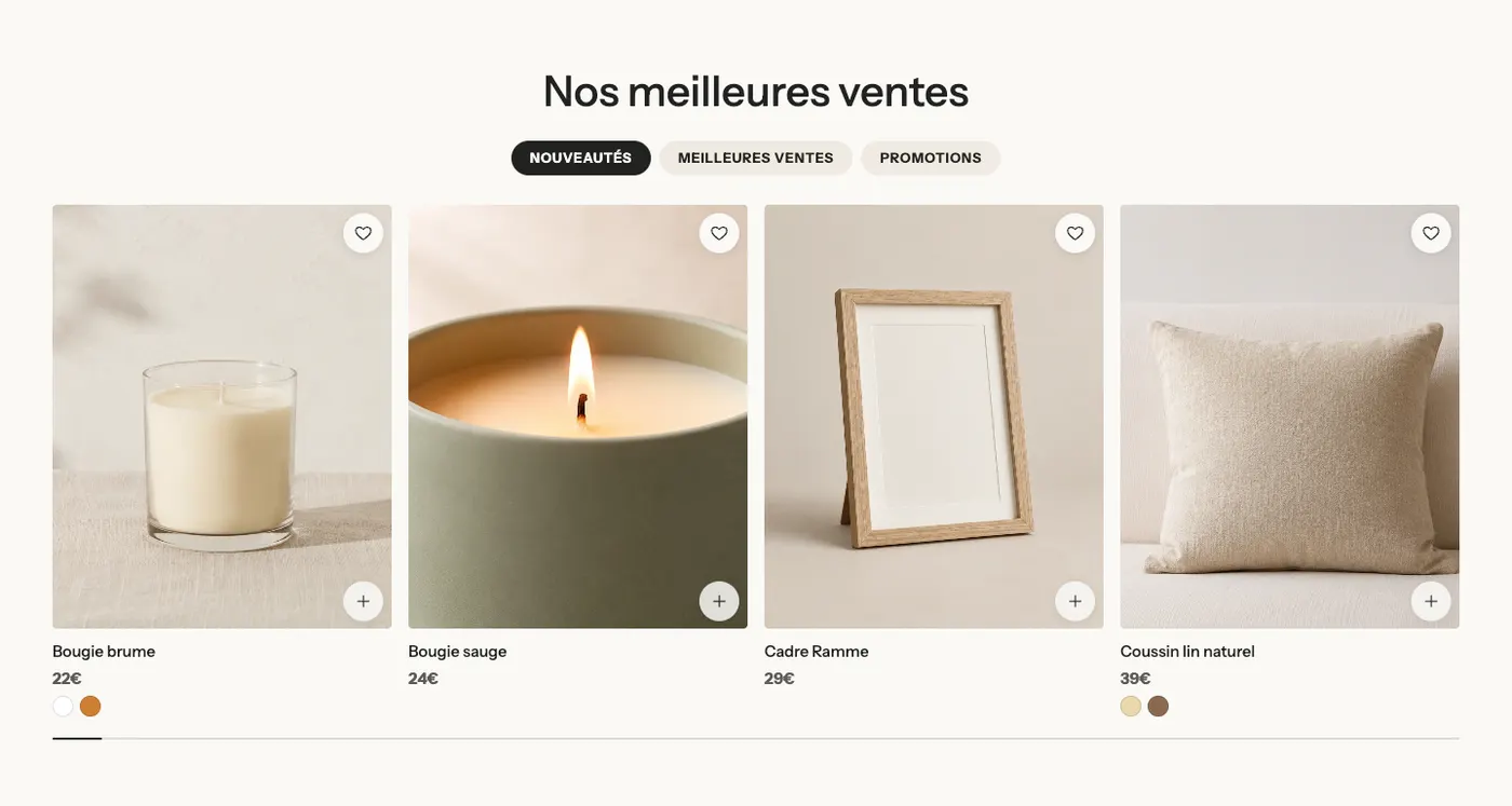
To see every section before choosing, open the catalog that ships with the theme: in the template menu, open Collections and choose one of the templates whose name starts with sections- (banners, products, media…). Each page shows a category's presets as they appear on the store. Each section's description, with its variants in pictures, is also in the Sections part of this documentation, for example the Banner section or the Product list section.
Add, edit and move a block
- Expand a section in the list on the left (small arrow next to its name).
- Click Add block inside the section and choose the block.
- Click a block to open its settings on the right: text, style, size, alignment…
- To change the order, drag the section or block by its handle (the six dots to the left of its name).
Each section also has its own settings (click its name): Color palette, width, spacing, Separators, Animation…
The most common blocks are described in Text blocks and Layout blocks.
Hide or delete
- Hide: hover over the section or block and click the eye icon. The element disappears from your store but keeps all its settings: that's the right option for a seasonal offer. A hidden element shows a crossed-out eye.
- Delete: open the element and click Remove section or Remove block, at the bottom of its settings.
Check how it looks on mobile
Most of your visitors arrive on a phone. At the top of the editor, click the mobile icon to switch the preview to phone width, then go back to desktop with the icon next to it.
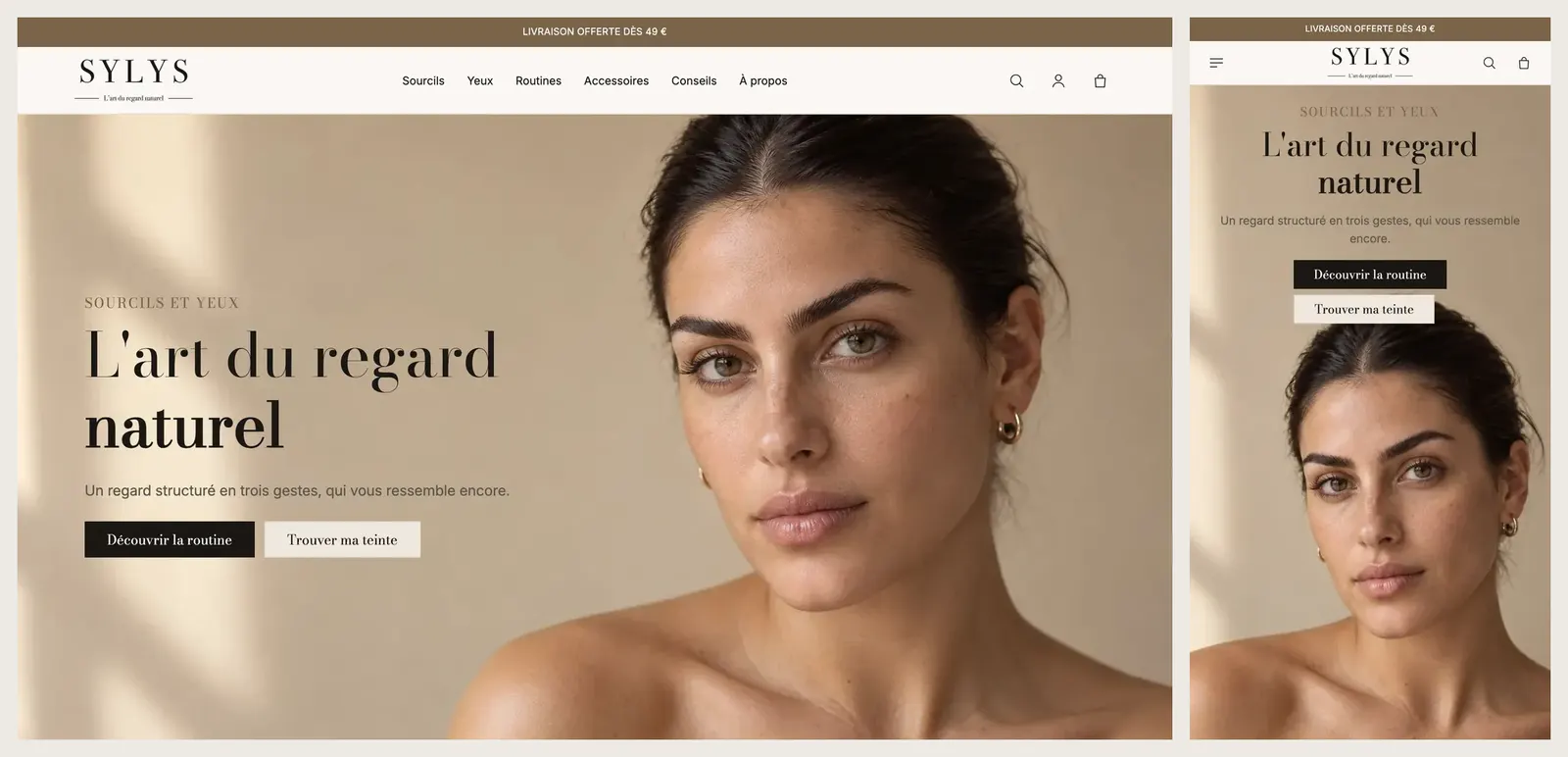
Most blocks have a Show on setting (Desktop and mobile, Desktop only, Mobile only). For a different layout on phones, duplicate the block and set one to Desktop only and the other to Mobile only. Don't overdo heavy duplicates (videos, large images): a block hidden this way is still loaded in the page.
Save
Click Save in the top right. Until you save, nothing is applied. On an unpublished theme, saving changes nothing for your customers: you'll publish the copy once it's ready.