
Add trust badges, tabs and accordions
Reassure your customers with badges (shipping, returns, warranty) and organize product details in accordions or tabs, powered by metafields when needed.
Right below the buy button, customers look for two things: reassurance (shipping, returns, warranty) and a quick way to find specific information (dimensions, care, materials). Story Theme covers both with three blocks: Trust badges, Accordion / FAQ (or Collapsible row) and Tabs.
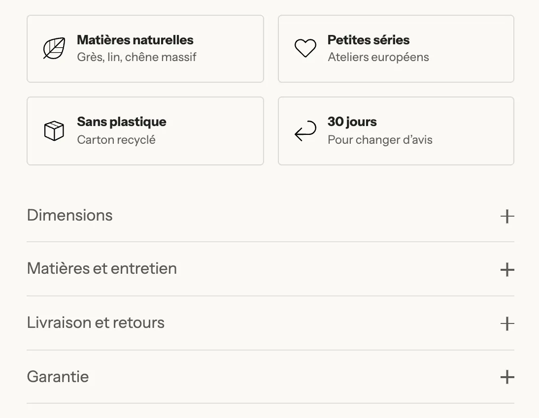
Add trust badges
- Open Online Store > Themes > Edit theme, template Products > Default product.
- In the Product page section, expand the Group and click Add block.
- Choose Trust badges in the Reviews and trust category. The block comes with four Badge sub-blocks.
- Drag it below Buy buttons.
- Click each Badge and fill in:
- Icon: choose from the theme's library (Truck, Return, Lock, Check mark…);
- or Badge image: a logo or a certification (B Corp, organic…), which replaces the icon;
- Heading and Text: "30-day returns", "Change your mind for free";
- Link (optional): to your shipping or returns page.
- Click Save.
The Trust badges block settings control the presentation: Layout (Row or Grid, with the number of columns on desktop and on mobile), Direction (icon next to or above the text), Style (Plain, Card, Outline), Icon size and Single color icons.
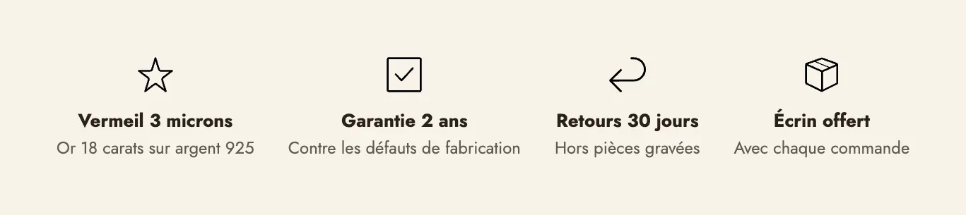
The Trust badges block can also go in any section of the home page or the cart.
Organize details in accordions
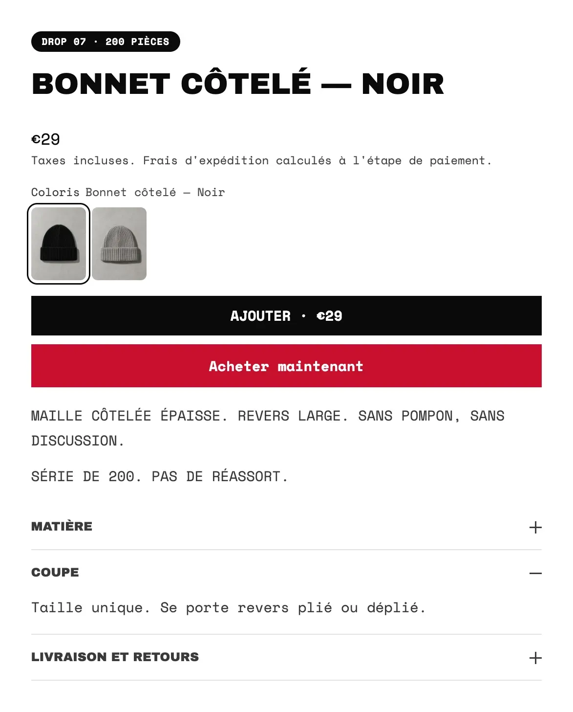
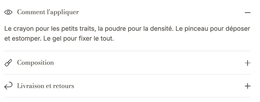
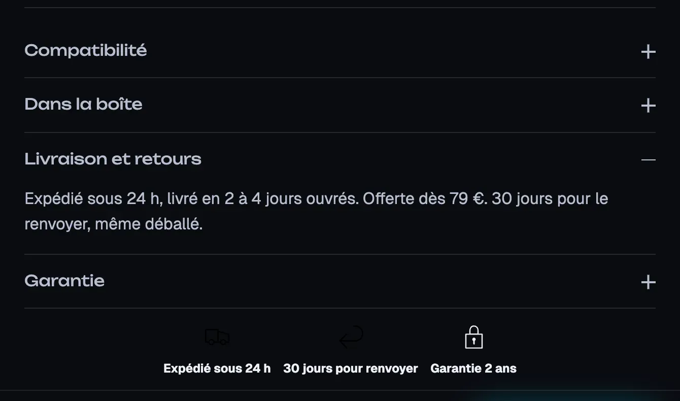
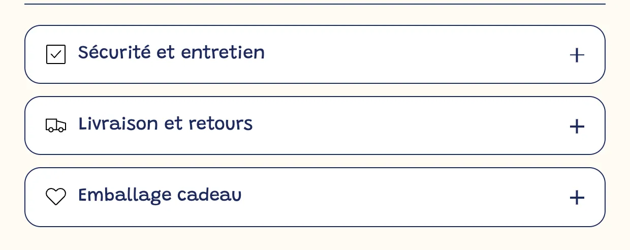
The product page that ships with the theme already contains a Group with two Accordion / FAQ blocks, below the description. Each accordion has a clickable heading and content that expands.
- In the buy column, expand the Group that contains the accordions.
- Click an Accordion / FAQ and fill in the Heading (for example "Shipping and returns") and the Content.
- To reuse a long text you've already written, choose a Page: its content is added below the accordion's content. Handy for showing your "Shipping and returns" page on every product page.
- To add one, click Add block in this Group and choose Accordion / FAQ.
Useful settings:
- Open by default: for the most important information.
- Close other accordions when this one opens (checked by default): opening one panel closes the others.
- Style: Minimal (bottom line), Card (background and border) or Filled (background only); Open / close icon: Plus / minus, Chevron or None.
- Icon: a small icon in front of the heading.
Put other blocks in a panel: the collapsible row
An Accordion / FAQ only contains text. To collapse something else, for example the Product description, a specifications table or a Size guide, use the Collapsible row block (Layout category): it can hold any blocks. Add it, give it a Heading, then add the blocks you want inside it.
Organize content in tabs
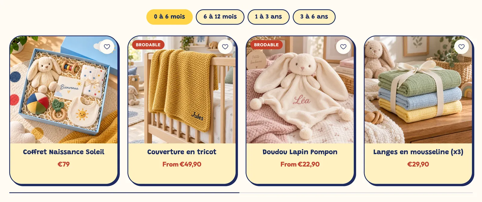
The Tabs block (Layout category) shows several pieces of content side by side, with only one visible at a time: "Description", "Ingredients", "How to use".
- Add the Tabs block in the buy column or in a section below the product page. It comes with two Tab sub-blocks.
- For each Tab, fill in the Tab label, then add the blocks to display inside it (text, image, product description…).
- Choose the Tabs style (Pills, Underline, Minimal) and the Tab position on desktop (Top or Left).
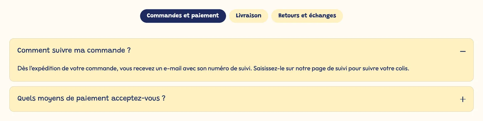
Accordions or tabs? On mobile, accordions read more naturally. Tabs work well for a few short pieces of content of similar length.
Show different content for each product
Text entered in the editor is the same on every product page that uses the template. For content specific to each product (ingredients, dimensions, tips), use a metafield:
- In Shopify, open Settings > Custom data > Products and create a metafield definition, for example "Ingredients", of type multi-line text or rich text.
- Fill in this field on each product's page in the admin, at the bottom.
- In the editor, open the relevant accordion, click the dynamic source icon next to the Content field, then choose your metafield.
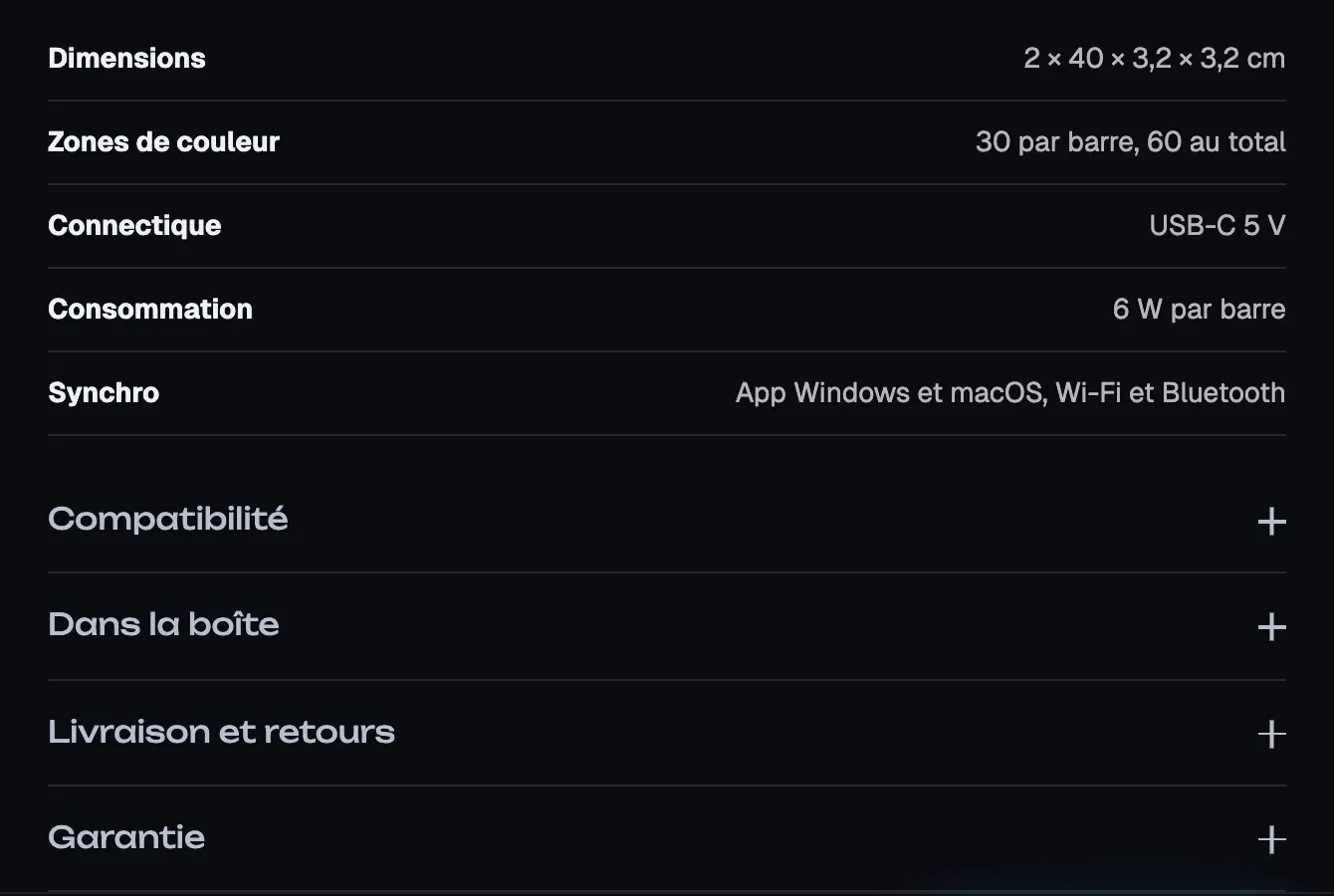
Each product page then shows its own text. Many other text fields in the theme also accept a dynamic source: look for the same icon next to the field.
Learn more
- Structure a product page that converts
- Show customer reviews
- Create a page and add it to the menu
- Reviews and trust blocks (Trust badges) and Layout blocks (Tabs, Collapsible row)