
Reviews and trust blocks: testimonials, ratings and badges
The blocks in the Reviews and trust category: testimonial, stars, rating summary, Trustpilot, trust badges, payment icons and logo list.
A visitor who doesn't know you is looking for reasons to trust you. The reviews and trust blocks give them those reasons: a customer review, a rating out of five, the logos of media outlets that talk about you, the payment methods you accept. Place them near the buy buttons, on the home page or in the cart.
These blocks share Show on (Desktop and mobile / Desktop only / Mobile only), the block width and Animations.
Testimonial
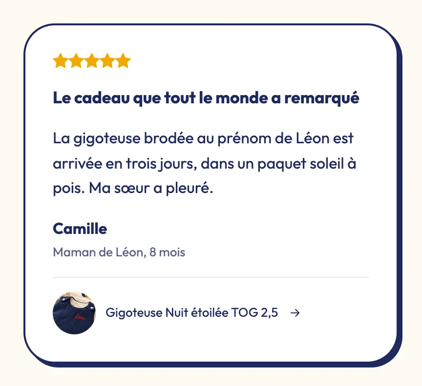
The Testimonial block is a card that holds other blocks. It comes with Stars (typed score), a Text and an Author, and you can add a heading, an image or a Product.
- Author sub-block: Photo and Photo size, Name, Role (shown under the name, for example "Verified buyer") and Show the verified icon.
- Product sub-block: the Product purchased, with a link to its product page, and Show product image.
- Layout group: Style (Minimal, Card, Quote marks), Alignment, Font (Body or Heading), Inner padding, Corner radius, Space between blocks, Color palette (in the Card style) and Hover effect.
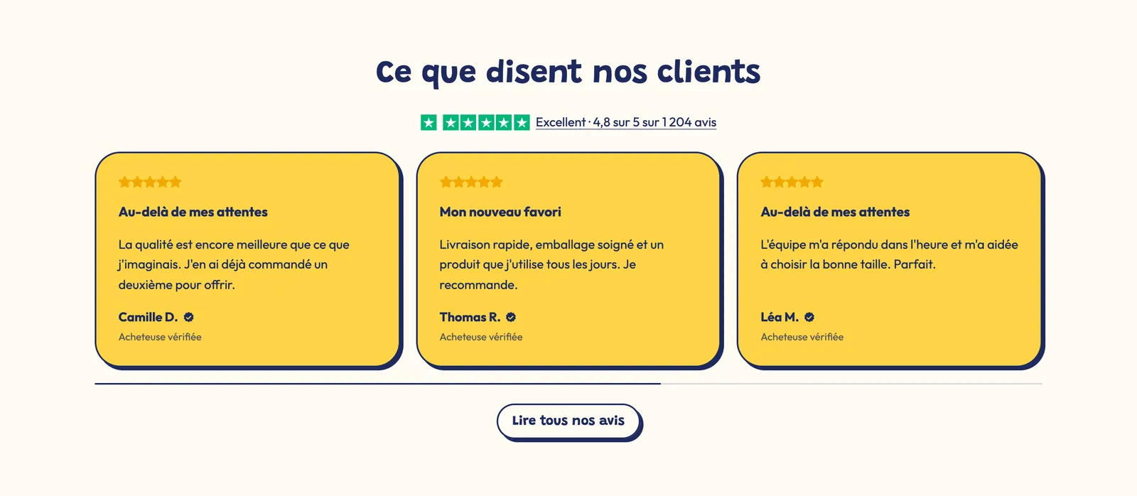
Placed in a Carousel, several testimonials make a scrolling row of reviews, as in the Trustpilot screenshot below.
Stars (typed score)
The Stars (typed score) block shows a rating you type yourself, anywhere: in a banner, a badge, a testimonial.
- Rating: the score out of 5 (4.8 by default).
- Stars style: ★★★★★, 5/5 ★★★★★, 5★ or Hide. In the 5★ style, Star before the score and Show "/5".
- Stars color: empty = the theme's star color, set in Theme settings > Colors > Color palette ("stars" color).
- Star size, Text size (and their mobile versions), Text beside the stars and Text color.
Rating summary
The Rating summary presents the average, the number of reviews and, in the stacked layout, the breakdown by stars.
- Source: Custom (you enter the Rating out of 5, the Number of reviews and the Distribution, as percentages from 5 down to 1 star:
82, 12, 4, 1, 1) or Product (the rating and review count your reviews app saves on the product). - Display group: Layout (Stacked or Row), rating Size, Label and Text (
[count]shows the number of reviews; empty = "Based on [count] reviews"). - Button group: a link to the page with all your reviews.

Trustpilot
The Trustpilot block shows your Trustpilot rating with the brand's green stars.
- Trustpilot rating and Stars (Show stars or Hide stars), Empty stars colour, Show the Trustpilot icon.
- Text group: Text (for example "Excellent, based on 1,204 reviews"), its position before or after the stars, and a Link to your profile.
- Load the TrustBox widget: shows the official Trustpilot widget. Copy the Template ID and the Business unit ID from Trustpilot Business, under Integrations > TrustBox. The typed stars show until the widget loads.
Trust badges
The Trust badges block lines up your guarantees: free shipping, free returns, secure payment, certification. Each Badge sub-block has an Icon (or a Badge image, for example a B Corp or organic logo), a Title, a Text and a Link.
- Layout: Row or Grid (with columns on desktop and mobile). Direction: Horizontal (icon beside the text) or Vertical.
- Style: Plain, Card or Outline. Icon size, Single color icons, Text size.
- Layout group: Spacing and Alignment.

Payment icons
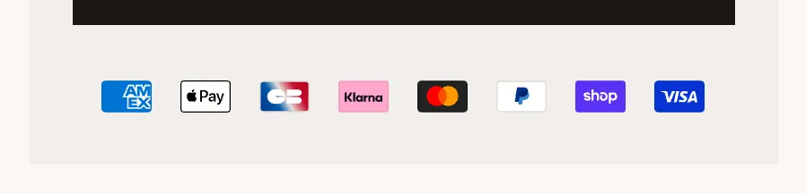
The Payment icons block shows the logos of the payment methods you accept: a reassuring cue near the buy button, in the cart or in the footer.
- Content: Automatic (from store settings: the methods turned on in Settings > Payments), Chosen payment methods (a comma-separated list, for example
visa, master, paypal, apple_pay) or Custom images (up to 8 badge images). - Single color icons.
- Text group: Reassurance text (a short line, for example "Secure payment") and its Text position (above or below the icons).
- Layout group: Icon size (32 px), Spacing, Alignment.
Logo list
The Logo list presents the brands, media or partners that trust you. Each Logo sub-block has an Image, a Name, a Link and a Text (a short press quote, for example).
- Layout: Row, Grid or Continuous flow (with Delay, Direction and Pause on hover (desktop)).
- Appearance group: logo Height (40 px) and Height on mobile, Style (Plain, Card, Outline), Grayscale until hovered and Opacity.
