
Layout blocks: group, tabs, carousel and collapsible rows
Organize your sections with the Group, Content over image, Carousel, Tabs, Collapsible row, Spacer / Divider, Breadcrumb and Custom Liquid blocks.
Layout blocks show almost nothing on their own: they arrange the other blocks. A Group puts a heading and an image side by side, a Carousel slides cards, Tabs tuck content behind buttons. Using them well means you can build any layout without an app.
Most of these blocks also have the common settings Show on (Desktop and mobile / Desktop only / Mobile only), Sizing (block width within its container) and Animations.
Group
The Group is a container: it lines up the blocks it holds, in a row or a column. You can put groups inside groups, which makes any grid possible.
- Layout group: Direction (Horizontal or Vertical), Stack on mobile (on by default: columns move one under the other), Order on mobile (Default, First, Last), Horizontal alignment (Left, Center, Right, Stretch, Space between), Vertical alignment, Gap (24 px) and Gap mobile (16 px).
- Keep visible while scrolling and Distance from the top: on desktop, the group stays in place while the rest of the section scrolls (a sticky column, ideal next to a long list).
- Sizing group: top, bottom and horizontal inner spacing, and Link, which makes the whole group clickable like a card.
- Media group: a Background image (and a mobile version), Minimum height, focal points and a colored overlay.
- Color palette group: Transparent background (default, the group lets the section show through), or a palette and a Corner radius to turn it into a card.

Content over image
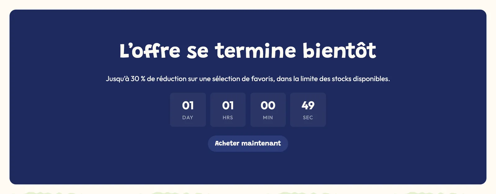
The Content over image block is a Group that comes with a background image: the blocks it holds (a heading, a text and a button by default) show on top of it.
- Background image and Background image (mobile) (empty = the desktop image cropped around the focal point).
- Minimum height: 400 px by default, so the image stays visible even with little text.
- Focal point (horizontal) and Focal point (vertical), Image overlay opacity and Overlay color to keep the text readable.
- The other settings (direction, alignments, spacing, link, palette) are the Group's.
Carousel
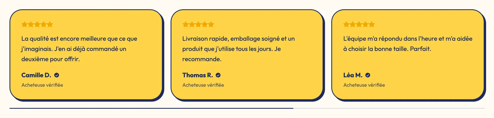
The Carousel scrolls the blocks it holds horizontally. It ships with four groups and accepts any block: testimonials, images, text cards…
- Layout: Carousel or Grid. In grid, Carousel on mobile (on by default) keeps the swiping on phones.
- Columns on desktop (3), Columns on tablet (2) and Columns on mobile (1.25 by default: part of the next item stays visible, which invites swiping).
- Items' Vertical alignment and Use the full width of the screen.
- Controls group: Arrows (None, On the sides, With the pagination), Move by (A full page or One item at a time), Navigation style (Circle, Square, Outline, Blur), Pagination style (None, Dots, Progress bars, Counter), Auto-rotate slides and Change slides every (5 s).
Tabs
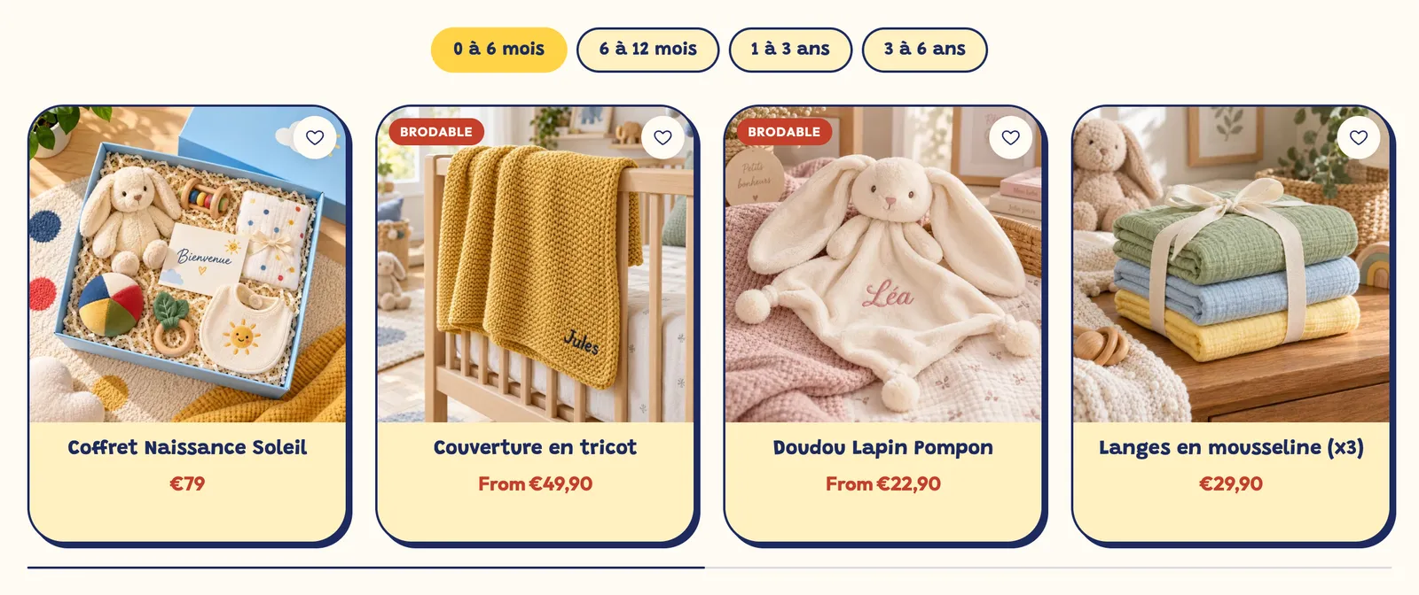
The Tabs block tucks content behind buttons: one tab per FAQ topic, per age, per product line… Each Tab sub-block has a Tab label and accepts any blocks (product list, text, accordions, image).
- Style group: Tabs style (Pills, Underline, Minimal), Alignment (Left, Center, Right, Stretch), Tab position on desktop (Top or Left), Uppercase labels, Label size, Bold, margins and the pills' Corner radius.
- Space between tabs and Space below the tab bar.
- Color palette group: background and text of the active tab and of the other tabs (empty = theme colors).
- In each Tab: Direction, alignments and spacing of the blocks it holds.
Collapsible row
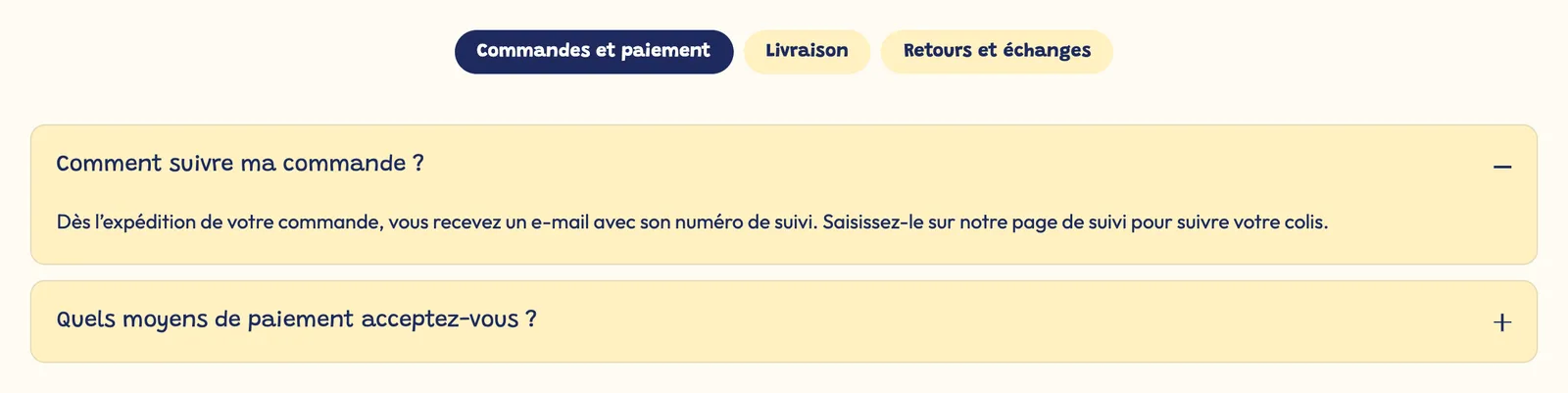
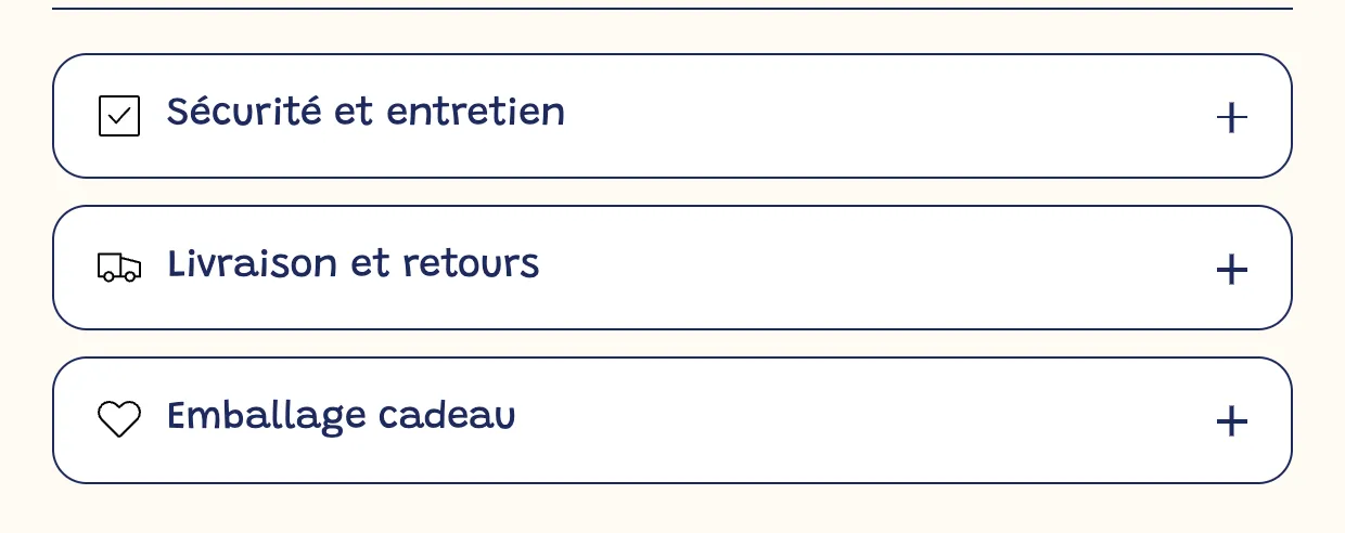
The Collapsible row hides any blocks behind a title that opens and closes. It's the ideal tool for a product page's tabs (description, care, shipping, size chart).
- Title, Open by default and Close other accordions when this one opens.
- Appearance group: Style (Minimal (bottom line), Card (background and border), Filled (background only)), Open / close icon (Plus / minus, Chevron, None), Question size, margins, Corner radius, colors and Spacing between the blocks inside.
Spacer / Divider
The Spacer / Divider block adds breathing room between two blocks, with or without a line.
- Line style: No line (spacing only), Solid, Dashed or Dotted. Line color: empty = text color at 15% opacity.
- Spacing: total height of the block, 32 px by default (the line is centered). Spacing on mobile: 24 px.
Breadcrumb
The Breadcrumb shows visitors where they are (Home > Collection > Product) and helps them go back up a level. Google reads it too.
- Home link (Text or Icon) and its Label.
- Separator: Chevron, Slash, Vertical bar, Dot or Arrow.
- Show the current page and Add a collection on product pages: the collection the customer came from, otherwise the product's first collection.
- On mobile: Shorten long titles, Show the full trail, or Back link only.
- Text size (13 px) and All caps.

Custom Liquid
The Custom Liquid block (Apps and code category) accepts a snippet of Liquid or HTML code in the Liquid code field: a widget provided by an app, a tracking script, a small customization. It also has Bottom spacing and Show on.