
Structure a product page that converts
The blocks of the Story Theme product page, the recommended order in the buy column and the key settings of the photo gallery.
Your product page is the page that makes or breaks the sale. In the Story Theme, it's built entirely from blocks: the gallery, the title, the price, the buy button… You can move them, duplicate them, hide them or add others, without touching the code.
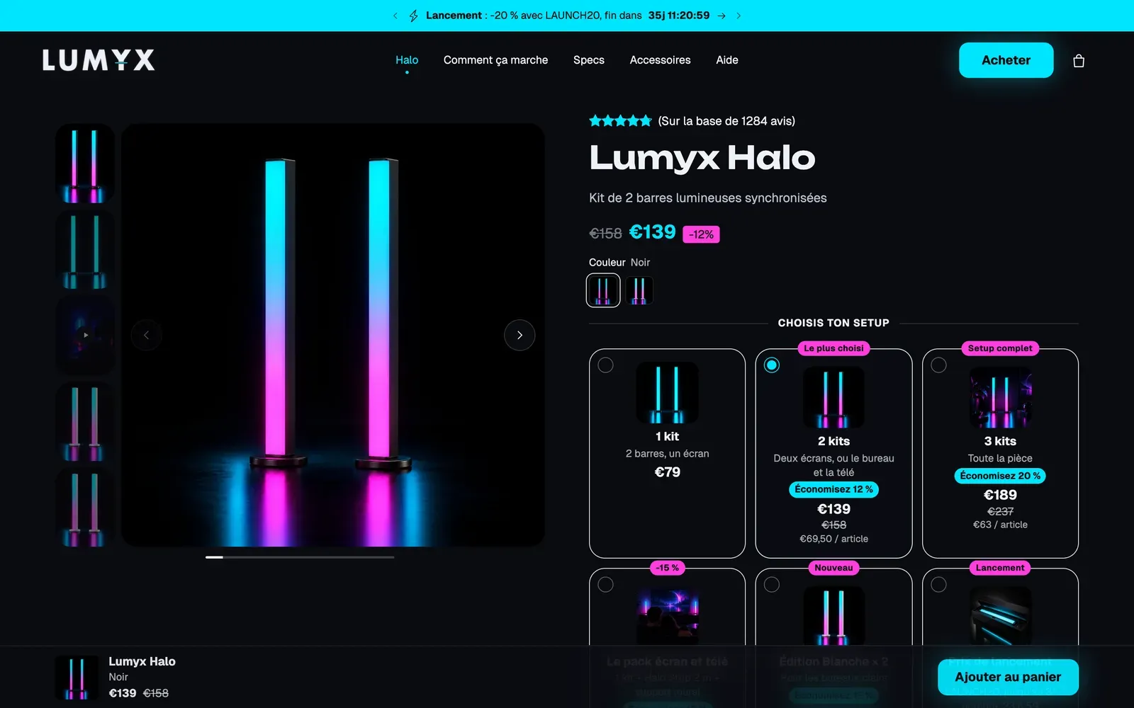
Open the product page template
- In your Shopify admin, open Online Store > Themes.
- Click Edit theme next to the Story Theme.
- In the dropdown at the top of the editor, choose Products > Default product.
- In the sidebar, expand the Product page section, then the Group block: this is the buy column, to the right of the gallery on desktop.
Remember to check how it looks on a phone too, by switching the editor preview to mobile view: most of your customers shop from their phone.
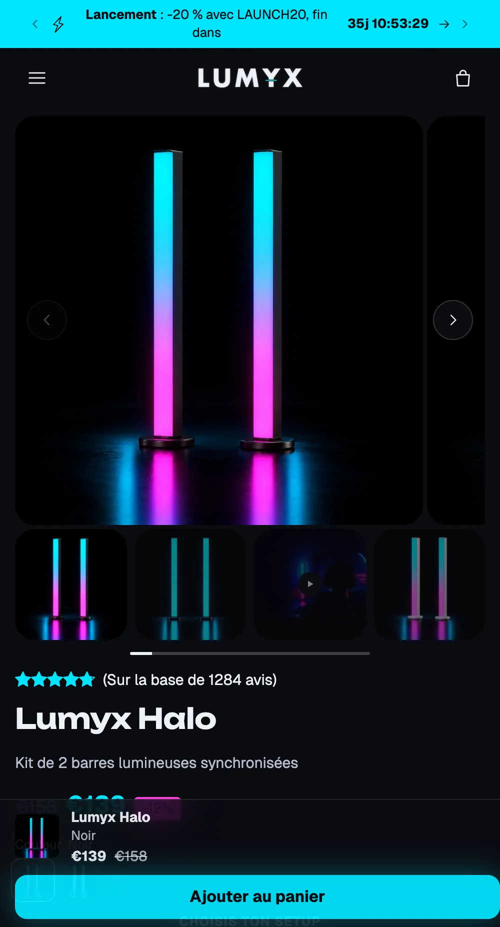
The included blocks, in order
The Default product template comes with a gallery and a buy column already organized. This order follows the path of a customer who discovers the product and then makes up their mind:

| Order | Block | What it does |
|---|---|---|
| 1 | Breadcrumb | Places the product within your store. |
| 2 | Product rating | Stars and review count (see Show customer reviews). |
| 3 | Product title | The product name. |
| 4 | Price | The price, the compare-at price and the tax note. |
| 5 | Variant picker | Sizes, colors… (see Variants and swatches). |
| 6 | Stock | The availability of the selected variant. |
| 7 | Quantity | The quantity selector. |
| 8 | Buy buttons | The add to cart button. |
| 9 | Checklist | Three or four short selling points. |
| 10 | Delivery date | The estimated shipping and delivery dates. |
| 11 | Product description | The description entered in Shopify. |
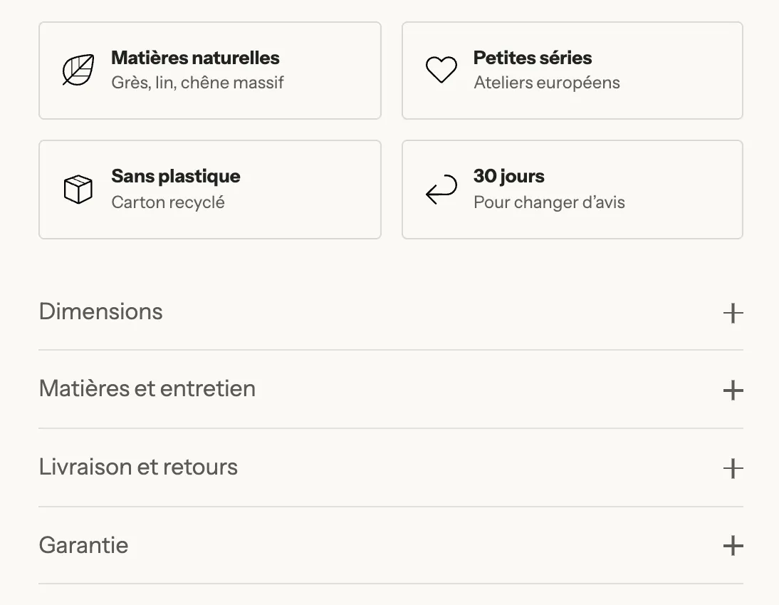
| 12 | Group with two Accordion / FAQ | Collapsible details: care, shipping, returns… |
The section also contains the Sticky add to cart block, which ships hidden (see Sticky add to cart button). Below the product page, the template continues with other sections: selling point columns, image with text, FAQ, testimonials, customer photos and related products.
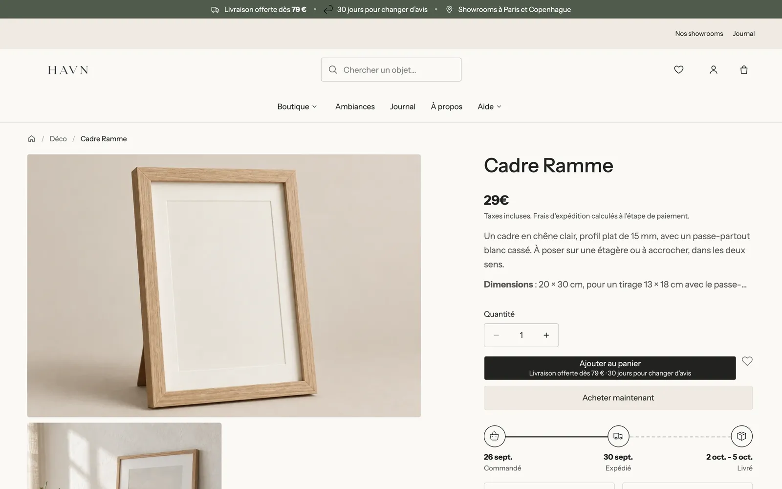
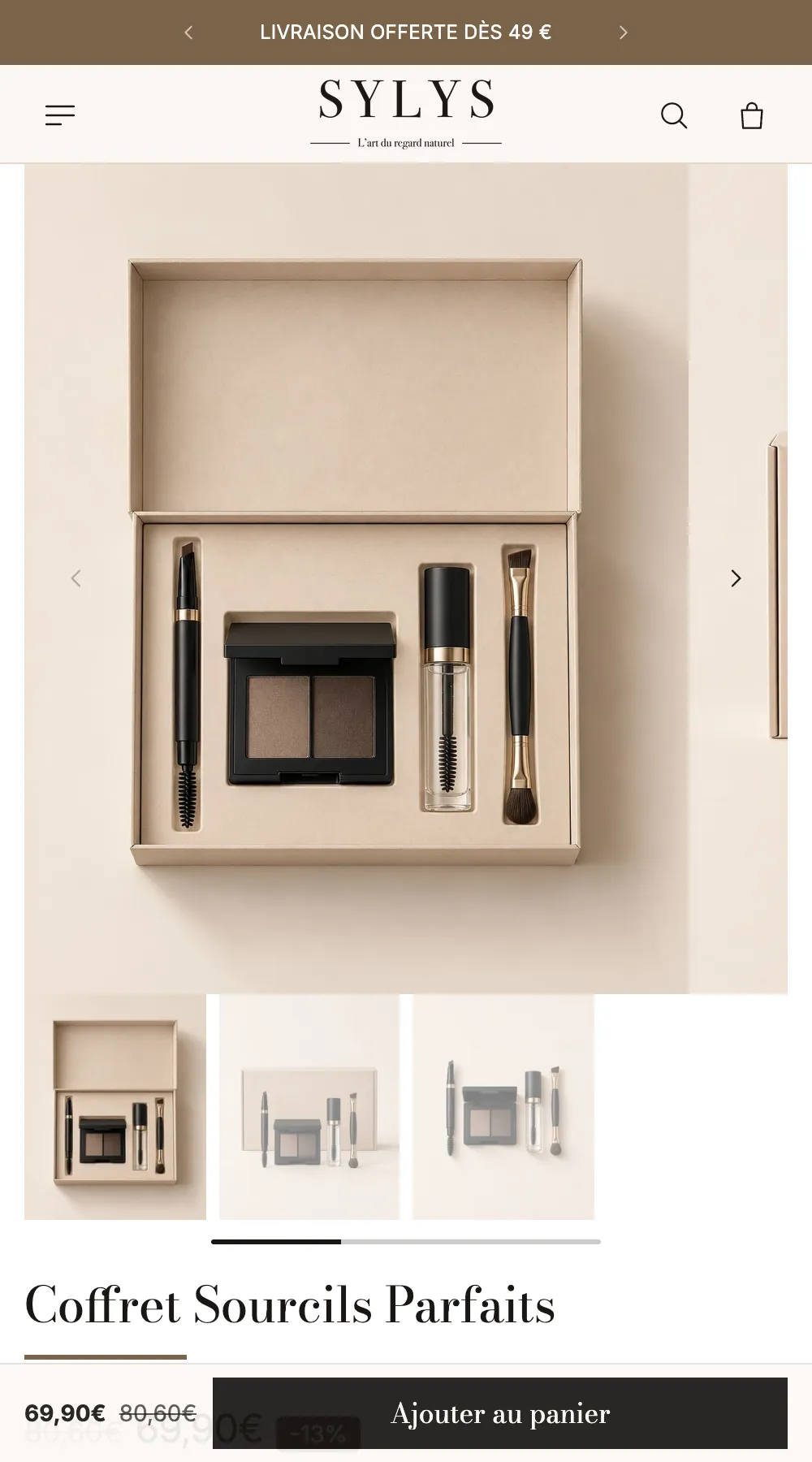
On mobile, the same blocks stack under the gallery, in the same order:
For details on each block and its settings, see Product page blocks: buying and Product page blocks: content, as well as the Product page section.
Add, move or hide a block
- To add a block to the buy column, click Add block under the last block of the Group. Product-specific blocks are grouped in the Product page and Offers categories.
- To move a block, drag it by the handle to the left of its name.
- To hide a block without deleting it, click the eye icon next to its name.
- Click Save at the top right.
Useful blocks to add depending on your business:
- Offers: quantity discounts, bundles, "buy X, get Y" (see Quantity discounts and bundles).
- Trust badges, Tabs and Collapsible row (see Trust badges, tabs and accordions).
- Rotating messages: a few short messages (returns, warranty) that rotate below the button, without shifting the page.
- Size guide, Personalisation field (engraving, gift wrap), Free shipping progress.
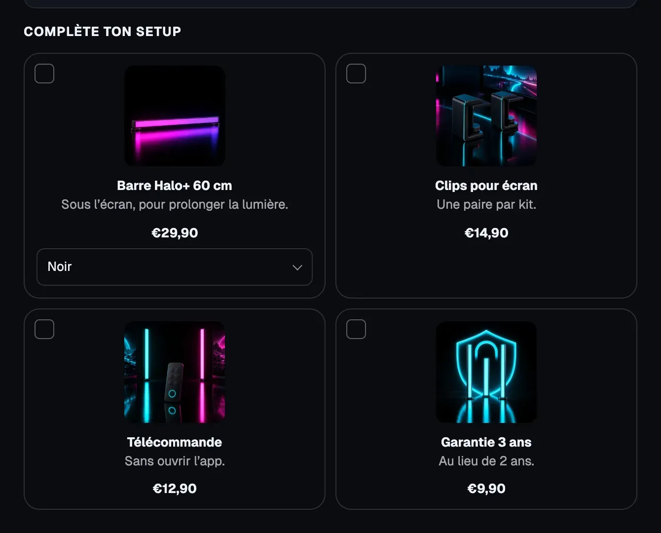
- Add-ons: accessories to check, added along with the product.
Set up the photo gallery
Click the Product gallery block to open its settings.
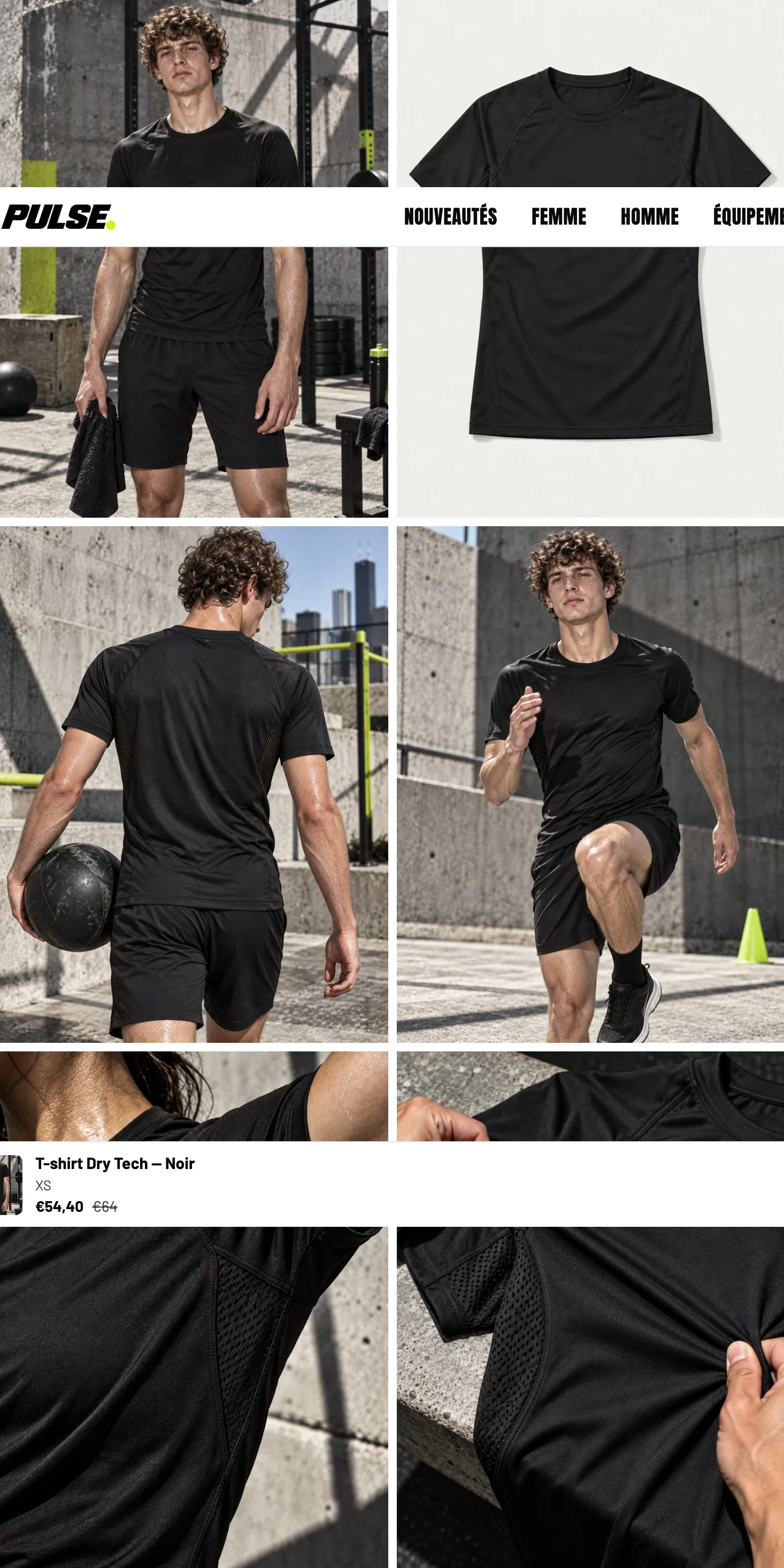
- Desktop layout: Carousel (default), Stacked, Grid or Mosaic. A stacked or grid layout shows several photos at once; the carousel keeps the page shorter.
- Mobile layout: keep Carousel unless you have very few photos.
- Image ratio: Portrait (4:5) by default. Choose the format of your photos, or Adapt to image if they have different formats.
- Show thumbnails and Thumbnails position: below the photo, on the left or on the right.
- Enable zoom: lets customers open photos full size. Off by default.
- Hide variant images (on by default): photos linked to a variant only show when the customer picks that variant. For this to work, assign an image to each variant in the product in Shopify.
- Keep visible while scrolling: on desktop, the gallery stays on screen while the customer scrolls through the buy column.
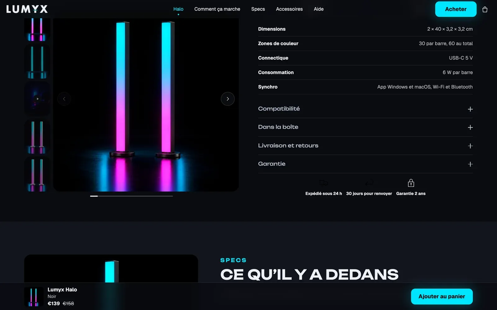
The gallery also plays Shopify and YouTube videos added to the product, and 3D models, with a button to view the item in your own space with augmented reality.