
Show variants as swatches, buttons or photos
Set up the Story Theme variant picker: color swatches, variant photos, buttons, list or dropdown, and unavailable options.
When a product comes in several sizes or colors, customers choose their variant in the Variant picker block on the product page. The Story Theme can show colors as swatches, other options as buttons, and even replace the swatches with a photo of each variant.
Open the variant picker
- Open Online Store > Themes > Edit theme.
- Choose the Products > Default product template from the dropdown at the top.
- In the Product page section, expand the Group block and click Variant picker.
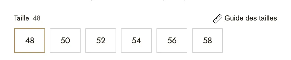
Choose the display type
Under Type, choose:
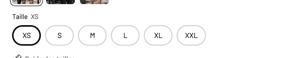
- Buttons (default): each value is a button. The most readable for sizes.
- List: one row per value, with the option to show each option's price (Show each option's price).
- Dropdown: compact, useful when an option has many values.
Two settings complete the display:
- Show the selected value beside the option name: "Size: M" for example. On by default.
- Hide option names: for a cleaner look.
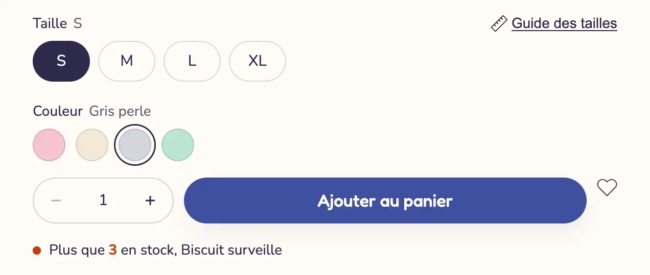
Show colors as swatches
In the Colour swatches group:
- Leave Show colour options as swatches checked.
- Check Options shown as swatches: the theme turns options with these names, separated by commas, into swatches. By default:
Color, Colour, Couleur, Coloris. If your option is called "Shade" or "Finish", add that name to the list. - Choose the Swatch shape (Circle, Rounded, Square, Portrait) and their Swatch size.
Where does each swatch's color come from? In this order:
- the color or image saved on the option value in Shopify. When you create an option linked to the product's category (Color, for example), Shopify lets you choose a color or an image for each value;
- otherwise, the value's name, if it's a color the browser recognizes in English (Black, Navy, Beige…).

Use each variant's photo
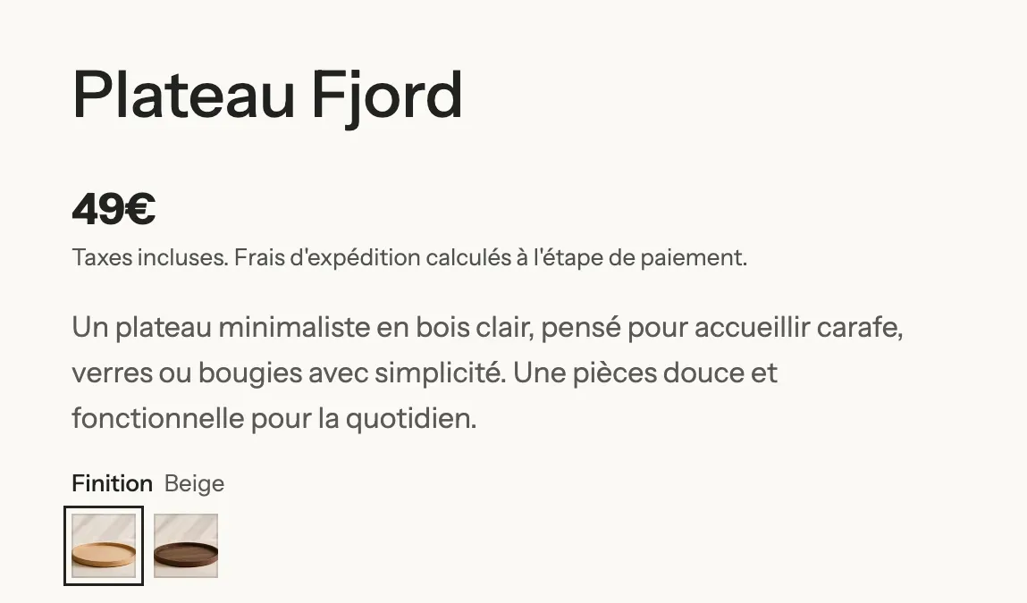
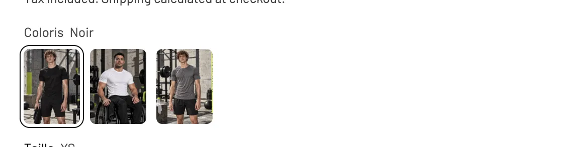
Instead of a solid color, the swatch can show the variant's photo, handy for materials, patterns or finishes.
- In Shopify, assign an image to each variant (product page, Variants area, click the variant, then the image slot).
- In the theme, under Colour swatches, set Swatch content to Variant photo.
- A Square or Portrait Swatch shape shows off photos better.

Also keep in mind the Hide variant images setting of the Product gallery block: on by default, it removes photos linked to a variant from the gallery and only shows them when that variant is selected.
Customize buttons and unavailable options
The Button appearance group sets the Shape (Pill, Rounded, Square, Underline), the Selected state (Filled, Outline, Thick border), the padding, text sizes and colors.
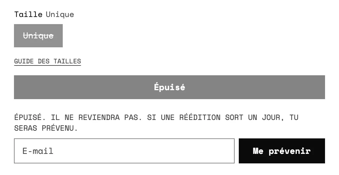
The Unavailable options setting decides what customers see when a combination is sold out or doesn't exist: Dimmed, Struck through (default) or Hidden.
Frequently asked questions
My colors show as buttons, not swatches
Your option's name isn't in Options shown as swatches. Add it (for example Shade), or save a color on each option value in Shopify.
The swatch is gray or white
The value has no color saved in Shopify and its name isn't a recognized color. Save the color on the option value, or switch to Variant photo.
Can I show a size guide next to the Size option?
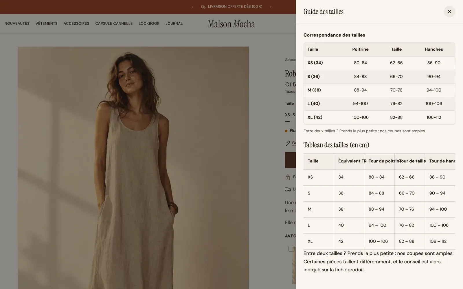
Yes: in the Size guide group of the same block, check Show a size guide and enter the exact name of the option in Option that carries it (for example Size). The guide opens in a centered window or in a side drawer (Opens as setting).
Learn more
- Structure a product page that converts
- Product page blocks: buying (Variant picker)
- Product page blocks: content (Sibling products, Size guide)
- Quantity discounts and bundles
- Use a different layout for some products