
Product page blocks: price, variants and buy buttons
Every block that drives the purchase on the Story Theme product page: price, variants, quantity, buy buttons, sticky bar, stock, delivery and personalization.
These are the blocks in the buy column: the ones customers look at right before they click. You'll find them under Add block, Product page category, inside the Product page section (and also in Featured product and the Quick view template). Each block follows the page's product; its Product setting, left empty, uses the nearest product.
The presentation blocks (title, rating, gallery, description, size guide…) are described in Product page blocks: content, and discounts, add-ons and subscriptions in Offer blocks.
Where these blocks are
In the shipped product page, the buy column is a Group block that holds, in order: Breadcrumb, Product rating, Product title, Price, Variant picker, Stock, Quantity, Buy buttons, Checklist, Delivery date, Product description and two accordions. The Sticky add to cart block is there but hidden.
- Open Edit theme > Products > Default product.
- In the Product page section, expand the buy column's Group.
- Click a block to set it up, or click Add block > Product page to add one.
Price
Shows the price of the selected variant, the compare-at price, a discount badge and the tax note.
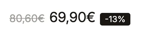
- [Display] Show compare-at price and its Position (Before the price / After the price), Show discount badge (off by default) and its Badge value (Percentage / Amount), Show unit price, Show "from" price, Show Shop Pay Installments, Show the tax and shipping note.
- [Offers] Price shown with an offer: Offer total, Total with add-ons, Price per item or Variant price. The price then follows the product's Offers, Purchase options and Add-ons blocks.
- [Style] Size (Small to Extra large), Alignment, Price color, Sale price color, badge colors.
The compare-at price comes from the variant's Compare-at price field in Shopify. Shop Pay Installments only appears if it's turned on in your payment settings and the price is eligible.
Variant picker
The block that lets customers choose the size, color or format. It can show buttons, a list or a dropdown, and turns colors into swatches.
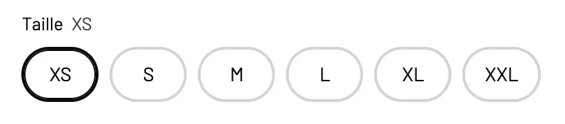
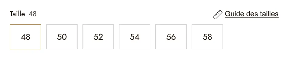
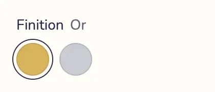
- [Display] Type (Buttons, List, Dropdown), Show the selected value beside the option name, Show each option's price (List type), Hide option names.
- [Colour swatches] Show colour options as swatches, Options shown as swatches (by default "Color, Colour, Couleur, Coloris"), Swatch content (Color / Variant photo), Swatch shape, Swatch size.
- [Button appearance] Shape (Pill, Rounded, Square, Underline), Selected state (Filled, Outline, Thick border), borders, padding, sizes, Unavailable options (Dimmed, Struck through, Hidden) and colors.
- [Offer cards] turns up to three option values into cards (Offer 1: option value, Badge, Title, Price text…). The value must be typed exactly as in Shopify. These cards only change the look: the variant is charged at its own price.
- [Size guide] Show a size guide adds a link on the option whose name exactly matches Option that carries it ("Size" by default); it opens as a Centered window or a Side drawer.
All the details on swatches are in Variants and color swatches.
Quantity
The quantity selector, as a separate block so you can place it wherever you want.
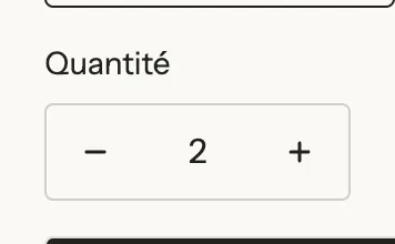
- [Display] Show the label, Show the quantity already in the cart (editable text,
$qty= the quantity), Show volume pricing (B2B customers whose catalog includes quantity pricing). - [Appearance] Style (Bordered box, Separate buttons, Minimal), Size, Corners and colors.
The block respects Shopify's quantity rules (minimum, maximum, increment).
Buy buttons
The Add to cart button, with optional express checkout buttons, pickup availability, pre-order and back-in-stock alert.
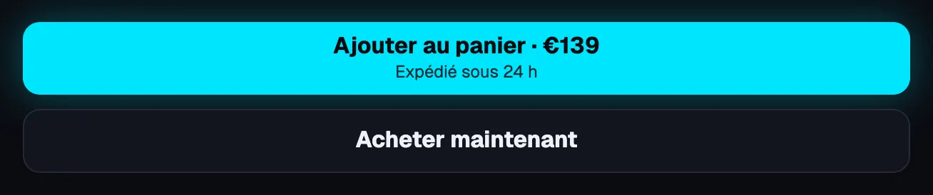
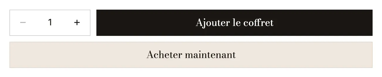
- [Button] Button text (empty = "Add to cart" in the store language;
[price],[compare_price],[savings]and[percent]follow the selected offer), Second line under the text, Style, Icon, Width (Content, Half, Full). - Show a quantity selector and its style, Show the express checkout buttons (off by default), Show pickup availability, Let shoppers send a gift card to someone (gift cards only).
- Show payment icons and a rating under the buttons: payment icons (or an Image instead), stars, Rating and Text beside the stars.
- [Pre-order] Show pre-order (Never, Out of stock but still sold, Always), Pre-order button text, Message under the button (also saved on the order line).
- [Back in stock] Notify me form (None, Email to the store, Klaviyo) and Text above the form, shown while the selected variant is sold out.
- [Text above] a short text above the button, and its alignment.

Sticky add to cart
A bar that stays on screen when the page's buy button is out of view. Its button adds everything chosen on the page: variant, quantity, personalization and offer.

- [Display] image, title, selected variant, compare-at price, Variant selector (None / Dropdown, which changes the variant for the whole page), Show quantity selector.
- [Behavior] Appears (Once the add to cart button is out of view / As soon as the page scrolls), Hide at the bottom of the page, Show on.
- [Position] Position (Bottom, Top, Floating), Position on mobile, Layout on mobile (Compact keeps the price and the button; Detailed).
- [Button] Button text (
[price],[compare_price]) and Button style; [Appearance] palette, Frosted glass, border, shadow, Full width.
Stock
A message that follows the selected variant's stock: in stock, running low, sold without stock, sold out.


- [Display] Stock type: Stock managed on Shopify or Simulated figure. In Shopify mode: Running low at or below (10), and whether to show the In stock, Sold without stock and Sold out messages. In simulated mode: Figure, Lower the figure during the visit, One less every, Minimum simulated stock.
- [Messages] Low stock (
[quantity]= the number left), In stock, Sold without stock, Sold out. - [Indicator] Indicator (Dot, Bar, None), Full bar at, one color per state.
- [Appearance] Style (Plain, Filled, Outline), size and alignment.
In Shopify mode, inventory tracking must be turned on for the variant; otherwise the block shows "in stock" with no number. A simulated figure isn't connected to your stock: the editor reminds you to keep it honest. See Stock bar and urgency.
Delivery date
Three dated steps (Ordered, Shipped, Delivered) or a single line, calculated in business days from today, in the store's time zone.
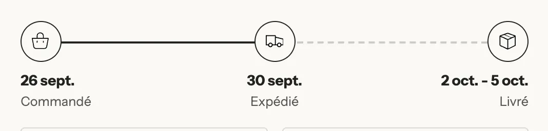
- [Display] Layout (Steps / One line with
[dates]), Icon style (Filled, Soft tint, Outline). - [Order step], [Shipping step], [Delivery step]: a Label and an Icon per step.
- [Dates] Days to prepare order (1), Shortest shipping time (days) (2) and Longest shipping time (days) (4), Don't count weekends, Closed days (
25/12, 01/01), Cut-off time (14:00), Show the time left before the cut-off and its Text ([timer],[date]), Date format. - [Appearance] Style (Plain, Filled, Outline), Highlight, size and alignment.
Public holidays aren't known automatically: add them in Closed days. The same calculation powers the Delivery estimate cart block. See Delivery estimate.
Free shipping progress
Shows what the cart is missing for free shipping, and updates with every addition.


- Threshold (50 by default, in the store currency) and Thresholds per currency (for example
USD:60;GBP:45). - [Messages] Progress message (
[amount]), Say when this product unlocks free shipping and its message, Message once unlocked, Icon. - [Progress bar] show or hide, thickness, colors; [Appearance] Style (Plain, Filled, Outline), Highlight.
The block doesn't give anything away by itself: create the free shipping rate or a "Free shipping" discount in Shopify. See Free shipping bar.
Personalisation field
A field the customer fills in before adding to cart: text to engrave, a card message, a photo to print, a date, a wrapping choice. Presets: Engraving, Photo upload and Gift wrapping.
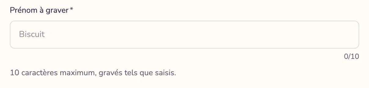
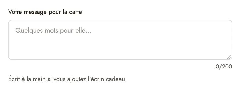
- [Field] Field type (Short text, Long text, Number, Dropdown, Choice buttons, Checkbox, Date, File), Field title (it also names the value in the cart and the order), Placeholder, Choices (one per line), Default value, Help text, Required and Error message.
- [Rules] Character limit and Show character counter, Height (lines), Earliest date, Accepted files (Images, Images and PDF, Any file) and Maximum size (1 to 20 MB), Number of fields (several photos, for example), Columns, Show only for these option values (for example
With engraving), Hide from cart and order. - [Appearance] Field style (Outline / Filled), Show title, Show the required asterisk.
The value entered goes with the item and shows in the order. A Required field blocks adding to cart while it's empty, including from the sticky bar.