
Product page blocks: gallery, description and size guide
The blocks that present the product in the Story Theme: title, rating, gallery, description, specifications, size guide, messages and sibling products.
These blocks tell the product's story: its photos, name, rating, description, spec sheet, size guide and other colors. Like the buy blocks, they're under Add block, Product page category, inside the Product page section (and also Featured product and the Quick view template).
The blocks that drive the purchase (price, variants, button, stock, delivery, personalization) are in Product page blocks: buying.
Product gallery
The gallery of the product's photos and videos. It fills the left column of the shipped product page. Shopify and YouTube videos play inside the gallery; 3D models show with a View in your space button (augmented reality).
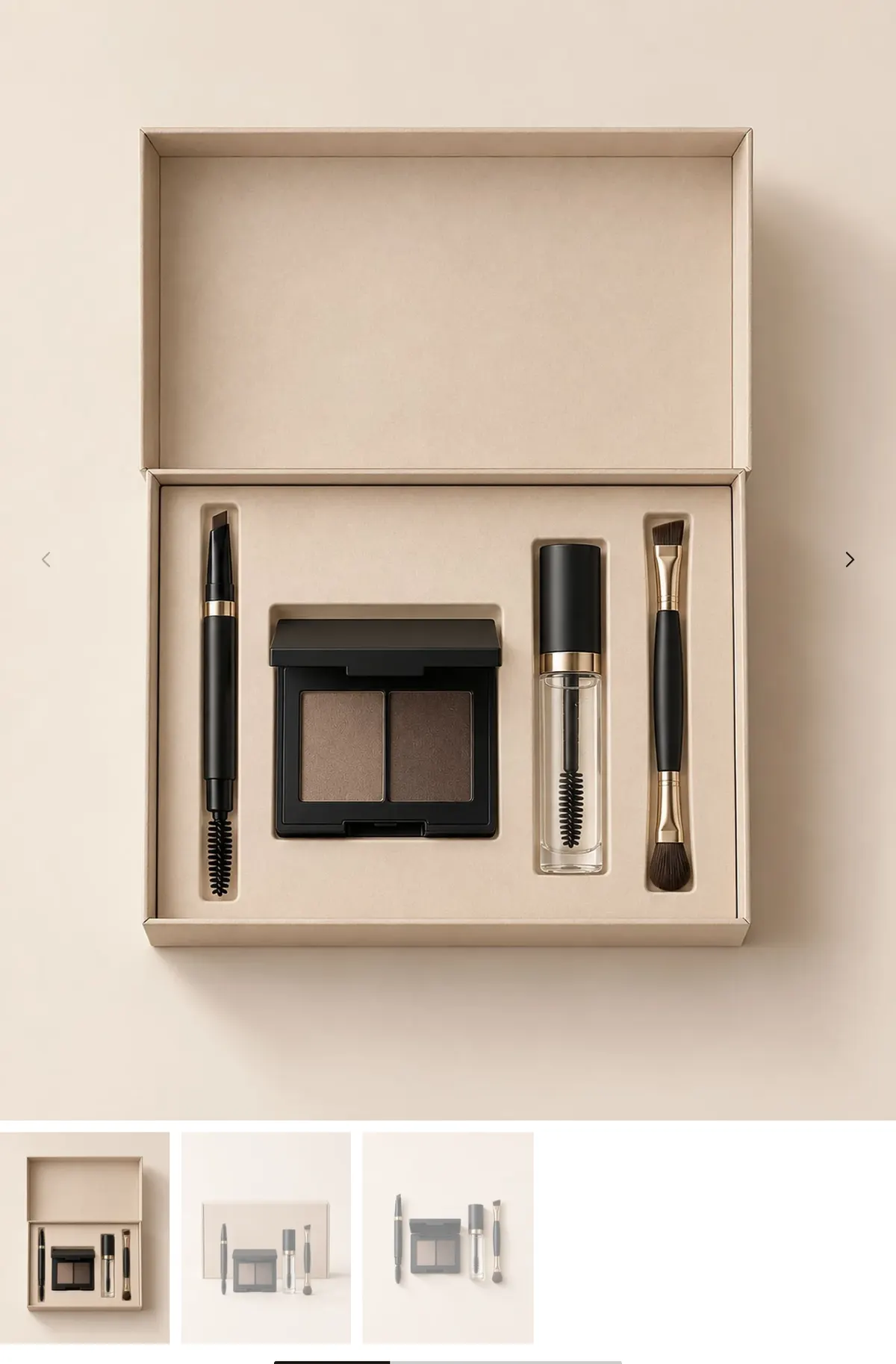
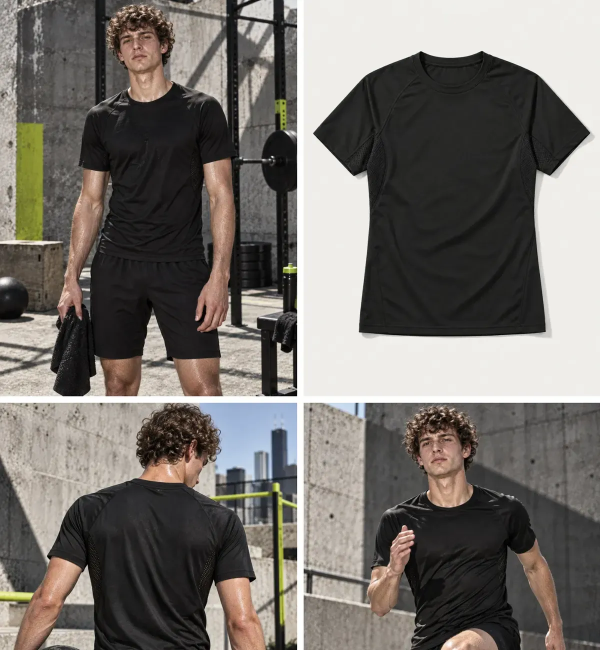
- [Layout] Desktop layout (Carousel, Stacked, Grid, Mosaic), Columns on desktop, Large images at the start, Pattern (mosaic), Layout on mobile (Carousel, Stacked, Grid).
- [Format] Image ratio (Adapt to image, Square, Portrait (4:5) by default, Portrait (3:4), Tall (2:3), Landscape (3:2), Wide (16:9)), Fill mode (Cover / Contain), spacing, Corner radius, Edge to edge on mobile.
- [Options] Show thumbnails and their position (Below the media, Left, Right), Preload the first image (lets the next media peek out on mobile), Enable zoom (off by default), Hide variant images (on by default).
- [Arrows and pagination] arrow style and position, Pagination (Dots, Pills, Progress bar, Counter), control size and colors.
- [Sticky] Keep visible while scrolling: on desktop, the gallery stays in place while the buy column scrolls.
Product title
The product name, as the page's main heading.

- [Style] Heading style (None, Style 1, 2 or 3; Style 2 by default), Heading level (h1 by default), Custom font size with a desktop size and a mobile size, Alignment, Title color.
Keep h1 on the main product, and only once per page: it's what Google reads.
Product rating
A line of stars with the number of reviews, near the title.

- Style (Score only, Score and stars, Stars).
- Source: Product reads the rating and review count your reviews app saves on the product; Custom shows a Rating and a Number of reviews that you type.
- Text beside the rating (
[count]= number of reviews; empty = "Based on [count] reviews"), Alignment.
With the Product source, you need a reviews app that writes Shopify's standard rating data (Judge.me, Loox, Shopify Product Reviews…). Without reviews, the block stays hidden on the storefront and shows a sample in the editor. The theme doesn't show the list of reviews: add your app's block for that. See Customer reviews.
Product description
The description entered in the product's Shopify page.
- [Display] Limit the number of lines and Lines shown (4 by default): the customer expands the rest. Alignment, Text color.
SKU
Shows the selected variant's SKU and follows every variant change. Hidden when the variant has no SKU.
- [Display] Show the label and Label, Show the barcode and its label, Layout (On one line / Stacked).
- [Appearance] text size, All caps, color, alignment.
Specification list
A spec sheet in rows: material, dimensions, care, warranty… Each row is a Specification sub-block with a Label, a Value and an Icon. The block also exists as a section, see Specifications section.
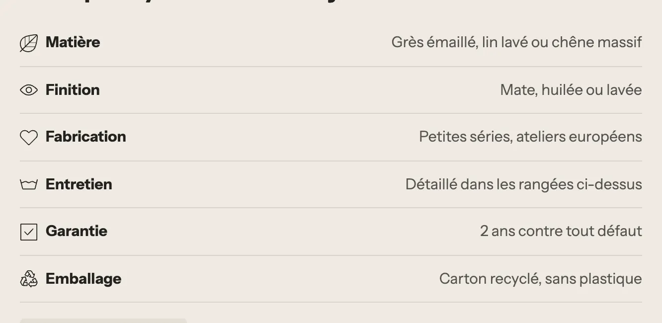
- [Layout] Layout (Table, Stacked, 2 columns), Label width, Inner spacing, Show dividers, Striped rows.
- [Text] size, Bold labels, value Alignment (Left / Right), icon size.
- [Colors] labels, text, line and striped row background (empty = theme colors).
Size guide
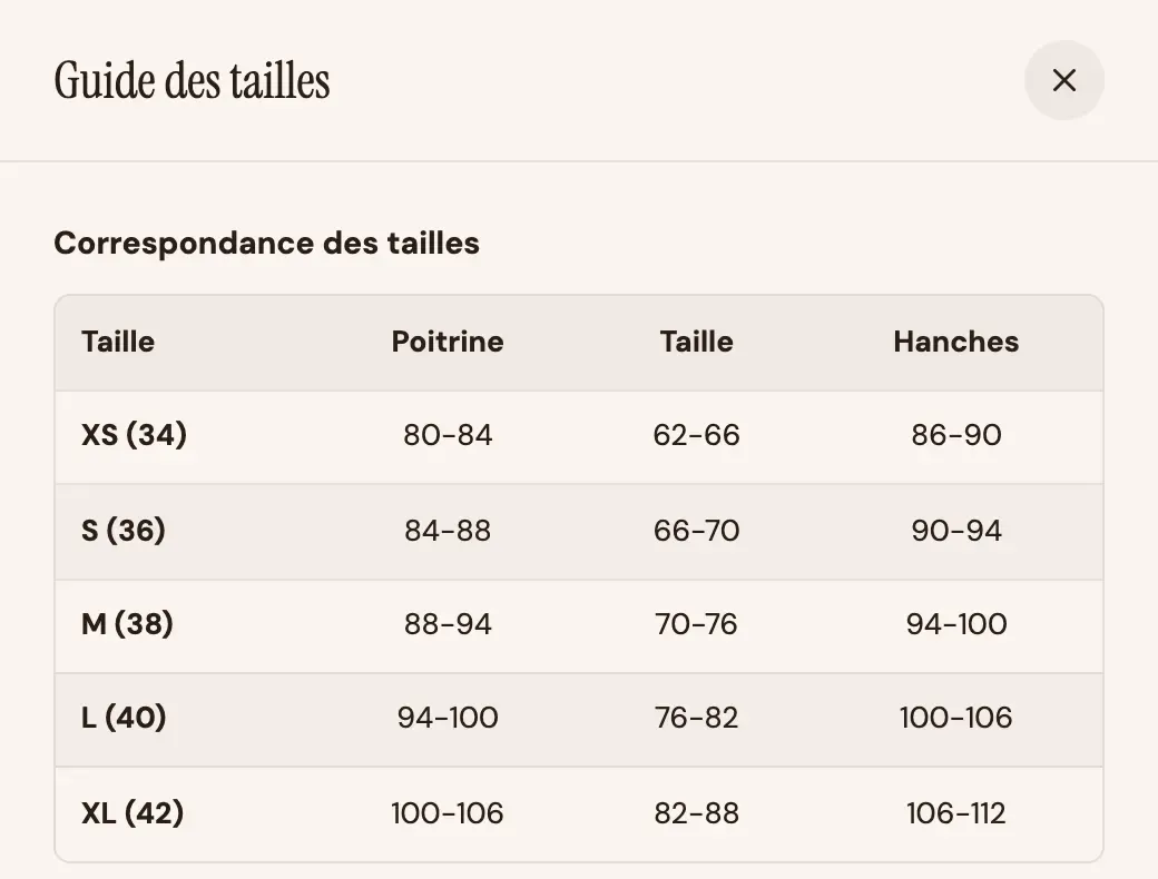
A link or button that opens the size guide in a window or a drawer. The guide first shows its blocks (size charts, text, images), then the content of a page if you choose one.
- [Button] Label, Button style (Link by default, or a button style), Icon, size and alignment.
- [Size guide] Guide title, Opens as (Centered window / Side drawer), Page shown in the guide.
Size chart
The Size chart sub-block builds a table without code:
- Title;
- Table: one row per line, cells separated by
|or;. The first line holds the column headings, the first column the sizes; - Unit (Centimeters, Inches, None) and Let shoppers switch between centimetres and inches;
- Striped rows and a Note under the table.
The Variant picker also has its own size guide link (Size guide group), placed on the "Size" option. Use one or the other, not both.
Rotating messages
Short messages that replace each other in the same spot: free returns, secure payment, craftsmanship. Each message is a Message sub-block with a Text, an Icon and an optional Link.

- [Display] Transition (In from the bottom, Slide sideways, Fade), Time per message (2 to 10 s), Pause on hover (desktop), Show the pause button (recommended for accessibility).
- [Appearance] Style (Plain, Filled, Outline), Highlight, size and alignment.
The block has a fixed height: the page doesn't jump when the message changes.
Sibling products
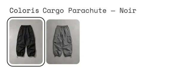
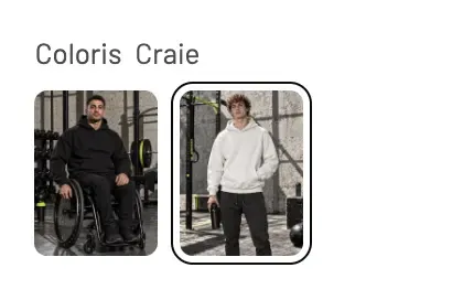
Presents other products as an option of this one: typically colors sold as separate products. A click switches products without reloading the page.
- [Source] Source (Product list metafield / Collection), Metafield (for example
custom.siblings), Collection, Number of items, Switch products without reloading the page. - [Display] Label, Show the selected value beside the option name, Style (Swatches, Image, Buttons), Colour metafield, Name metafield, swatch shape and size, Unavailable options, spacing.
Tabs and accordions on the product page
To tuck away composition, care or shipping details without making the page longer, the shipped product page uses two Accordion / FAQ blocks in a Group. Three blocks from the Layout and Text categories do this job:
- Accordion / FAQ: a title and a text, with Open by default;
- Collapsible row: can hold any blocks, for example a Product description or a Size chart;
- Tabs: several contents side by side, tabs at the top or on the left.
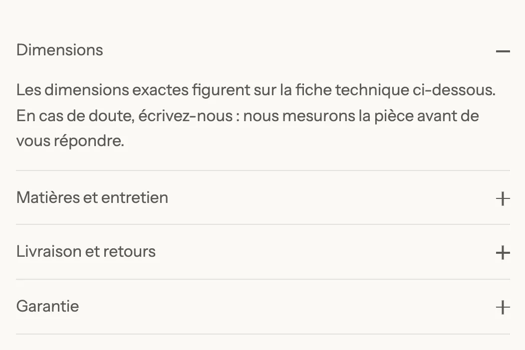
Their settings are detailed in Layout blocks and Trust badges and tabs.
Featured product blocks
The Featured product section puts a product page on any page. It holds two fixed blocks, plus a link block.
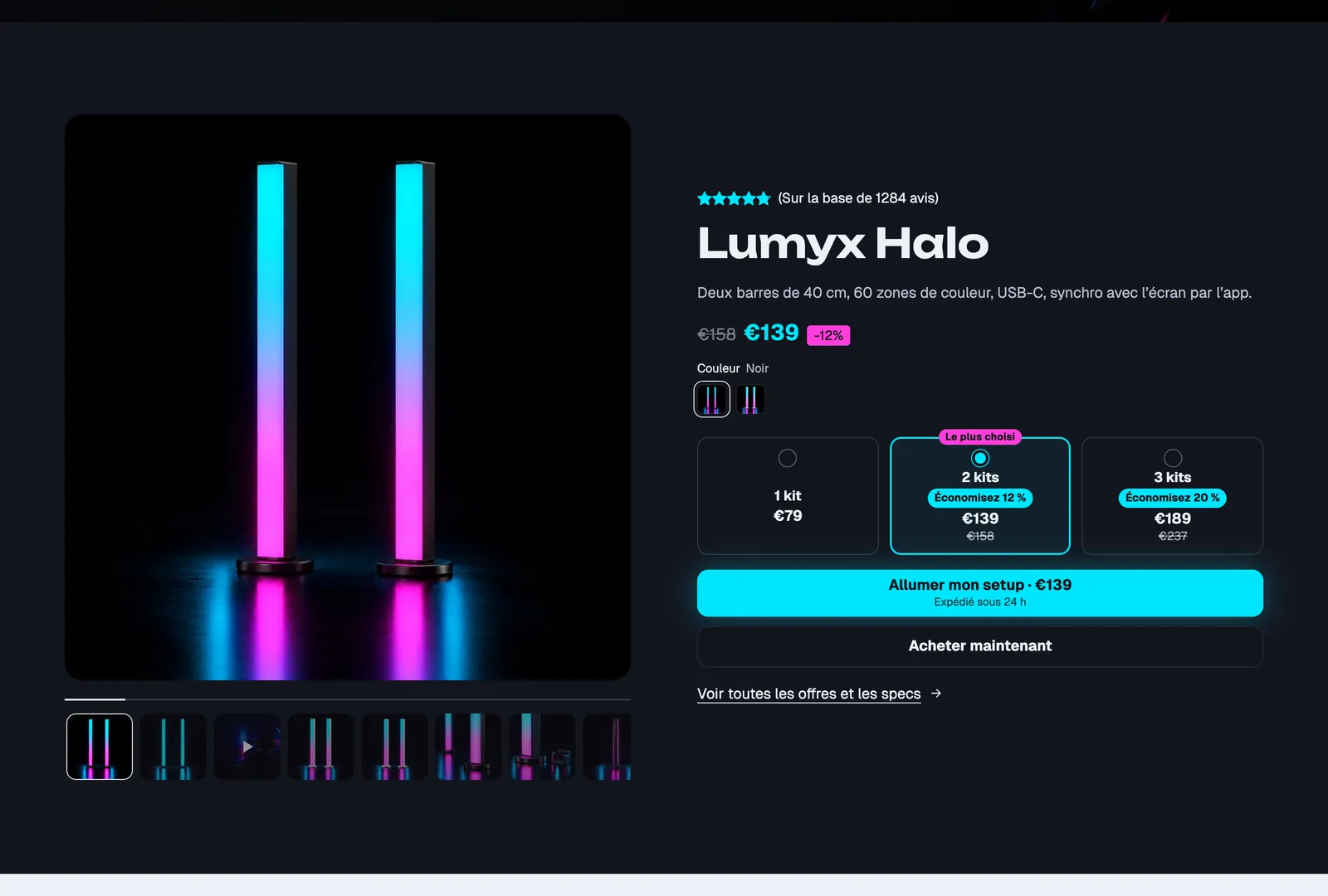
Product gallery
The section's gallery: Image ratio, Image fit, Number of items (10), Show thumbnails, Corners, Layout (Carousel / Grid) and columns per screen.
Product details
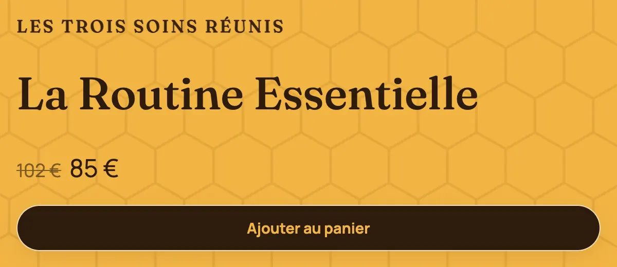
A group that accepts every product page block: title, price, variants, offers, stock, buy buttons… Group settings: Direction, alignments, spacing, Keep visible while scrolling, background image, color palette and Corner radius.
Link to the product
A link to the full product page: Button text, Style (Link by default, or a button style), Alignment. It only appears in Product details. On the Lumyx screenshot above, it's the "See all offers and specs" link.