
Logo, favicon, colors and fonts
Set up your store's identity in the Story Theme: header logo, favicon, color palette, fonts, button style and rounded corners.
Logo, colors and fonts are set once and then apply to the whole store. Allow about twenty minutes for the theme to take on your brand's colors.
Add your logo
In the Story Theme, the logo is a header block, which lets you place a different one on desktop and on mobile.
- In the list on the left, expand Header, then the Main row and its zones (Left, Center, Right).
- Click the Logo block. The default theme contains two: one for desktop, the other for mobile (Show on setting).
- In Logo, choose your image (a PNG or SVG on a transparent background is ideal).
- Set the Desktop logo width (140 px by default) and the Mobile logo width (110 px by default).
- Repeat on the second Logo block.

If your header is transparent over the page's first image, add a light version of your logo in Logo over the first section. Without a logo, the theme shows the store name, whose Text size you can set.
The Store logo block in the footer uses, if empty, the logo set in Settings > Brand in your Shopify admin. You can add a Logo for dark backgrounds there.
Add a favicon
The favicon is the small icon shown in the browser tab.
- In Theme settings, open Favicon.
- In Image, choose a square image (32 × 32 px recommended), for example your brand's initial.
- Save. The icon can take a few minutes to appear, since the browser keeps the old one in memory.
Set your colors
Open Theme settings > Colors. You'll find two levels of settings there:
- Color palette: your brand's base colors (background, text, muted text, two accents, borders, shadow and review star color). Many theme settings use these colors by default.
- Just below, the store's list of palettes. Each palette brings together the colors for headings, text, backgrounds and accents (Accent 1, Accent 2). Each section then picks one of these palettes in its Color palette setting. The theme starts with six: white, lilac, lavender, purple, night and peach.
Start by replacing the base palette with your colors, then adjust the palettes one by one. It's all explained in Color schemes: create them and apply them.
Choose your fonts
In Theme settings > Typography:
- Under Fonts, choose the Headings font and the Body font from the Shopify library. Font size scales all the text up or down (100% by default).
- Under Headings, check Uppercase if your brand writes its headings in capitals, and adjust the Letter spacing.
- The Style 1, Style 2 and Style 3 groups define three heading sizes (on desktop and on mobile). These are the styles you then choose in each Heading block.
- The Subheadings group sets the small texts placed above headings. Its Separator color menu actually chooses the subheading color.
Use your own font
If your brand has a font that isn't in the Shopify library:
- Upload your
.woff2files in Content > Files in your Shopify admin and copy their links. - In Typography > Custom fonts, paste them into Headings font file, Body font file and Body bold font file.
A field left empty keeps the font chosen above. Without a bold file, the browser "draws" an approximate bold.
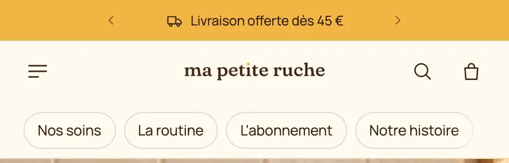
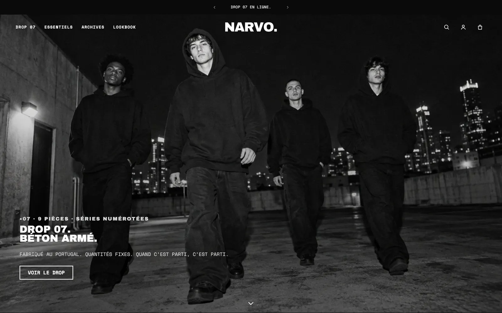
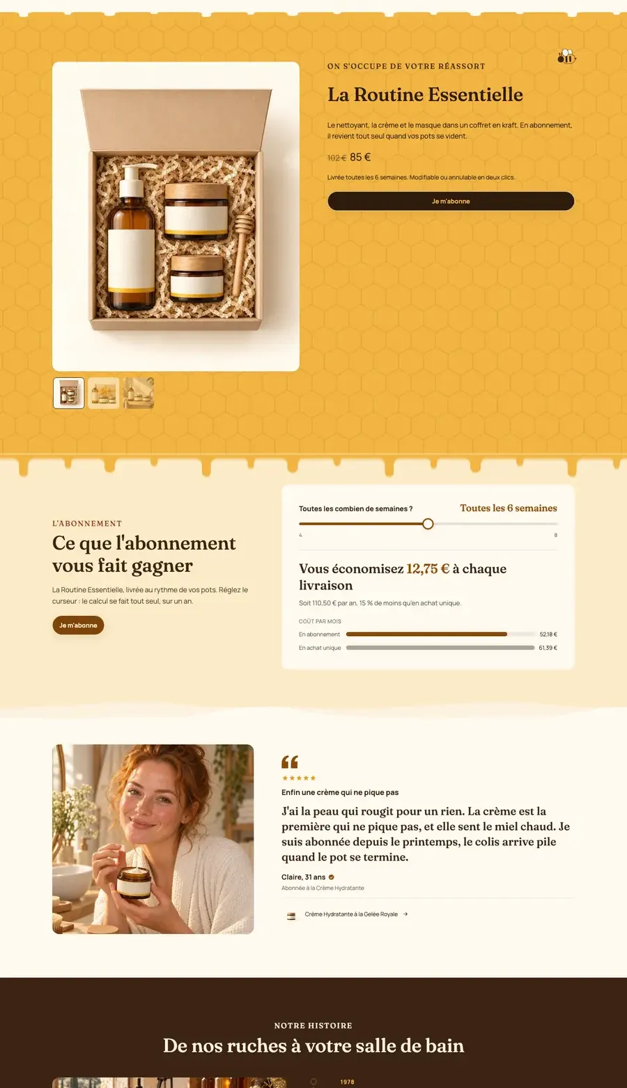
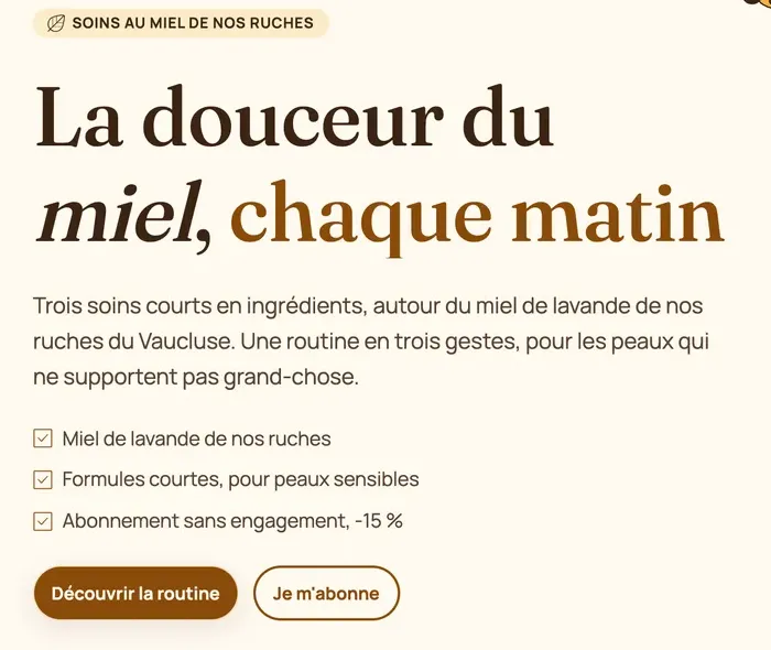
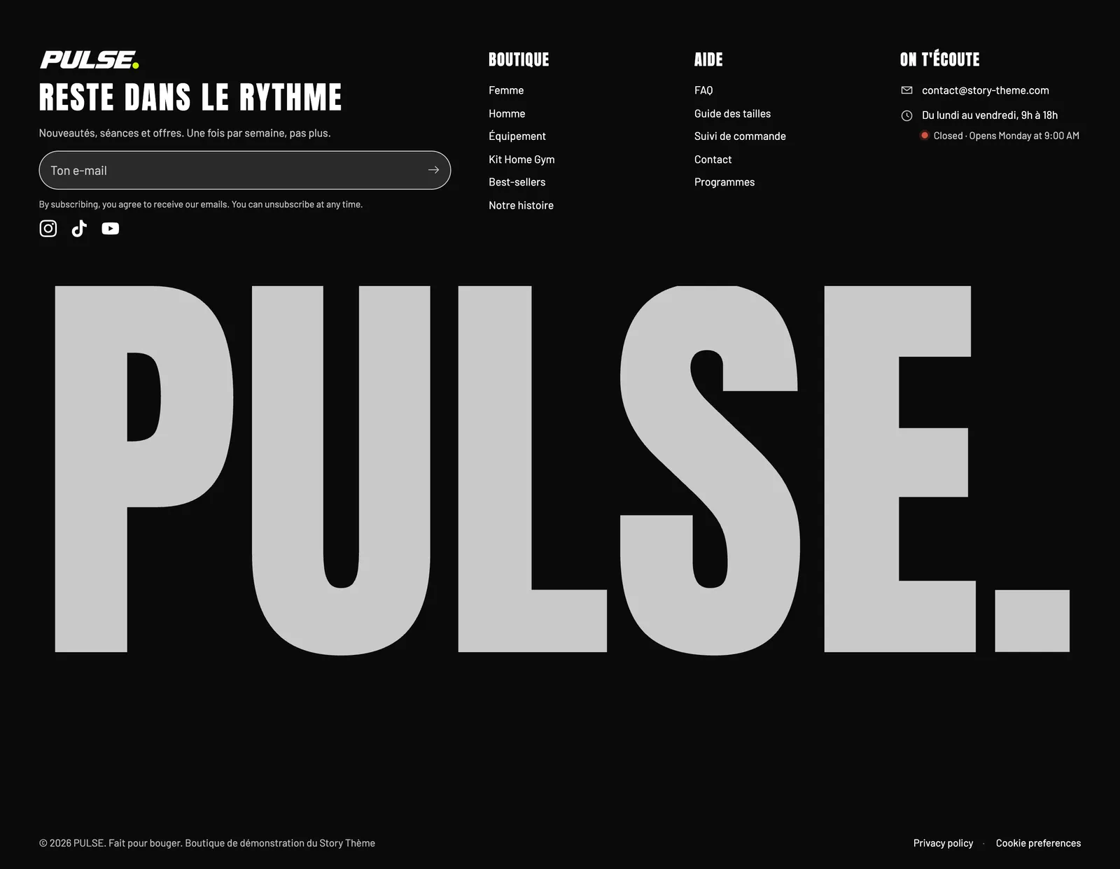
Two demos, two personalities: Ma Petite Ruche pairs a serif font for headings with a sans-serif font for text; Pulse goes for very bold condensed capitals.
Set up the buttons
In Theme settings > Buttons:
- Style 1, Style 2, Style 3: choose a Color palette for each (Accent 1, Accent 2, Text, outline versions…), a Border and a Shadow. Style 1 is usually for the main button ("Add to cart"), Style 2 for the secondary button.
- Hover color effect: Darker, Lighter, Accent color or Outline.
- Font choice and Font size for buttons.
Throughout the theme, a block's Button style menu offers Theme, Style 1, Style 2, Style 3 or Custom for a one-off button.
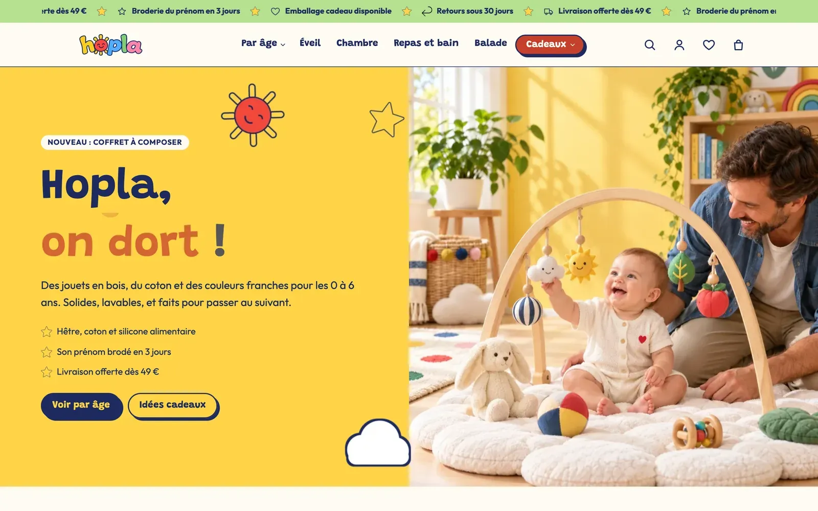
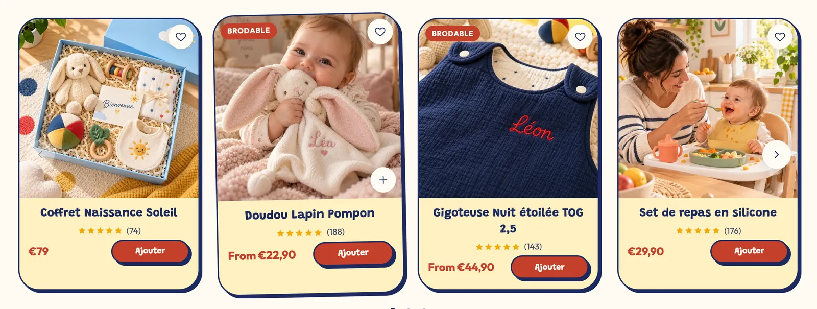
In the Ma Petite Ruche screenshot above, the solid "Discover the routine" button and the outline "Subscribe" button use two different styles. On the Hopla demo, the buttons have a border and an offset shadow, sticker-style:
Choose the rounded corners
In Theme settings > Roundings, Roundness sets the store's personality in one click: Sharp, Soft, Rounded (default) or Very rounded. Custom lets you set Buttons, Fields, Cards and containers and Media separately.
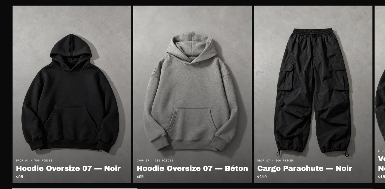
Compare the Hopla demo above, with its very rounded corners, to Narvo, with square corners: it's the same theme.
Save, then browse your store on desktop and mobile to check the result.