
Menus, header and footer
Create your menus in Shopify, then set up the Story Theme header (rows, mobile menu, mega menu, search, account, cart) and the footer.
Navigation is built in two steps: first you create your menus in the Shopify admin (the list of links), then you choose in the theme where and how they appear. The header and footer are shared by every page.
1. Create the menu in Shopify
- In your Shopify admin, open Content > Menus.
- Open Main menu (the one the header uses by default) or click Create menu.
- Click Add menu item, give it a name ("Necklaces") and choose where it links: a collection, a product, a page…
- To create a submenu, drag an item under another one, slightly indented to the right. The theme shows up to three levels.
- Click Save.
Create one or two footer menus the same way ("Help", "The brand"…). The step-by-step details are in Create a page and add it to the menu.
2. Understand the Story Theme header
In Online Store > Themes > Edit theme, expand Header in the list on the left. The header is split into three rows, each with three zones:
- Top row, Main row, Bottom row (an empty row is hidden automatically);
- in each row, the Left, Center and Right zones.
You place blocks there freely: Logo, Menu, Menu button, Search, Account, Cart, Wishlist, Country and language, Link, Social media, Button, Text… The Menu drawer, at the bottom of the list, is the panel that opens on mobile.

In the Header section settings:
- Menu: the menu used by default (Main menu);
- Sticky header > Behavior: Scrolls with the page, Always visible or Visible when scrolling up (the default);
- Transparent header > Over the first section: the header sits on top of your banner, for example on Pages starting with a banner.
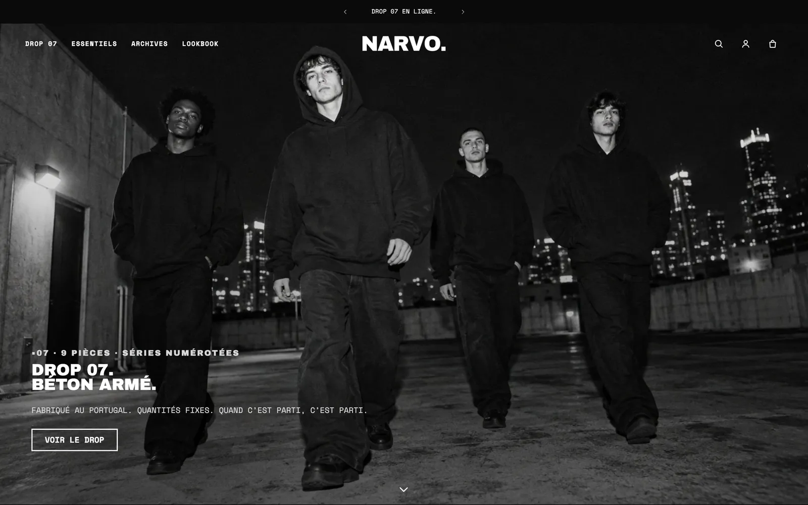
All the header settings and blocks are detailed in Header section and Header blocks.
3. Show the menu on mobile
Below 990 px wide (phones and small tablets), the header switches to its mobile version. The default theme then shows the logo and the cart: so your customers can open the menu, add the button that opens the drawer.
- Expand Header > Main row > Left.
- Click Add block and choose Menu button.
- Leave Show on set to Mobile only. Choose the Icon (Three lines is the most recognizable).
- To add search on mobile too, add a Search block in the Right zone and set Show on to Mobile only (the one in the default theme is set to Desktop only).
- Switch the preview to mobile and click the icon: the drawer opens.
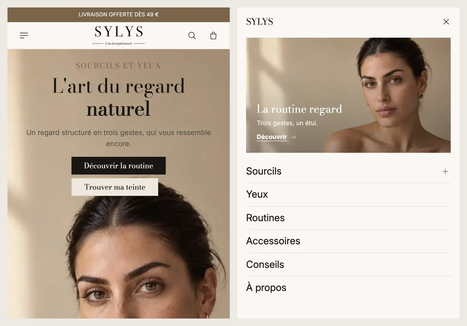
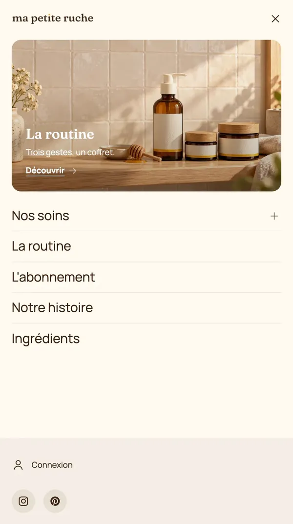
The drawer's content is set in Menu drawer: Position (left or right), then the Drawer menu block with its Navigation (Sliding panels, Accordion or Everything visible). The default drawer also contains Account, Country and language and Social media.
4. Create a mega menu
The mega menu opens a large panel under the header, with your subcategories in columns and visuals.
- In Header > Main row, click the Menu block.
- In Submenus, set Style to Mega menu. Choose Open submenus on: Hover or Click.
- In the Menu block, click Add block and choose Mega menu panel (or Visual mega menu for a panel of three cards).
- In Link to open, enter the link concerned: its title (
Necklaces), its address (/collections/necklaces) or its position (1). - Add Promo card, Featured products or Featured collections blocks to the panel.
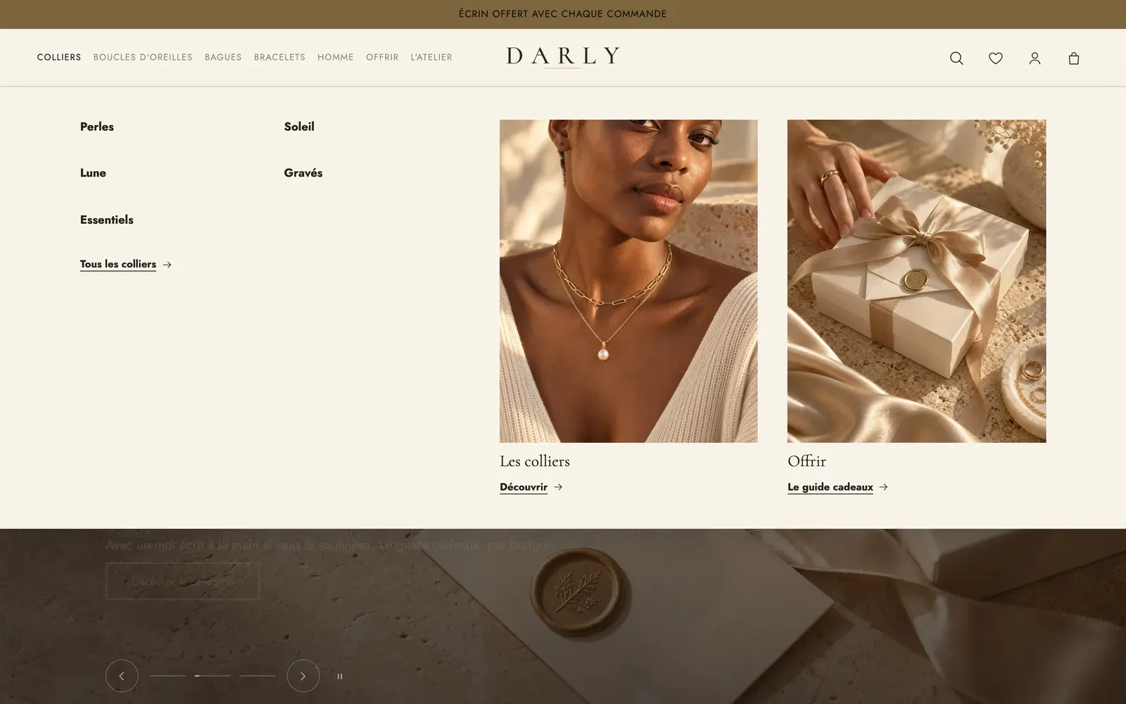
Two useful settings in the Menu block: Show the last link as a button (for "Sale" or "New in"), and in the Header section, Menu badges, one line per badge, for example Sale | -50% | #d4380d.
5. Search, account and cart
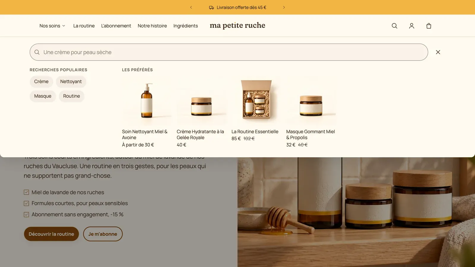
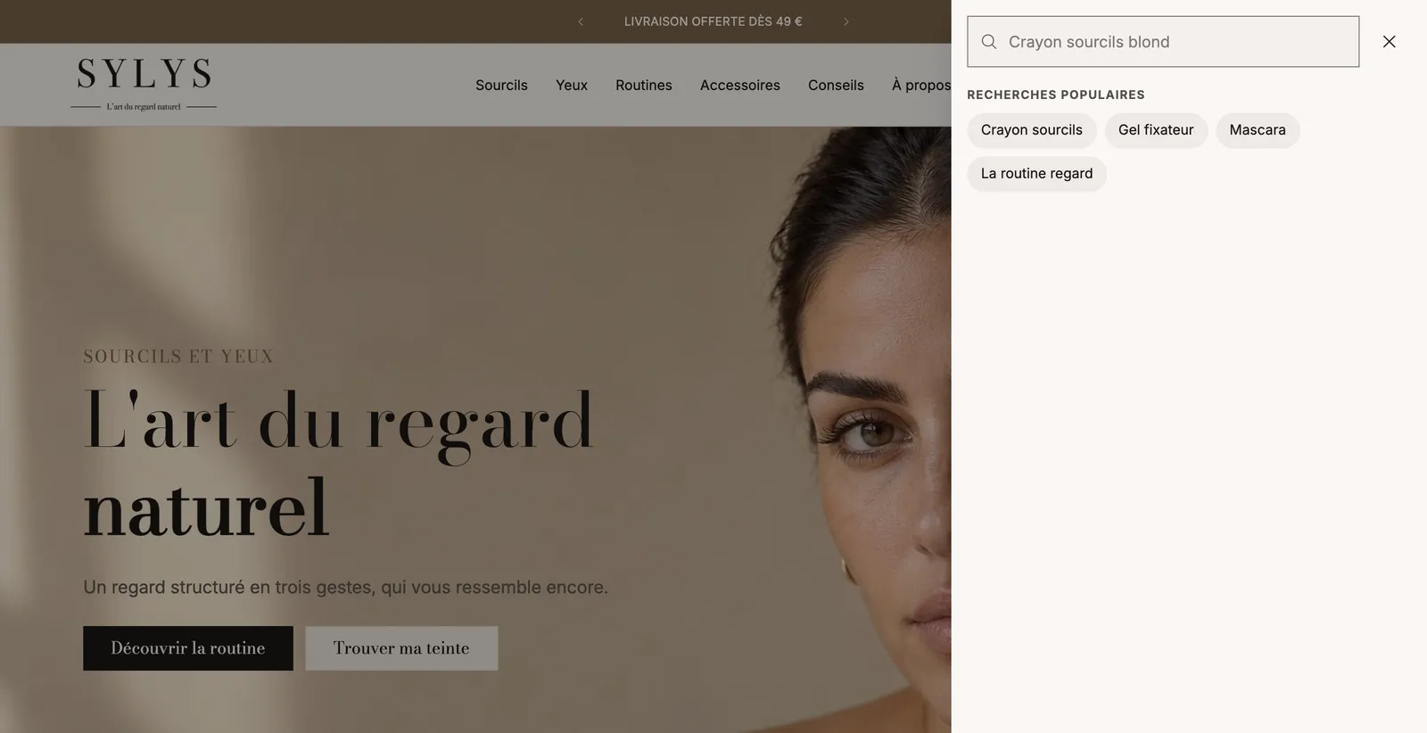
- Search: Style Icon or Search bar, and Panel: Sheet under the header, Side drawer or Centered window. Fill in Rotating placeholder (one phrase per line, typed one after another), Popular searches (suggested when the panel opens and when a search finds nothing) and, if you like, some Featured products.
- Account: Opens The account page or A sign-in window (the latter requires Shopify's new customer accounts).
- Cart: icon and item count. The cart type (drawer, page or popup) is set in Theme settings > Cart: see Set up the cart.
6. Set up the footer
Expand Footer at the bottom of the list on the left.
- The default theme starts with a Browse all sections section, with buttons leading to the section catalog. Useful for discovering the theme, it has no place on your store: delete it.
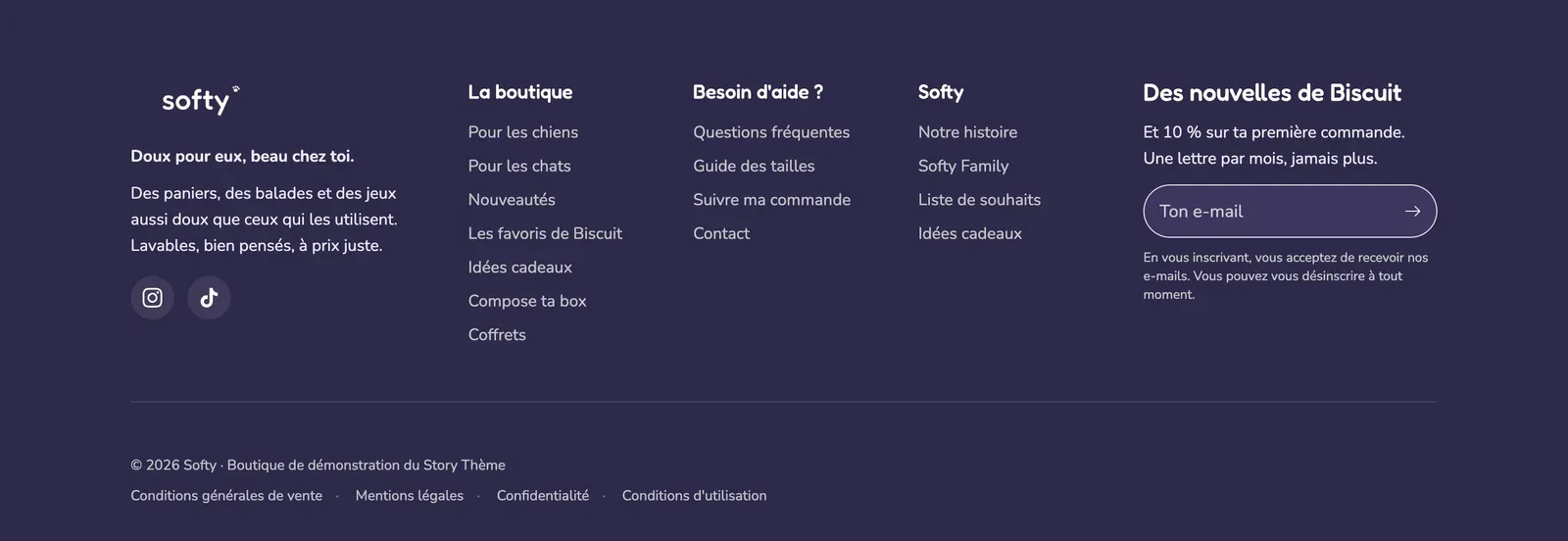
- In the Footer section, click each Link list block and choose the Menu created in step 1. On mobile sets the accordion: Collapsed, Expanded, can be collapsed or Always expanded.
- Fill in the other blocks: Store logo, Newsletter, Social media links (the addresses are entered in Theme settings > Social media), Contact information, Copyright, Policy links, Payment icons.
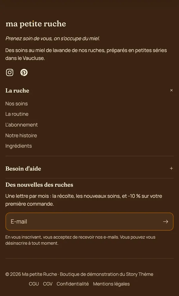
On mobile, each Link list becomes an accordion: here, the first list is expanded and the next one collapsed.
To start again from a different layout, add a section and choose Footer with columns, Centered footer or Footer with wordmark, then delete the old one.
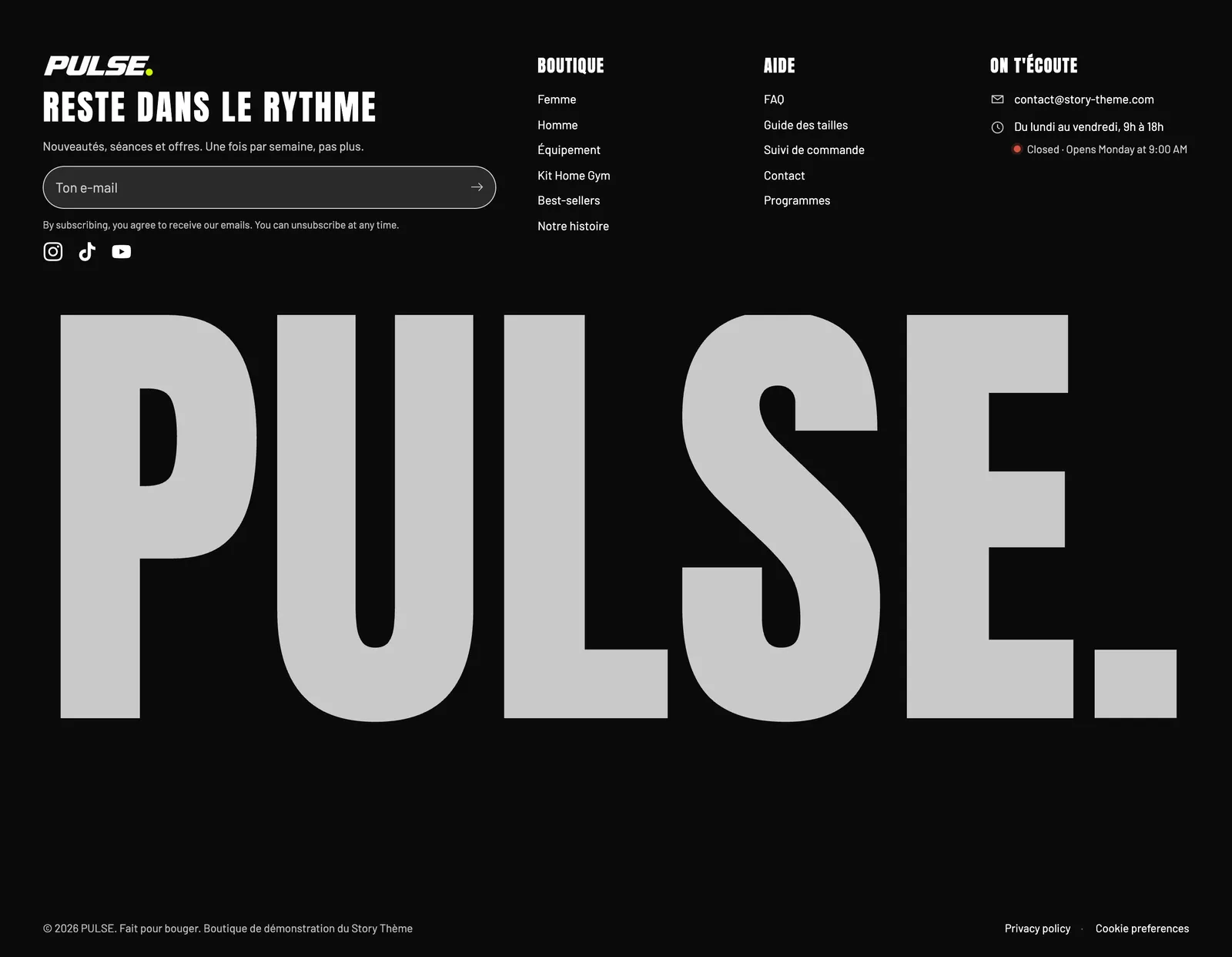
The settings are detailed in Footer section and Footer blocks.