
Color schemes: create them and apply them
Create the Story Theme color palettes (headings, text, backgrounds, accents) and apply them section by section to give your pages rhythm.
In the Story Theme, you don't pick colors section by section: you create a few palettes (the "color schemes"), then each section chooses one. Changing a palette instantly updates every section that uses it.
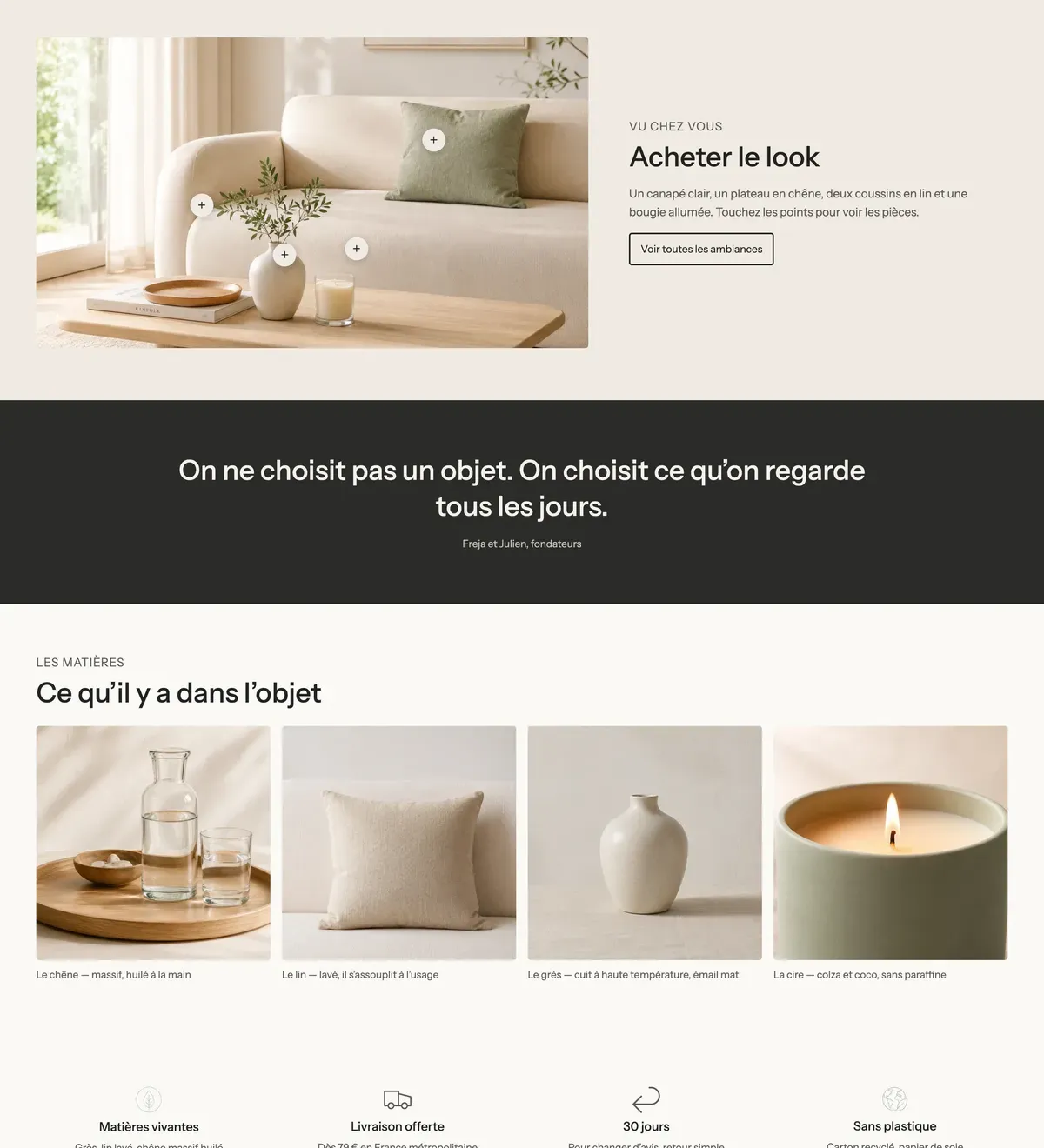
How colors are organized
Open Online Store > Themes > Edit theme, then Theme settings > Colors. You'll find two levels there:
- Color palette: the brand's base colors (background, surface, text, muted text, two accents, border, shadow, review stars). Many theme settings use them by default.
- Below it, the list of palettes that sections use. The theme ships with six: white, lilac, lavender, purple, night and peach. The announcement bar uses the night palette.
Each palette in the list contains:
| Group | Colors | Where they appear |
|---|---|---|
| Text | Headings, Text, Text gradient | Headings, paragraphs |
| Background | Background, Secondary background, Gradient | Section background, cards and boxes |
| Accents | Accent 1, Accent 2, Gradient button | Buttons, links, highlighted words |
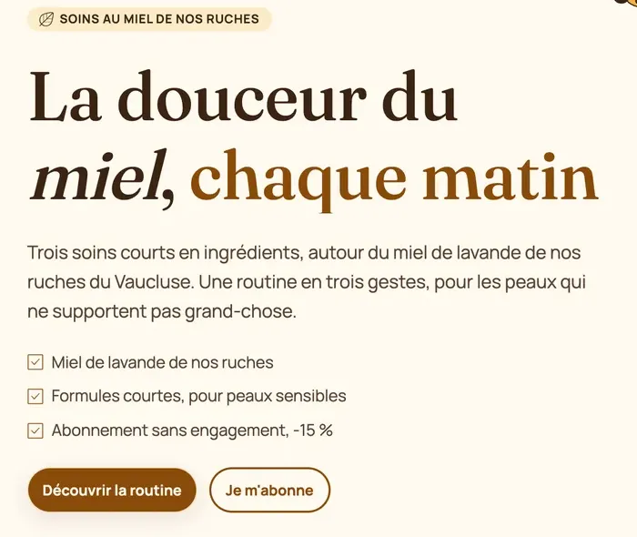
Edit an existing palette
- In Theme settings > Colors, click the palette you want to edit in the list.
- Change the colors one by one: click the swatch and enter your color code (for example
#1C1433). - Watch the preview: every section using this palette changes live.
- Save.
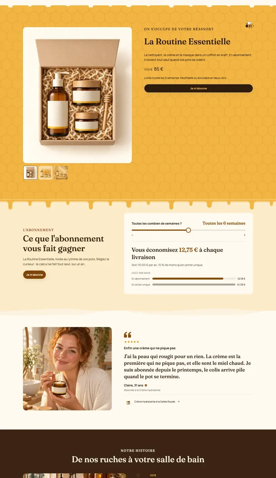
The palettes that ship with the theme are only a starting point. Ma Petite Ruche kept the same palette structure but replaced every color with its brand colors: cream, honey yellow, brown.
Create a new palette
- Under the list of palettes, click the add button.
- Set its colors as above.
- Save: it now appears in the Color palette menu of every section and every block that offers one.
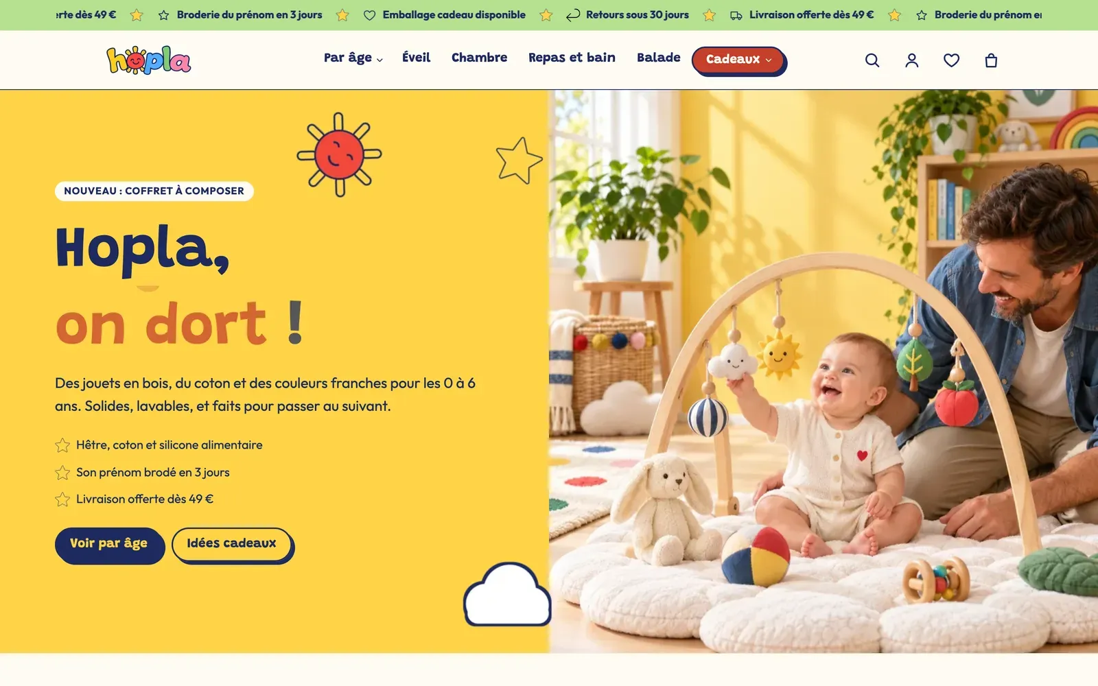
Four or five palettes are usually enough: a main light background, a secondary light background (beige, very light gray), a dark background, a brand-color background. Beyond that, the store loses consistency.
Apply a palette to a section
- Click the section in the list on the left.
- In the Color palette group of its settings, choose the palette in the Color palette menu.
- Do the same on the next section with a different palette to mark the change of topic.
Group blocks have a palette menu too. On Ma Petite Ruche, each card in the Stacking cards section is a group with its own palette:
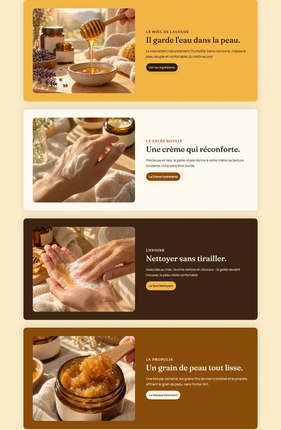
Some elements have their own palette menu: the Header, the Announcement bar, the header rows (with Use its own color palette), the mega menu panel, banners and slides (content background), the Group block, popups…
A two-color background
In the same group, Enable background cut adds a block of Background color that only covers part of the section (set with Vertical cut range and Horizontal cut range). Handy for a two-tone effect behind an image or a product list.
Check readability

A few good habits:
- check each palette with a section that contains a heading, a text and a button;
- on a dark background, lighten the Text color too, not just the Headings;
- each button style (Style 1, 2, 3) picks its own accent in Theme settings > Buttons: see Logo, favicon, colors and fonts.