
Header section: logo, menu, mega menu and sticky header
Build the Story Theme header row by row: logo, menu and mega menu, search, cart, mobile menu drawer, sticky or transparent header.
The Header section holds everything shown at the top of every page: the logo, the menu, search, the customer account and the cart. It belongs to the Header group, along with the announcement bar, and you set it up once for the whole store.

How the header is built
The Story Theme header has no preset to pick: it's made of rows in which you place blocks.
- Top row, Main row and Bottom row: each has three areas, Left, Center and Right. An empty row is hidden automatically.
- Menu drawer: the panel that slides in from the side, mostly used on mobile.
This structure allows any layout: centered logo, menu below the logo, wide search bar, secondary links above…


On mobile
Below 990 px wide (phones and small tablets), the header switches to its mobile version. Each block has a Show on setting (Desktop and mobile, Desktop only, Mobile only): that's how you build a layout specific to phones. On a fresh theme, a "desktop" logo sits in the Left area and a "mobile" logo in the Center area.

Edit the header
- In Online Store > Themes, click Edit theme.
- In the left-hand column, under Header, click Header for its general settings.
- Expand a row, then an area (Left, Center, Right) to see its blocks. Add block adds a logo, a link, an icon…
- Drag a block from one area to another to move it.
The menu itself is created in the Shopify admin: see Header and footer menus.
Header blocks
| Block | What it's for |
|---|---|
| Logo | Your logo, with a version for the transparent header |
| Menu | The main links, as a dropdown or a mega menu |
| Mega menu panel | A large panel (links, images, products) for one menu link |
| Menu button | The icon that opens the menu drawer |
| Search | A search icon or a search bar with suggestions |
| Account, Cart, Wishlist | The customer icons; Wishlist requires the wishlist to be enabled |
| Country and language | The market and language selector |
| Link, Social links, Announcements | Secondary links, social icons, messages |
| Group, Spacer, Text, Icon, Image, Button, Countdown, Custom Liquid | Generic theme blocks |
Logo
Logo, Logo over the first section (a light version for the transparent header), Desktop logo width (140 px by default) and Mobile logo width (110 px). Without a logo, the store name is shown as text.
Menu and mega menu
The Menu block uses the menu chosen in the section (the main menu by default). In the "Submenus" group, Style offers Dropdown or Mega menu, and Open submenus on Hover or Click. Other useful settings: Hover effect, Show the last link as a button (for a "Sale" or "Gifts" link) and More link label (links that don't fit are grouped together).
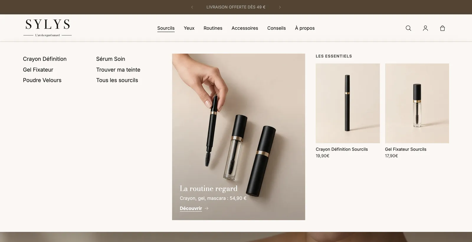
For a rich panel, add a Mega menu panel inside the Menu block and enter in Link to open the title of the link it belongs to (for example Sourcils). Inside it, place Promo card, Featured products or Featured collections blocks.
Menu drawer
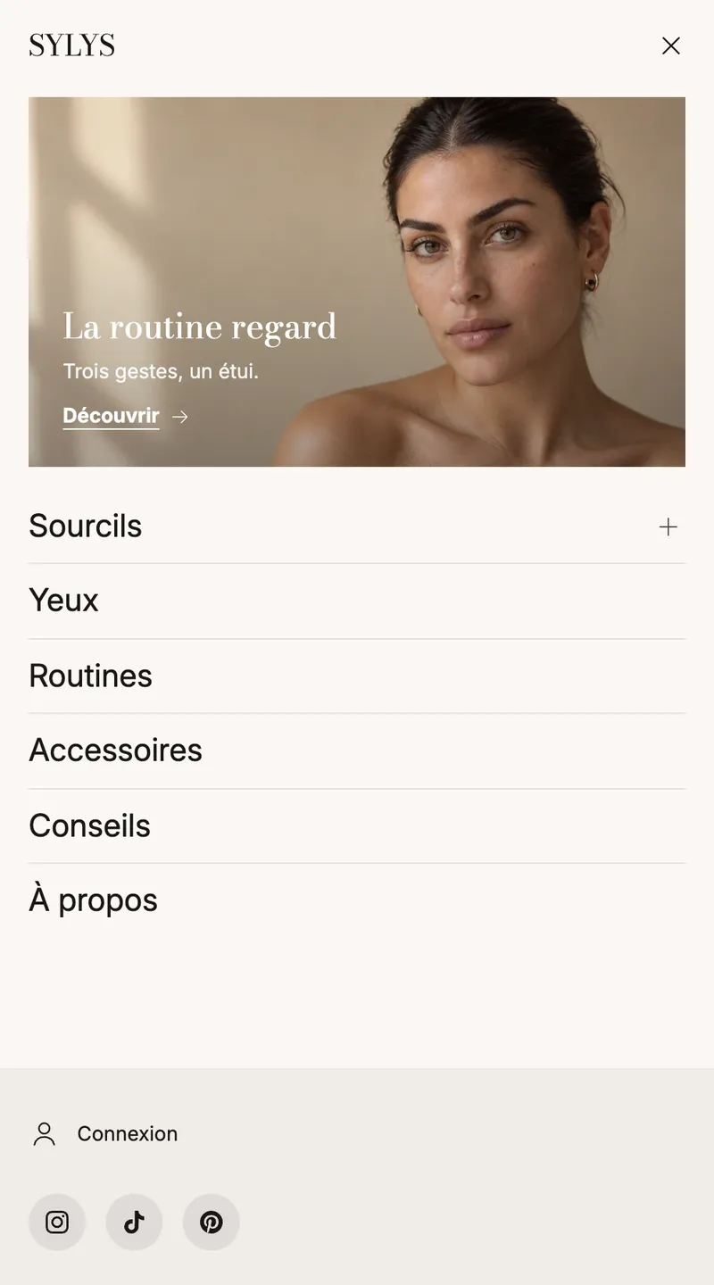
The Menu drawer opens with the Menu button. It holds a Drawer menu (Navigation setting: Sliding panels, Accordion or Everything visible), then Account, Country and language and Social links blocks. Pin the blocks under the menu to the bottom sticks them to the bottom of the panel. You can also add a promo card to it.
Section settings
- "Layout": Layout width and Menu (used by the menu, the drawer and any mega menus that don't have their own).
- "Sticky header": Behavior (Scrolls with the page, Always visible, Visible when scrolling up — the latter on a fresh theme), Compact when the page scrolls, Shadow when the page scrolls, Frosted background when the page scrolls.
- "Transparent header": Over the first section (Off, Pages starting with a banner, Home page, Every page), Colors over the first section, Product pages too, Collection pages too.
- "Color palette": palette, Bottom edge (None, Line, Shadow), Border color.
- "Menus": Page behind an open menu (Unchanged, Dimmed, Blurred) and Menu badges.
- "Icons": Icon line weight (Thin, Regular, Bold).
Each row has its own settings: padding, Minimum height, Use its own color palette, Line below and Fold away when the page scrolls (on by default for the Top row).
Add a badge to a menu link
In Menu badges, write one line per badge: menu link | text | color, for example Sale | -50% | #d4380d. The link can be identified by its title, its address (starting with /) or its position.
Tips and pitfalls
- For a successful transparent header, add a light Logo over the first section and check the contrast on your image.
- Visible when scrolling up frees up the screen while reading and keeps the cart within reach: a good choice on mobile.
- Don't go beyond six or seven menu links: the rest goes under "More". Put secondary links in the Top row or the footer.
- The Wishlist block only shows up if Theme settings > Wishlist > Enable wishlist is checked.
- The Country and language block hides itself if the store has only one country and one language.