
Header blocks: logo, menu, mega menu, search and cart
Every block in the Story Theme header and announcement bar: rows, zones, logo, menu, mega menu, search, account, cart and menu drawer.
The Story Theme header isn't a fixed block: it's an assembly of blocks you place wherever you want. Three stacked rows, each split into three zones (left, center, right), hold the logo, the menu, search, account, cart… This page goes through each of these blocks, along with those of the announcement bar.

Almost every header block has a Show on setting (Desktop and mobile, Desktop only, Mobile only). That's how you build a different header on phones. Note that in the header, the switch to the mobile version happens below 990 px wide, not below 750 px as in the rest of the theme.
Top row, Main row and Bottom row
The three rows are the header's floors. They're always there, but an empty row is hidden automatically: a simple header only uses the Main row.

- Vertical padding (and its mobile version): the row's thickness. 6 px for the top row, 14 px for the main row, 10 px for the bottom row by default.
- Minimum height, Gap (between zones) and their mobile versions.
- Use its own color palette: gives the row a different Color palette from the rest of the header. Background color, Text color and Line below complete the group.
- Fold away when the page scrolls: with a sticky header, the row disappears as soon as the page scrolls and comes back at the top of the page. Checked by default for the top row only.
Left, Center and Right
Each row contains three zones. They're what hold the blocks: logo, menu, search, but also the public blocks Group, Spacer, Text, Icon, Image, Button, Countdown, Custom Liquid and app blocks.
- Alignment: Automatic, Left, Center, Right or Spread (blocks spread across the full width of the zone).
- Gap between the blocks in the zone (20 px by default) and Gap mobile (4 px).
Logo
The Logo block shows your logo, or the store name if there's no image.
- Logo: the image. Logo over the first section: a second version (often white) shown while the header is transparent over a banner.
- Desktop logo width (140 px by default) and Mobile logo width (110 px).
- Text size: the size of the store name when no logo is selected.
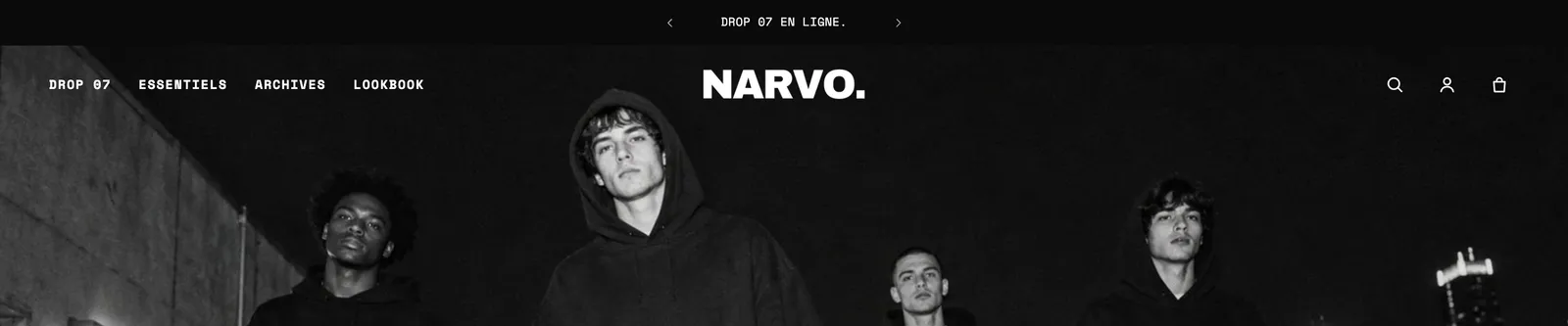
The default header contains two Logo blocks: one for desktop in the Left zone, one for mobile in the Center zone. Remember to set the image in both.
Menu
The Menu block shows the navigation links. It's set to Desktop only by default; on mobile, the menu drawer takes over.

- Menu: the Shopify menu to show. If empty, it's the main menu selected in the Header section settings.
- Submenus > Style: Dropdown list or Mega menu (a full-width panel for each link that has sub-links). Open submenus on hover or on click.
- Link with a submenu: it opens its submenu, opens it with a "View all" link, or goes straight to its page.
- Third level (dropdown list): Side panel or Indented list. Show collection images (mega menu).
- Text: font, size, weight, uppercase, letter spacing.
- Appearance: Hover effect (None, Underline, Fade, Pill), Show arrows, and Show the last link as a button to highlight "Sale" or "New in". More link label: when the links don't fit on one line, the last ones are grouped under this link.
- Current page > Style: None, Underline, Dot or Bold, to show visitors which page they're on.
Mega menu panel
The Mega menu panel goes inside the Menu block. It lets you build a link's panel yourself: columns of links, images, products, promo cards. Two variants are available: Mega menu panel and Visual mega menu (three promo cards).
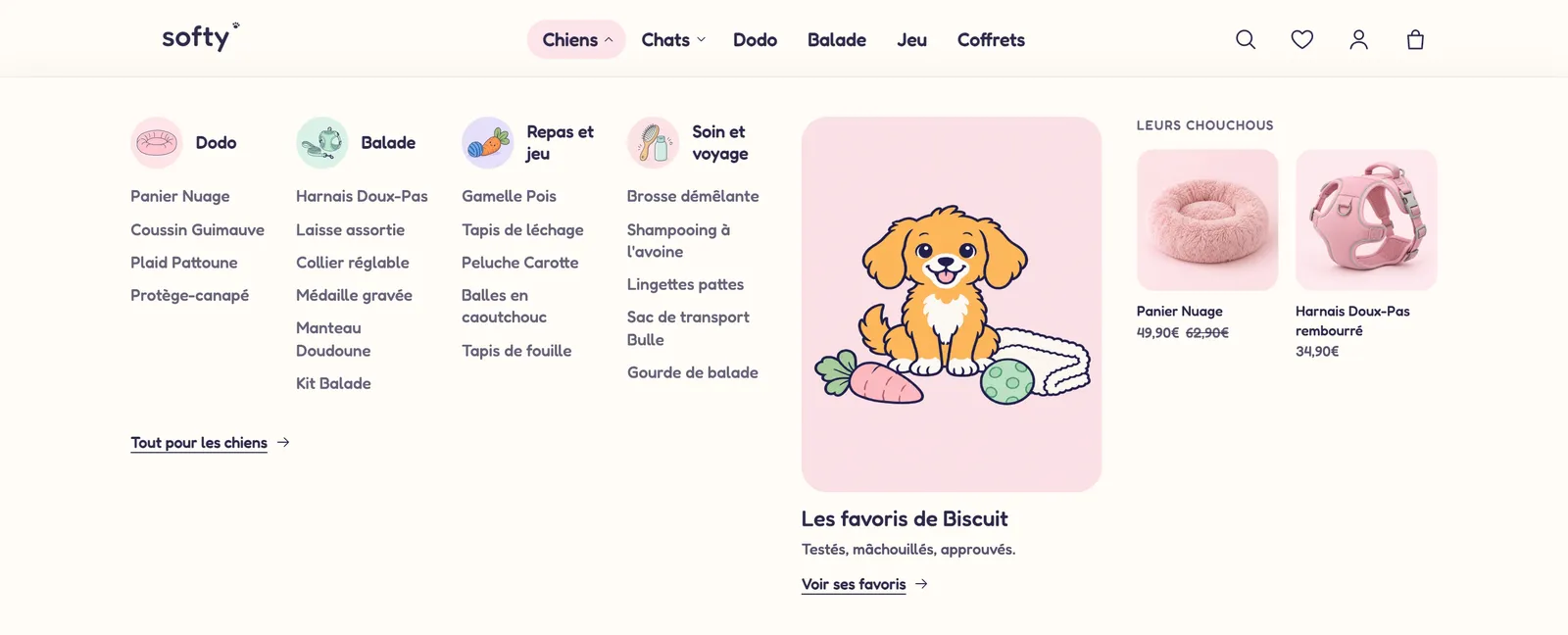
- Link to open: the main link concerned, identified by its title, its address starting with
/, or its position (for exampleShop,/collections/allor1). - Menu: choose the same menu as in the Menu block (empty = main menu).
- Links > Layout: Columns, Tabs, List or Hidden. Collection images (None, Next to the title, Above the title), Show a View all link.
- Content: the content's Position (Right, Left, Below), its Content width in twelfths, the Panel height (0 = based on the content) and its own color palette.
The panel also accepts public blocks: Heading, Text, Image, Button, Badge, Countdown, Product list, Collection list, Blog posts, Video…
Promo card
A clickable image with a title, a text and a button, to place in a mega menu or in the menu drawer.
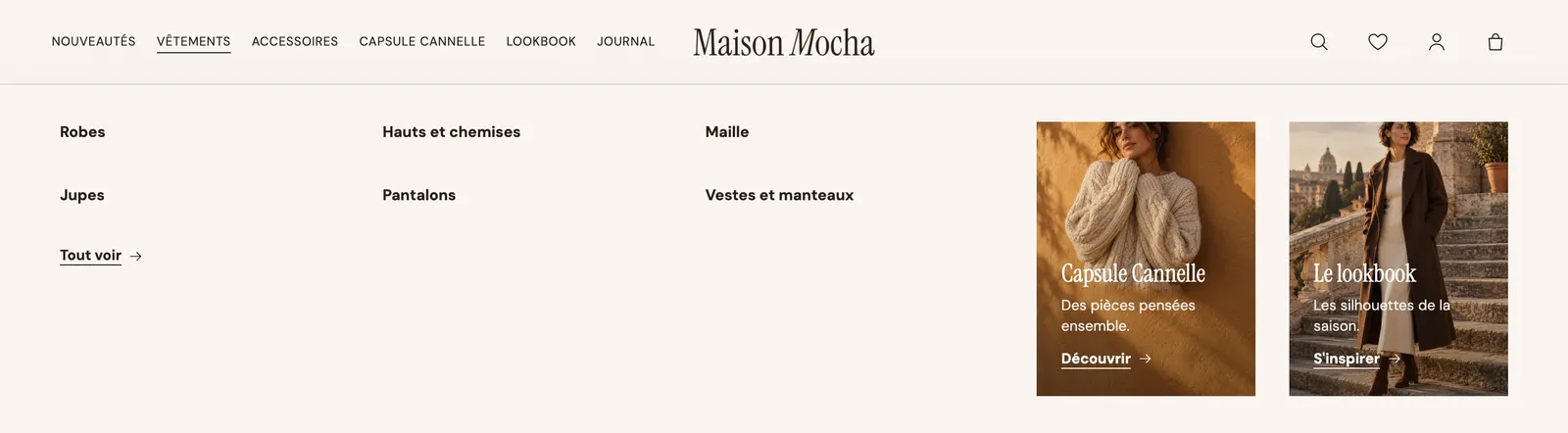
- Image and Image mobile, Image ratio (Portrait 4:5 by default, Square, Wide, Extra tall, Full height…).
- Title, Text, Button text, Link.
- Text position: On the image at the bottom, On the image in the center, or Below. Overlay opacity (30%) to keep the text readable.
- Button style (Underline by default), Corner radius, Zoom on hover.
Featured products
A few products in the mega menu or the drawer: a new arrival, your best sellers.
- Products chosen one by one, or a Collection used when no product is chosen. Number of products: 4 by default, up to 12.
- Layout: Grid (photo on top) or Compact (thumbnail next to the name). Desktop columns, Image ratio.
- Show price, Show vendor, Show the second image on hover.
Featured collections
Collection thumbnails, perfect for a visual "Shop" menu.
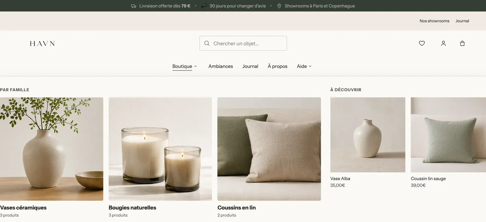
- Collections: the ones to show, in the order you choose.
- Style: Title below, Title over the image or Round (circular thumbnails). Desktop columns (3 by default), Image ratio.
- Show product count, Spacing, Font size, Corner radius.
Search
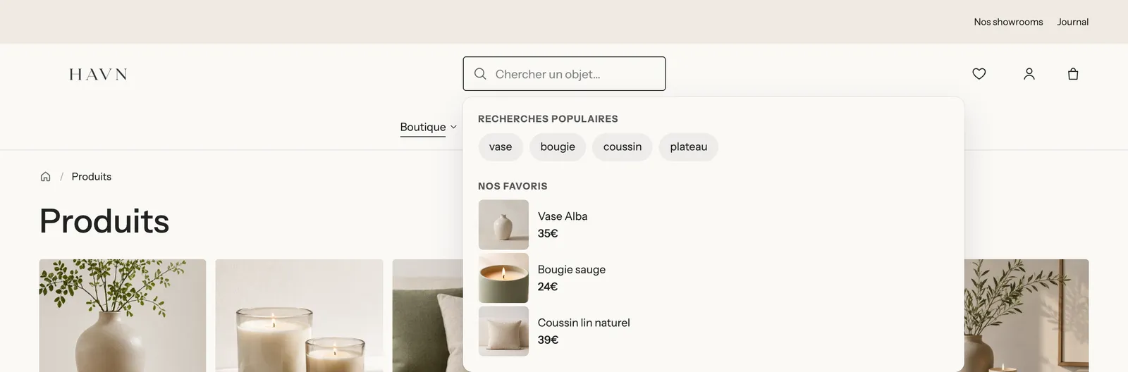
The Search block comes in two variants: Search (an icon that opens a panel) and Search bar (an always-visible field, like on Havn).
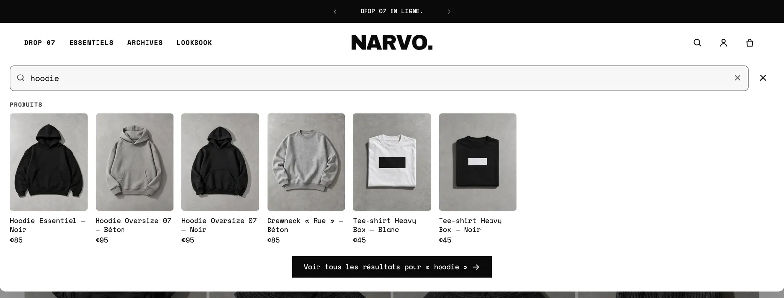
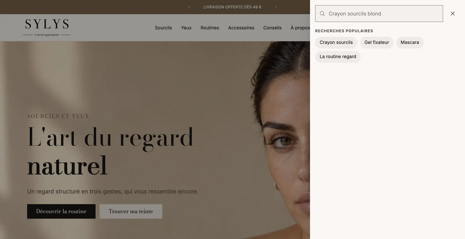
- Style: Icon or Search bar. With the icon, Panel: Sheet under the header, Side drawer or Centered window.
- Field style (Filled, Outline, Underline), Corner radius, Width on desktop (search bar).
- Placeholder and Rotating placeholder: one phrase per line, typed one after another while the field is empty ("Search for a vase…", "A candle…").
- Search suggestions: Number of products suggested (6 by default), Image ratio, price, vendor, collections, pages, blog posts. Search page shows products only limits the results page to products.
- Before typing: Popular searches (one per line, also suggested when a search finds nothing), Show recently viewed products and Featured products with their Title.
- Open with the / key on desktop: a keyboard shortcut for regulars.
Account
The customer account icon.
- Opens: The account page or A sign-in window. The window requires new customer accounts (Settings > Customer accounts in Shopify); its Menu lists the links offered to logged-in customers.
- Display: Icon, Text or Icon and text. Label, Icon (Person, Person in a circle, Image).
- Greet logged-in customers by their first name.
- Icon size (22 px), Color and Hover color, shared by the Account, Cart, Wishlist, Link and Menu button blocks.
Cart
The cart icon and its item count.
- Display (Icon, Text, Icon and text), Label, Icon: Bag, Cart, Basket or Image.
- Count: Bubble, Next to the label or Hidden, with Count background and Count text.
What opens on click (drawer, page or popup) is set in Theme settings > Cart. See Set up the cart.
Wishlist
The wishlist icon (Heart or Star), with the same display settings as the Account block.
Country and language
The country (and therefore currency) and language selector. It comes in two variants: Country and language and Other stores.
- Source: Markets (the countries and languages set up in Shopify) or Other stores (links to your other sites, one Store block for each).
- Show country/region and Country display: Flag and currency, Flag and name, Currency only, Flag only. Flag shape: Circle or Rectangle.
- Show language and Language display: Code (EN) or Name.
- Layout: Dropdown list for the header bar, Rows for the menu drawer.
The selector stays hidden on your store as long as you only sell in one country and one language. To add more, see Translate your store.
Store
One Store block per site, to place inside the Country and language block set to Other stores: an Image (a flag, for example), a Label and a Link (full address, https://…). The store whose domain matches the visited address appears selected.
Link
A standalone link: "Our showrooms", "Help", a phone number. The two links in Havn's top row are Link blocks.
- Display: Icon, Text or Icon and text. Label, Link, Open in a new tab.
- Style: Plain, Underline or Outlined pill.
- Icon: Help, Phone, Email, Location, Store, Shipping, Gift, Tag, Star, Heart, Chat, Clock, Globe, Person, Magnifying glass or Image.
Social media
Your social media icons. The addresses are entered once in Theme settings > Social media; an empty field hides the icon.
- Style: Icons or Icons in circles. Icon size (18 px) and Spacing.
Menu button
The three-line button that opens the menu drawer. It's set to Mobile only by default.
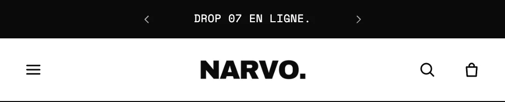
- Display: Icon, Text or Icon and text, with its Label.
- Icon: Three lines, Three lines with a short last one, Staggered lines, Offset lines, Two lines, or Image.
- Icon size, Text size, Uppercase, Color, Hover color.
Menu drawer
The Menu drawer is the panel that slides in from the edge of the screen when the menu button is clicked. It's a fixed block of the Header section: you don't add it, you fill it.
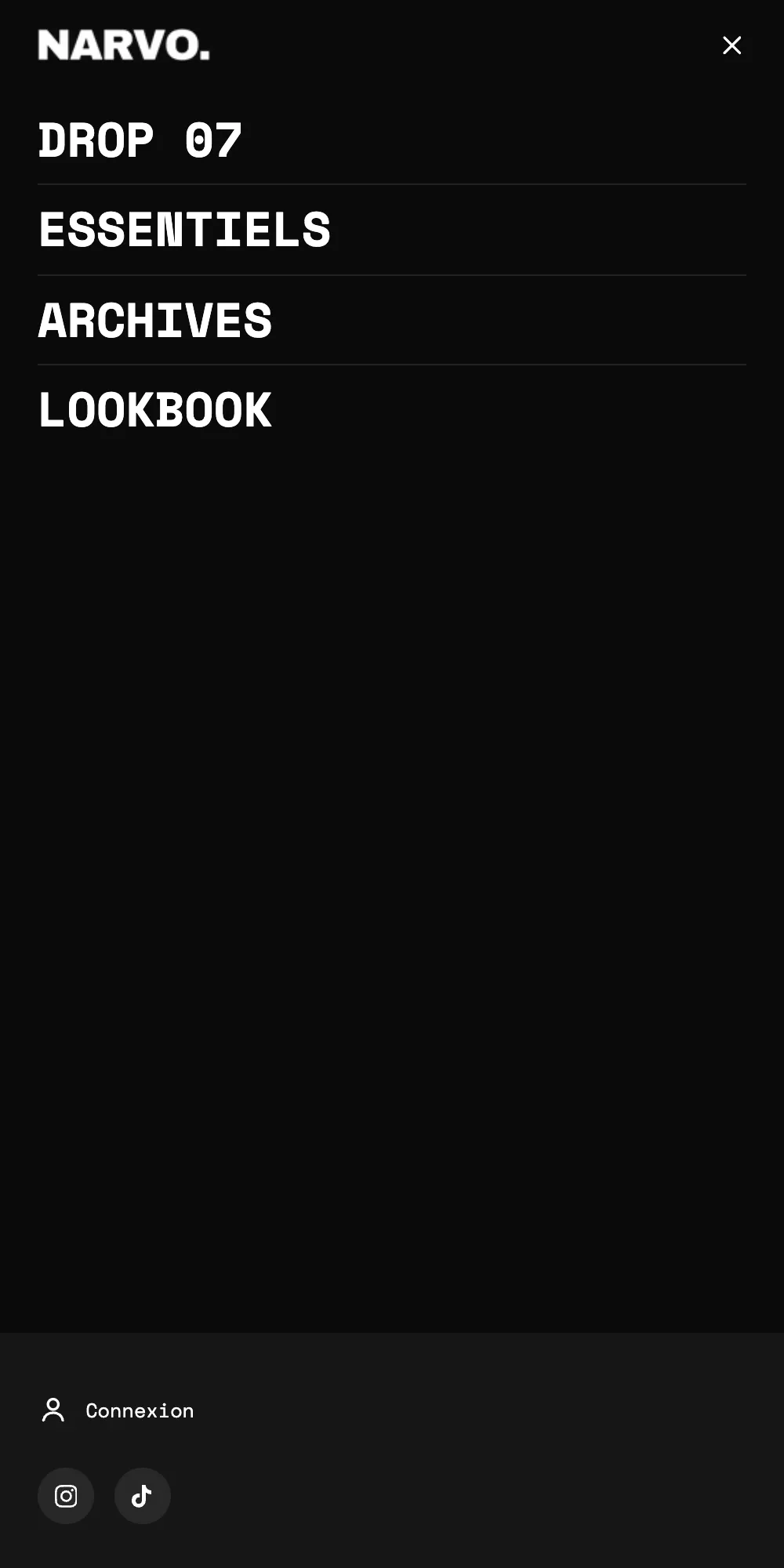
- Position: Left or Right. Width on desktop (420 px), Inner spacing, Space between blocks, Lines between blocks.
- Pin the blocks under the menu to the bottom: account, languages or social media stay stuck to the bottom of the drawer, with a Tinted background behind them.
- Top bar: Display the Logo, the Store name or nothing, Logo width, Close button style (Icon or Round).
- Color palette, Page behind (Dimmed, Blurred, Unchanged), Swipe to close on touch screens.
The drawer accepts the Drawer menu, the Account, Country and language, Social media, Link, Search, Promo card, Featured products and Featured collections blocks, as well as public blocks (Heading, Text, Image, Button, Contact information…). The default header places a Drawer menu, an Account block, a Country and language block and a Social media block in it.
Drawer menu
The list of links inside the drawer.
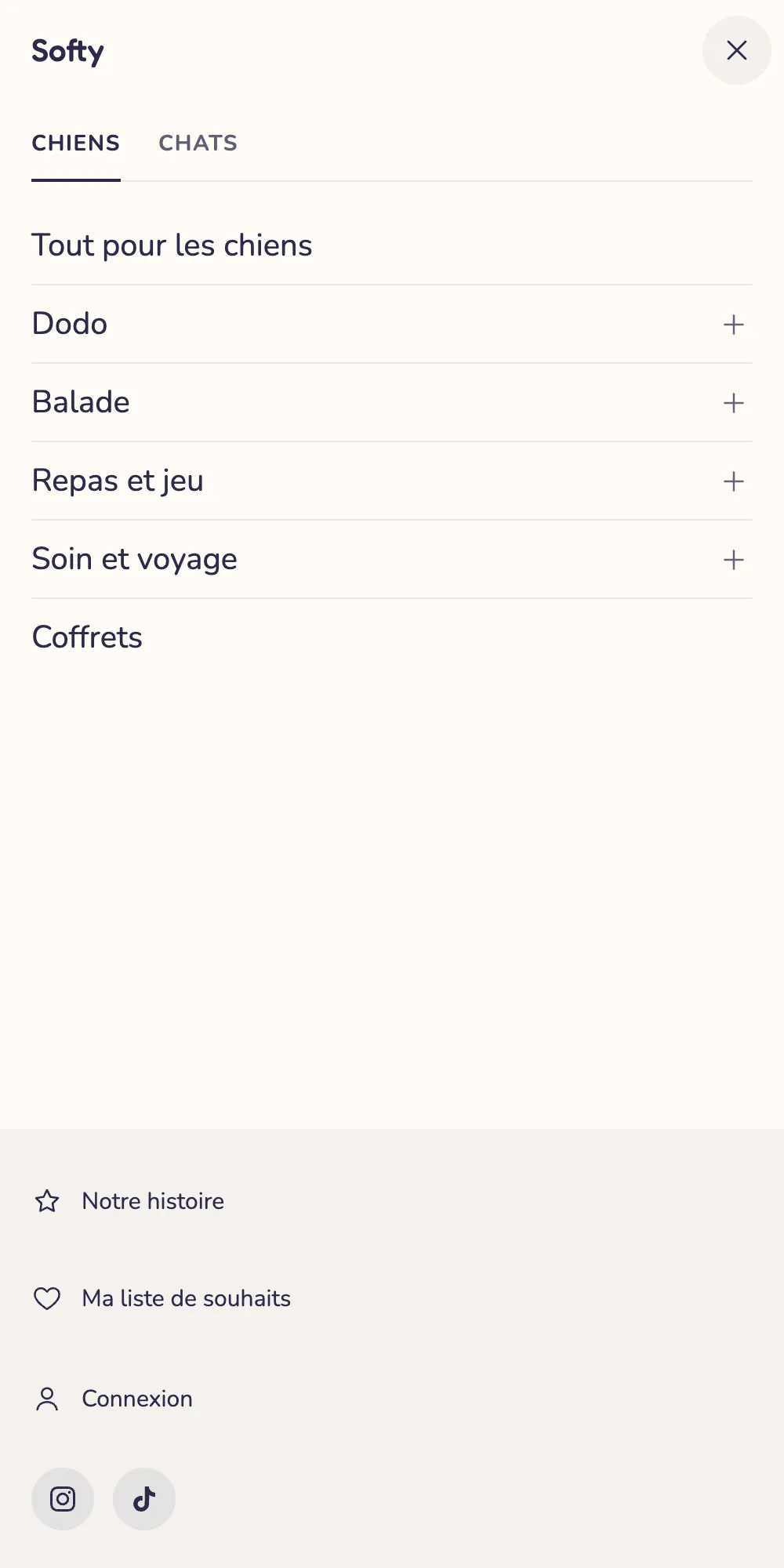
- Menu (empty = main menu) and Tab label: as soon as two Drawer menu blocks have a label, the drawer shows them as tabs, like "Dogs" and "Cats" on Softy.
- Navigation: Sliding panels, Accordion or Everything visible. With the accordion, Keep only one open and Open the branch of the current page.
- Link with a submenu: it opens its submenu, opens it with a "View all" link, or its title leads to its page and the arrow opens the submenu.
- Show the mega menu content in submenus: the cards and products from your mega menu panels also appear on mobile.
- Main links: size (20 px), weight, uppercase, Space around links, Show dividers, Open / close icon (Chevron, Arrow, Plus / minus, None), Sub-link text size.
- Link images: None, Thumbnails (Circle or Square) or Tiles in sliding panels. The image is the one from each link's collection or product.
Announcements
The Announcements block rotates your messages. It lives in the Announcement bar section, but you can also place it in a header zone.

- Display: One at a time, Continuous flow, Typewriter or Side by side. Mobile layout: same as desktop, or a different mode.
- One at a time: Transition (Fade, Slide up, Slide down, Slide sideways), Rotate automatically, Time per message (5 s by default), Arrows.
- Continuous flow: Scrolling speed, Direction, Pause on hover, Separator (None, Dot, Slash, Custom icon), Space between messages.
- Show the pause button: recommended for accessibility whenever messages move on their own.
- Text: size, weight (0 = the bar's value), uppercase, letter spacing, Link style (Underline, Arrow, None).
Message
Each announcement bar message is a Message block, to add inside the Announcements block.

- Text and Link (the whole message becomes the link).
- Icon: Truck, Return, Box, Plane, Price tag, Stopwatch, Star, Heart, Lightning, Lock, Check, Leaf, Recycle, Map pin, Chat bubble, Question mark, or your own image.
- Countdown > Countdown end: a real deadline in
YYYY-MM-DD HH:MMformat, in your store's time zone. Position (before or after the text), Format (Days and clock, Clock, Blocks) and Text once ended (empty = the message disappears). - Text color and Background color specific to the message.