
Product page section: gallery, buy column and presets
Understand the Story Theme Product page section: its gallery, its block-based buy column, its three presets and the Google rating setting.
The Product page section is the heart of every product page: the image gallery on one side, the buy column on the other (title, price, variants, buy button, trust elements…). Each element is a block you add, move or hide, without code. It only exists on Product templates.
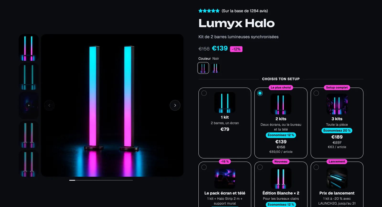
The presets
Product page
The classic buy column, the one in the shipped template: breadcrumb, rating, title, price, variant picker, stock, quantity, buy buttons, checklist, delivery date, description and two accordions. The starting point for most stores.
Product with offers
The same base with offers (quantity breaks, bundles) above the button. Lumyx uses it to offer 1, 2 or 3 kits with the savings shown on each card (screenshot above).
Compact product page
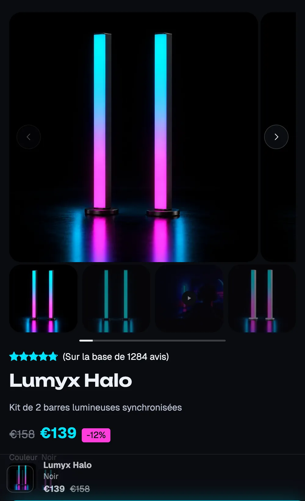
Built for mobile: the buy button fits on the first screen of a phone, and the details are tucked into Collapsible row blocks. Ideal for a simple product or mostly mobile traffic.
On mobile, the gallery moves above the buy column. On Lumyx, the Sticky add to cart bar appears at the bottom of the screen as soon as the main button is out of view:
Add or change the section
The section is already in place on the Default product template. To edit it:
- Open Online Store > Themes > Edit theme.
- In the dropdown at the top, choose Products > Default product (or another product template).
- In the sidebar, expand Product page: you'll see the Product gallery and the Group that holds the buy column blocks.
The three presets are offered by Add section when you edit a Product template. To give a product a different layout, create a template and assign it to the product: see Use a different layout for some products.
The section's blocks
The section holds a Product gallery block, a Group (the buy column) and the Sticky add to cart block. In the Group, you can add every block from the Product page and Offers categories, plus all the theme's general blocks.
| Block | What it's for |
|---|---|
| Product gallery | Photos, videos and 3D models: carousel, stacked, grid or mosaic. |
| Product title, Price, Product rating | The essentials at the top of the column. |
| Variant picker | Buttons, list or dropdown, color swatches, size guide. |
| Stock, Quantity, Buy buttons | The purchase itself: stock indicator, quantity, add to cart, express checkout, pre-order. |
| Offers, Add-ons, Purchase options | Quantity breaks, bundles, complementary products, subscription. |
| Delivery date, Free shipping progress, Rotating messages, Trust badges | Reassurance. |
| Product description, Specification list, Collapsible row, Accordion / FAQ, Tabs | Product details. |
| Sticky add to cart | The buy bar that stays visible while scrolling. |
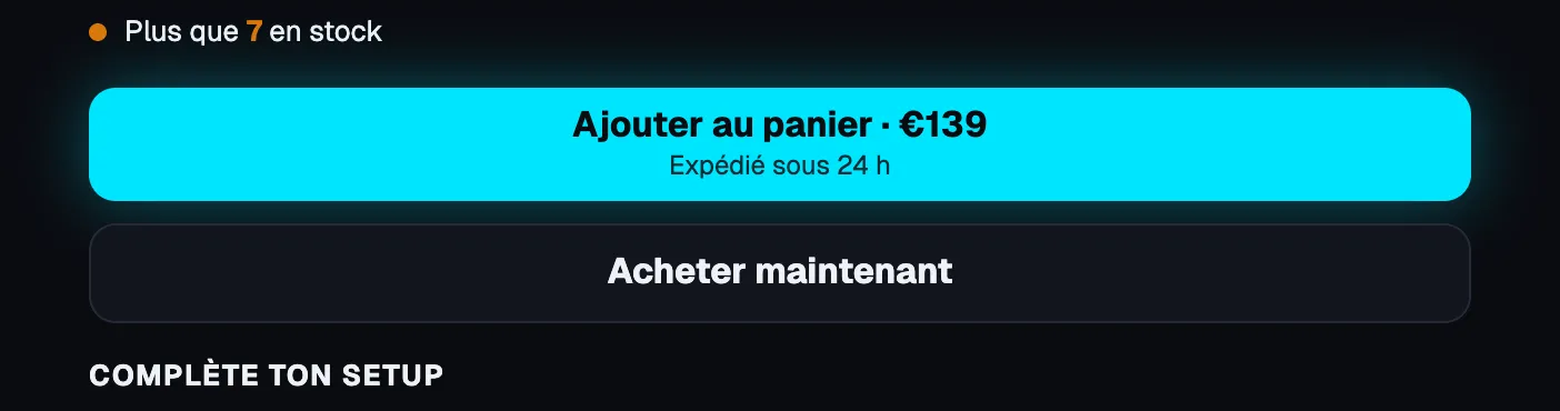
Close-up: buy buttons and stock
The Stock block shows "Only 7 left in stock" when stock drops below the threshold; here the Buy buttons block shows the price in the button and a Second line ("Ships within 24 hours"), followed by the express checkout button.
Close-up: add-ons
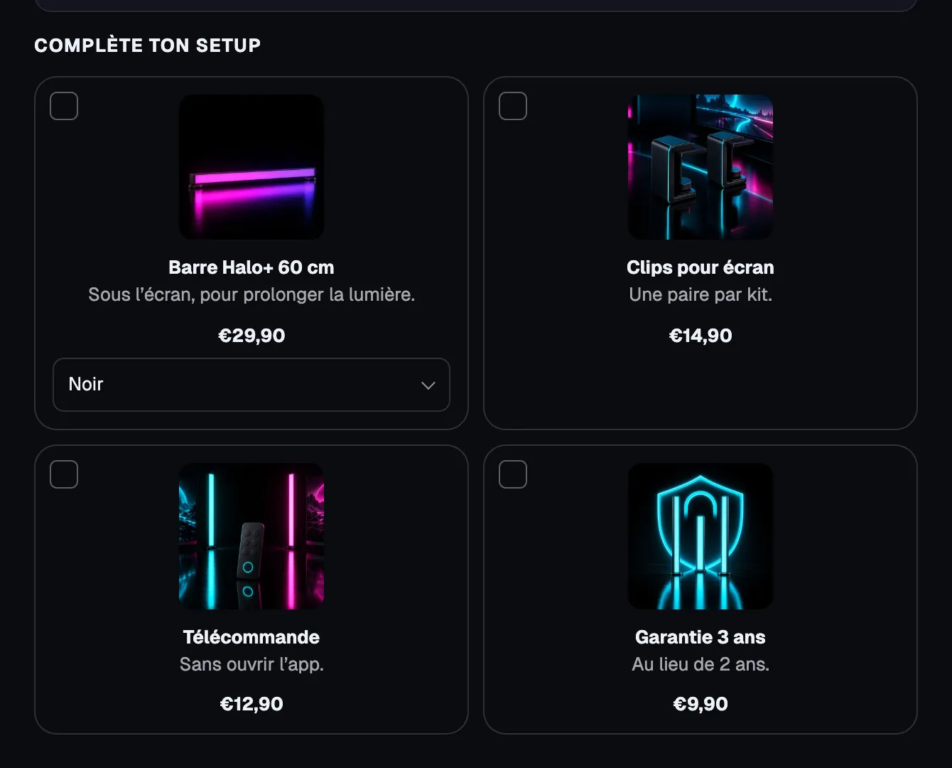
The Add-ons block offers products to add at the same time, each with its checkbox, price and variant selector:
Another style: Pulse
The same section on another demo: photo swatches, size buttons, size guide, offers in a grid and specifications below the button.
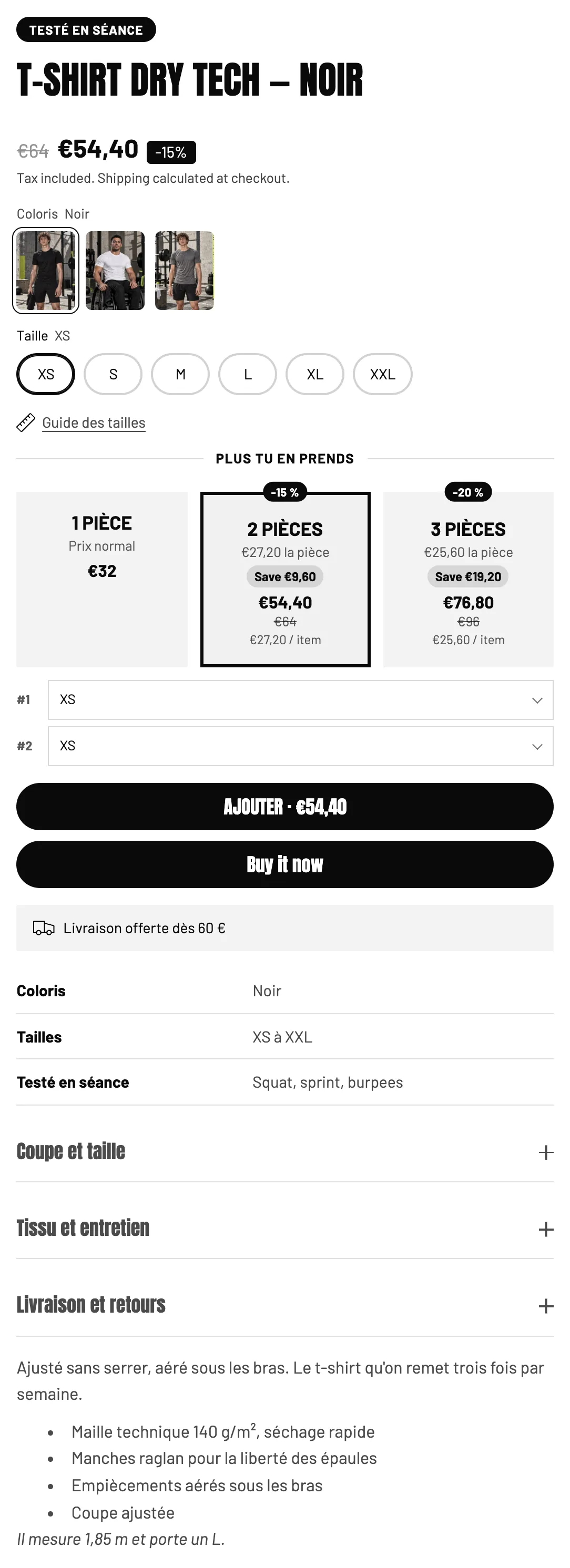
Each block is detailed in Product page buy blocks and Product page content blocks.
The section settings
- [Search engines] Add the rating to search results (off by default): adds the rating and review count saved by your reviews app. Most apps already add their own markup: turn it on only if yours doesn't, otherwise Google sees the rating twice.
- The rest is the common frame (Layout, Color palette, Separators, Animations), see Understand the theme editor.
Tips and pitfalls
- Offers, bundles and add-ons show a discounted price, but Shopify is the one charging: create the matching discount in Discounts, otherwise the customer pays full price. See Quantity discounts.
- The Product rating needs a reviews app that saves the rating on the product; without reviews, it's hidden on the storefront.
- Keep a single main heading (h1) per page: the Product title block is one by default.
- On mobile, check that the buy button is visible without too much scrolling; otherwise, tuck the description into a Collapsible row or try the Compact product page preset.
- Sections placed below the Product page (reviews, FAQ, related products) are set up like on any other page.