
Banner section: image banner, split banner and video
Create the big opening image of your pages with the Story Theme Banner section: image, video, media beside the text, overlay, height and mobile version.
The Banner section is the big visual that opens a page: a photo or a video, a heading, a text and one or two buttons. It's mostly used at the top of the home page, but also on a launch page, an "Our story" page or mid-page to push a collection.
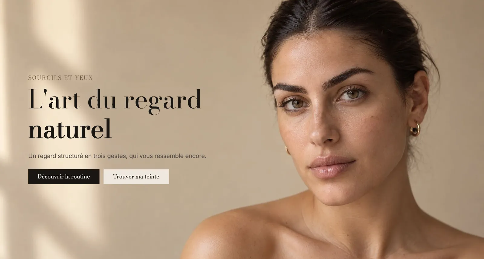
Presets
Three presets are offered in the Banners category of the section picker. They're three starting points for the same engine: you can switch from one to the other by changing a few settings.
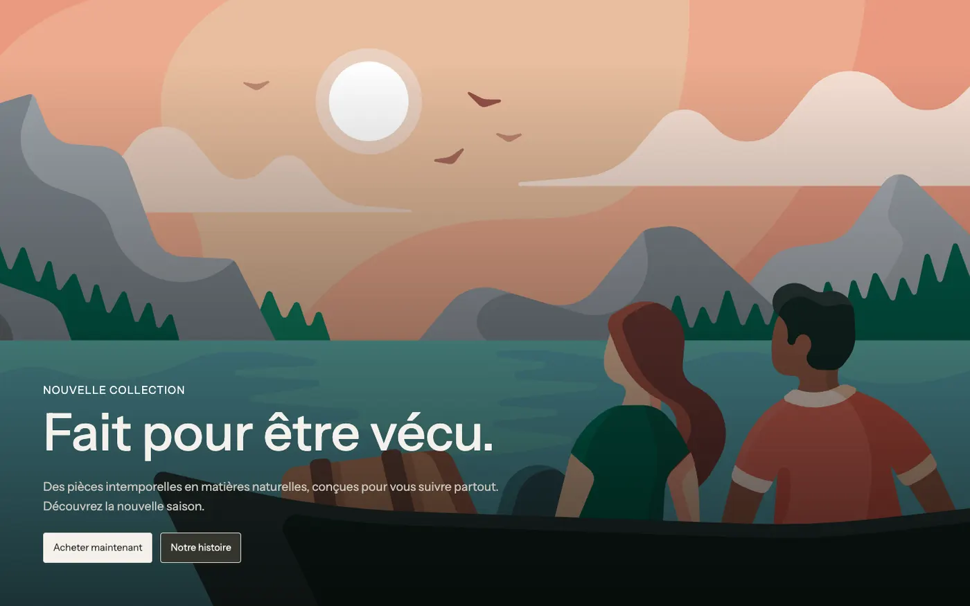
Image banner
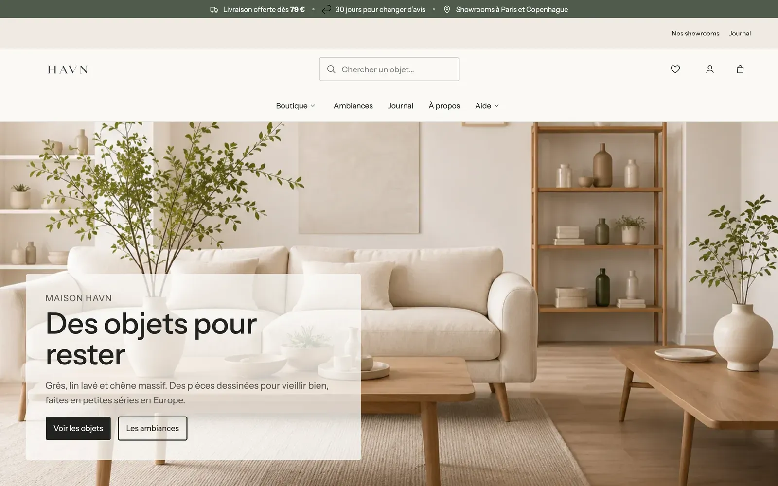
The text sits on the photo, with a light dark overlay to keep it readable. An eyebrow, a heading, a text and two buttons. It's the classic home page banner.
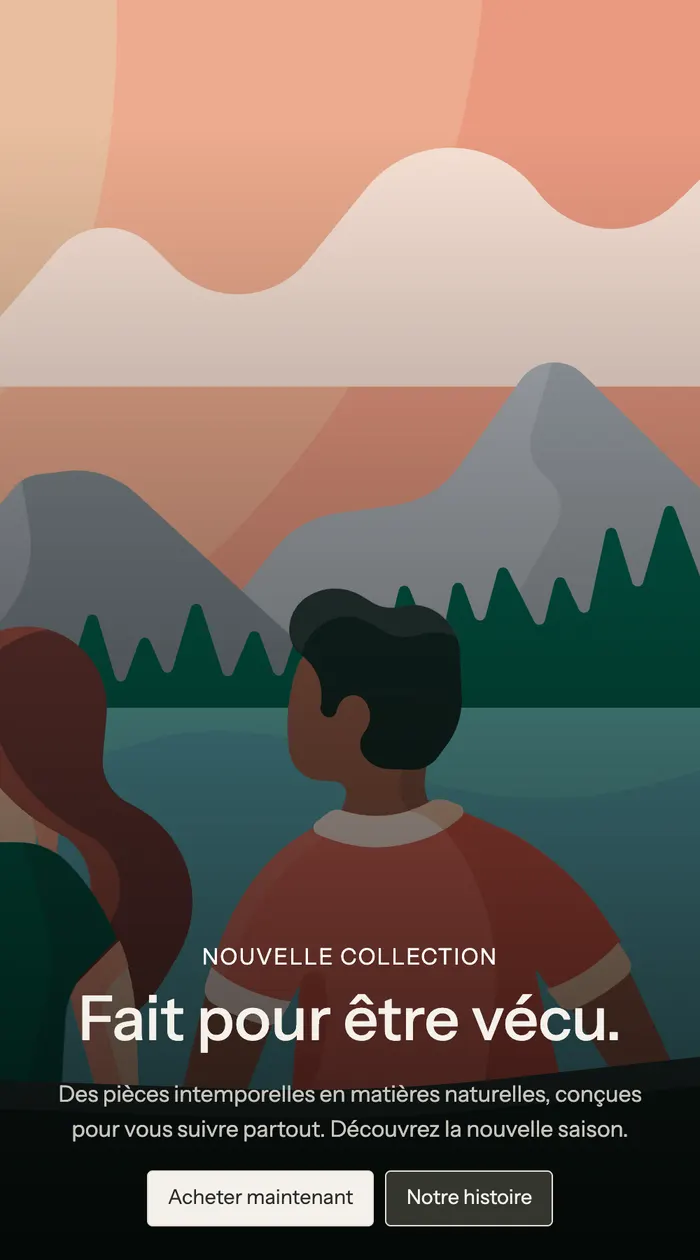
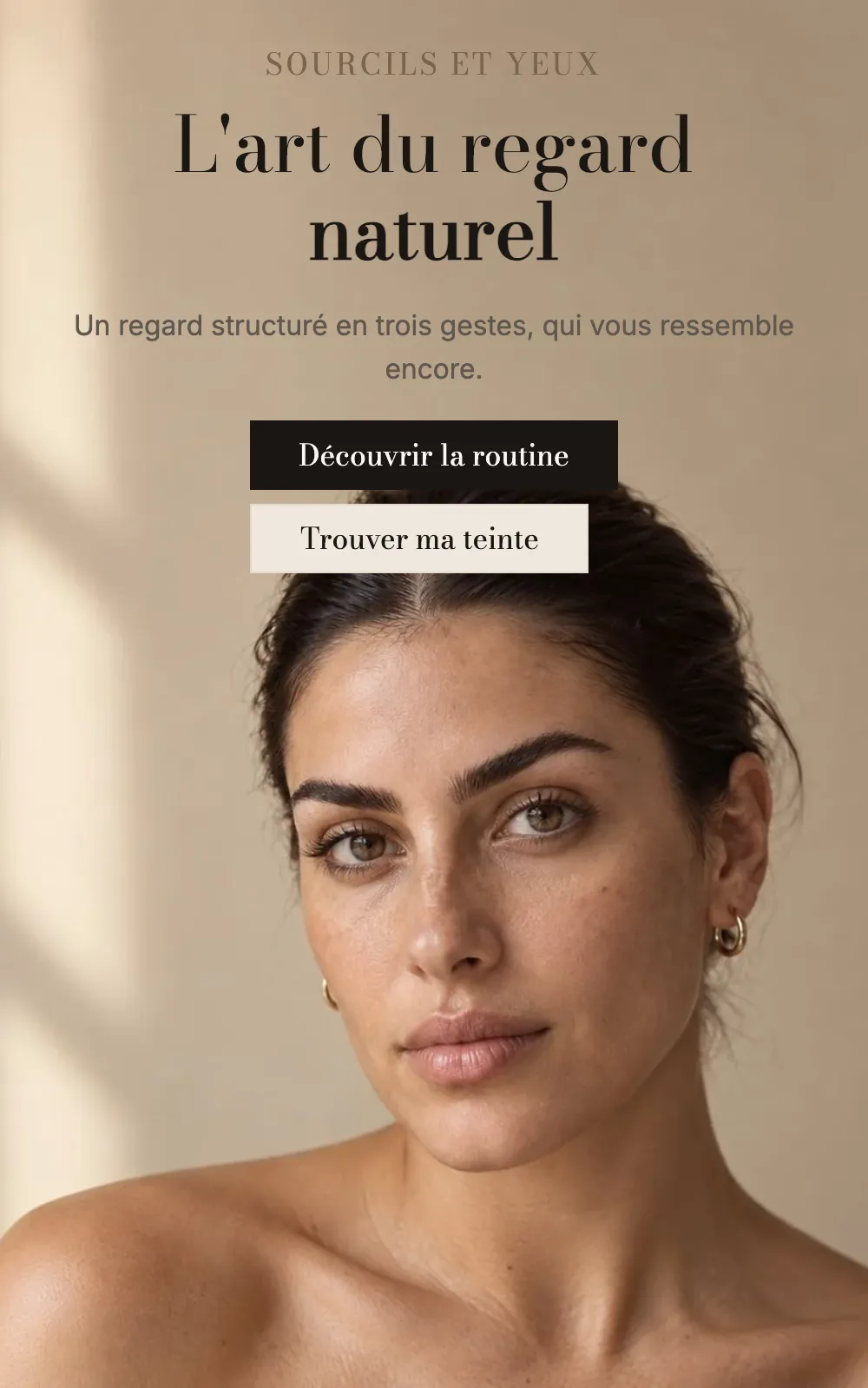
On mobile, the text stays on the image and centers at the bottom:
Split banner
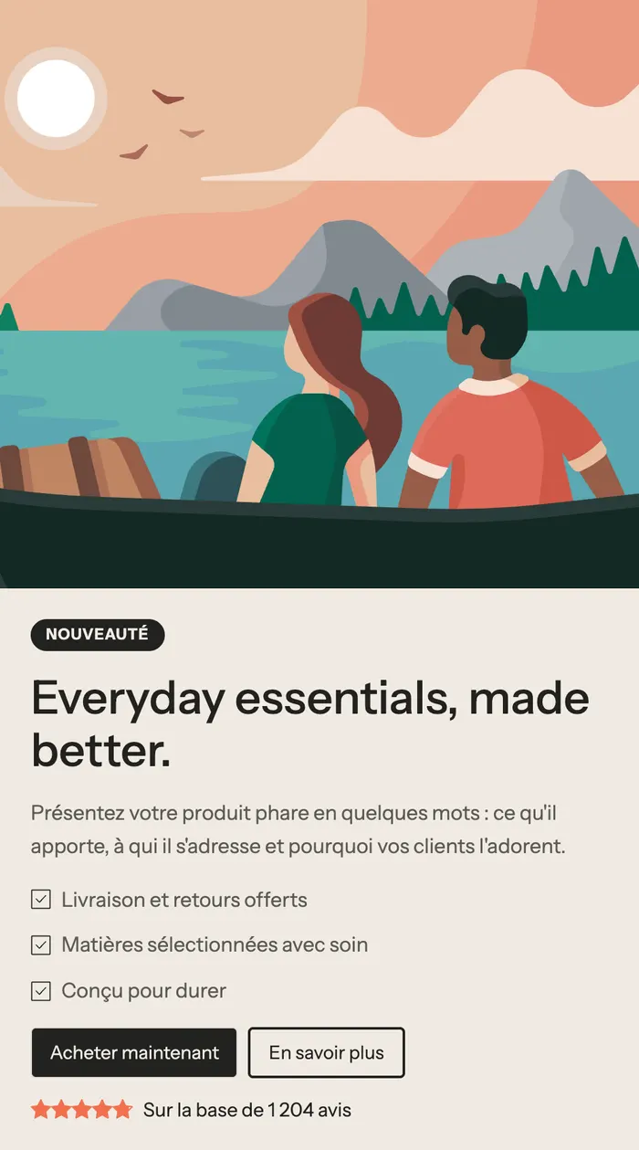
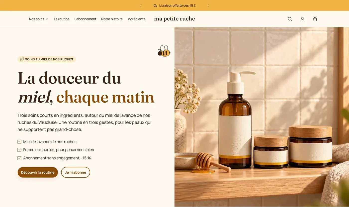
The image on one side, the text on the other (Layout: Media beside the content). The preset adds a badge, a checklist and a star rating: it presents a flagship product with its selling points.
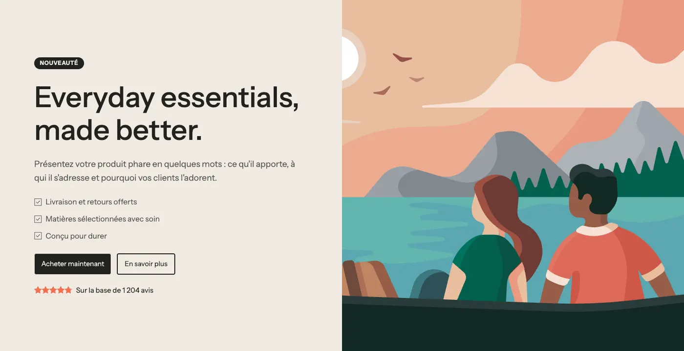
The Ma Petite Ruche demo uses it to open its home page:
Video banner
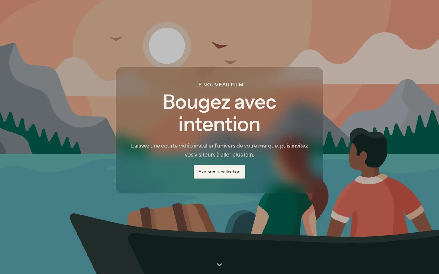
A background video, with the text in a Frosted glass box and a scroll indicator at the bottom. To set a brand mood.
Add the section
- In Online Store > Themes, click Edit theme and open the page you want (for example Home page).
- Click Add section.
- Open the Banners category and choose Image banner, Split banner or Video banner.
- Drag the section to the top of the list if it should open the page.
- Choose your Image (or your Video) in the "Media" group, then edit the texts by clicking the blocks.
The section's blocks
The banner is a free-form frame: you can add any theme block to it.
| Block | What it's for |
|---|---|
| Heading | The main heading (and the eyebrow, with a smaller style) |
| Text | A tagline |
| Group and Button | Buttons side by side |
| Badge | A "New", "-20%"… pill |
| Checklist | Three checked selling points |
| Stars | An average rating and a number of reviews |
These blocks are covered in detail in Text blocks and Layout blocks.
Section settings
"Media" and "Media on mobile"
- Media type: Image, Video, YouTube or Vimeo or None.
- Image: it also serves as a cover while a video loads. Set the focal point on the subject so it stays framed on every screen.
- Media effect: None, Slow zoom, Parallax or Zoom on scroll.
- Show a pause button on videos (checked by default).
- On mobile, Media type offers Same as desktop, Image, Video or None: add a portrait image for phones.
"Overlay"
Overlay: None, Solid, Gradient or Custom, with its Color, the Darkest side (for a gradient) and the Opacity (30% by default), adjustable separately on mobile.
"Layout"
- Layout: Content over the media or Media beside the content, with Media position and Media width (50% by default).
- Layout on mobile: Content over the media, Content below the media or Content above the media.
- Content max width (680 px by default) and mobile alignments.
"Content background"
Content background: None, Solid, Translucent or Frosted glass, with its palette, padding and Corner radius. A box makes the text readable on a busy photo.
"Size", "Animations" and link
- Height: Fit the content, Fit the media, Small, Medium, Large (default), Full screen or Custom (as a % of the screen), with a separate Height on mobile. Full screen takes the header and announcement bar into account.
- Space around the content, Keep the content within the page width, Corner radius.
- Content animation (Fade up by default), Delay between elements, Show a scroll indicator.
- Link: makes the whole banner clickable; buttons keep their own link.
The banner has a simplified frame: a section Color palette and Separators. See Understand the theme editor.
Tips and pitfalls
- The first section on a page matters most for speed: use a well-compressed image (see Optimage) and avoid a heavy video on mobile.
- For a transparent header over the banner, set Over the first section in the Header section and leave the banner with no top spacing.
- An overlay that's too light makes text unreadable on a bright photo: test on mobile, where the text often lands on the busiest part of the image.
- On a page without its own title, like the home page, the heading of the first section becomes the page's main heading for Google: make the banner heading count.
- Several messages to get across? Use the Slideshow section instead.