
Text blocks: heading, text, button, FAQ and timeline
Every block in the Story Theme Text category: heading, text, button, checklist, accordion, scrolling text, timeline and text reveal.
Text blocks are the most used building blocks of the Story Theme: a heading, a paragraph, a button, an FAQ… They can be added to almost every section and inside Group blocks, so you can compose a section exactly the way you picture it.
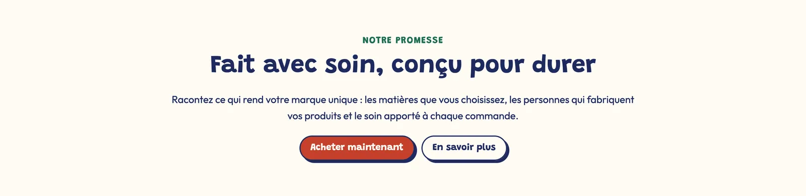
Almost all these blocks share the same settings at the bottom of the panel: Alignment and Mobile alignment, Bottom spacing, Show on (Desktop and mobile / Desktop only / Mobile only), the Sizing group (block width) and the Animations group. They aren't repeated below.
Heading
The Heading block shows a heading, optionally preceded by a small Subheading (an all-caps hook, for example "Our promise").
- Heading: rich text. The SEO tag (H1, H2…) is chosen with the Aa menu right in the field. Only one H1 per page: it keeps its tag only in the first section of a page without its own title (home, page, 404); elsewhere, it becomes an H2 that looks the same.
- Heading style: None, Style 1, Style 2 or Style 3 (the sizes set in Theme settings > Typography). Show separator line adds the theme's decorative line under the heading.
- Font weight, Custom line height, Custom font size (32 px on desktop and 24 px on mobile by default) and Heading color (empty = text color).
Rotating words
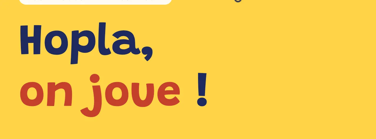
The Rotating words field rotates several words in the heading, one per line. Type [words] in the heading where you want them, otherwise the words are added at the end. Set the Transition (In from the bottom, Fade, Typewriter), the Time per word (2.5 s by default) and their Color.
Text
The Text block is a rich paragraph (bold, italic, links, lists) entered in the Description field.
- Color of bold words: Heading, Text, Accent 1 or Accent 2. Handy to make a keyword stand out without changing the font.
- Custom font size: 16 px on desktop and 14 px on mobile by default.
- Heading color: the paragraph color (empty = the palette's text color).
Button
The Button block shows a link as a button.
- Button text: accepts bold, italic and a dynamic source.
- Button link: a page, a collection, a product or an external address.
- Button style: Theme, Style 1, Style 2 (default), Style 3 or Custom. The three styles are set once for the whole store in Theme settings > Buttons; "Custom" opens color, border and corner settings for this button only.
For two buttons side by side, place them in a Group block with a horizontal direction (see Layout blocks).
Checklist
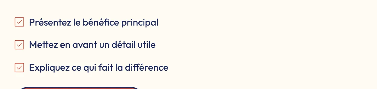
The Checklist block presents short selling points with an icon in front of each one.
- Items: one item per line, in rich text.
- Space between items (6 px by default) and Align the icon with the first line, useful when an item wraps onto several lines.
- Icon group: Icon (a check mark by default, or another icon from the library), Custom icon (your image), Size and Color (empty = accent color).
Accordion / FAQ
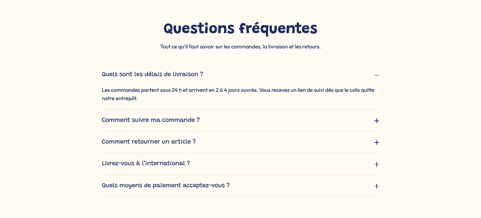
The Accordion / FAQ block shows a question that opens onto its answer. Stack several to build an FAQ.
- Title (the question) and Content (the answer). The Page field also adds the content of a Shopify page below the answer.
- Open by default and Close other accordions when this one opens (on by default): opening a question closes the others in the same section.
- Include in the FAQ structured data: the question can appear in Google, if the FAQ section has its markup turned on.
- Collapsible content group: Style (Minimal (bottom line), Card (background and border), Filled (background only)), Open / close icon (Plus / minus, Chevron, None), Question size, margins, Corner radius and colors.
- Icon group: an optional icon in front of the question.
Scrolling text
The Scrolling text block scrolls phrases continuously, like an announcement banner.
- Text (one phrase per line): empty lines are ignored. To connect a metafield to a phrase, add a Phrase sub-block (text and link) instead of typing in the field.
- Text size (0 = theme size) and Text size mobile, Font (Body or Heading), All caps, Style (Default or Outline).
- Separator between phrases: None, Dot, an icon from the library or a Custom icon.
- Layout group: Delay (speed, 16 s by default), Direction (Left or Right), Pause on hover. Edge to edge lets the banner extend past the section margins.

Timeline
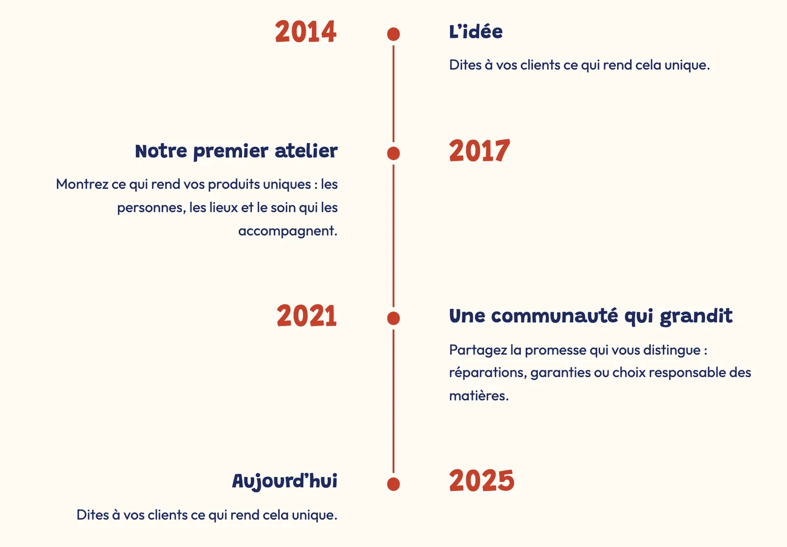
The Timeline block tells a story or explains how to use something in steps. It comes in two ready-made versions: Our story (four steps) and How it works (three steps).
- Layout: Vertical, Alternating or Horizontal. In horizontal, Layout on mobile offers Horizontal scroll or Stacked.
- Media position, Image ratio, Card style (None or Card) and Title size.
- Marker group: Style (Dot, Numbers, Icon, Image) and Size.
- Line group: Line style (Solid, Dashed, Dotted), Thickness and Fill the line while scrolling (on by default): the line fills with color as the visitor reads.
Each Step sub-block holds a Subheading (a year, for example), a Title, a Text, an Image and an Icon. A step also accepts other blocks (button, image…).

Text reveal
The Text reveal block lives in the Scroll effects category of the picker, but it's a text block: a large sentence whose words light up one by one as the visitor scrolls the page.
- Text: bold words take the Color of bold words.
- Font size (desktop) (56 px by default) and Font size (mobile) (32 px), Line height.
- Opacity before the reveal: 15% by default, the transparency of the words not reached yet.

Page title
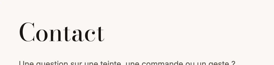
The Page title block shows the title of the Shopify page being viewed. It's used in page templates (standard page, contact, FAQ, order tracking…).
- Heading style (Style 1 by default), Show separator line, Bold.
- Custom font size: 48 px on desktop and 32 px on mobile by default.
Page content
The Page content block shows the text entered in Online Store > Pages in your Shopify admin.
- Page: leave empty to show the content of the page being viewed, or choose a specific page to reuse its text elsewhere (for example your shipping terms on a product page).
- Maximum text width: 800 px by default, to keep lines easy to read.
- Custom font size (16 px on desktop, 15 px on mobile).
Share
The Share block shows your social networks and/or a button to share the page.
- Show: Social links and share button, Social links only, or Share button only. Text before the icons is optional.
- Social media group: the links come from Theme settings > Social media; a network left empty isn't shown. Set the Icon shape (None, Circle, Rounded, Square), their size and their colors.
- Share button group: the button Text and the URL to share (empty = the current page).