Build a home page that sells
A proven section order for the Story Theme home page, with the sections to use and content tips for each one.
Your home page has to answer three questions in a few seconds: what do you sell, why buy from you, and where to click next. Here's a section order that works for most stores, with the Story Theme sections to use at each step.
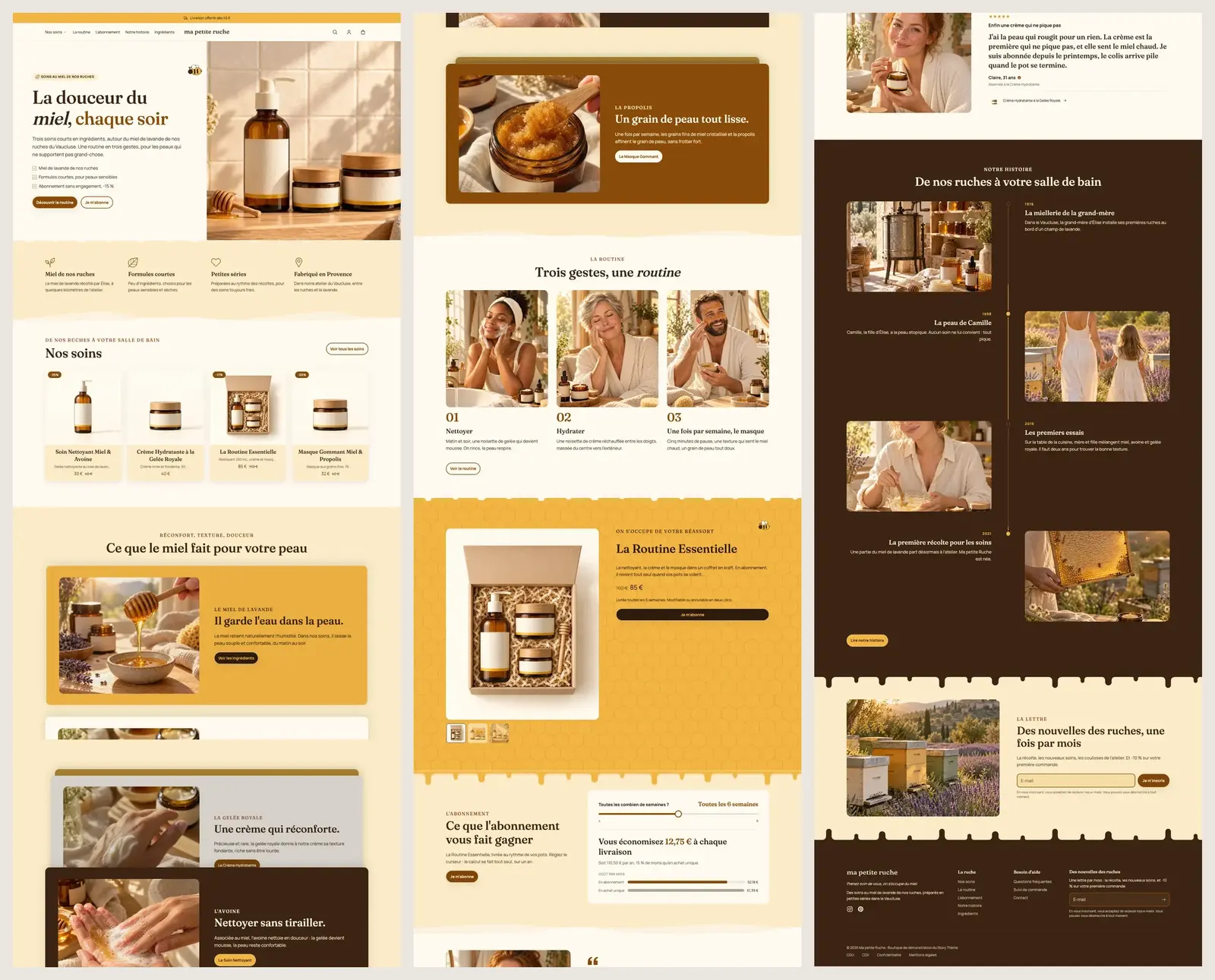
The recommended order
| Step | Role | Story Theme section (suggested preset) |
|---|---|---|
| 1 | Hook | Banner (Image banner, Split banner, Video banner) or Slideshow |
| 2 | Reassure right away | Multicolumn (Icons with text) or Marquee (Scrolling text) |
| 3 | Show the products | Product list (Featured collection, Product carousel, Collection tabs) |
| 4 | Guide | Collection list (Shop by category, Collections bento) |
| 5 | Explain what makes you different | Image with text (Product benefits, Brand story) |
| 6 | Push a hero product | Featured product |
| 7 | Prove it | Testimonials, Reviews (Rating banner), Customer photos & videos |
| 8 | Remove doubts | FAQ, Multicolumn (Numbered steps) |
| 9 | Stay in touch | Newsletter (Newsletter with discount) |
You don't have to use everything. A small store with three products can stop at six sections; a large catalog will add more product and collection lists.
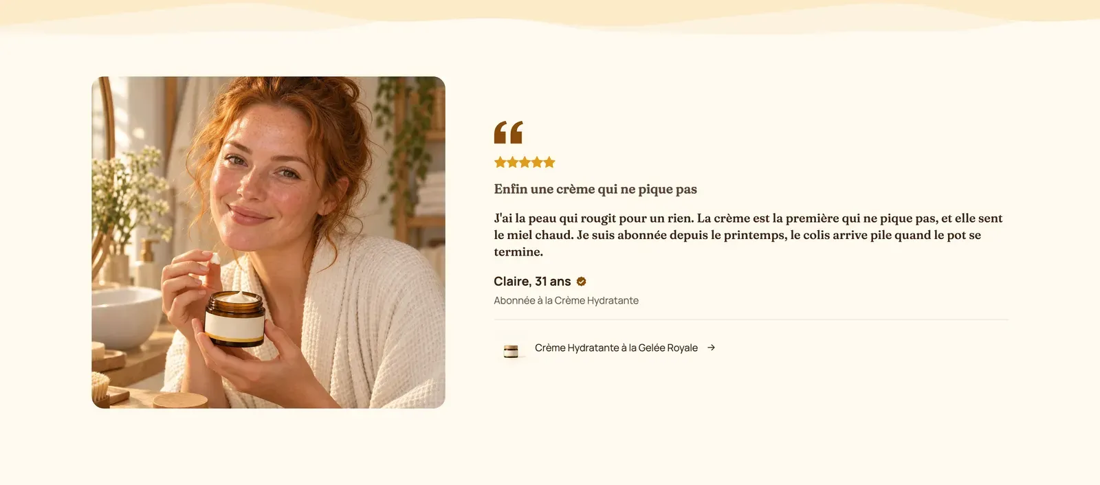
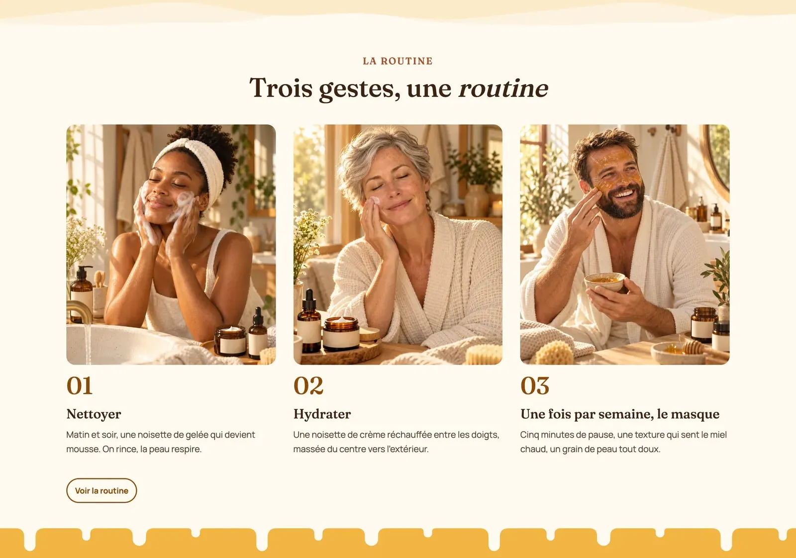
The screenshots below come from the home page of the Ma Petite Ruche demo, a small skincare range built in exactly this order.
1. The banner: say what you sell
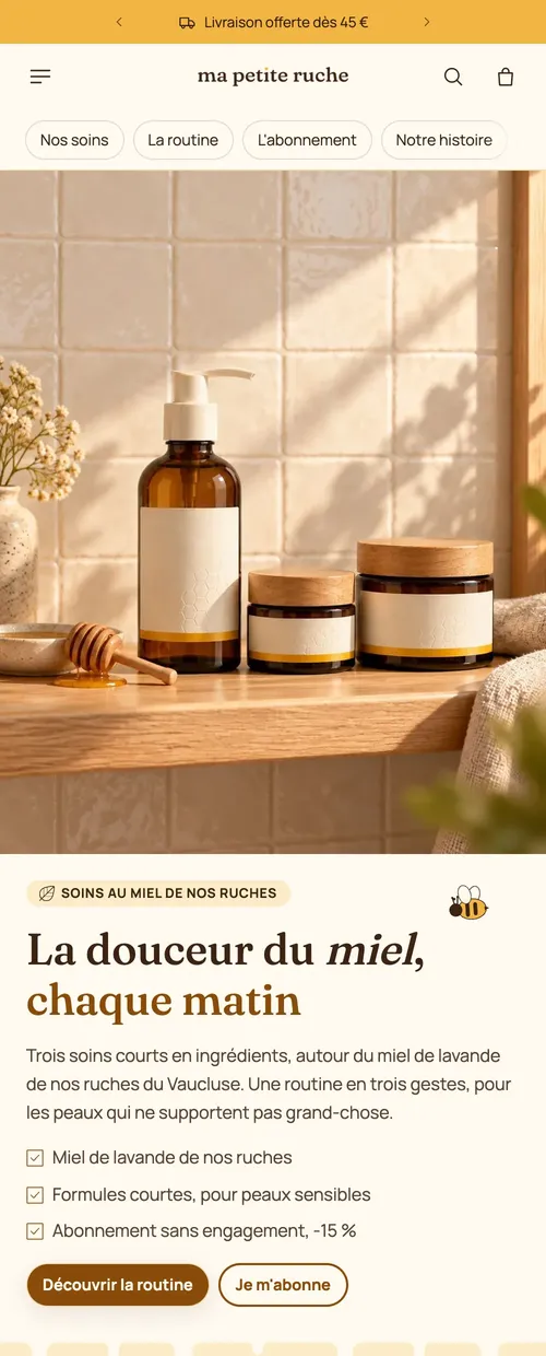
The first screen must be understood without scrolling: an image showing the product in use, a heading that says what you sell and to whom, a benefit sentence, a button. Skip vague slogans ("Welcome") in favor of a concrete promise.
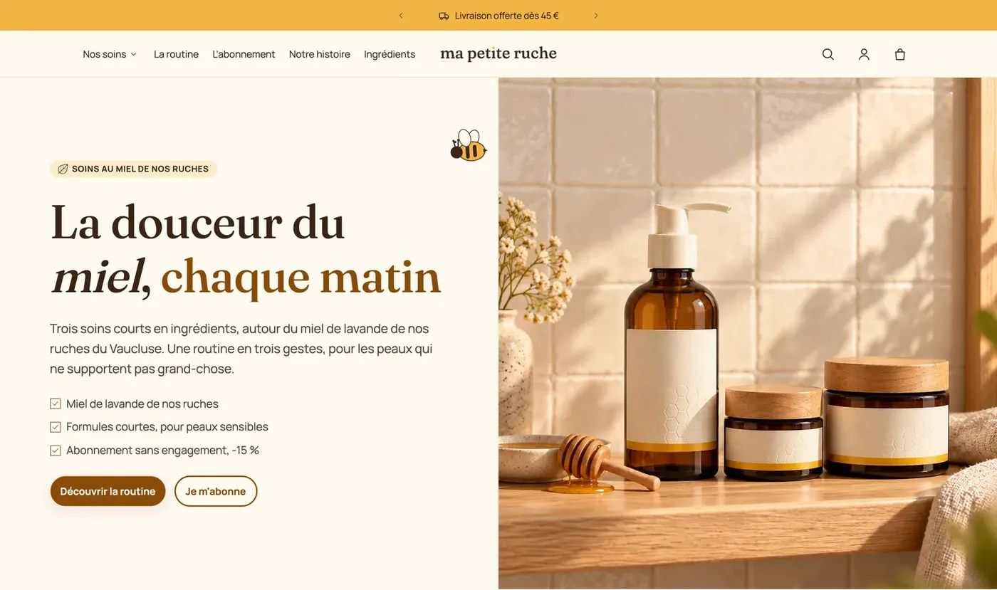
All the settings (mobile image, video, overlay, height) are detailed in Hero banner, slideshow and video and in Banner section.
2. Reassurance, right under the banner
Three or four short selling points with an icon: shipping, returns, secure payment, craftsmanship. The Icons with text preset of the Multicolumn section is made for this. For a version that moves, use Scrolling text: see Announcement bar and scrolling marquee.
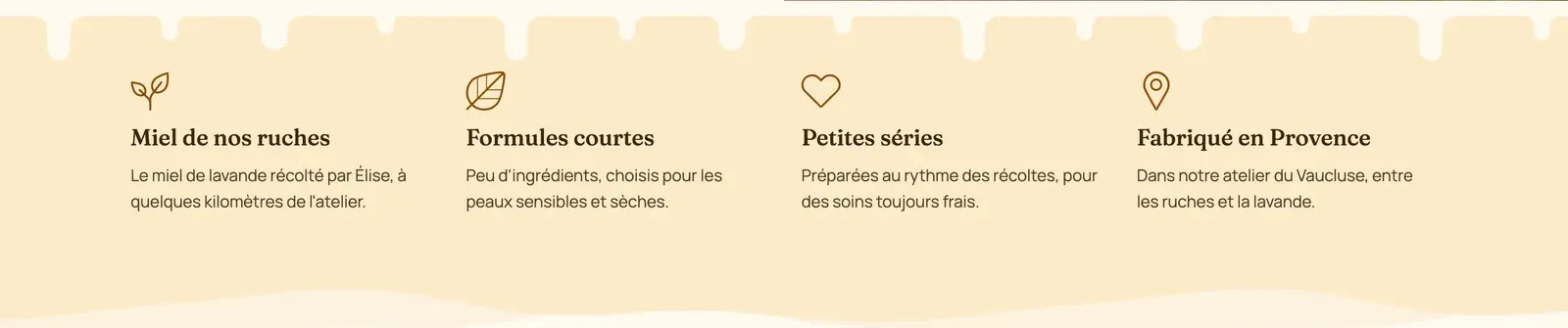
See also the Multicolumn section and the Marquee section.
3. Products: your best sellers first
Add a Product list and, in its Product list block, set:
- Source: Collection (for example a "Best sellers" collection) or Chosen products;
- Number of products: 4 to 8 is enough on the home page;
- the View all card to send visitors to the full collection.
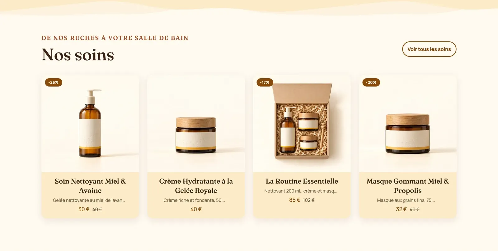
The Collection tabs preset shows several collections in a single section, one per tab: handy for a varied catalog.
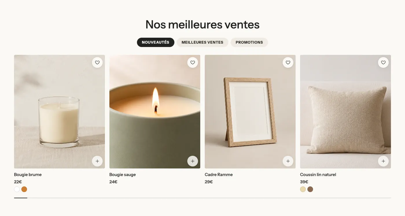
All presets and settings: Product list section.
4. Collections: help visitors find their way
If you sell several product families, a Collection list (Shop by category, Collection grid, Collections bento) lets visitors go straight to what interests them. Choose consistent images (same framing, same lighting).
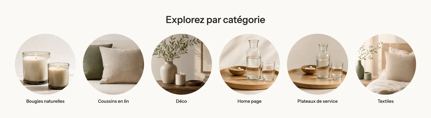
See the Collection list section.
5 and 6. Explain, then push a product
An Image with text section answers "why buy from you?": ingredients, craftsmanship, main benefit. One photo, one heading, three lines, one button.
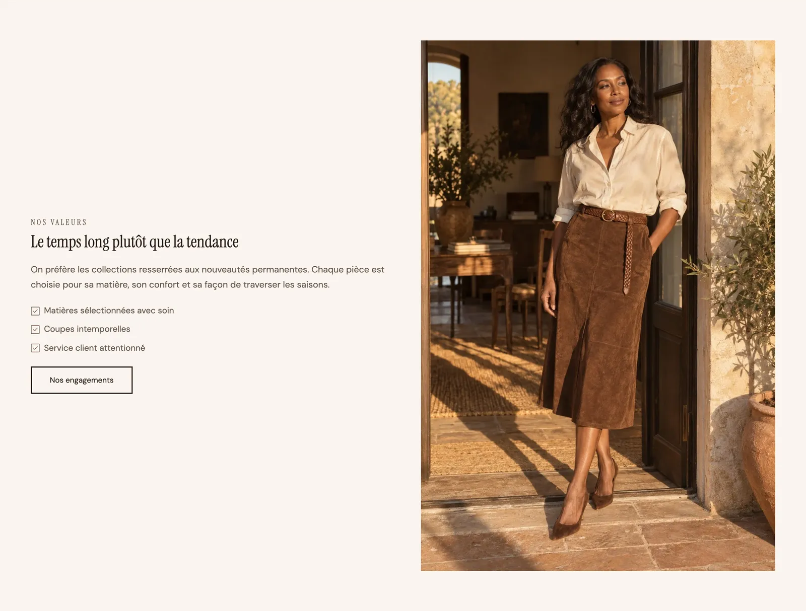
The Featured product section shows a product with its gallery and buy button, right on the home page: ideal for a one-product store or a best seller. Set Product in its settings (with no product chosen, the section doesn't show).
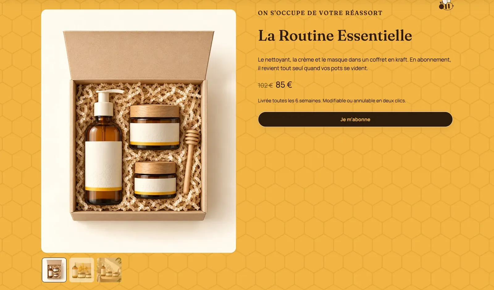
See the Featured product section and the Image with text section.
7. Social proof
Real reviews reassure more than any selling point. Your choice: Testimonials (cards with rating, text, author and product), Reviews with the Rating banner preset (average rating and logos), or Customer photos & videos (your customers with the product, shoppable from the viewer). See Customer reviews and the Testimonials section.
8 and 9. Remove the last doubts, then stay in touch
A short FAQ (4 to 6 questions: shipping, returns, sizing, care) saves you support messages. The Numbered steps preset of Multicolumn explains in three steps how your product or ordering works.
End with a Newsletter. With the Newsletter with discount preset, the Newsletter block can show a Discount code to reveal after signing up; create this code in Shopify first (Create a discount code).
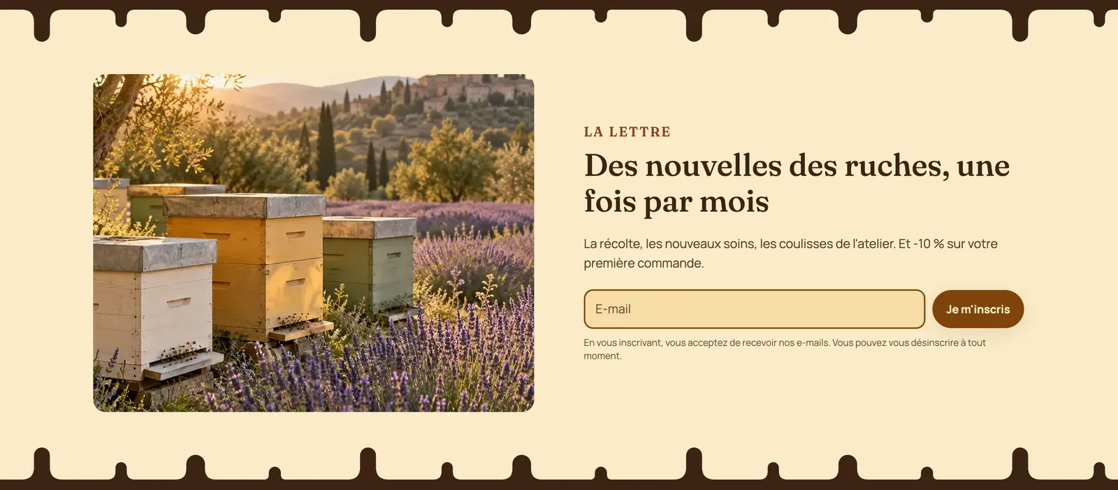
See the FAQ section and the Newsletter section.
Good habits
- Check mobile every time you add a section (mobile icon at the top of the editor). That's where most visits happen.
- Alternate palettes from one section to the next (each section's Color palette setting) to give the page rhythm: see Color schemes.
- One idea per section. If a section needs a long text, it often means it should become a separate page.
- No heavy videos everywhere: one video on the home page is enough, and a mobile image in the banner lightens the first screen.
- Delete what you don't use rather than leaving it empty.