
Footer section: columns, newsletter and wordmark
Build the Story Theme footer: link lists, contact details and opening hours, newsletter, social media, policy links, payment icons and a giant wordmark.
The Footer section closes every page of the store. It's where visitors look as a last resort: help pages, contact details, policy links, the newsletter and payment methods. It belongs to the Footer group and you set it up once for the whole site.
Presets
Three presets are offered in the Footer category. They're all made of Group blocks that you can then rearrange freely.
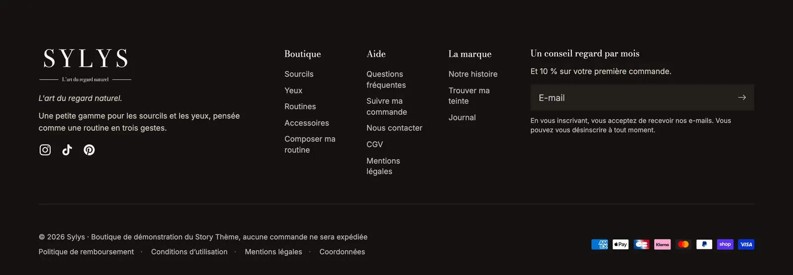
Footer with columns
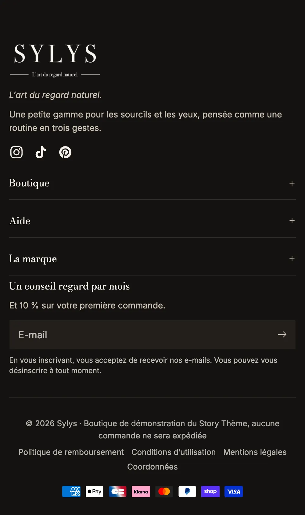
Logo and a text on the left, link lists and the newsletter in columns, then a bottom line with the copyright, policy links and payment icons. It's the layout of a fresh theme and the most common one. On mobile, link lists collapse into accordions.
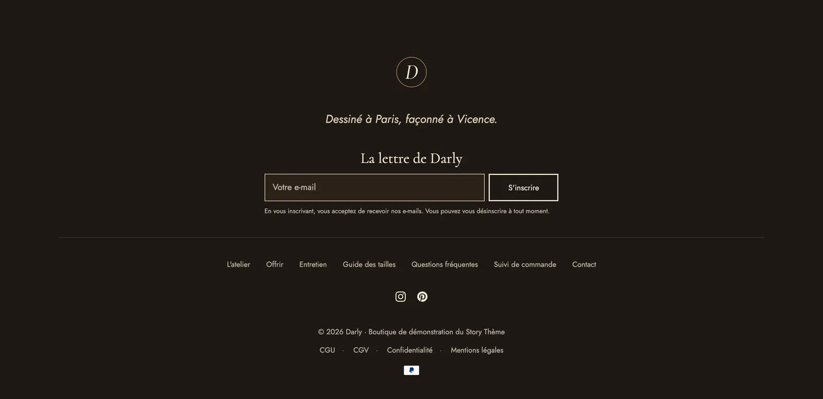
Centered footer
Everything is centered in a single column: logo, menu, social media, trust badges, copyright, policy links and payment icons. It suits stores with few links and a minimal identity.
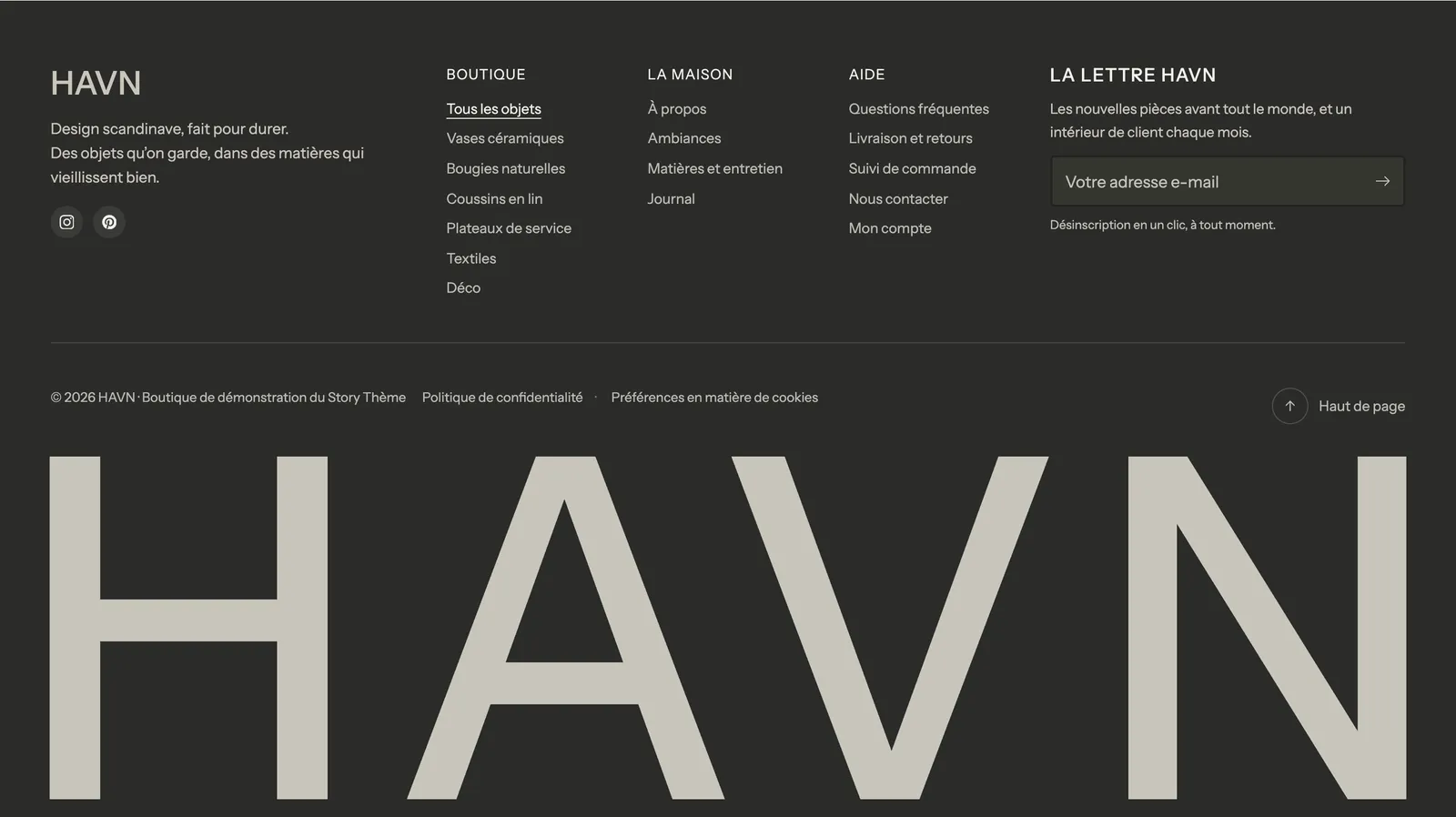
Footer with wordmark
The usual columns, followed by your brand name in very large type across the full width (Wordmark block). A strong effect for a brand that relies on its typography.
Add or edit the section
- In Online Store > Themes, click Edit theme.
- In the left-hand column, under Footer, click Footer.
- Expand the groups to see their blocks; drag them to change the order, or click Add block.
- To switch presets, click Add section in the Footer group, choose the preset in the Footer category, then delete the old footer.
Footer blocks
| Block | What it's for |
|---|---|
| Link list | A column of links from a Shopify menu, collapsible on mobile |
| Contact information | Email, phone, WhatsApp, address and opening hours |
| Store logo | Your logo, with a version for dark backgrounds |
| Wordmark | The brand name across the full width |
| Newsletter | The signup form for your emails |
| Social media links | The icons for the accounts filled in under Theme settings |
| Copyright | The "© year store" notice |
| Policy links | Your Shopify policies, an extra menu and a link to cookie preferences |
| Payment icons | The logos of the payment methods you accept |
| Country/language selector | The market and language choice |
| Back to top | A link, or a floating button in a corner on every page |
Link list
Choose the menu (created in Content > Menus) and its title. The On mobile setting offers Collapsed, Expanded, can be collapsed or Always expanded.
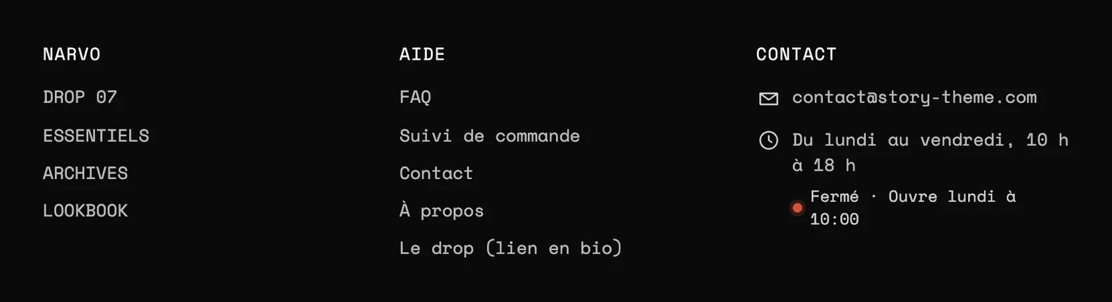
Contact information
Add one sub-block per piece of information: Email, Phone, WhatsApp, Address, Opening hours, Link, Text. Opening hours show live whether you're open or closed, based on your store's time.
Copyright, policy links and payment
Copyright accepts the [year] and [store] codes (default text: © [year] [store]) and can show Powered by Shopify. Policy links pull in the policies from Settings > Policies: see policy pages.

Section settings
- "Typography": heading Font family (Heading or Body), Heading font size (16 px by default) and text Font size (14 px), with their mobile versions, Uppercase, Links (Muted or Text color), Link hover (Underline or Color).
- "Color palette": palette and Top border.
- Reveal effect on scroll: on desktop, the page slides up to reveal the footer. It only plays if the footer fits in the window, and not with a top separator.
The rest (spacing, separators, animations) follows the frame shared by all sections: see Understand the theme editor.
Tips and pitfalls
- Social icons only show for the accounts filled in under Theme settings > Social media. Clear the demo fields pointing to
#(TikTok, X, LinkedIn on a fresh theme). - The Footer group also holds a newsletter Popup section, hidden on a fresh theme. Show it again (eye icon) if you want to use it: see popups.
- Put the pages people look for but can't find in the menu here: FAQ, order tracking, shipping and returns, contact.
- The logo for dark backgrounds avoids a black logo on a black footer.