
Footer blocks: links, contact information, copyright and logo
The Story Theme footer blocks: link lists, contact information and opening hours, logo, giant wordmark, copyright, policy links and social media.
The Story Theme footer is made of blocks, like the rest of the theme: columns of links, your contact information, your logo, policy links, social media icons… You arrange them in Group blocks to form columns and rows. This page details every block in the Footer category.
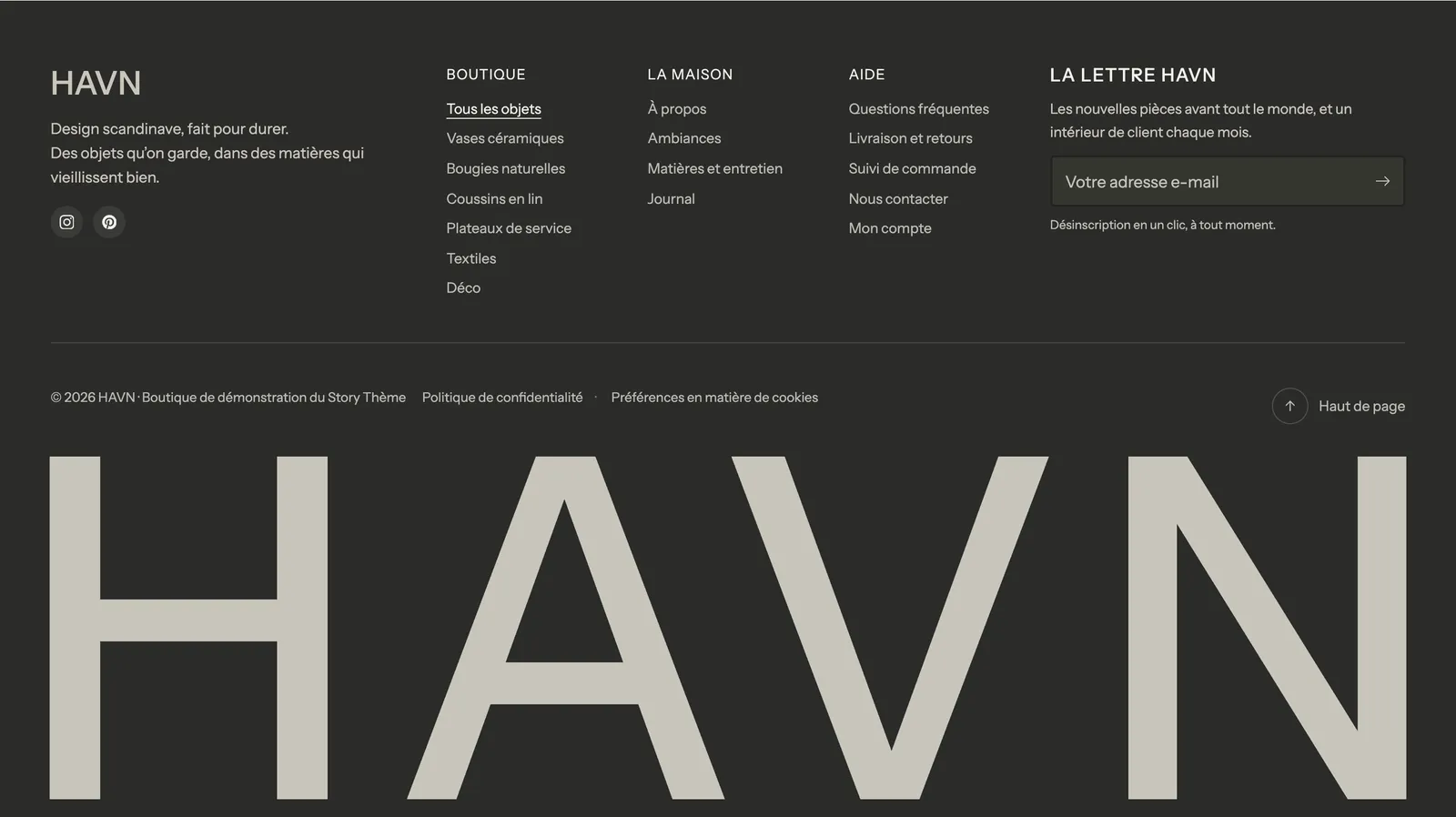
Most of these blocks share the same layout settings: Alignment and Mobile alignment (Left, Center, Right), Show on (Desktop and mobile, Desktop only, Mobile only) and the Sizing group. They aren't repeated below.
Two other blocks often used in the footer come from other categories: Newsletter (see Form blocks) and Payment icons (see Review and trust blocks).
Link list
A column of links taken from a Shopify menu: "Shop", "Help", "About"…
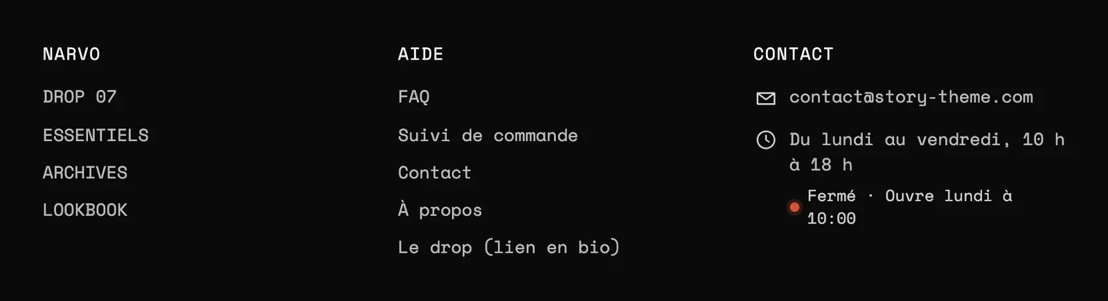
- Menu: the menu to show (the
footermenu by default). Create it in Content > Menus, see Create the header and footer menus. - Title (empty = the menu title) and Show title.
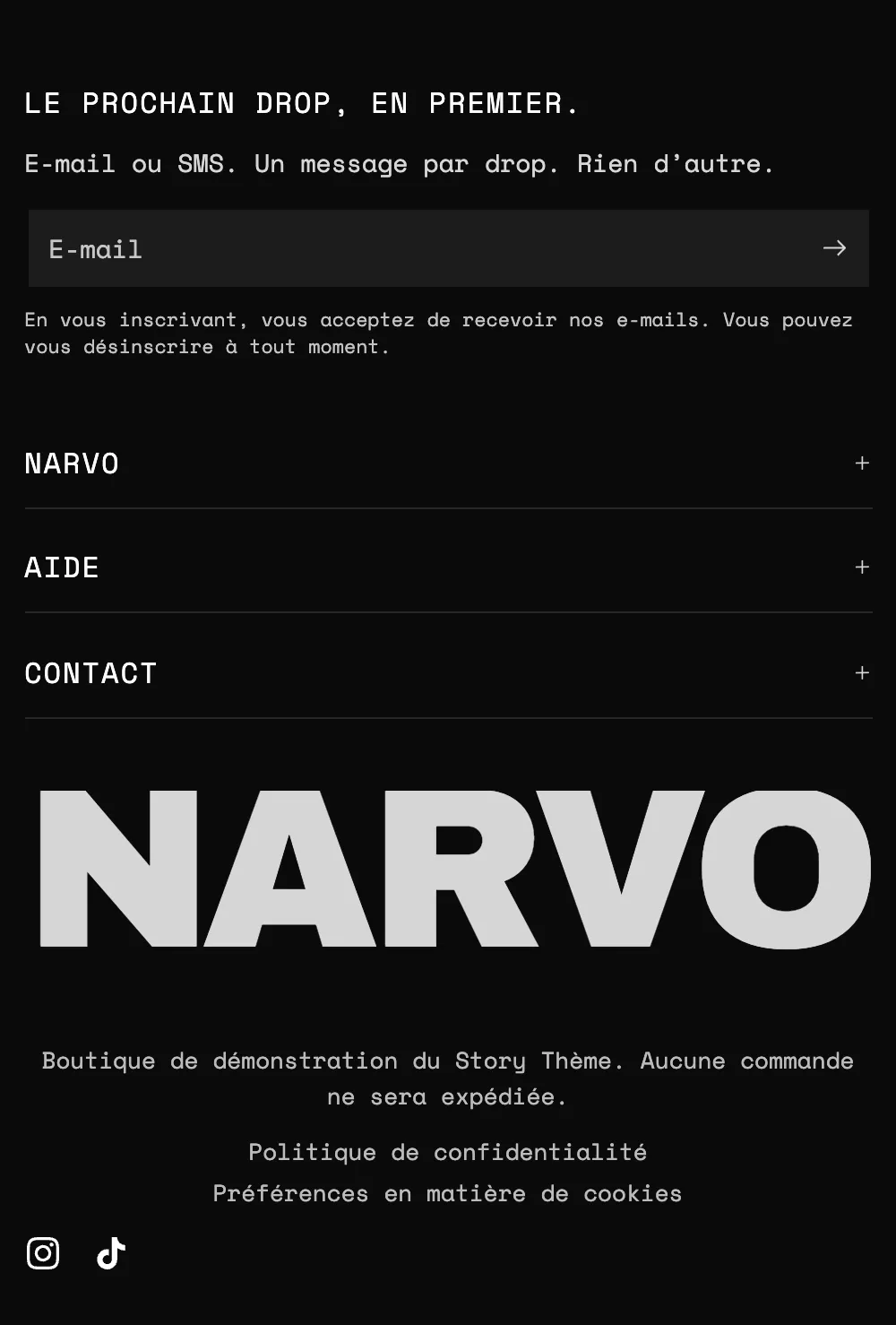
- On mobile: Collapsed, Expanded, can be collapsed or Always expanded. When collapsed, each list becomes a row that opens with one tap, which makes the footer much shorter on phones.
- Show nested links: also shows the menu's second level.
- Direction (Vertical or Horizontal), Desktop columns (up to 3 for a long list) and Space between links.
Contact information
The Contact information block groups your contact details, each on its own line with its icon. By default it contains an email, a phone number and opening hours.
- Title and On mobile (Collapsed, Expanded can be collapsed, Always expanded), like the link list.
- Show icons and Icon size (18 px).
- Direction: Vertical (one line per piece of information) or Horizontal. Spacing between lines.
Each line is a sub-block, with a Text, an optional Label above it and an Icon (Default, None, an icon from the theme's icon library or your own image).
Email, Phone and Address
Leave the Text empty to use the email, phone number or address set in your Shopify store settings. The email and phone number become clickable links.
Enter your number with the country code, for example +1 555 123 4567. Customers open a conversation with one tap.
Opening hours
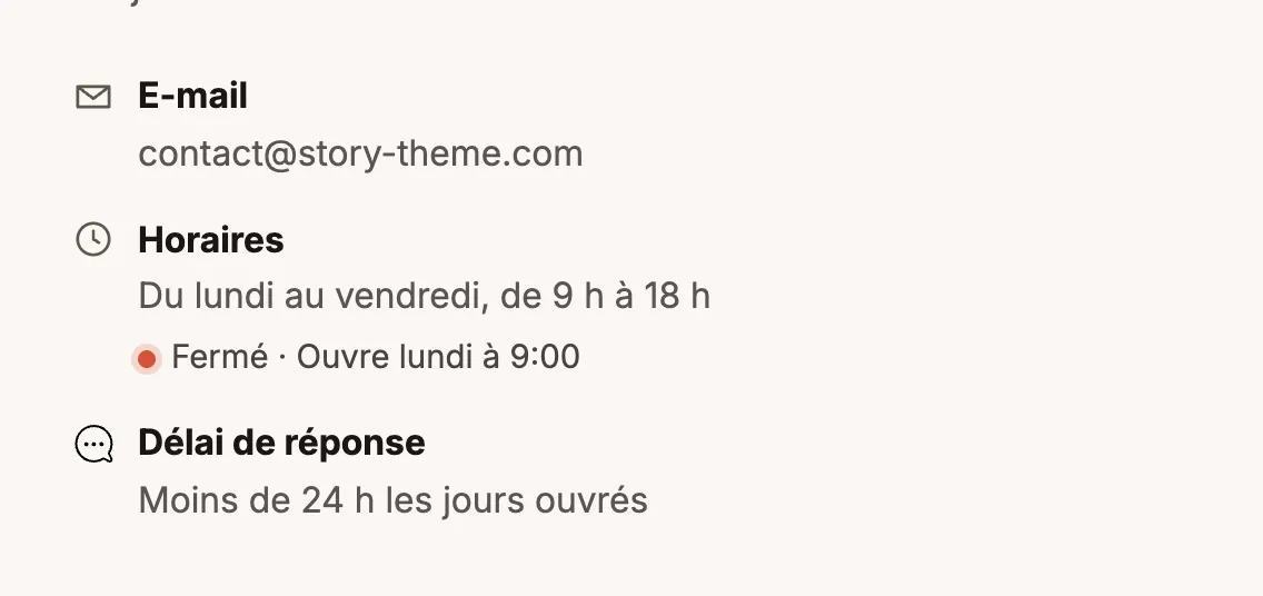
Your hours written out ("Monday to Friday, 9 am to 6 pm"). Check Show open or closed now and fill in Monday to Friday, Saturday and Sunday in 09:00-18:00 format (or 09:00-12:30, 14:00-19:00, empty = closed): the theme shows live whether you're open, in your store's time zone.
Link and Text
Link adds a clickable line of your choice (an FAQ, a returns form). Text adds any free information, such as a response time.
Store logo
Your logo, usually at the top of the first column.
- Logo: if empty, the theme uses the logo from Settings > Brand in Shopify, or the store name if there isn't one.
- Logo for dark backgrounds: a light version, shown automatically when the section background is dark. Logo version lets you force one or the other.
- Desktop logo width (140 px) and Mobile logo width (120 px). Without an image, Font size (desktop) and Font size (mobile) control the store name.
- Link to the home page: checked by default.
Wordmark
Your brand name written across the full width of the page, in very large letters. It's the signature of the Footer with wordmark variant.
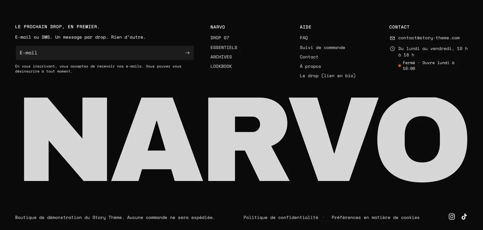
- Text: if empty, it's the store name. The text always fills the full width, whatever its length.
- Font (Heading or Body), Uppercase, Letter spacing (-2% by default) and Text color.
- Crop the bottom: hides the bottom of the letters, as if they ran off the edge of the page.
- Effect on scroll: Rise (the letters rise as they appear) or None.
Copyright
The copyright notice at the bottom of the page.

- Text:
© [year] [store]by default.[year]shows the current year (no need to change it every January 1st) and[store]the store name, linking to the home page. - Show Powered by Shopify and Text size (13 px).
Policy links
Links to your policies (privacy, refunds, terms of sale…).
- Show store policies: automatically uses the ones written in Shopify's Settings > Policies. See Write the legal pages.
- Additional links: a menu to add a legal notice, an accessibility statement or a withdrawal page.
- Show a cookie preferences link: reopens the Shopify cookie banner preferences. It only appears where the banner is active.
- Direction (Horizontal or Vertical), Separator between links (None, Dot, Vertical bar, Slash), Spacing, Text size.
Back to top
A button that scrolls back to the top of the page.

- Label and Show text (otherwise, only the arrow remains).
- Floating button: the button leaves the footer and stays in a corner of the screen, on every page, as soon as the customer scrolls. You then choose its Position (Left or Right) and its Distance from the edges (24 px). Useful on long product or catalog pages.
Country/language selector
The country (and currency) and language selector for the footer. It only appears if your store sells in several countries or languages, set up in Shopify's Settings > Markets and Languages.
- Show country selector, Show flags, Show currency (only if your countries use different currencies).
- Show language selector and Show titles above the lists.
- Style (Outline or Plain) and List colors (the dropdown list's color palette).
To add languages, see Translate your store.
Social media links
Your account icons. The addresses are entered once in Theme settings > Social media (17 networks, from Facebook to Spotify); an empty field hides the icon.

- Display: Icons, Icons and names or Names.
- Icon shape: None, Circle, Rounded or Square. Icon size (20 px).
- Icon colors: Theme (with your Icon color and Icon background) or Brand colors (Facebook blue, YouTube red…).
- Show Follow on Shop: lets customers follow your store in the Shop app. Requires Shop Pay.