
Form blocks: contact, newsletter, map and order tracking
The Story Theme Contact form (and its 15 field types), Newsletter, Map and Order tracking blocks, with their settings.
Form blocks let your customers write to you, sign up for your newsletter, find your store or track their package. They're in the Forms and contact category of the block picker and can be added to any section: a Contact page, the footer, a popup, a tracking page.
At the end of their panel, all these blocks have Show on (Desktop and mobile, Desktop only, Mobile only), the Sizing group and the Animations group. They aren't repeated below.
Contact form
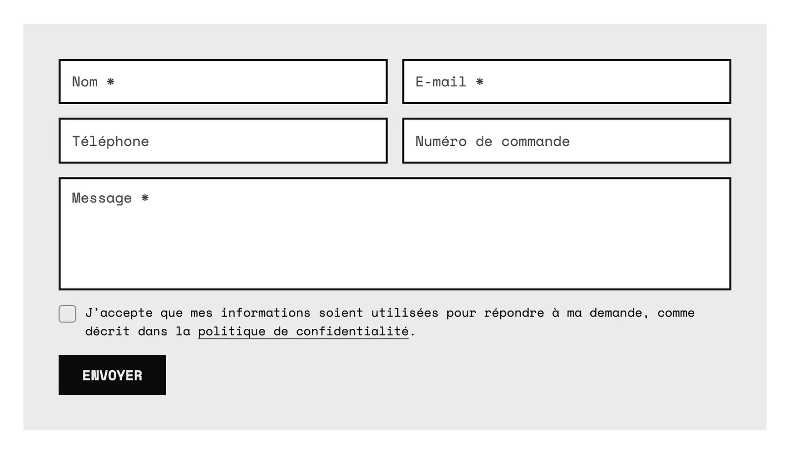
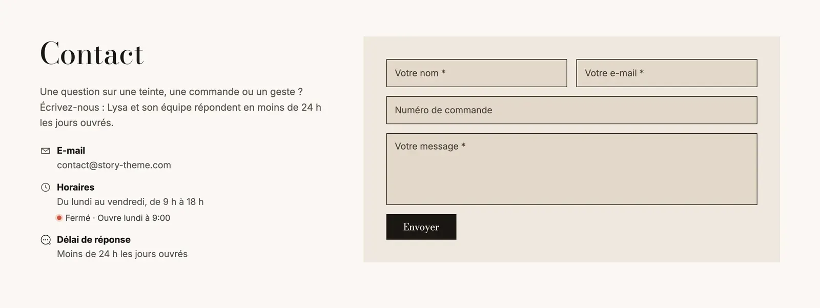
The Contact form block sends the customer's message to your store's email address (the one in Settings > General in Shopify). Each field is a sub-block: you choose which ones to show, in what order, and which are required. By default, it contains Full name, Email, Phone, Order number and Message.
- Labels: Inside the fields (the label acts as placeholder text, like on Narvo) or Above the fields. Spacing between fields (16 px).
- Consent > Display: None, Required checkbox (the message won't send unless the box is checked) or Information text. The Text can be customized; leave it empty to keep the default text, translated into the visitor's language.
- Button: Button text, Button style, Width (Fit content or Full width) and Confirmation message shown after sending.
- Appearance: Background (None, or a Color palette with its Inner spacing) and Corners.
The form fields
Every field has a Label (it also names the answer in the email you receive), an optional Help text under the field, and most have a Placeholder and a Required checkbox.
| Field | What it's for | Specific settings |
|---|---|---|
| Full name | The name in a single field | Required by default |
| First name / Last name | The name in two fields | Required by default |
| The address to reply to | Always required | |
| Phone | To call the customer back | — |
| Company | For a B2B store | — |
| Order number | Find the order | Placeholder #1001 |
| Subject | The topic of the message | Choices: one per line for a list, empty for free text |
| Message | The free text | Height (lines): 5 by default; required by default |
| Short text | A free answer on one line | — |
| Dropdown list | One choice from a list | Choices: one per line |
| Single choice | Radio buttons | Choices: one per line |
| Checkbox | A yes/no option ("Call me back") | — |
| Date | A date (appointment, event) | — |
| Number | A quantity | Minimum and Maximum |
Even if you remove the Email sub-block, Shopify requires an address: the field stays.
Newsletter
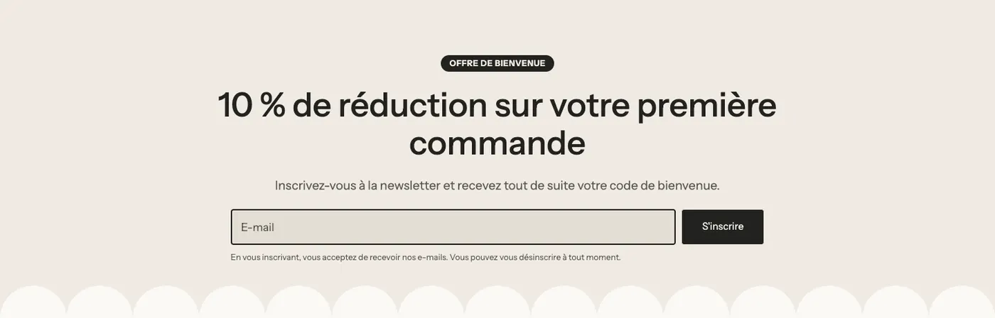
The Newsletter block signs your visitors up to your emails. Subscribers land in Shopify Customers, as marketing subscribers, with the tag of your choice.
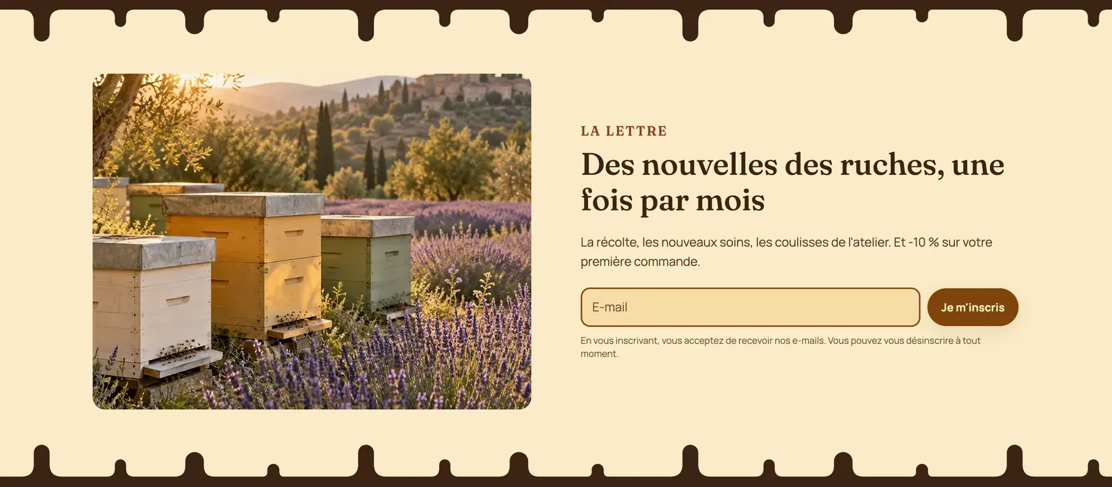
- Button: Arrow inside the field (default, understated, ideal in a footer), Next to the field or Below the field. Button text and Button style for the last two.
- Field label and Ask for the first name.
- Customer tags:
newsletterby default. Add one tag per source (footer,welcome-popup) to know where your subscribers come from. - Collect phone numbers for SMS: adds an optional phone field. The SMS consent checkbox becomes required as soon as a number is entered, and the Tag for SMS consent (
sms-consent) is added to the customer. - Marketing consent: None, Information text or Required checkbox.
- Confirmation message shown after signing up.
- Discount code to reveal: the code appears with a Copy button right after signing up.
Map
The Map block shows a Google Maps map of your store, with a directions link.
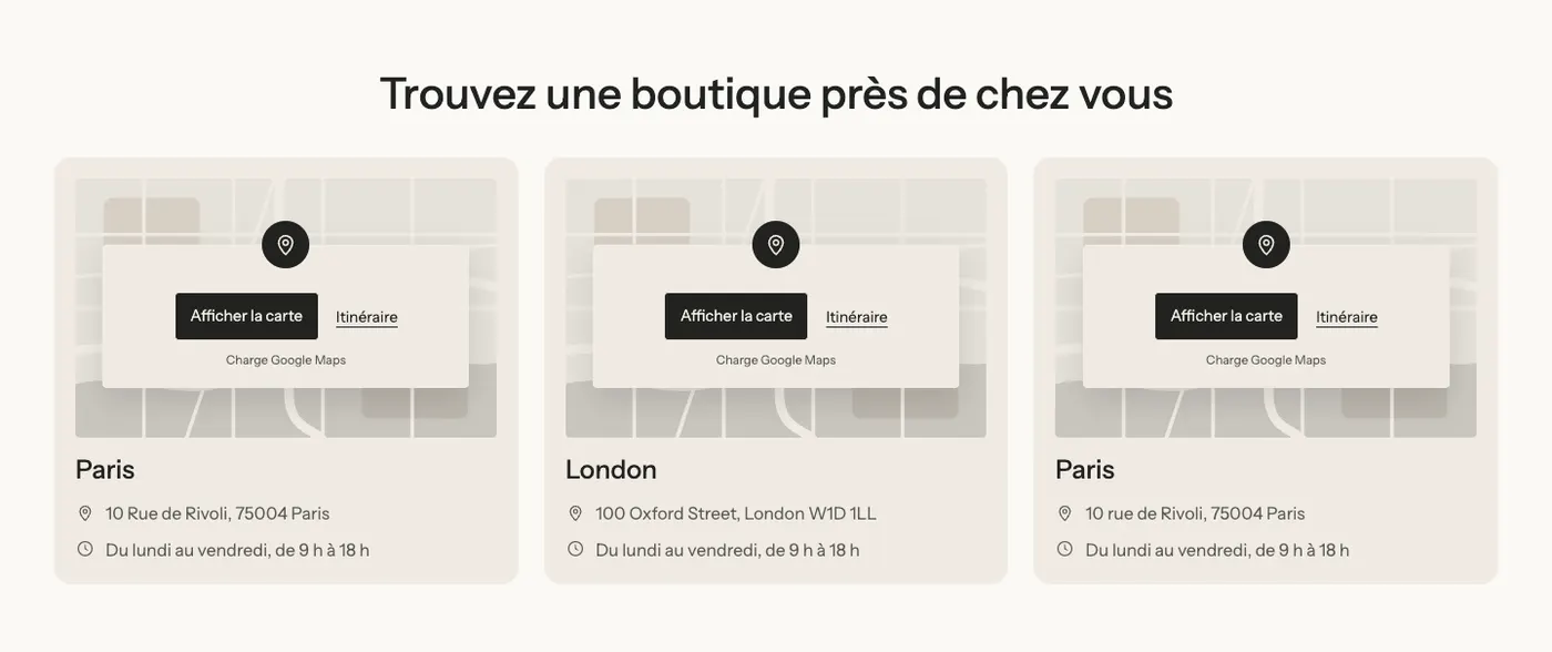
- Place Name and Address (empty = your store's address). Show the address on the map, Zoom (15 by default).
- Load the map automatically: unchecked by default. The map then only loads when the visitor clicks Show map: the page stays fast and nothing is sent to Google before that.
- Directions link and its Button style.
- Cover image: shown until the map loads. Without an image, an illustrated map in your theme colors is shown. Grayscale until hovered.
- Height (460 px) and Height on mobile (320 px), Corners, pin Color.
Order tracking
The Order tracking block lets customers track their package with their tracking number, without writing to you. Results come from the 17TRACK service, loaded only when the customer runs a search.
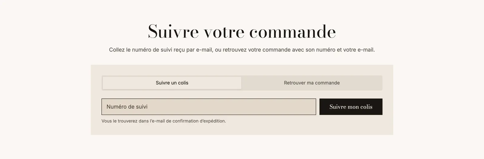
- Field label, Help text, Button text and its Button style.
- Button: Next to the field or Below the field.
- Let customers choose the carrier and Carriers to list (for example
USPS, UPS, FedEx; empty = all). - Remember recent searches on the customer's device.
- Display: Show a Find my order tab with its text, and List the recent orders of logged-in customers.
- Appearance: background (None, Color palette, Color), border, corners, Inner spacing, Shadow.

Close button
The Close button can only be added to a Popup. It's the "No thanks" under a sign-up form, or the "No, leave" button of an age verification.
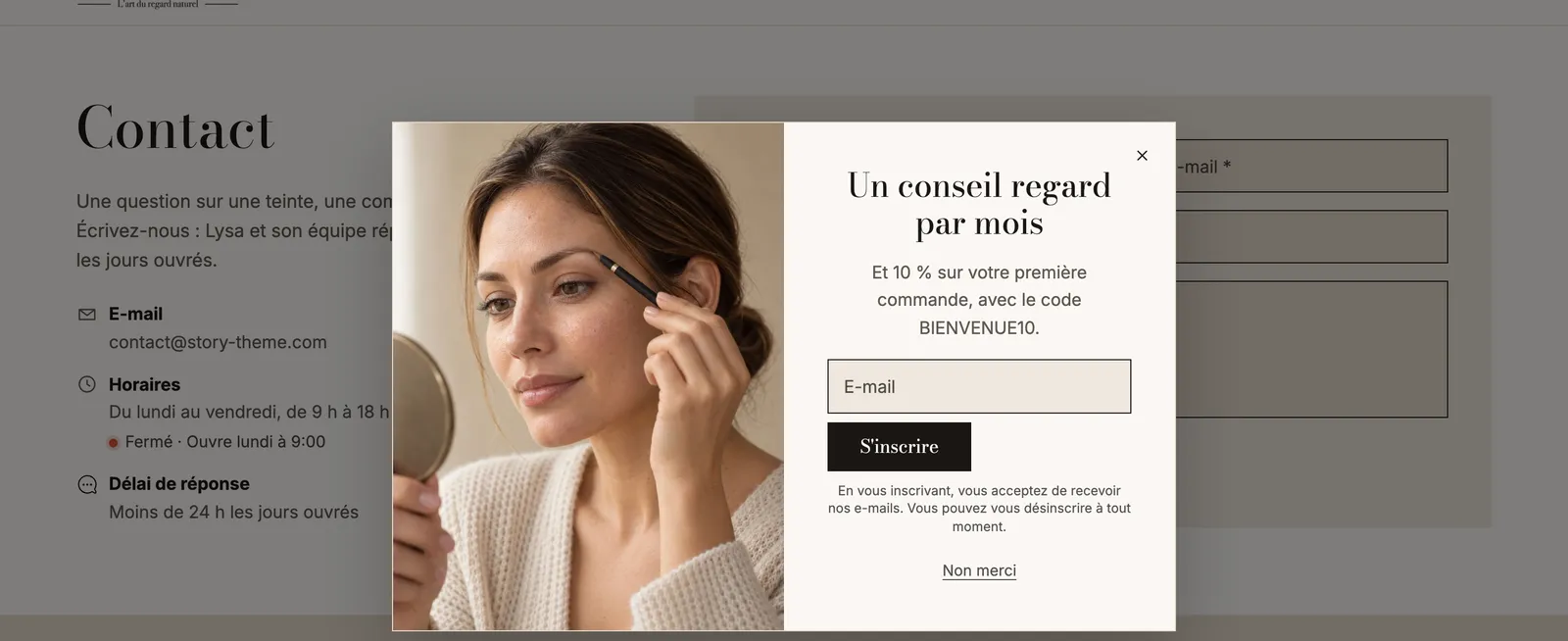
- Label: "No thanks" by default.
- Style: Link (discreet, the default) or a button style.
- Never show the popup again after this click: visitors who decline aren't asked again.
- Full width and Alignment.
It's essential when the popup is set to Require a choice before browsing: the X and the Escape key are then disabled, so this button is the only way out. See Popups.