
Product card, collection card and blog post card blocks
Build the cards in your product lists, collection lists and blog lists in the Story Theme: image, badges, price, swatches, rating, add button and more.
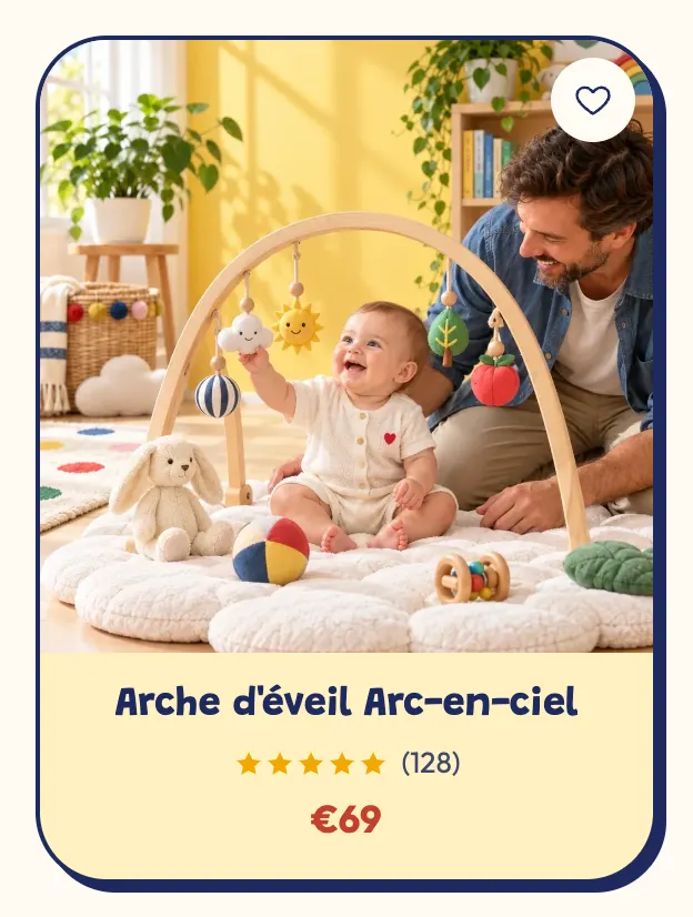
In the Story Theme, a product card isn't a fixed block: it's a small set of blocks (image, title, price, swatches, button…) that you compose once and that repeats for every product in the list. The same idea applies to collection cards and blog post cards.
These blocks don't appear in the general Add block list: they live inside a list's Product Card block (or Collection card, Blog post card).
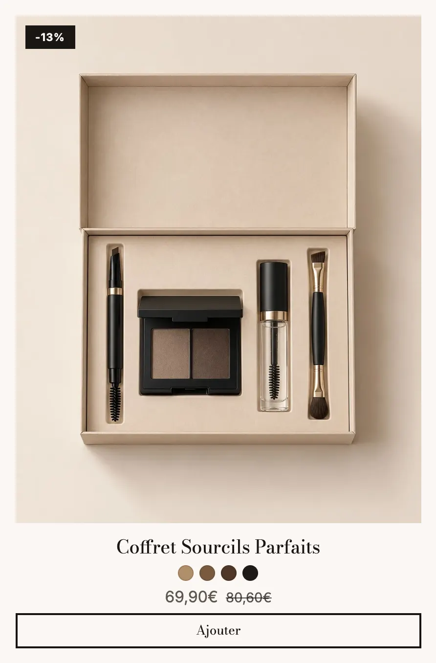
Where to set up the card
- Click Edit theme and open the page that holds the list (home page, collection, product page for related products…).
- In the section, expand the list block (Product list, a collection page's Product grid, Bundle builder…).
- Click Product Card: its settings open, and its sub-blocks appear below it.
- Click Add block under the card to add a title, a rating, a button… Drag the sub-blocks to change their order.
Product Card
The parent block, shared by every product in the list.
- [Layout] Layout (Stacked, Side, Text over the image), Media position and Media width (side), Vertical alignment, Overlay opacity (text over the image), Text alignment, Space between blocks, Space between media and content.
- [Appearance] Style (Theme, Standard, Card, Custom); with Custom: background, border, corners, spacing, shadow. Hover effect (Theme / None) and Make the whole card clickable.
Media
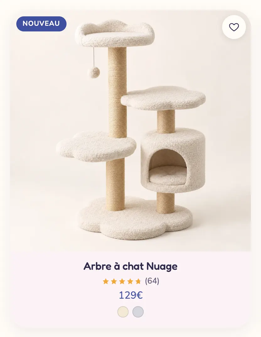
The product image, with its badges and buttons on top. It's a fixed sub-block: it's always there.
- [Media] Image ratio (Adapt to image, Portrait (4:5) by default, Portrait (3:4), Tall (2:3), Square, Landscape (4:3), Wide (16:9)), Image fit, On hover (None / Second image), Play the product video on hover, Browse the images in the card and Images per card, Corners.
- [Badge] Show badges: discount, sold out, and product tags starting with
badge-; Tag position. - [Button] Wishlist (the heart, visible if the wishlist is turned on in the theme settings), Quick add (None, Icon, Button; position, visibility On hover / Always visible, Plus, Bag or Cart icon, size, shape, colors), Quick view button.
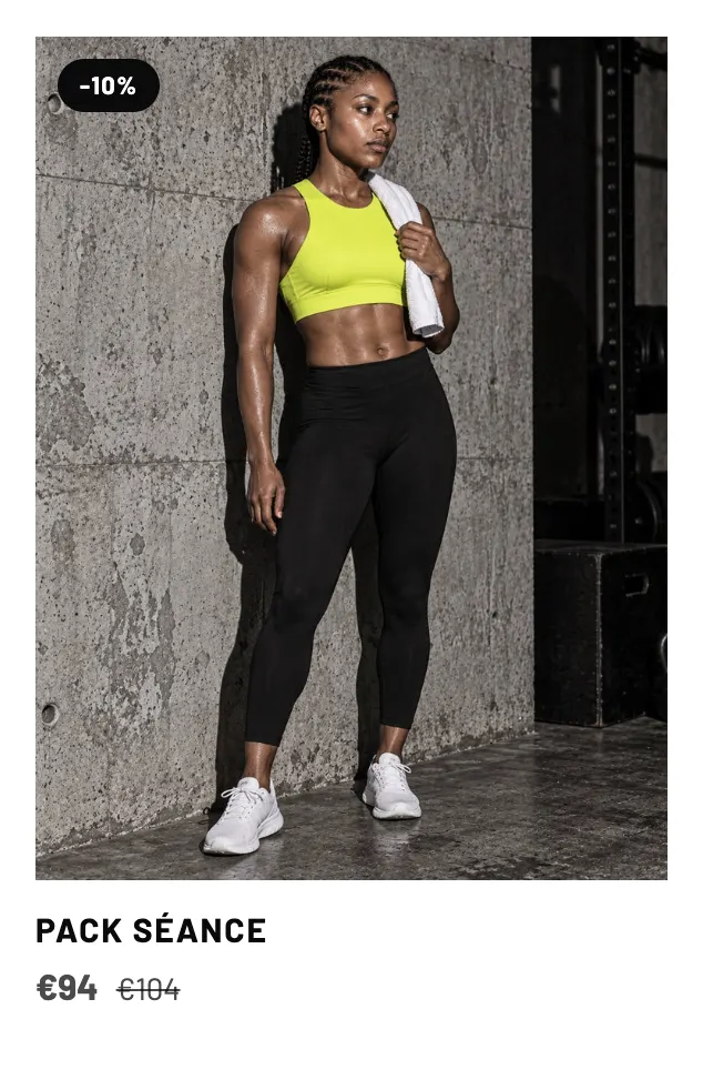
Quick add puts a button on the image: a product without options goes straight to the cart, a product with options shows its choices in the card. The Quick view button opens the product in a window, whose content is set up in the Quick view product template (see Quick view section).
Product title
Heading level (h2, h3, Paragraph), Font (Body / Headings), desktop and mobile sizes, Font weight, All caps, Maximum lines, Color, Hover effect (None, Underline, Color, Opacity).
Price
Show compare-at price and its position, Show discount badge (Percentage / Amount), Show unit price, Show "from" price (for products whose variants have different prices), Price color, Sale price color, sizes.
Swatches
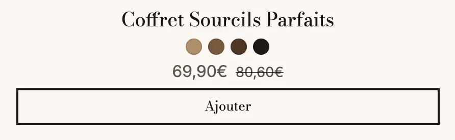
The product's colors or variants as small swatches.
- Option shown (empty = the first option with swatches or a color name), Show the variant image on hover, Swatch shape (Round, Rounded, Square), Swatch size, Number of items (5 by default).
Add to cart
A buy button under the card, with or without a variant selector. Two presets: Add to cart and Add to cart + variants.
- Button type (Theme, Add to cart, To product page, Open the quick view), Button text (
[amount]= the price,[percent]= the savings percentage), Show variant selector, Products with options (Choices over the card / Open the quick view). - [Variant selector] Position (Above the button / Beside the button), One list per option, Show prices in the list, style, corners and colors.
- [Style] Display (Button / Icon), Button style, Button size, Full width.
Rating
The stars and the number of reviews, read from your reviews app.
- Style (★★★★★ / 5★), Show the count, Show before the first review, Star size, Stars color (empty = the theme's star color).
You need a reviews app that saves the rating on the product, just like the Product rating block.
Stars
A rating you type yourself, or connect to a metafield to show each product's rating.
- Rating (4.8 by default), Show the rating number, Text beside the stars, sizes, Stars color and Empty stars colour.
Trustpilot
Trustpilot's green stars, with a rating you type or connect to a metafield, or the official widget.
- Trustpilot rating, Show the rating number, Show the Trustpilot logo, Text (for example "Excellent, based on 1,204 reviews"), sizes, Empty stars colour.
- Load the TrustBox widget with the Template ID and the Business unit ID, copied from Trustpilot Business. Each card loads its widget as it gets close to the screen.
Text
A free text, the same on every card or connected to a metafield for a text per product (tagline, volume, material).
- Text, Heading level, Font, sizes, Font weight, All caps, Maximum lines, Color.
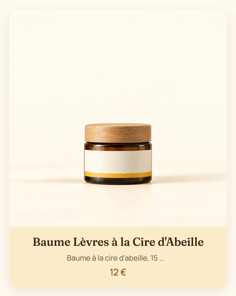
Vendor
The brand (Shopify's vendor field). Settings: sizes, All caps (on by default), Color.
Stock
A stock reminder on the card, based on the stock tracked by Shopify (products without tracking show nothing).
- Low stock from (10), Show when in stock, Show the count, text size.
Icon and text
A small icon + text line, for example "Free shipping". Settings: Icon (a truck by default), Text, sizes, spacing, colors.
Badge
A free-text badge in the card content (not to be confused with the automatic badges placed on the image).
- Text, Style (Filled, Soft, Outline), colors, Corners, Size, All caps.
Row
Arranges several sub-blocks side by side, for example the price on the left and the rating on the right. Drag the sub-blocks inside the row.
- Direction (Horizontal / Vertical), Horizontal alignment (Space between by default), Vertical alignment, Spacing.
Collection card
Used by collection lists: same idea, with its own sub-blocks.

- Collection card: Layout (Stacked, Side, Text over the image), Overlay opacity, alignments, spacing, Style (Theme, Standard, Card, Custom).
- Media: Image (empty = the collection image, then that of its first product), Image ratio (including Round), Image fit, Zoom on hover, Grayscale until hovered, Corners.
- Title: level, font, sizes, weight, All caps, max lines, Arrow after the title, color.
- Product count: Display (Text, Number, Badge), size, color.
- Description: Text (empty = the collection description), Maximum lines (2), sizes, color.
- Button: Button text, Display (Button, Link, Arrow), style, size, Full width.
- Row: arranges these sub-blocks side by side.
The collection card also accepts the Text, Icon and text, Stars, Badge and Trustpilot sub-blocks described above. See Collection list section.
Blog post card
Used by blog post lists.
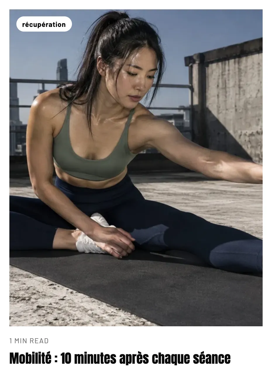
- Blog post card: same layout and appearance settings as the product card.
- Media: Image ratio (Landscape (4:3) by default), Image fit, Corners, Zoom on hover, Badge (None, Tag, Date).
- Title: level, font, sizes, weight, all caps, max lines, color, hover effect.
- Date and author: Show date, Show author, Show reading time, Show the number of comments, Date format, Separator, icons, size, All caps.
- Excerpt: Maximum lines (3), sizes, color.
- Tags: Number of items, Style (Pills, Outline, Plain), size, all caps.
- Link: Label and Style (Arrow by default, Link, or a button style).
See Blog posts section.
Tips
- Three or four pieces of information are enough on a card: image, title, price, and a single proof point (rating or swatches). Each extra sub-block weighs down the grid on mobile.
- Keep the same Image ratio on every card in a store: a grid with even heights reads better.
- Test Quick add on a product with options: customers should be able to pick their size without leaving the list.