
Blog and customer account blocks: article, table of contents, login
The Story Theme Blog blocks (title, info, table of contents, sharing, author, navigation, comments, blog posts) and the customer account page blocks.
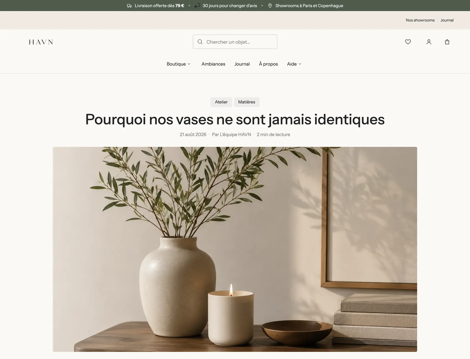
A Story Theme article page isn't a fixed block of text: the title, the date, the image, the content, the table of contents, the share buttons or the author box are all blocks you place, adjust or hide. This page describes the blocks in the Blog category, then those in the Customer account category and the password page button.
At the end of their panel, all these blocks have Show on (Desktop and mobile, Desktop only, Mobile only), the Sizing group and, for most of them, Alignment, Mobile alignment and Animations. They aren't repeated below.
Article title
The article's title, pulled in automatically.
- Heading style (Style 1 to 3, or None) and Show separator line (checked by default).
- Bold: when unchecked, only the words set in bold in the title stay bold.
- Custom font size (48 px on desktop, 32 px on mobile by default) and Title color.
Article info
The information line under the title: date, author, reading time.
- Show date, Show author, Show reading time (checked by default) and Show the number of comments. Reading time is calculated from the article's length.
- Date format: Full date, Short date or Numbers only.
- Separator (Dot, Vertical bar, Slash, None) and Show icons.
- Text size, Uppercase, Color.
Article image
The article's featured image, the one you choose when writing the article in Shopify.
- Image ratio: Adapt to image, Wide 16:9 (default), Landscape 4:3, Square, Portrait 4:5.
- Corners: Theme, None or Custom.
- Edge to edge on mobile: the image takes the full width of the phone screen.
Like the Group and Image blocks, this block offers On scroll animations (parallax, zoom, reveal…) in its Animations group.
Article content
The article's text, as you wrote it in Shopify.
- Maximum text width: 720 px by default. A shorter line of text is easier to read.
- Custom font size (18 px on desktop, 16 px on mobile by default).
- Large first letter: the article's first letter in large type, magazine-style.
Table of contents
A table of contents built from the article's subheadings. Each entry leads to its part, and the entry for the part being read is highlighted.
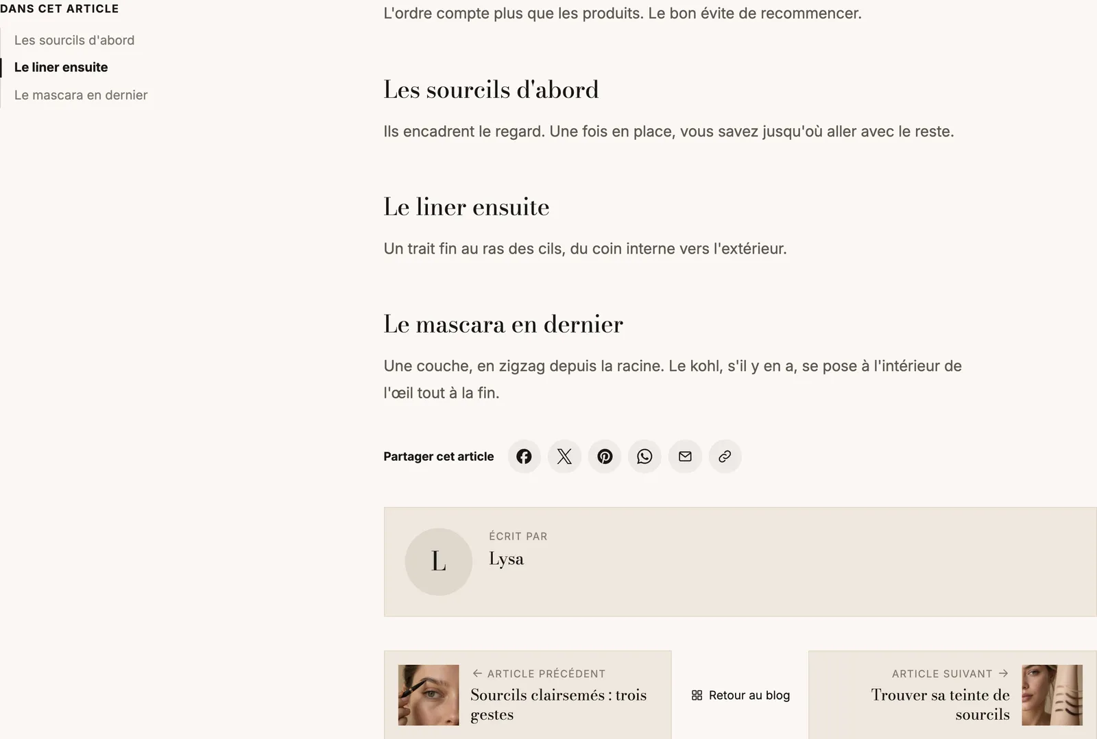
- Title: "In this article" by default.
- Headings listed: H2s only, or H2s and H3s.
- Style: Plain, Line (default) or Card. Numbers in front of each entry.
- Keep visible while scrolling: the table of contents stays on screen while reading (checked by default).
- On mobile: Collapsed (default), Expanded can be collapsed or Always expanded.
Article sharing
Buttons to share the article on social media.
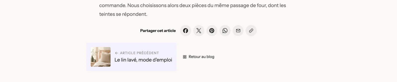
- Show text and its Label ("Share this article").
- Share buttons: Facebook, X (Twitter), Pinterest, WhatsApp, Email and Copy link, or share menu on phones are checked by default; LinkedIn needs to be checked.
- Display (Icons, or Icons and names), Icon shape (Round, Rounded, Square, Outline, None), Icon colors (Theme or Brand colors), Icon size.
Article tags
The article's tags, each leading to the list of articles that have it. On the blog page, the same block shows all the blog's tags, preceded by an "All" link: it then works as a filter.
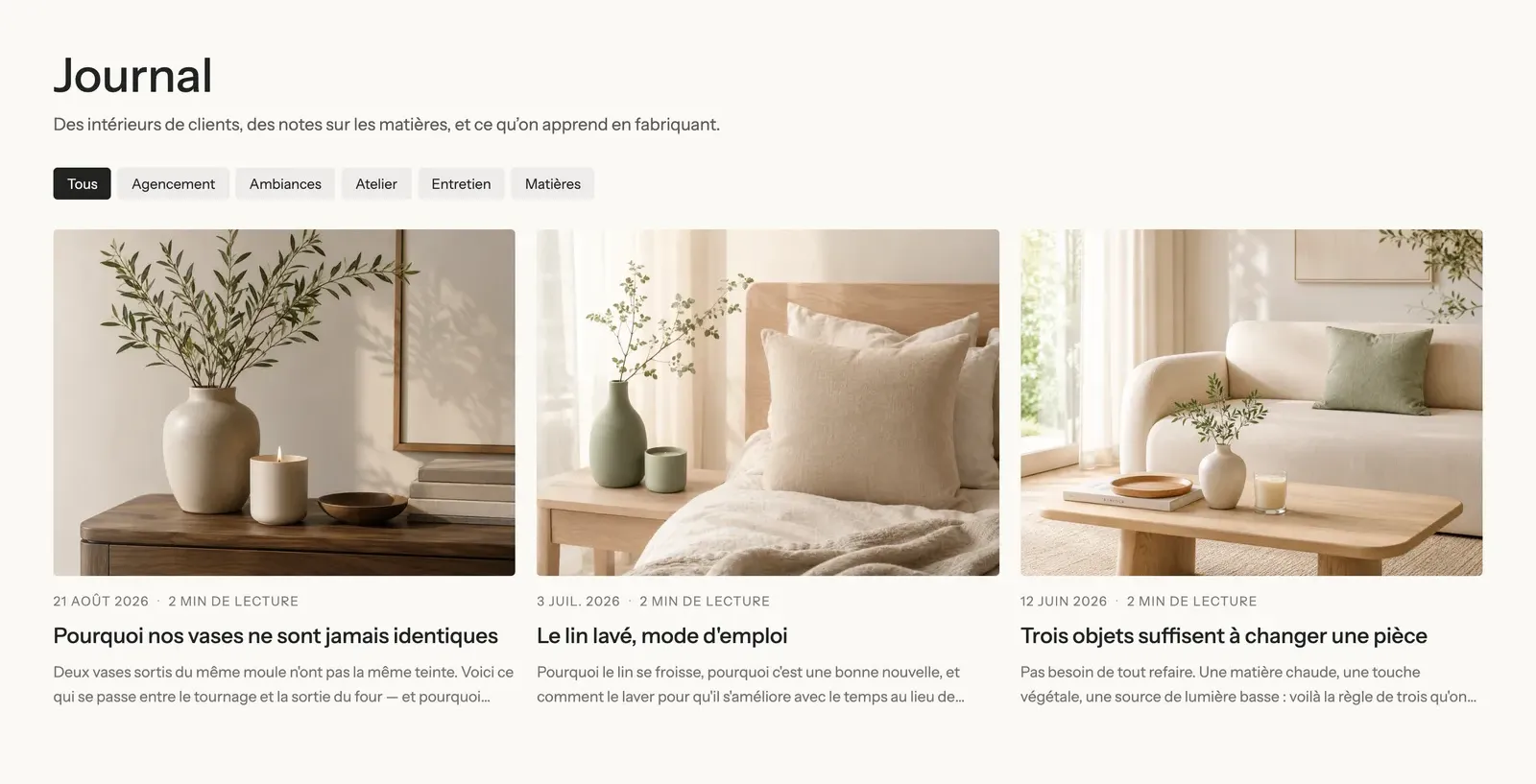
- Optional Label in front of the tags.
- Style: Pills (default), Outline or Plain. Text size, Uppercase.
- Carousel on mobile: the tags scroll on one line instead of wrapping.
Author box
A box that introduces the article's author, at the end of the article.
- Title: "Written by" by default.
- Photo and Custom image: if empty, the photo comes from the Shopify staff account that published the article. Photo size (80 px).
- Text: the bio. If empty, it also comes from the staff account.
- Layout (Horizontal or Vertical) and Style (Plain or Card).
Article navigation
Links to the previous and next article, at the end of the page.
- Show featured image for each article.
- Style: Plain or Card.
- Show a back link to the blog.
Comments
The list of comments and the form to leave one. The block only appears if comments are turned on in the blog settings, in Shopify. On a moderated blog, a new comment waits for your approval before being published, and the customer is told so.
- Number of items per page (10).
- Style (Plain or Card) and Button style.
Blog posts
A list of articles: on the blog page, on the home page, under an article ("Read next").
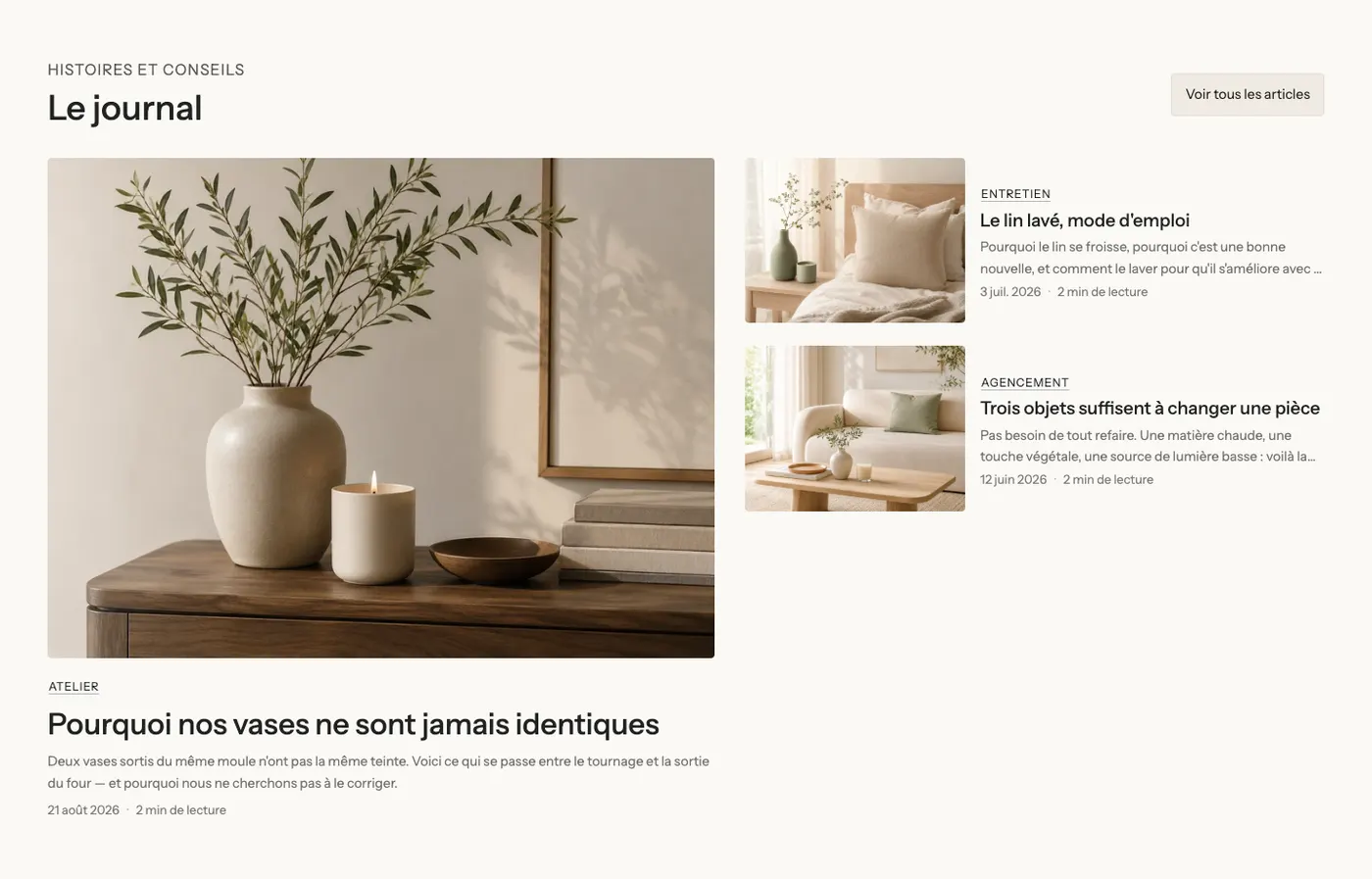
- Source: Blog (all the articles in a blog) or Articles chosen one by one. Empty Blog = the page's blog, otherwise the blog with the handle
news. - Only articles with this tag: for a "Tips" or "Recipes" list.
- Number of items (3 by default, up to 24).
- Hide the article of the page: on an article page, the article being read isn't suggested, and those that share its tags come first.
- Page navigation on the blog page: Numbers, Load more button or None.
- "View all" card: a last card that leads to the blog, with its text and colors.
- Layout: Grid, Carousel, Bento or Featured article, with the columns, spacing and carousel controls shared by every list in the theme.
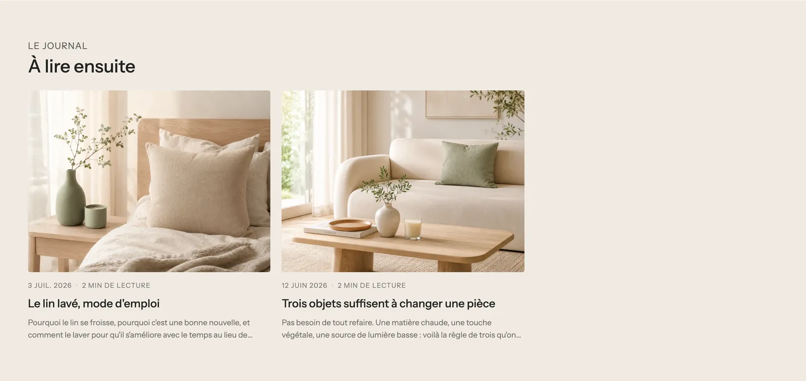
Each article in the list is a Blog post card, whose elements (Media, Title, Date and author, Excerpt, Tags, Link) are described in Product card blocks.
Customer account blocks
The Customer account category groups the account page blocks: Login form, Registration form, Account activation, Password reset, Account details, Address book, Order history and Order details.
Login form, Registration form, Account activation and Password reset
The four account access forms share the same settings: Show title, Content max width (440 px), Style (Plain or Card), Button style, Full width button. The Registration form adds Marketing consent (checked by default): a checkbox to sign up for your emails when creating an account.
Account details
The account home page: Show title, Greet logged-in customers by their first name, Addresses and Style.
Address book
The customer's saved addresses, which they can edit: Show a back link, Show title, Columns (2), Style, Button style.
Order history and Order details
The list of orders (Show product image, Number of items per page, Style, Button style) and the details of an order (Show a back link, Show product image, Addresses, Style).
Password
The Password block only exists on the password page, the one visitors see while your store is protected (before launch, for example). It's the link that lets you enter the password to access the store.
- Button text and Style (Link by default, or a button style).
- Position (Top or Bottom) and Alignment (Right by default).
By default, the password page also contains your logo, a heading, a text, a countdown, a newsletter and your social media: enough to announce a launch and collect emails in the meantime. See System pages section.