
Offer blocks: quantity breaks, add-ons and bundles
The Story Theme Offers, Add-ons, Purchase options and Bundle builder blocks, their presets and their settings, with real examples.
Offer blocks turn a product page into an upsell showcase: discounts for buying several, "buy 2, get the 3rd free", bundles, complementary products to check, subscription, or a bundle the customer builds. You'll find them under Add block, Offers category, inside the Product page section, the Featured product section and the Quick view template. The Bundle builder, for its part, is in the Products category.
Add an offer block
- In Online Store > Themes, click Edit theme.
- In the top menu, open Products > Default product (or the product template you want).
- In the Product page section, hover over the buy column and click Add block.
- Choose the Offers category, then the block or one of its presets (for example Quantity breaks).
- Drag the block above the Buy buttons block, then click Save.
Offers
The Offers block presents several purchase choices as cards: a single item, a duo, a trio, a pack, an offer with a gift. Each choice is an Offer sub-block. It comes in three presets: Quantity breaks, Buy X get Y and Packs.
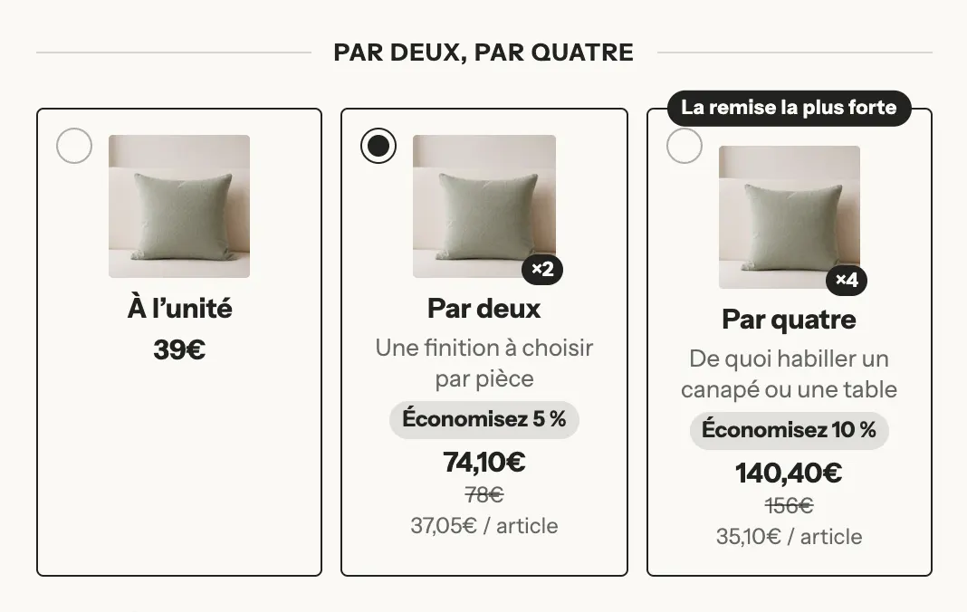
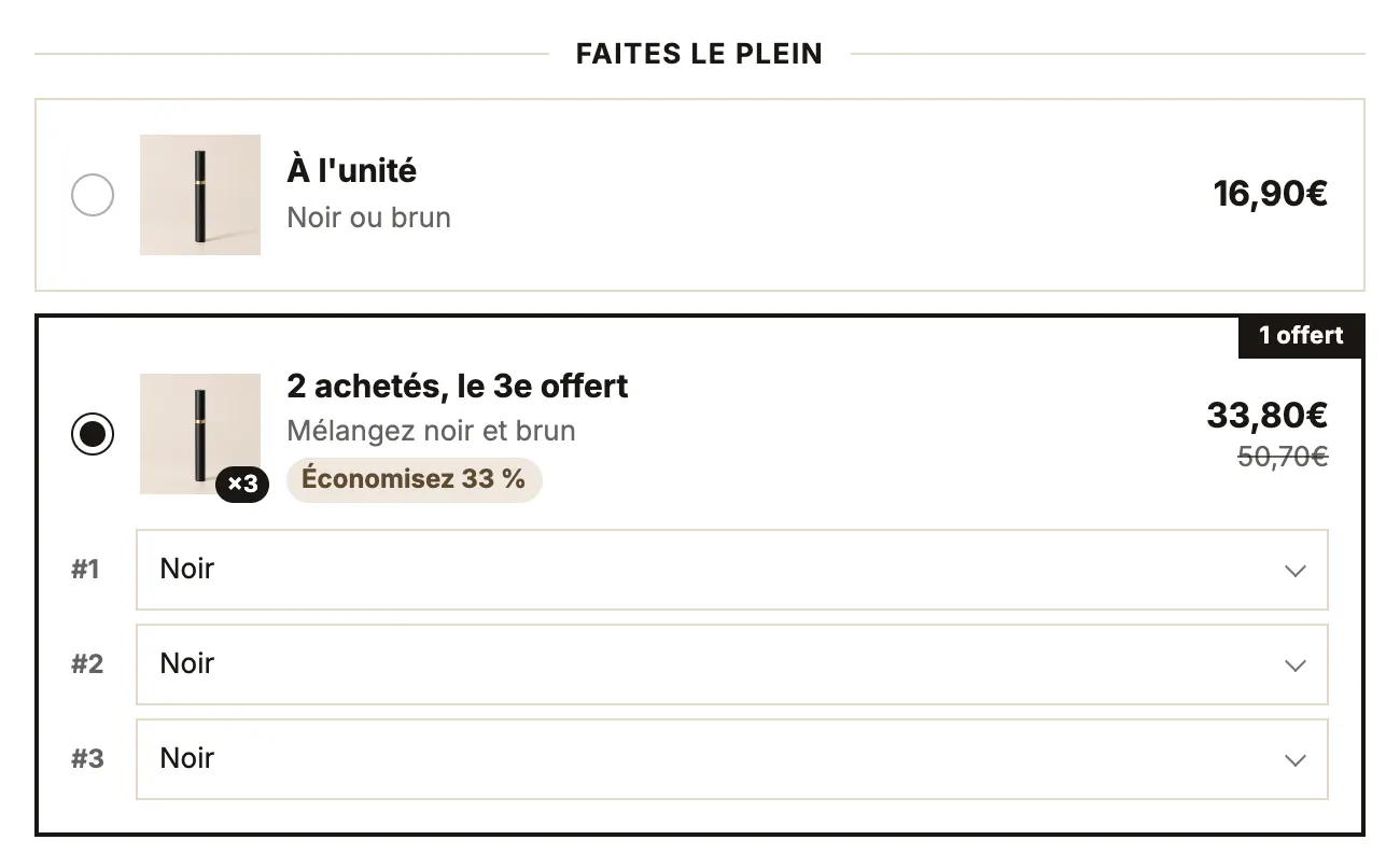
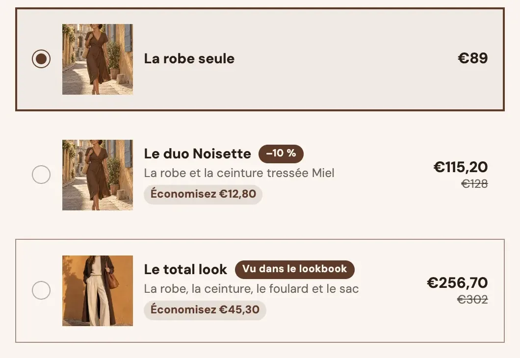
Block settings:
- [Layout] Title and Heading style (With lines / Plain); Layout: List (default), Grid, Carousel or Compact, with Columns and a separate Layout on mobile; Offer details (Selected offer only / Always); Show variant selector (the customer picks the size or color of each item in the offer).
- [Card] Style (Outline, Filled, Shadow, Minimal), Selection mark (Radio button, Checkmark, None), Badge position, Image size, Price position, Show compare-at price, Savings (Percentage, Amount, None), Show the price per item.
- [Appearance] corners, border, spacing, title and price sizes, and eleven colors (empty colors follow the palette).
- [Behavior] Sync the quantity selector (on by default: the quantity follows the chosen offer), Unavailable offers (Show as sold out / Hide), Name the offer on cart lines.
The Offer sub-block
- [Content] Title (variables
[quantity],[free],[price],[compare_price],[unit_price],[savings],[percent]), Subtitle, Badge, Image, Highlight this offer, Selected by default. - [Offer] Quantity (1 to 20), Discount (None, Percentage, Amount off each item, Amount off the offer, Price of the offer) and its Value, Free items and Discount on free items, Linked option value (sells the variant carrying this value, for example
Pack of 3), Purchase type. - [Products included] other products added with the offer (the "full look" above), their quantity, and whether they count toward the discount.
- [Gifts] Gift products, added as a gift under the product's line, and their discount.
- [Discount at checkout] Discount code, applied to the cart when the offer is added (leave empty if an automatic discount applies).
Add-ons
The Add-ons block offers to add other products along with the one on the page: gift wrapping, accessory, warranty, choice of gift. Each product offered is an Add-on sub-block. Presets: Add-ons, Bought together and Choose a gift.
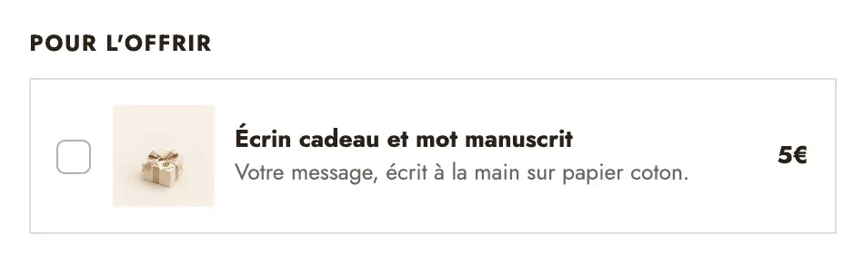
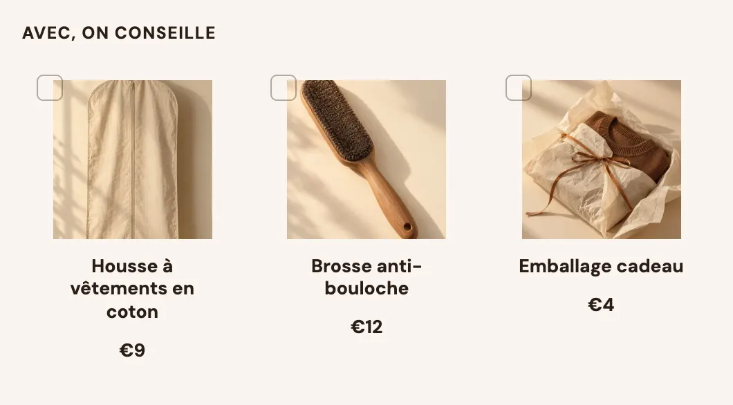
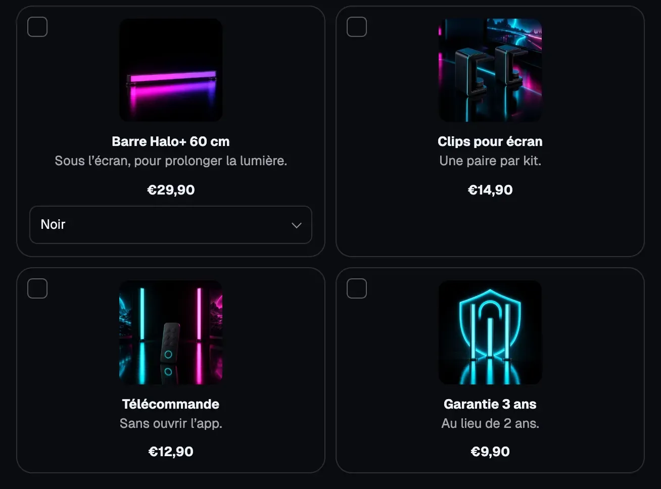
The Bought together layout shows the page's product and its add-ons side by side, with a total and a button that adds everything at once:
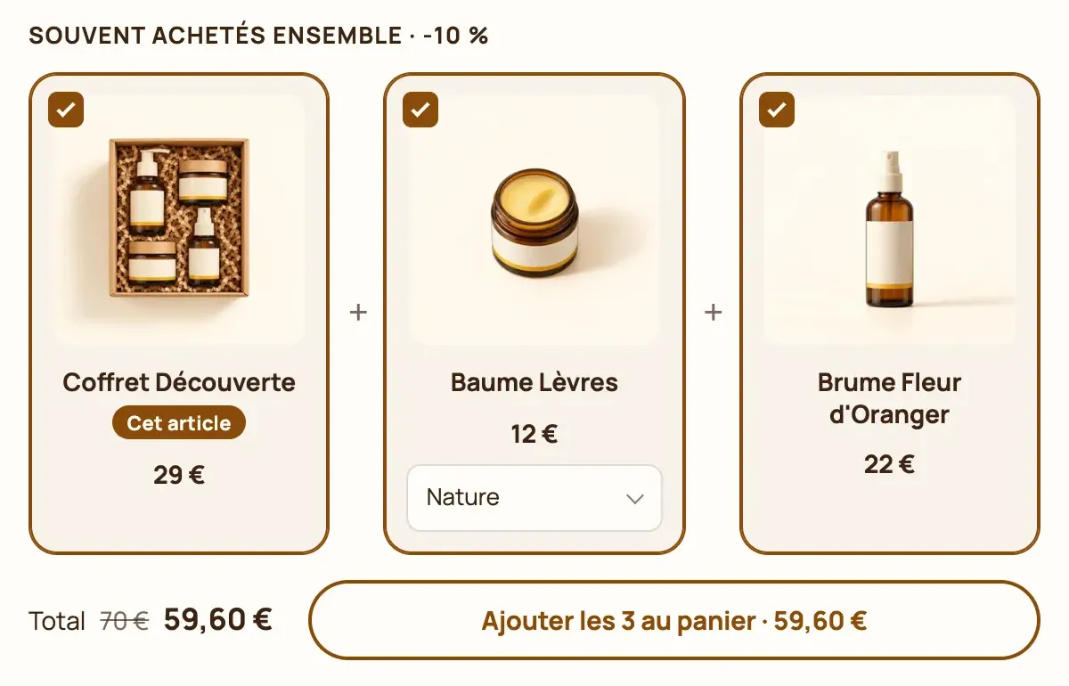
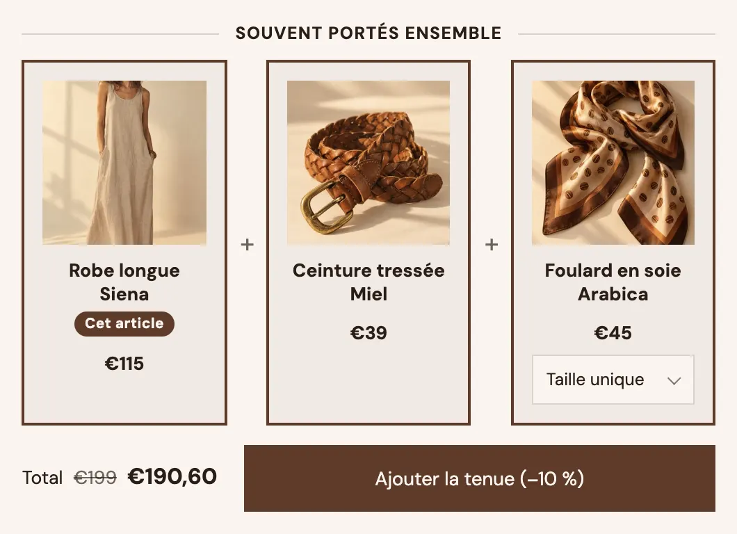
Block settings:
- [Layout] Title, Heading style, Layout (List, Cards, Bought together), Columns and Columns on mobile (with cards), Selection (Several, One only, All included), Show variant selector.
- Add to cart: With the product's button (default, checked add-ons go with the buy button) or Separate button (the block has its own button; settings Include this product, Button text with
[count]and[price], Style). - [Discount] Discount (None, Percentage, Amount off each item, Amount off the offer, Price of the offer), Value, Minimum add-ons selected, Discount code.
- [Card] and [Appearance]: style, image size, corners, borders, spacing and colors.
Add-on settings: Product, Title, Description, Image, Badge, Selected by default (leave paid add-ons unchecked: the customer chooses them), Quantity of each product (One / Same as the product quantity), Remove it with the product (nested under the product's line in the cart) and Discount shown (100% shows it as free).
Purchase options
The Purchase options block lets customers choose between a one-time purchase and a subscription, with the delivery frequency. It reads the selling plans from your subscription app (Shopify Subscriptions, Recharge, Seal, Appstle…). Without an app or a plan on the product, it shows nothing on the storefront; the editor shows two sample frequencies.
- [Layout] Layout (Cards, Segmented, Switch, Dropdown), Selected by default (One-time purchase / Subscription; Shopify recommends one-time purchase), Show the subscription first, Frequency picker (Buttons, List with prices, Dropdown; with five frequencies or more, it's always a dropdown).
- Texts: One-time purchase label, Subscription label, Show the savings badge and Badge text (
[percent],[amount]), Show the plan description. - [Card] and [Appearance]: same settings as the Offers block.
Blocks you add inside (the preset contains a Checklist) show under the subscription: handy to list its benefits.
Bundle builder
The Bundle builder block (Products category) lets customers build their own bundle: they pick products one by one, see their progress toward the discount tiers, then add everything to the cart. It also exists as a section, detailed in Bundle builder section.
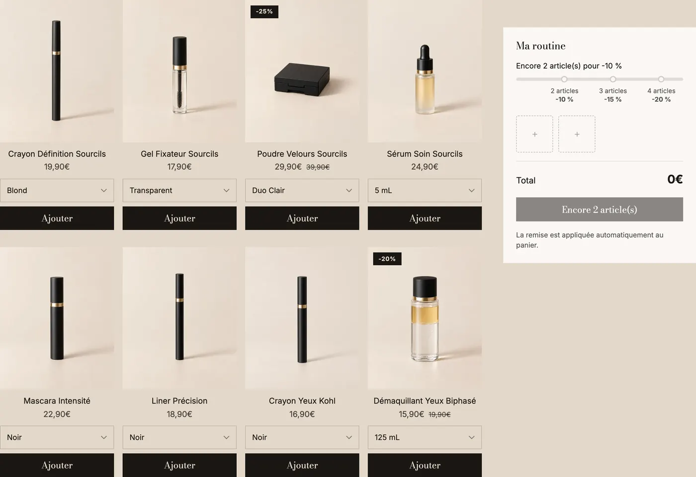
- [Products] Source (Collection / Chosen products), Number of items, Hide sold out products, Show variant selector.
- [Quantity] Minimum items (3 by default), Maximum items and Maximum of the same product (0 = no limit), Bundle name in the cart (saved on each line, invisible to customers).
- [Layout] Grid or Carousel, columns per screen, spacing, carousel controls.
- [Summary] Summary position (Right, Left, Bottom), Width, Show the summary first on mobile, Sticky bar on mobile (progress, chosen items and button stay visible).
Products in the grid use a Product Card block, set up like in any list: see Product card blocks.
Summary
The Summary sub-block shows the bundle slots, the total and the button.
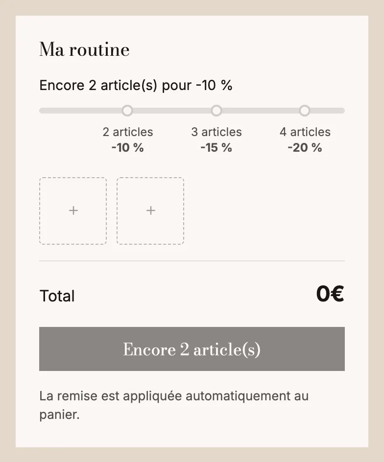
Settings: Title, Show compare-at price, Savings, Button text ([count] and [price]), Button style, Text under the button, Keep visible while scrolling, and its appearance (background, border, corners, spacing, shadow).
Progress bar and Tier
The Progress bar shows the discount tiers: Progress message ([amount] for what's left, [reward] for the next reward), Message once everything is unlocked, Show thresholds, thickness and colors. Each Tier has a Quantity, a Discount in % and a Label.
Tips
- Use one family of offers per product page: Offers cards and add-ons and a subscription on the same product overwhelm the customer.
- Highlight the offer you want to sell with Highlight this offer and a short Badge ("Most popular"), rather than selecting everything by default.
- Test each offer with a real add to cart, then check the total at checkout: that's where you'll spot a missing discount.
- On mobile, prefer the List or Compact layout as soon as you have more than three offers.