Media blocks: image, video, gallery, stories and before / after
Every block in the Story Theme Media category: image, icon, video, gallery, scrolling images, stories, customer photos, before / after and floating pictogram.
Media blocks show your photos and videos, from a simple image to an Instagram-style gallery. Like every block, they combine with headings, text and buttons in any section.
These blocks share Show on (Desktop and mobile / Desktop only / Mobile only), the block width (Sizing) and Animations. On the Image block, the animation menu also offers On scroll effects (Fade, Rise, Zoom in, Parallax, Reveal from the bottom, Blur).
Image
The Image block shows a photo, with or without a link.
- Image and Link. If the image has a link, the Link accessibility label is read by screen readers when the image has no alt text.
- Image loading: Automatic (immediate in the first section, deferred after that), Immediate or Deferred. Choose Immediate for an image visible as soon as the page opens.
- Sizing group: width (including Custom width in twelfths or Fixed width in pixels), Image height (Adapt to image, Small, Medium, Large), Corner radius, Edge to edge on mobile (on by default: the image touches the screen edges) and Add margins.
Icon
The Icon block shows a pictogram from the theme's icon library (a leaf by default, but also a truck, padlock, heart, star, recycling…) or your own image in Custom icon (ideally an SVG or a square PNG).
- Size: 40 px by default.
- Color: empty = text color.
- Link: the icon becomes clickable.
Video
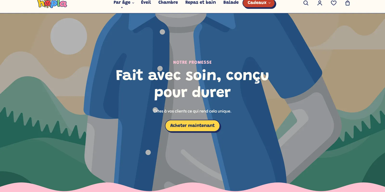
The Video block plays a video uploaded to Shopify or a YouTube or Vimeo video. It comes in two versions: Video (a player) and Background video (a muted background video, with a heading and a button on top).
- Media group: Style (Player or Background video), Video, YouTube or Vimeo (used only if no Shopify video is chosen), Video on mobile, Cover image and Video alt text.
- Player Controls group: Autoplay (muted, as soon as the video is on screen), Enable video looping, Play button (Solid circle, Frosted glass, Outline, With text) and its Size. For background videos: Show a pause button on videos and Show a sound button.
- Layout group: Aspect ratio (Adapt to the video, Wide (16:9), Vertical (9:16), Square, Portrait (4:5), Portrait (3:4), Fill the height, Height in % of the screen) and Aspect ratio on mobile, Fill mode (Fill or Contain), Color palette and Corners.
- Content over the video group: blocks added inside the video show on top of it; set their alignments, the Content max width and the Overlay opacity.
Gallery
The Gallery block presents several photos or videos. Each Media sub-block holds an Image or a Video, an optional Text and a Link.
- Layout: Grid, Masonry (free heights, Pinterest style), Carousel or Bento. Columns on desktop (3), on tablet (2) and on mobile (1.25), gaps between columns and rows.
- Controls group (in carousel): arrows, pagination, autoplay.
- Media group: Image ratio (Adapt to image, Portrait, Square, Landscape), Text position (Bottom or Text over the image), Enlarge on click (opens a full-screen viewer), Zoom on hover and video Autoplay.
Scrolling images
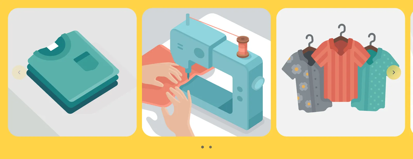
The Scrolling images block scrolls a row of images continuously. Add one Scrolling image sub-block per image (with an optional link): they scroll in the order you arrange them.
- Image ratio (Adapt to image, Portrait, Square, Landscape), Image sizes and Width on mobile (0 = same size as on desktop), Gap and Corner radius.
- Grayscale until hovered: ideal for a row of logos.
- Layout group: Delay (16 s), Direction and Pause on hover. Edge to edge lets the row extend past the section margins.
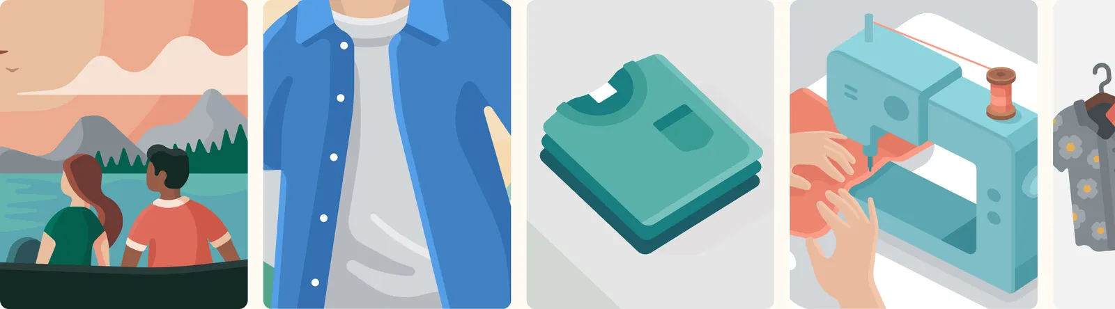
Photo and video stories
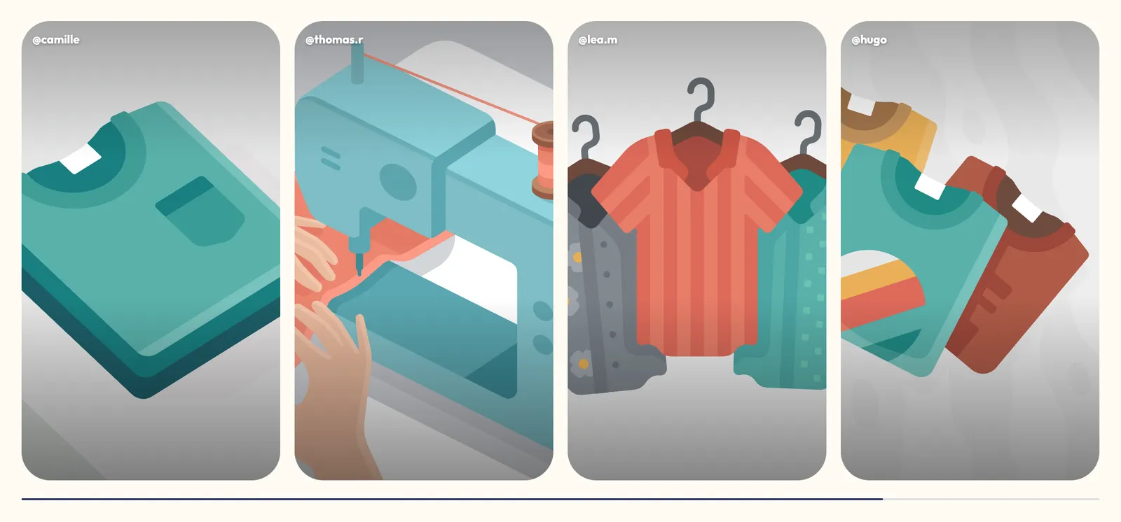
The Photo and video stories block recreates Instagram bubbles: a click opens a full-screen viewer that plays the stories one after another. Each Story sub-block has an Image or a Video, a Title, a Product and a button (Button text, Link).
- Shape (Round, Rounded, Portrait) and Outline (the ring around the bubble: Gradient, Accent or None).
- Size (84 px) and Size on mobile (68 px), Spacing, Alignment, Show titles.
- Duration: 6 s per image; videos play to the end.

Customer photos & videos
The Customer photos & videos block shows your customers' photos, like an Instagram feed. Each Customer post sub-block holds an Image or a Video, an Author, a Text, a Product (buyable from the viewer) and a Link.
- Layout: Grid or Carousel, with Columns on desktop (5 by default), tablet (3) and mobile (2).
- Media group: Image ratio (Square, Portrait, Vertical (9:16), Landscape), Enlarge on click, Zoom on hover, video Autoplay.
Before / after
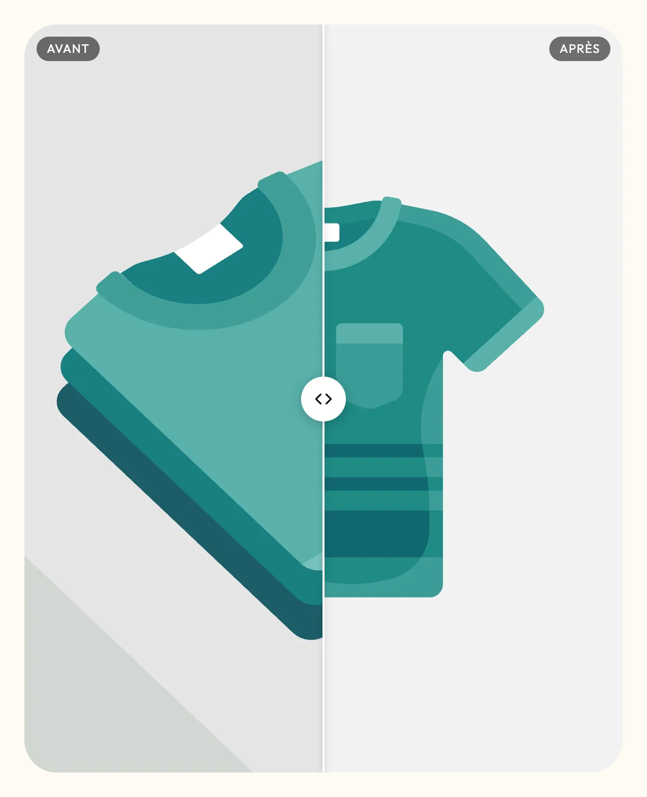
The Before / after block overlays two images separated by a slider the customer drags. Perfect for skincare, a renovation, a retouch.
- Image before and Image after: use the same framing for both.
- Labels group: Before and After texts and their Position (Top or Bottom).
- Layout group: Direction (Horizontal or Vertical), Image height (Adapt to image, Small, Medium, Large, Square, Portrait, Landscape), Start position (50%), Move the handle when it comes into view and Corner radius.
- Appearance group: Customize colors of the line, the slider background and the arrows.
Floating pictogram
The Floating pictogram is a decoration placed freely on the section: a sun, a star, a cloud… It takes no room in the layout and is positioned in percentages.
- Media: Image (animated GIF, WebP and SVG files stay animated) or Lottie animation: upload the JSON file to Content > Files, paste its link in Lottie file link, then choose the Playback (Loop; Once, when it appears; Follows the scroll).
- Distance from top and left: Top and Left in %, with separate values on mobile. Rotation and Width (72 px), also adjustable for mobile.
- Motion group: Continuous motion (Rotation, Reverse rotation, Float, Swing, Pulse, Bounce) and its Cycle duration, Scroll effect (Parallax, Sideways drift, Rotation, Zoom) with its Strength, Pointer parallax on desktop.