
Search and filter blocks: collection pages and results
The Story Theme collection and search page blocks: banner, filters, sorting, product count, grid density, grid, promotion tile and tabs.
The Story Theme collection pages and search results page are built with blocks: a banner, filters, sorting, the product grid… You can move them, hide them or change how they look to fit the page to your catalog. This page describes each block in the Search and filters category, along with the Collection banner.

The number of products per page, the columns and the Pagination style (Numbers, Load more button or Infinite scroll) aren't in these blocks: they're set on the section itself. See Collection and search section. Almost every block below also has Alignment, Mobile alignment, Show on and the Sizing group.
Collection banner
The top of the collection page: the collection's title and description, with or without an image.
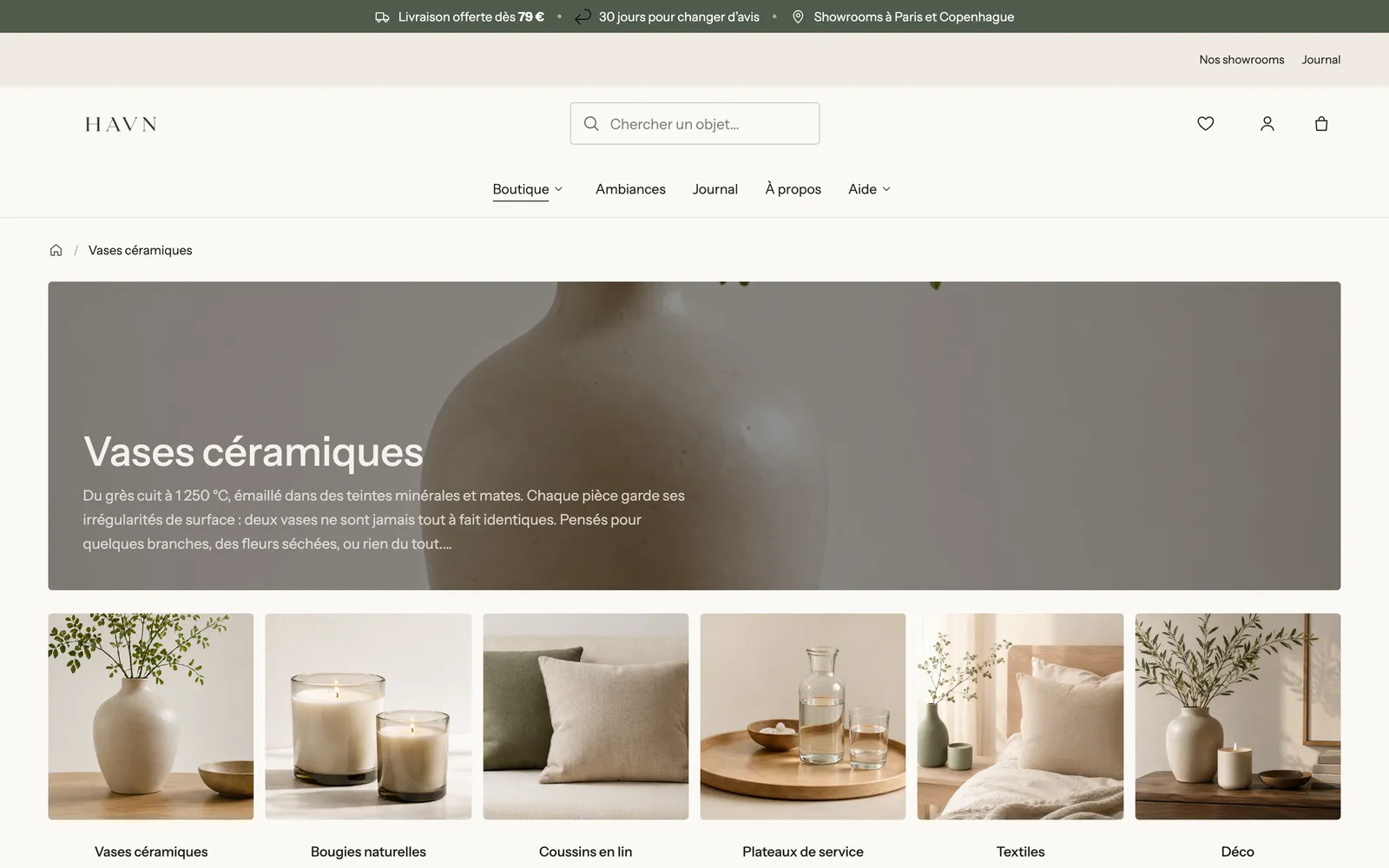
- Image: None (text only, like on Narvo), Content over the media (like on Havn) or Media beside the content. By default the image is the collection's own (set in Shopify under Products > Collections); you can choose a different one.
- With the media beside the content: Media position, Media width (45%), Image ratio and Mobile layout.
- With the content over the media: Height (360 px) and Height on mobile, Overlay opacity (35%), Color palette, Inner spacing.
- Content: Alignment, Vertical alignment, Content max width (760 px), Spacing.
Title and Description
The banner's two sub-blocks. Title: Heading style (Style 1 to 3), Show separator line, Bold, size and color. Description: Maximum lines (3 by default, 0 = all the text), Maximum text width, size and color. A long description therefore stays discreet at the top of the page. The banner also accepts other blocks (a button, a badge…).
Filters
The Filters block shows the collection's filters: availability, price, size, color, brand… The filters themselves are chosen in Shopify's free Search & Discovery app; the block handles how they look.
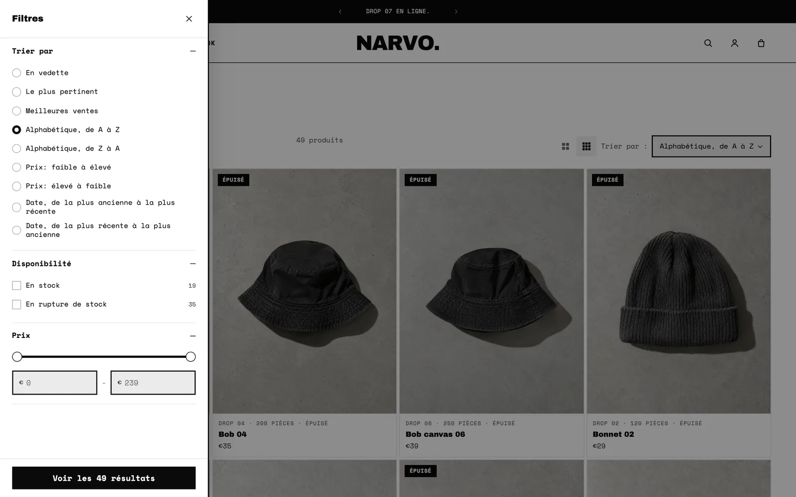
- Layout: Sidebar, Horizontal (a bar above the grid) or Drawer. Below 990 px wide, filters always open in a drawer.
- Keep visible while scrolling (sidebar) and Groups open when the page loads (3 by default, 0 = all closed).
- Drawer Position (Left or Right) and Show sorting in the drawer.
- Show the count of products per value, Values shown before Show more (6).
- Swatch shape (Round or Square) for color filters.
- Filters shown as buttons: the names of the filters to show as buttons rather than checkboxes, separated by commas, for example
Size, Shoe size. Ideal for sizes.
Filter button
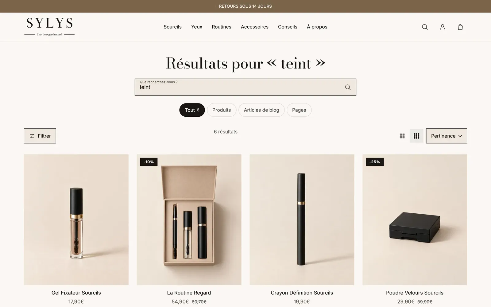
The Filter button that opens the filters in a drawer. It's hidden when there's nothing to filter, and on desktop when the filters already show as a sidebar or a bar. A counter shows the number of active filters.
- Style: Field (default), Text, or one of the theme's button styles.
- Label and Icon.
Active filters
The filters the customer has chosen, as pills: clicking the X removes a filter, Clear all removes them all.
- Show the label: shows the filter name before its value ("Availability: In stock").
Sort
The Sort by menu: relevance, best selling, price low to high or high to low, alphabetical, date.
- Style: Field (a boxed dropdown list) or Text (more discreet).
- Show the label "Sort by".
A collection's default order is chosen in Shopify, on the collection's page.
Product count
The number of products shown: "49 products", or "15 of 49 products" when a filter is active.
- Text size (14 px) and Text size mobile, Uppercase, Text color.
Grid density
Two small buttons that let customers choose between large cards and smaller ones (more products per row). Their choice is remembered on their device. This block has no other setting than its alignment.
Product grid
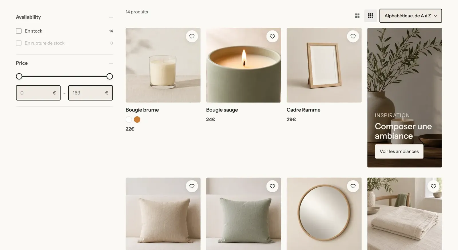
Where the products go. The card itself (image ratio, price, quick add button…) is set on the Product Card block in the same section: see Product card blocks. The Product grid block holds two sub-blocks.
Promotion tile
A grid slot filled with your own content instead of a product: some inspiration, an offer, a link to a guide. It contains a Content over image block you can build freely.
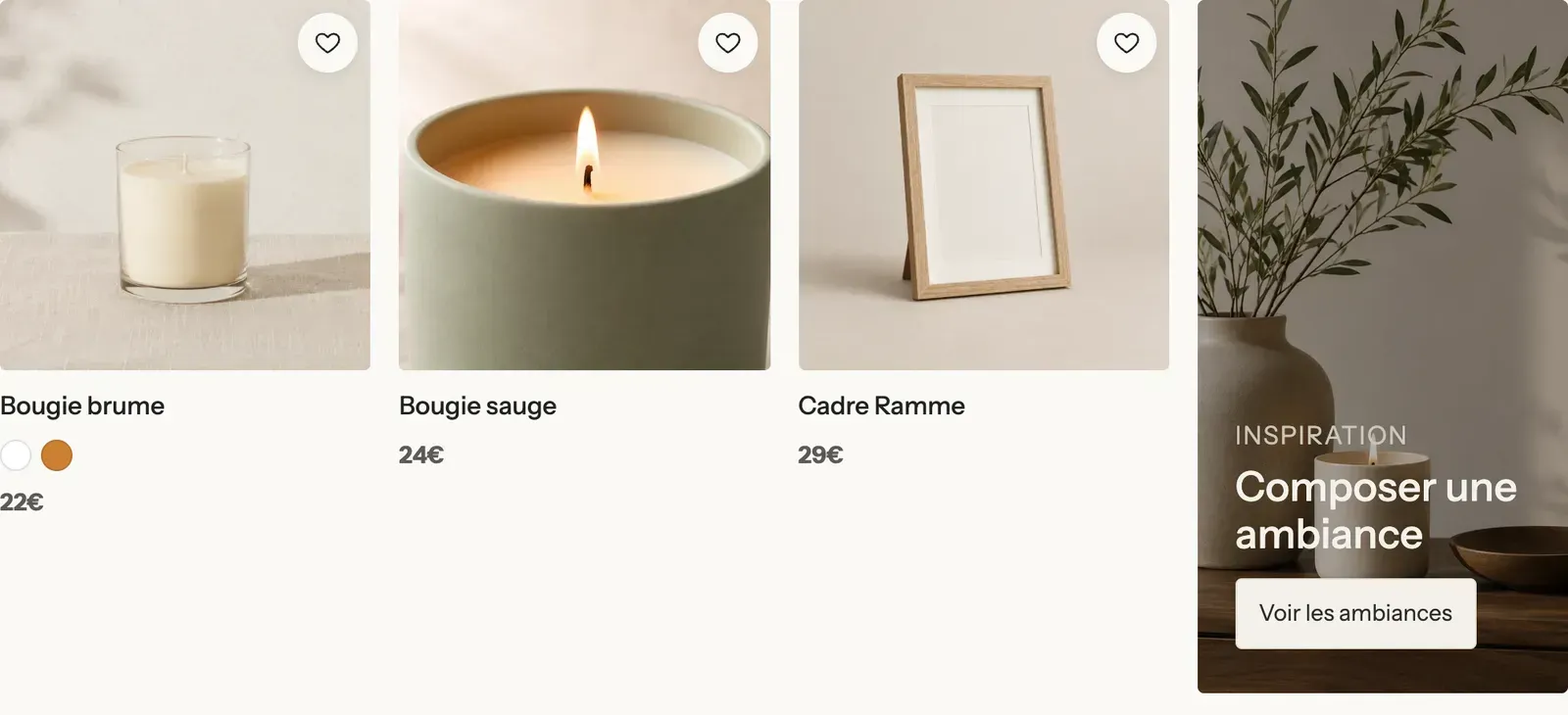
- Row: the grid row where the tile appears, on the first page only (2 by default).
- Columns: 1, 2 or Full width. Position: Left or Right.
- Two rows high: the tile takes the height of two rows of products.
No results
The content shown when there's nothing to list: an empty collection, a filter that's too strict or a search with no results. Build it with blocks (a text, a button to your best sellers…). Check Preview in the editor to see it while you work on it; it never shows on your store without a reason.
Search title
On the results page, the title "Results for "…"".

- Heading style, Show separator line, Bold, size and color.
- Show the count of results.
Search form
A search field, on the results page (to run a new search) or elsewhere: a help page, a 404 page.
- Placeholder.
- Search in: The whole store, Products, or Pages and blog posts. Useful for a "Search the help center" field.
- Button: Icon inside the field or Next to the field (with Button text and Button style).
- Popular searches: one item per line, suggested as shortcuts under the field.
Result types
The tabs that split results between Products, Blog posts and Pages.
- Tabs style: Pills (default), Underline or Minimal.
- Show the count of results per tab.
- Show products, Show blog posts, Show pages: uncheck a type to remove it from the tabs.