
Advanced custom section: build a section block by block
Start from a simple frame (an image and a text group) and build the layout you want with the theme's blocks.
The Advanced custom section is an almost empty frame: you place the blocks you want in it (image, heading, text, button, video, product list, form…) and arrange them with Groups. Use it when no ready-made preset matches what you have in mind. It can be added to every template.
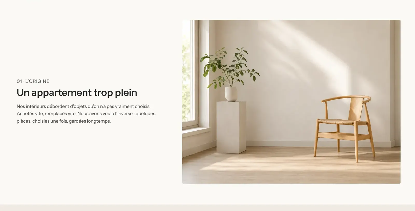
Preset
A single preset, Advanced custom section, filed under the Layout category of the section picker. It contains:
- an Image block (with no image: a colorful illustration shows in the meantime);
- a vertical Group, vertically centered, with a Heading, a Text and a Button.
The two sit side by side on desktop (horizontal direction) and stack on mobile, like on the Havn page:
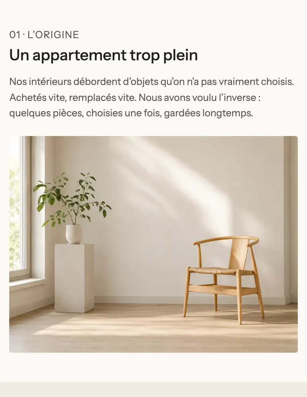
Add the section
- Open Online Store > Themes > Edit theme and choose the template.
- Click Add section, Layout category, then Advanced custom section.
- Choose the image for the Image block, then edit the heading, text and button in the Group.
- Add more blocks with Add block, in the section or inside a group.
- Click Save.
The section's blocks
The section accepts every public theme block and app blocks. The most useful ones for building layouts:
| Block | What it's for |
|---|---|
| Group | A container that arranges its blocks in a row or a column. Nest groups to make columns, cards, boxes. |
| Content over image | A group with a background image: to place text over a photo. |
| Heading, Text, Button, Checklist | The text content. |
| Image, Video, Icon, Gallery | The media. |
| Spacer / Divider | A space or a line between two blocks. |
| Product list, Newsletter, Accordion / FAQ, Tabs… | Any functional theme block. |
The Group, the key to layout
- Direction: Horizontal (side by side) or Vertical (one below the other), Stack on mobile, Order on mobile (Default, First, Last).
- Horizontal alignment (Left, Center, Right, Stretch, Space between), Vertical alignment, Gap and Gap mobile.
- Keep visible while scrolling: a column that stays in place while the other one scrolls.
- Sizing group: inner spacing and Link (the whole group becomes clickable).
- Media group: Background image, Minimum height, focal point, overlay.
- Color palette group: Transparent background or a palette, Corner radius.
Each block also has its Width (with Custom width, in twelfths: 5/12 for the text and 7/12 for the image on Havn) and Show on (Desktop only, Mobile only) for a different layout on phones. The details are in Layout blocks.
Section settings
The section only has the shared frame, set to a horizontal direction to start with and 20 px of spacing at the top and bottom:
- Layout: Show on, Layout width, Direction, Stack on mobile, alignments, Gap, top and bottom padding.
- Color palette: palette, Background image, Enable background cut (a solid block of color that only covers part of the section).
- Separators: a shape (wave, curve, zigzag…) at the top or bottom.
- Animations.
They're all explained in Understand the theme editor.
Tips and pitfalls
- Before starting from scratch, look at the presets of other sections (Image with text, Multicolumn, Rich text…): they're often already close to what you want and are edited the same way.
- Build from the outside in: groups (columns) first, then their content.
- Always check the mobile preview: a horizontal group stacks, and the mobile order is set with Order on mobile.
- For even spacing, prefer the groups' Gap settings over stacked Spacer / Divider blocks.
- Give each image alt text in Shopify's Content > Files: it helps accessibility and SEO.