Selling point blocks: comparison, calculator, counters
The blocks in the Selling points category: badge, comparison table, savings calculator, countdown, counter, progress bar and image with hotspots.
Selling point blocks turn your promises into visible proof: a table comparing you with the competition, a calculator that puts a number on the savings, counters that animate, a photo where every product can be bought. They can be added to any section, including the product page.
All these blocks have the common settings Show on (Desktop and mobile / Desktop only / Mobile only), the block width and Animations.
Badge
The Badge is a small rounded label: "New", "Best seller", "Made in France"… Place it above a heading to catch the eye.
- Text, an optional icon (Custom icon for your own image) and its Size.
- Color palette group: Background color (empty = accent color) and Text color (empty = background color).
- Layout group: Font size (12 px), Uppercase, vertical and horizontal padding, Corner radius (60 px: pill shape) and Alignment.

Comparison table
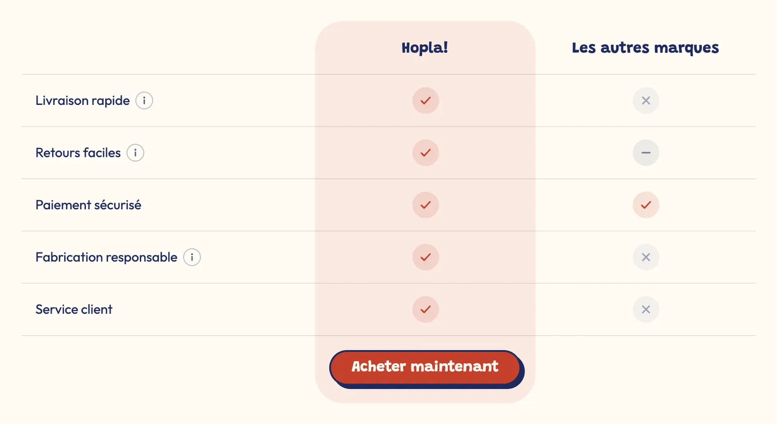
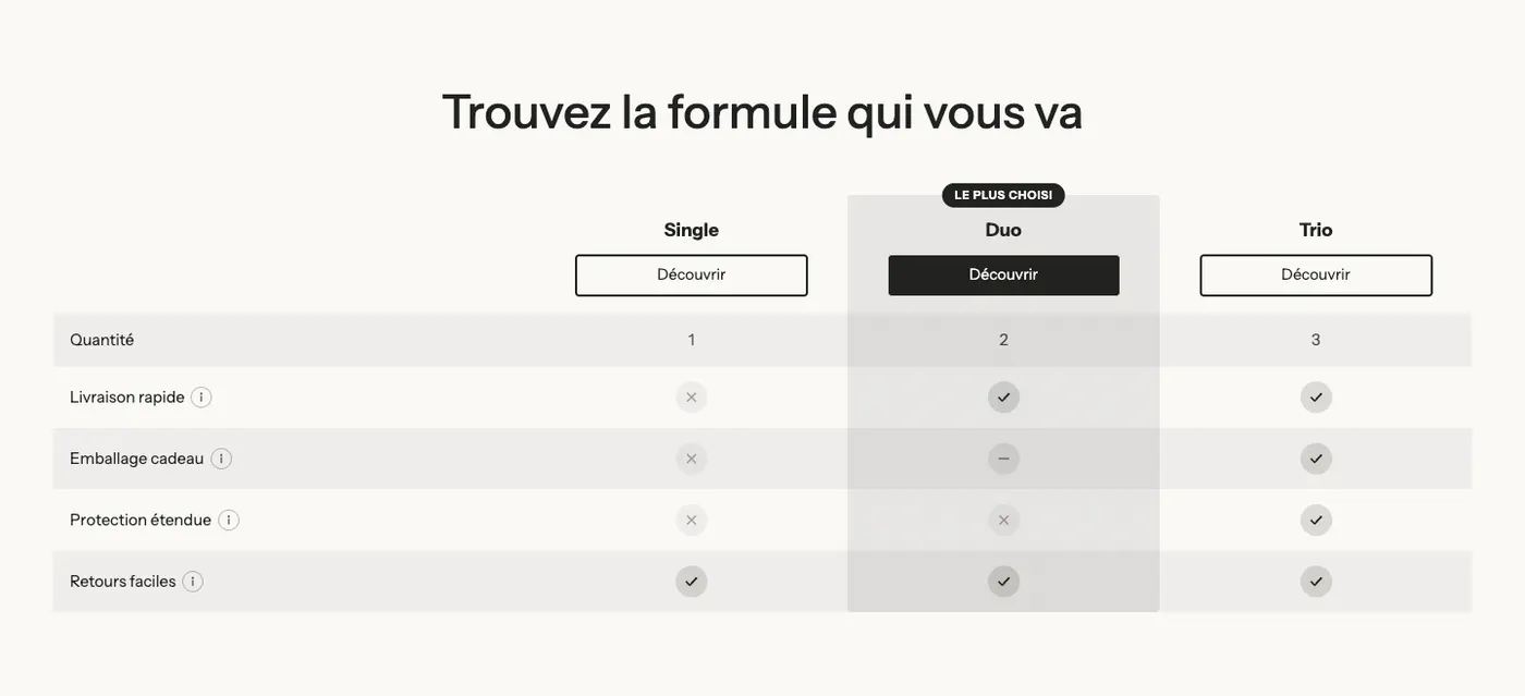
The Comparison table puts your product side by side with other options. Two versions are offered: Us vs them and Product comparison.
It holds two sub-blocks:
- Columns, with one Column sub-block per option compared: Name (empty on the highlighted column = your store name), Product (fills in the name, image, price and button link), Image, Subheading, Highlight this column, Badge text and a button.
- Rows, with one Row sub-block per criterion: Type (Feature or Category title), Label, Information text (shown in a tooltip), then a Value 1 to Value 5 group, one per column in order. Each value is a Checkmark, a Cross, a Partial, a Text, or Custom (icon and text of your choice).
Table settings:
- Style (Minimal, Striped rows, Card), Label width, Text size, Image height.
- Sticky header (on by default): column names stay visible while scrolling.
- Layout on mobile: Horizontal scroll, or Highlighted column against another one.
- Highlighted column group: Style (Tint, Solid, Outline) and Color. Icons group: shape and colors of checkmarks, crosses and partials.
Savings calculator
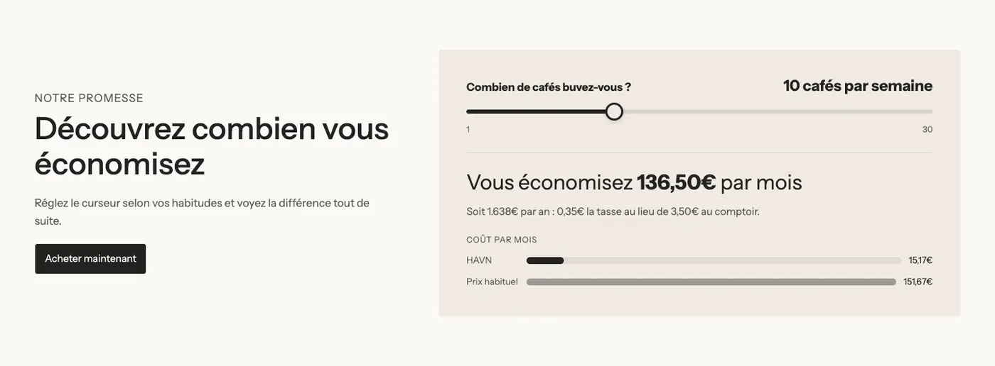
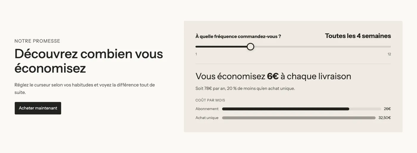
The Savings calculator lets customers move a slider and see, live, how much they save with your product. Three versions: Savings calculator, Subscription calculator and Cost per use calculator.
- What to compare: Your price vs another price (a product bought again regularly), Subscription vs one-time purchase, or Cost per use of a durable product.
- Price group: Prices come from (Prices typed below, or Product). Prices are entered in the store currency and converted for customers paying in another currency.
- Slider group: Question, Period (Day, Week, Month), Unit and Unit in the singular, Minimum, Maximum, Step and Default value.
- Result group: Main result and Detail line, with codes replaced live, for example
[monthly_savings](savings per month),[yearly_savings](per year) or[percent]. Show the cost per month of each option adds two comparison bars. - Button and Appearance groups (background, corners, color).
Countdown
The Countdown shows a days, hours, minutes, seconds timer to create a sense of urgency.
- Style group: Timer style (Cards, Outline (border only), Inline with labels, Minimal (digits only)), Font size, Corner radius and Card color.
- Text group: Text (place
[timer]to insert the timer), Minutes (timer duration, 1501 by default) and When timer expires: (Restart in next session, or after a set time). - Unit labels group: the words Days, Hours, Minutes, Seconds.

Counter
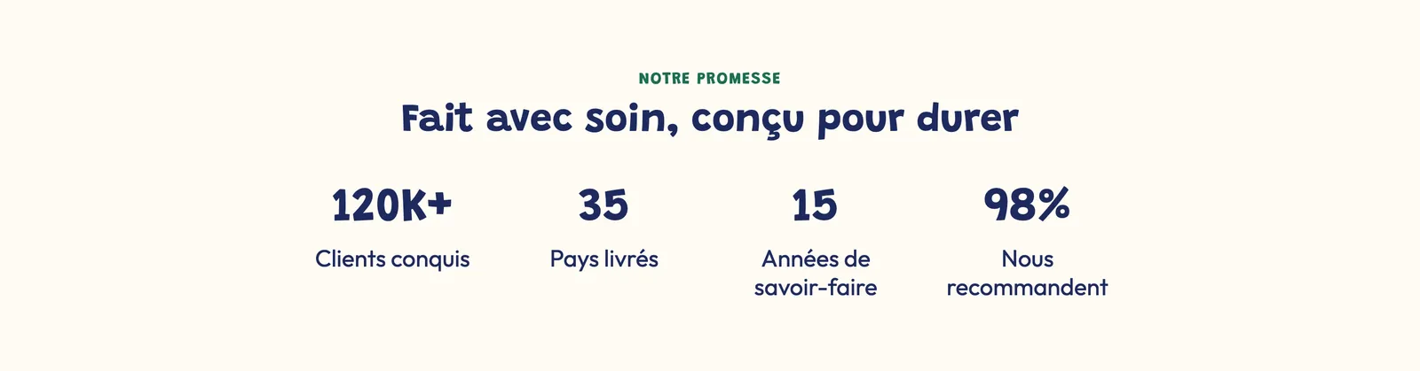
The Counter rolls a figure up from zero to its value when it comes on screen: happy customers, countries shipped to, average rating…
- Text group: Title (put the number in curly braces, with the text around it:
{120}K+,${1500}or{4.8}/5), Subheading and Description. - Title sizes on desktop (24 px) and mobile (21 px), Color, animation Duration (1.5 s).
- Custom image above the figure and an optional button.
Progress bar
The Progress bar illustrates a percentage: test results, share of natural ingredients, satisfaction.
- Content group: Style (Bar, Circle, Semicircle), Value (87 by default), Suffix (%), Label, Description and Count up when visible.
- Layout group: Layout (Stacked or Side by side) and its mobile version, Alignment, Size, Thickness and Text size.
- Colors group: progress, background and text (empty = theme colors).
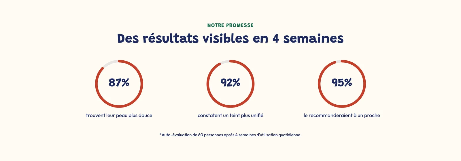
Image with hotspots
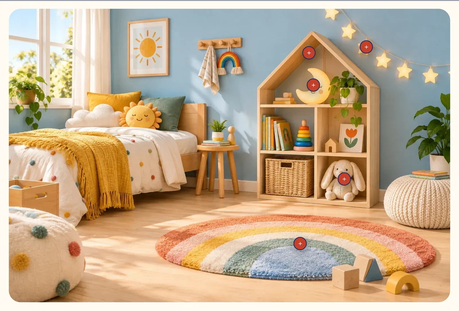
The Image with hotspots places clickable points on a photo. Two versions: Shop the look (each point opens a product to add to cart) and Explained product (each point describes a product detail).
Each Hotspot sub-block has a Type (Product or Text), the product or the title, text and link, its Horizontal position and Vertical position in %, and Another position on mobile if needed.
Image settings:
- Media group: Image, Media on mobile, Image ratio and Corners.
- Marker group: Style (Dot, Plus, Numbers, Icon, Product image), Shape, sizes, colors, Shadow, Animation (None, Pulse, Ripple) and Label beside the point (None, Title, Price).
- Display group: Open the details on (Hover or Click), Add to cart (single-variant products are added directly, the others open their product page) and List under the image (None, Mobile only, Desktop and mobile).