
Logo list section: partners, labels and press logos
Show the logos of the media that talk about you, your labels or your partners, in a row, a grid or a continuous scroll.
The Logo list section lines up logos: the media that have talked about you, your labels and certifications, your retailers or the brands you carry. It's a subtle kind of social proof, to place below the home page banner or near a reviews section.

The variants (presets)
The two variants are in the Reviews and trust category of the picker.
Logo row
A small heading and five logos on a single line, in black and white until hovered (at the top of this article). For partners or brands you carry, when only the logo matters.
Press logos
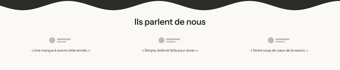
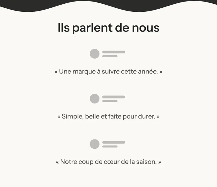
A heading and three logos in a grid, each followed by a short quote from the article ("A brand to watch this year."). To show what the media say about you, not just that they covered you.
On mobile, the three logos stack with their quotes:
Other layouts
The Logo list block can be set up freely. Here for example is a Grid layout in Outline style (each logo in a frame), on a dark palette:

And the Grid layout up close, with a quote below each logo:

For logos that scroll continuously from one edge of the screen to the other, choose the Scrolling layout, or the Logo marquee variant of the Marquee section.
Add the section
- In your Shopify admin, open Online Store > Themes and click Edit theme.
- Pick the template in the top menu (for example Home page).
- Click Add section, open the Reviews and trust category and choose Logo row or Press logos.
- Click each Logo block and choose its Image. Add a Link to the article or the partner's site if you like.
- Click Save.
The section's blocks
| Block | What it's for |
|---|---|
| Heading | "As seen in", "Featured in", "Our labels"… |
| Logo list | The layout of all the logos: arrangement, size, style. |
| Logo | One logo, inside the Logo list. |
The Logo list block
Layout group:
- Layout: Row (default), Grid or Scrolling.
- In Grid: Columns on desktop (5 by default) and Columns on mobile (2).
- In Row: Alignment (Left, Center, Right).
- Gap (48 px) and Gap mobile (24 px).
- In Scrolling: Delay (30 s by default), Direction (Left or Right) and Pause on hover (desktop).
Design group:
- Height (40 px) and Height on mobile (32 px): all logos get the same height.
- Style: Plain, Card or Outline.
- Grayscale until hovered: logos switch to color when the mouse hovers over them. Both variants turn it on.
- Opacity (100% by default): lower it for more discreet logos.
The Logo block
- Image: the logo, ideally a PNG with a transparent background or an SVG.
- Name: the name of the media outlet or brand.
- Link: to the article, the label or the partner's site.
- Text: a short quote shown below the logo (Press logos variant).
The section settings
The section only has the frame shared by almost every section: Layout, Color palette, Separators and Animations, explained in Understand the theme editor.
Tips and pitfalls
- Crop your logos tightly before uploading them: white margins around a logo make it look smaller than the others, since they all share the same Height.
- On a dark palette, use white or light logos; a black logo on a transparent background disappears.
- Only show real media, labels or partners, and link them to the article or certificate when you can.
- Five or six logos are enough on a row. Beyond that, use Scrolling.
- For an average rating next to the logos, the Rating banner variant of the Reviews section puts both on one line.