
Customize collection pages and search
Set up the banner, filters, product grid and cards on your collection pages, then the Story Theme's search results page.
The collection page is where your customers make their choice. It should help them find the right product fast: a clear banner, useful filters, an easy-to-read grid. In the Story Theme, every element of the page is a block you can set, move or hide. The search results page works the same way. For the full list of settings, see also the Collection and Search section and the search and filter blocks.
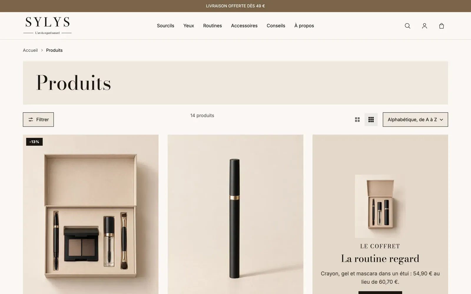
Open the collection page in the editor
- In your Shopify admin, open Online Store > Themes, then click Edit theme.
- In the dropdown at the top, choose Collections > Default collection.
- In the left column, expand the Collection section.
Your settings apply to all your collections. The content itself (name, description, image, products) is managed in Shopify, in Products > Collections. See Create a collection.
From top to bottom, the section contains: Breadcrumb, Collection banner, Filters, then a bar with Filter button, Product count, Grid density and Sorting, and finally Active filters and Product grid.
Set up the collection banner
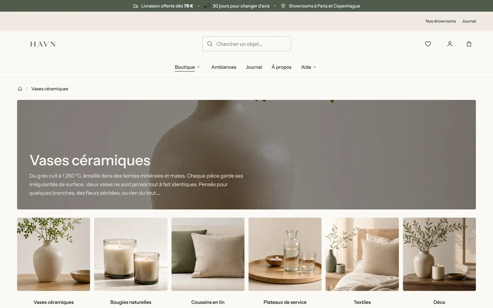
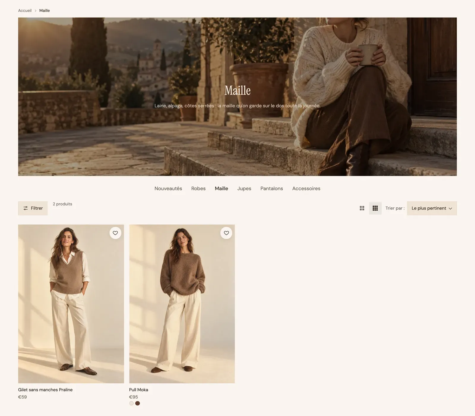
Click Collection banner. It shows the collection's title and description.
- Image: None (title only), Content over the media (the title on the photo) or Media beside the content. If you don't choose an image here, the collection's image is shown.
- With Content over the media, set the Height and the Overlay opacity so the title stays readable.
- Alignment and Content max width: where the text sits.
Set up the filters
The filters on offer (availability, price, size, color…) are created in Shopify's free Search & Discovery app. The theme takes care of displaying them.
- Install the Search & Discovery app from the Shopify App Store, if you haven't already.
- In the app, open the filters and add the ones that make sense for your catalog: availability, price, product type, variant options (size, color)…
- Go back to the theme editor and click the Filters block.
Then choose the Layout:
| Layout | Result | Best for |
|---|---|---|
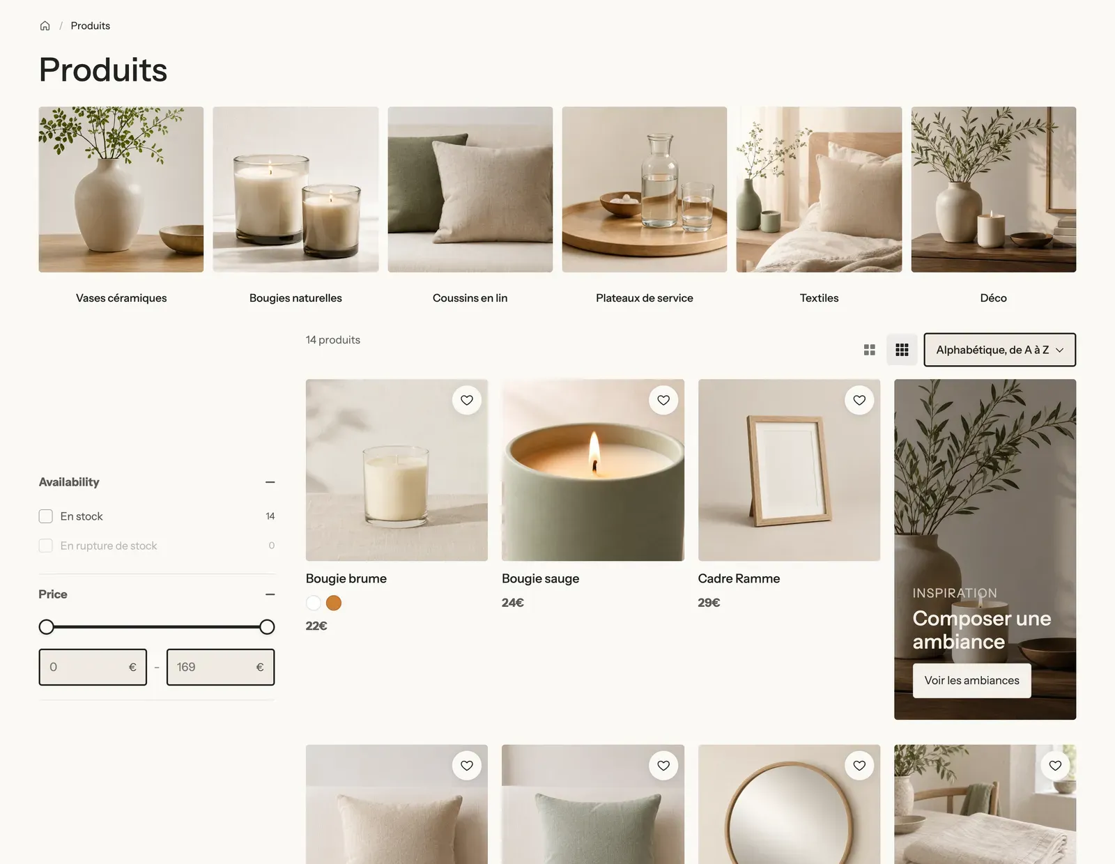
| Sidebar | Filters to the left of the grid, always visible. Check Keep visible while scrolling so they follow the page. | Large catalogs. |
| Horizontal | A filter bar above the grid. | Few filters, lots of room for products. |
| Drawer | A Filter button opens a side panel. | Small catalogs and a clean look. |
On mobile, filters always show in a drawer.
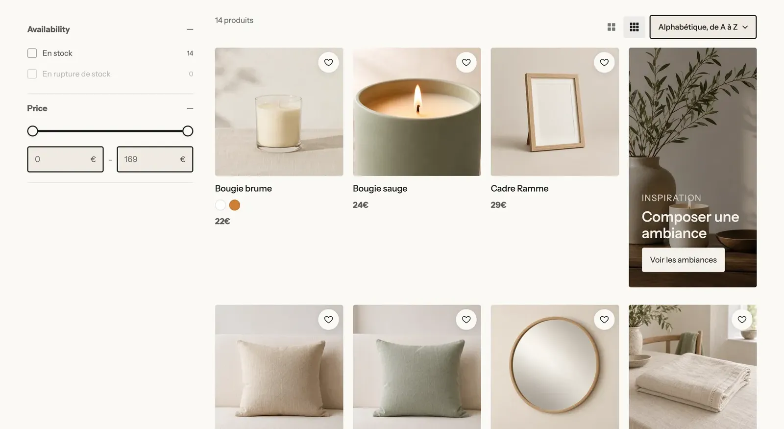
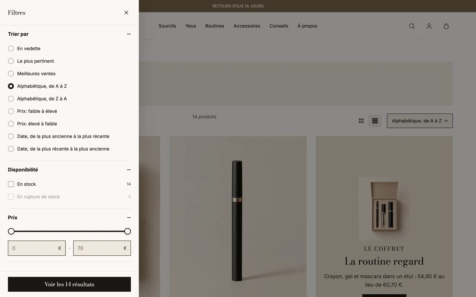
The other settings of the Filters block:
- Groups open when the page loads: how many filters are expanded on arrival (0 to keep them all closed).
- Show the count: the number of products next to each value.
- Values shown before Show more: beyond that, values are collapsed.
- Filters shown as buttons: the names of the filters to present as buttons rather than checkboxes, separated by commas, for example
Size, Shoe size. Ideal for sizes. - Show sorting in the drawer: groups sorting and filters in the same panel.
Set up the product grid
Click the Collection section itself (its name, at the top of the list) to set up the grid:
- Products per page (24 by default);
- Desktop columns, Columns on tablet, Mobile columns (1 or 2);
- Pagination style: Numbers, Load more button or Infinite scroll. Infinite scroll loads four pages as the customer scrolls, then shows the button so they can reach the footer.
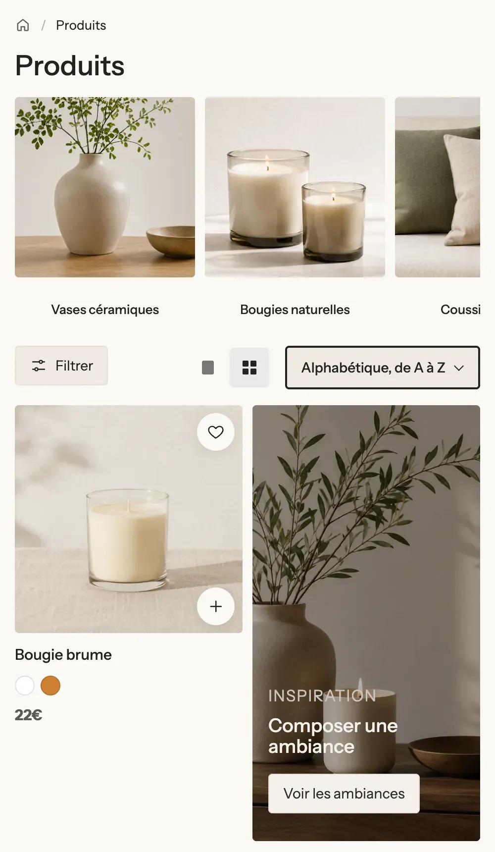
The Grid density block lets customers choose larger or smaller products themselves. Their choice is saved on their device. When they come back from a product page, the page takes them back to the product they had opened.
Insert a promotion tile
A visual with a heading and a button can sit between products, to highlight an offer or a collection. In the screenshot at the top, it's the gift box on the right.
- Expand the Product grid block, then click Add block and choose Promotion tile.
- Set the Row where it appears (on the first page), its Columns (1, 2 or Full width), its Position and, if needed, Two rows high.
- Expand the tile to edit its image, heading and button.
Customize product cards
The product card (photo, name, price, badges) is set in two places:
- Theme settings > Cards: the shared style for every card in the store, for example Style, Text alignment, the Sale badge text or the Button type.
- The Product Card block of the Collection section: what the card contains on this page (second image on hover, Quick add, Quick view button, color swatches, rating…). Options set to Theme follow the Theme settings.
To show a "New" or "Bestseller" badge on a product, give it a tag in Shopify that starts with badge-, for example badge-new: the card shows "New".
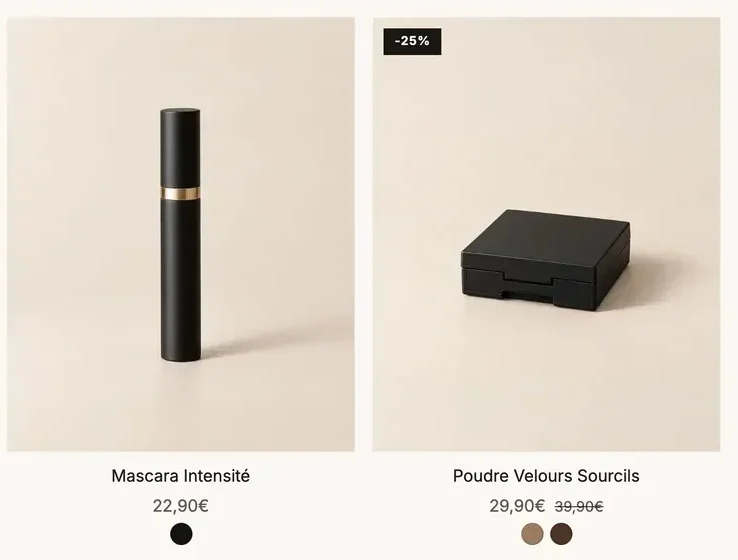
Each element of the card is a block: see Product card blocks.
Customize the search page
- In the dropdown at the top of the editor, choose Search.
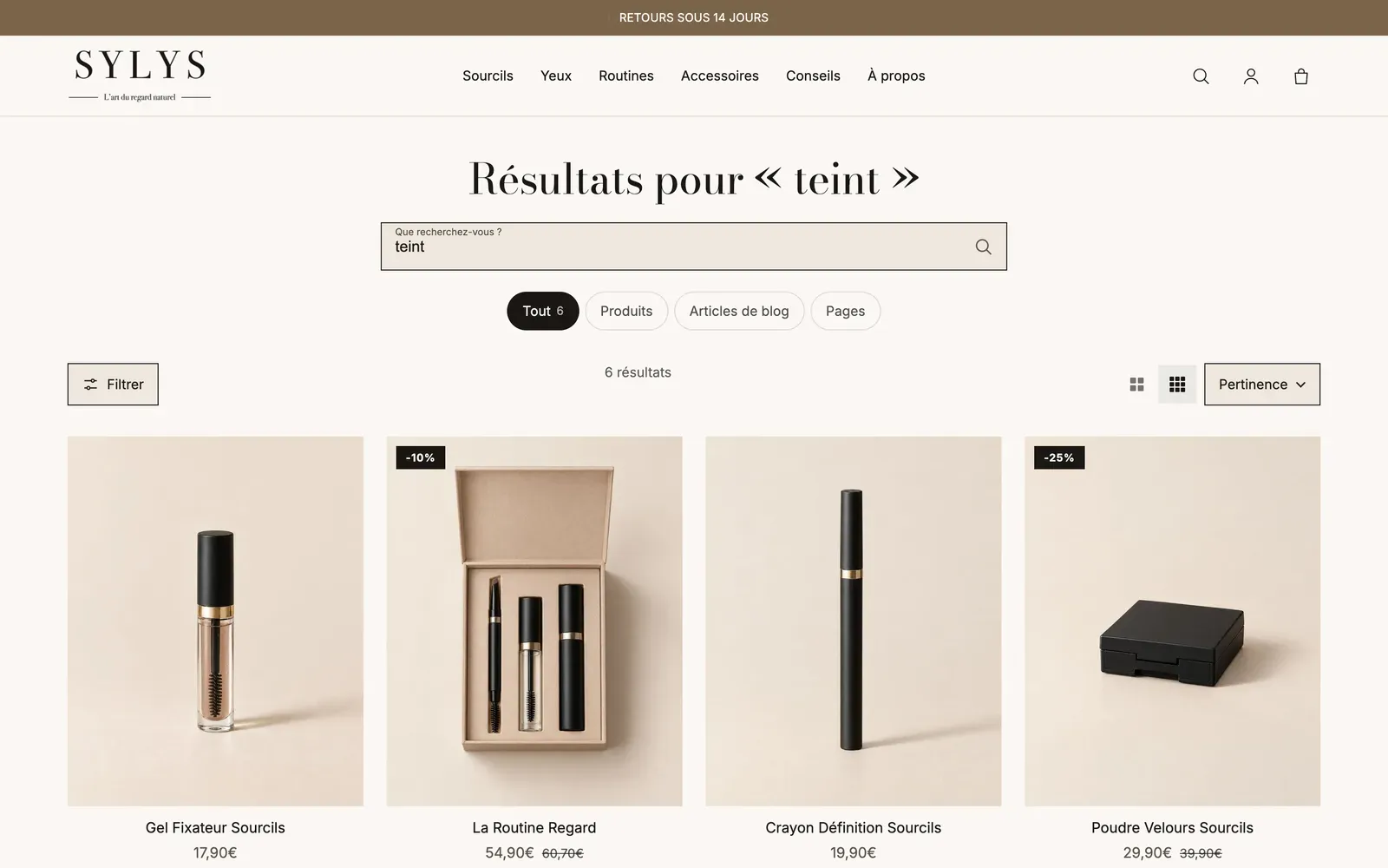
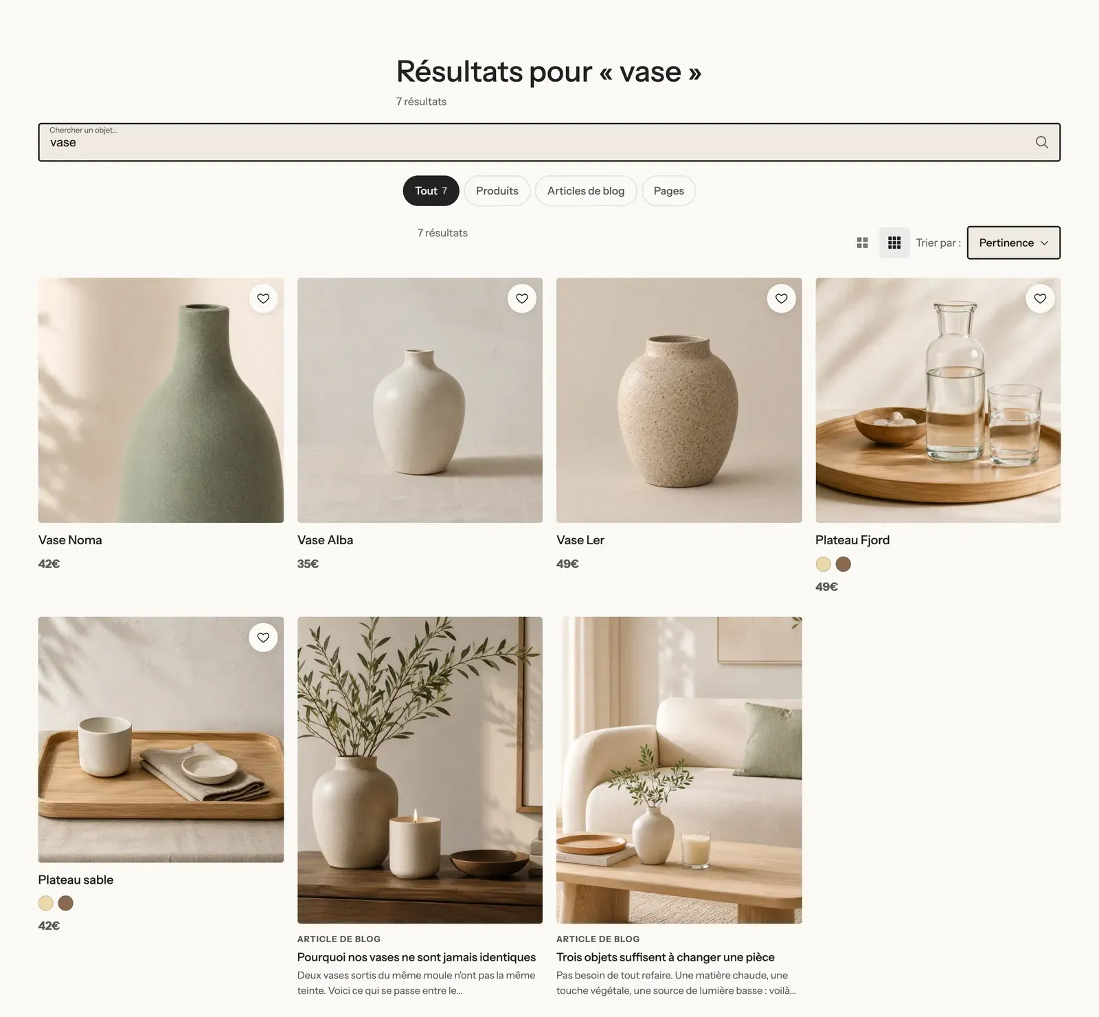
- Expand the Search results section. It uses the same blocks as the collection page (filters, sorting, density, grid), plus:
- Search title and Search form at the top of the page;
- Result types: Products, blog posts and pages tabs, with their count. Uncheck Show blog posts or Show pages to keep only products.
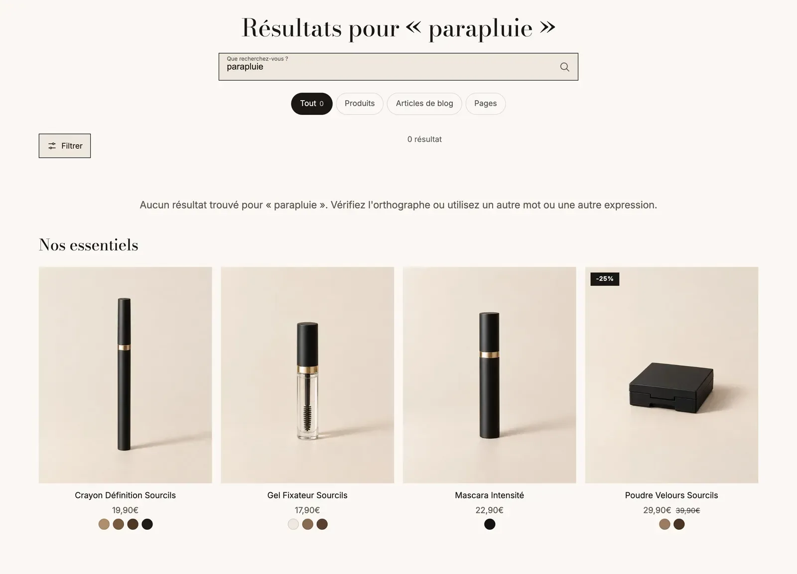
- Expand Product grid > No results: on the template as delivered, it shows a product list when a search returns nothing, so you don't lose the visitor.
The search that opens from the header (suggestions from the first letters, popular searches) is set in the header's Search block. See Menus, header and footer.