
Hero banner, slideshow and video
Set up the Story Theme home page banner: image or video, a different media on mobile, overlay, content background, height, slideshow and effects.
The banner is the first thing your visitors see. The Story Theme offers two sections for it: Banner (a single visual, image or video) and Slideshow (several slides that play one after another). Both support a different media on mobile.
Add a banner
- Open Online Store > Themes > Edit theme, Home page template.
- Click Add section, Banners category.
- Choose a preset:
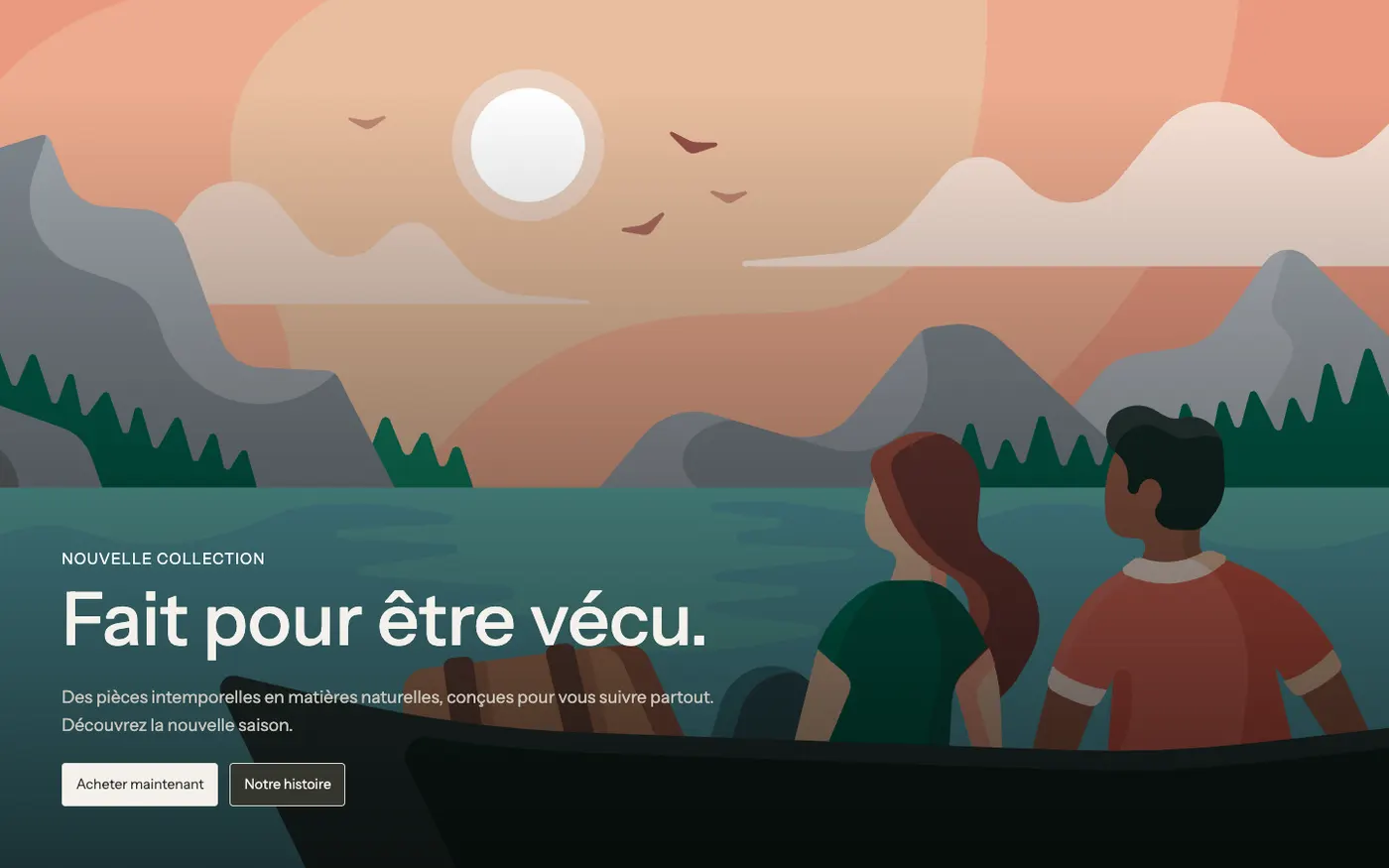
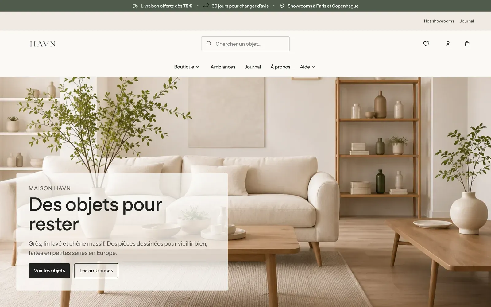
- Image banner: the text over a large photo;
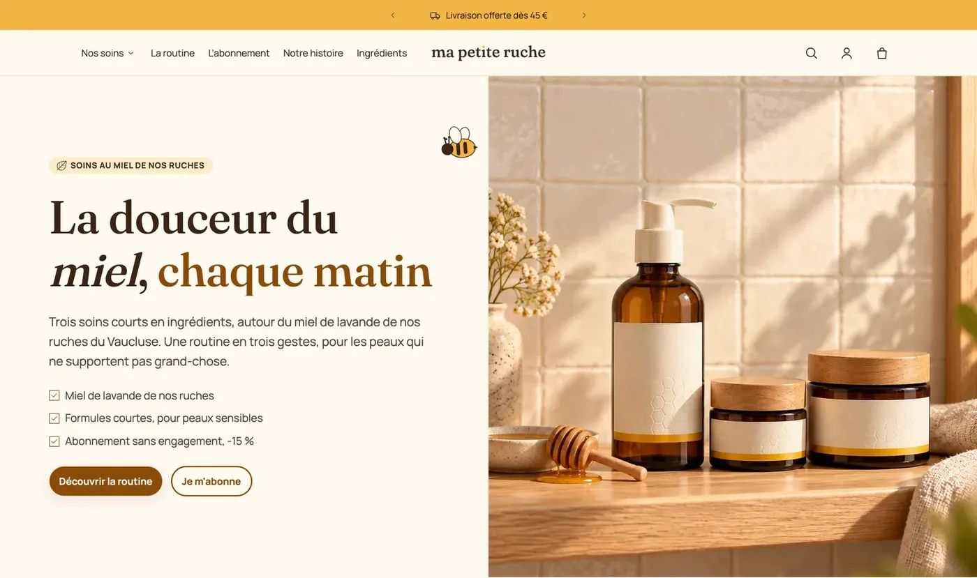
- Split banner: the photo on one side, the text on the other;
- Video banner: a looping background video;
- Slideshow or Slideshow with previews: several slides.
- Drag it to the very top of the section list.
Choose the media
Click the Banner section. In the Media group:
- Media type: Image, Video, YouTube or Vimeo or None.
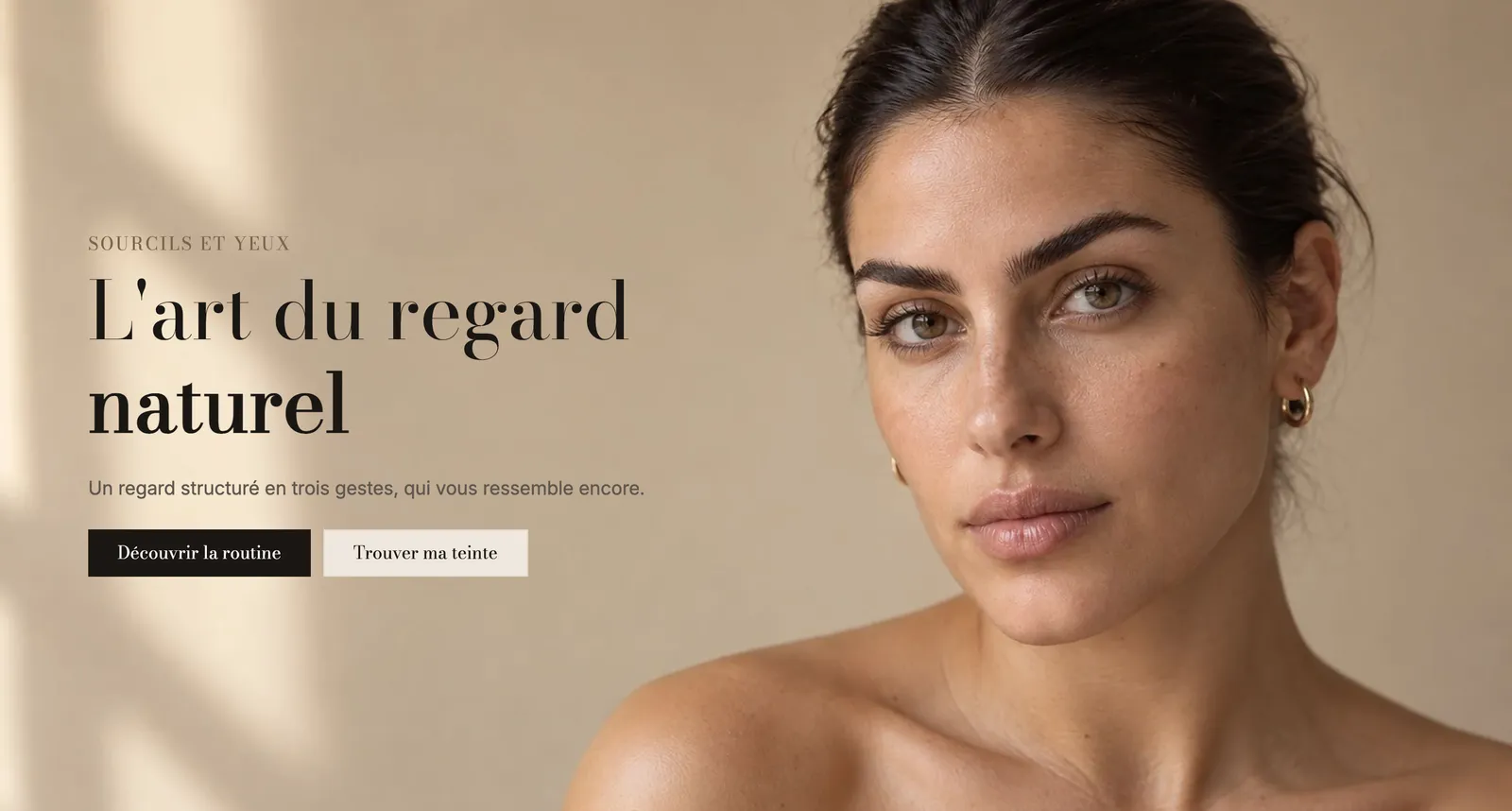
- Image: choose a wide, sharp photo in landscape format. Then click the image to set the focal point on the subject: it stays in frame on every screen.
- For a video, upload it in Video. The Image is then used as the cover while it loads: always fill it in.
- Media effect: None, Slow zoom, Parallax or Zoom on scroll, to add depth.
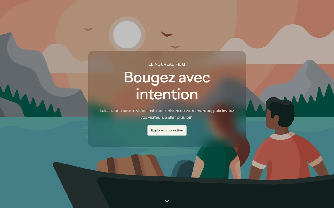
With a video, keep Show a pause button on videos checked: it's an accessibility comfort for visitors who are sensitive to motion.
Plan for mobile
A horizontal photo turns into a narrow strip on a phone. The Media on mobile group handles this:
- Media type: Same as desktop, Image, Video or None;
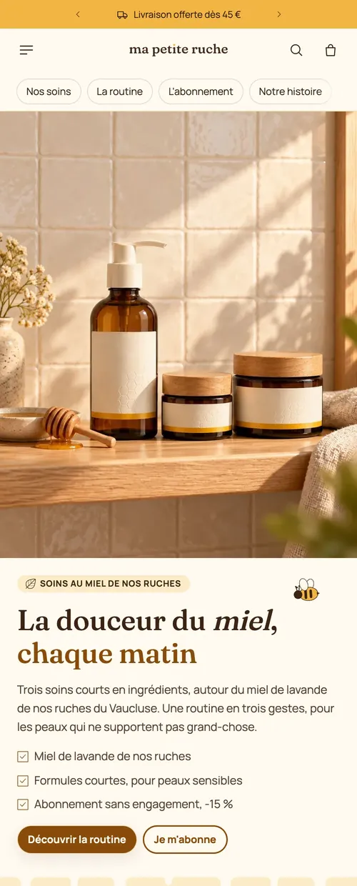
- Image: a vertical photo cropped for phones (optional: otherwise, the desktop media is used).
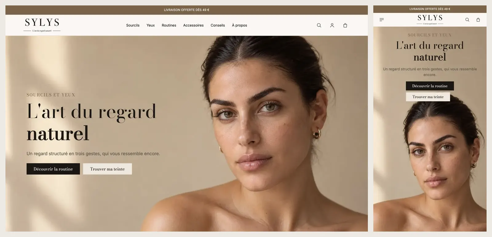
In Layout, Mobile layout places the text over, below or above the media. On a busy visual, placing the text above or below keeps it readable.
Make the text readable
- Overlay: None, Solid, Gradient or Custom, with its Color and Opacity (30% by default, also adjustable on mobile). A dark overlay at 30-40% is usually enough under white text. With Gradient, Darkest side puts the shadow on the text side.
- Content background: Solid, Translucent or Frosted glass puts a background behind the text only, without darkening the whole photo.
- Layout: Content over the media or Media beside the content (split banner), with the Media position and its Media width.
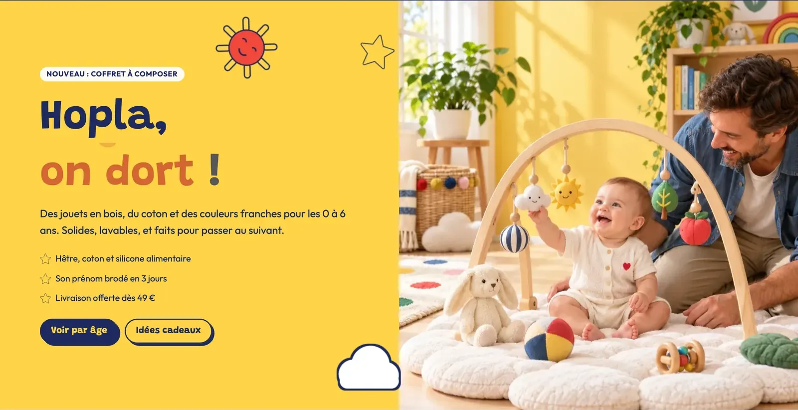
The banner content is made of blocks: Heading, Text, a Group of buttons, and depending on the preset a Badge, a Checklist or stars. Add, remove or reorder them as in any section. The section's Link setting makes the whole banner clickable.
Set the height
In Size, Height offers Fit the content, Fit the media, Small, Medium, Large (default), Full screen or Custom (as a % of the screen). Height on mobile is set separately. Full screen takes the header and announcement bar into account.
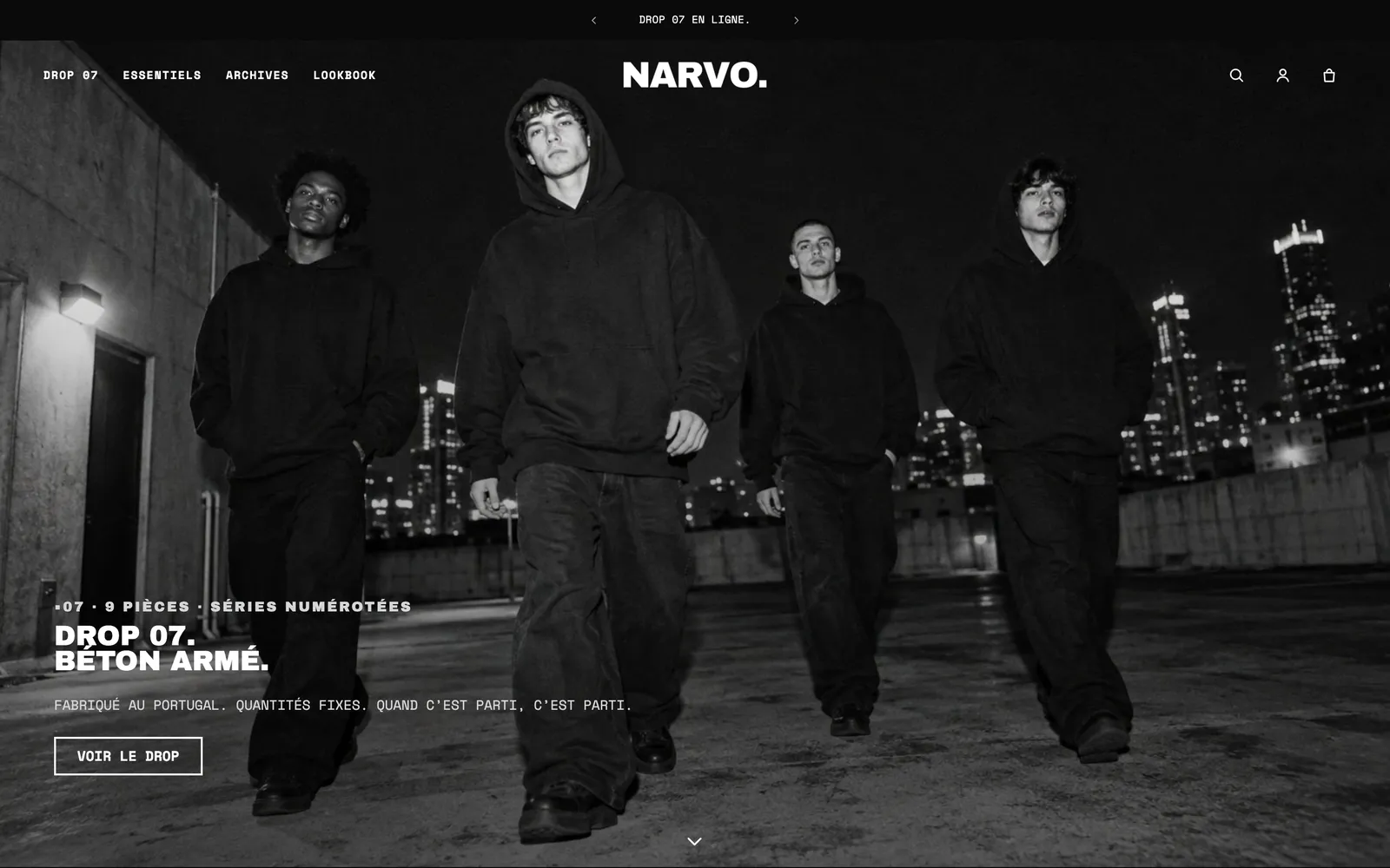
If you want the header to sit on top of the banner, set Over the first section to Pages starting with a banner in the Header section: see Menus, header and footer.
Use a slideshow
The Slideshow accepts up to 12 Slide blocks. Each slide has the same settings as a banner (media, media on mobile, overlay, layout, content background, link), plus a Title in the pagination and a Time on this slide.
In the section settings:
- Transition style: Fade, Zoom, Curtain, Parallax or Slide;
- Auto-rotate slides and Change slides every (6 s by default);
- Pagination style: Dots, Progress bars, Numbers, Counter or Slide titles, which shows each slide's title at the bottom.
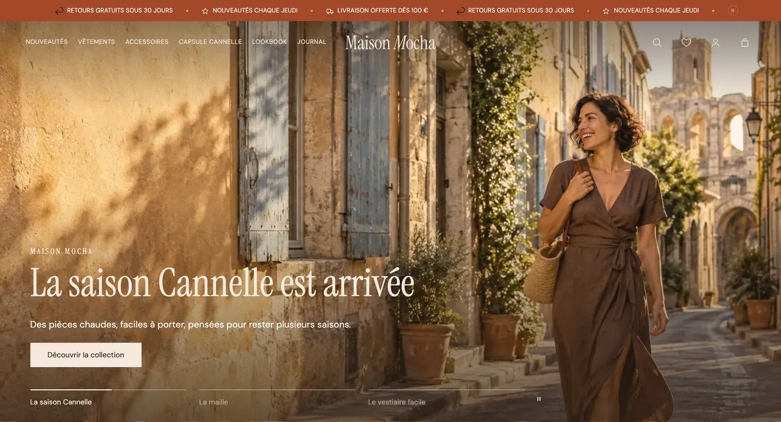
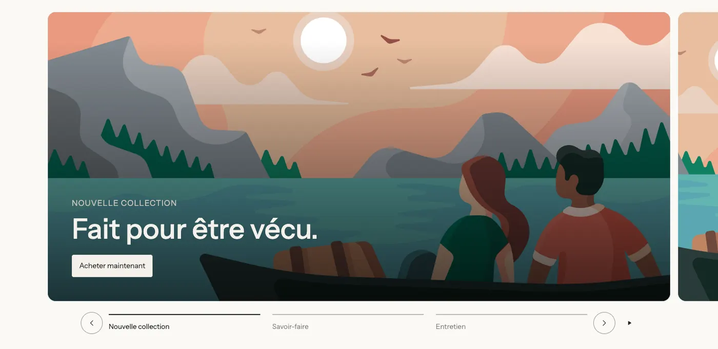
A slideshow doesn't replace a good message: most visitors only see the first slide. Put your main offer there and stick to three slides.