
Stacking cards section: cards that stack as you scroll
Present your benefits, ingredients or commitments in cards that pin in place, then stack on top of each other as the customer scrolls.
The Stacking cards section shows a series of cards (one image and one text each) that pin to the top of the screen, then cover one another as the customer scrolls. Each card has time to be read before the next one arrives: ideal for walking through three or four benefits, ingredients or commitments on the home page or an "Our story" page.
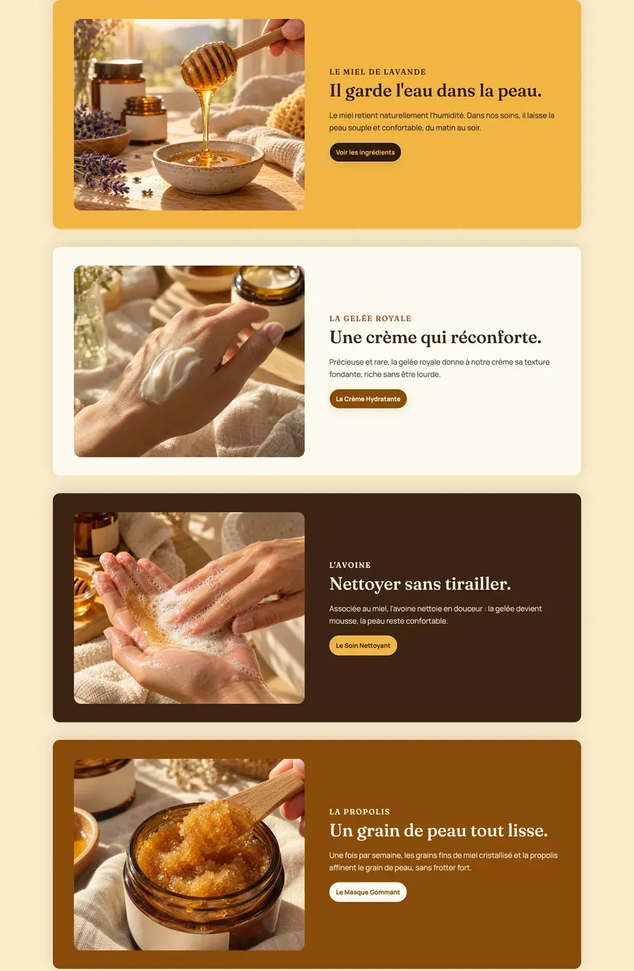
The presets
Stacking cards
The only preset: a centered heading, then three horizontal cards (image on the left, text and button on the right), on two alternating palettes. While scrolling, the card underneath shrinks and darkens slightly to add depth.
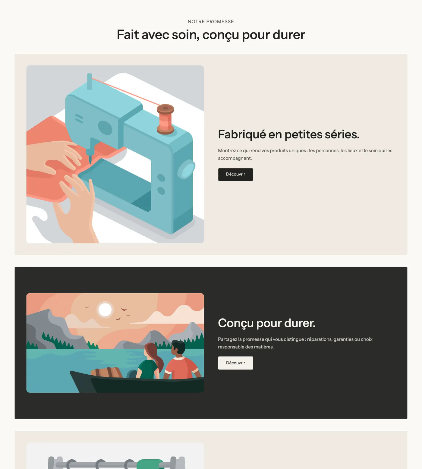
On mobile, the image moves above the text in each card and the offset between cards is smaller:
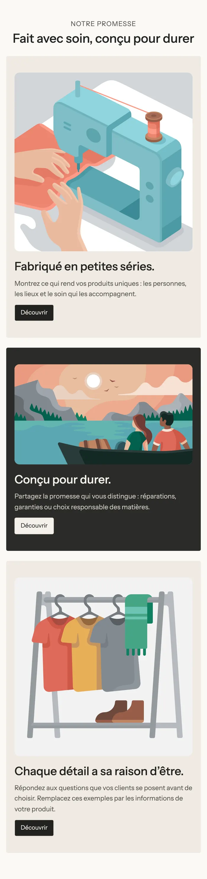
The effect in action
Mid-scroll, the next card covers the previous one, whose top is still visible. On the Ma Petite Ruche demo, on mobile:
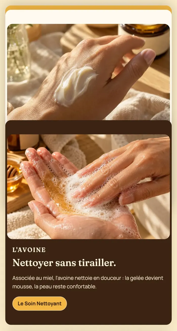
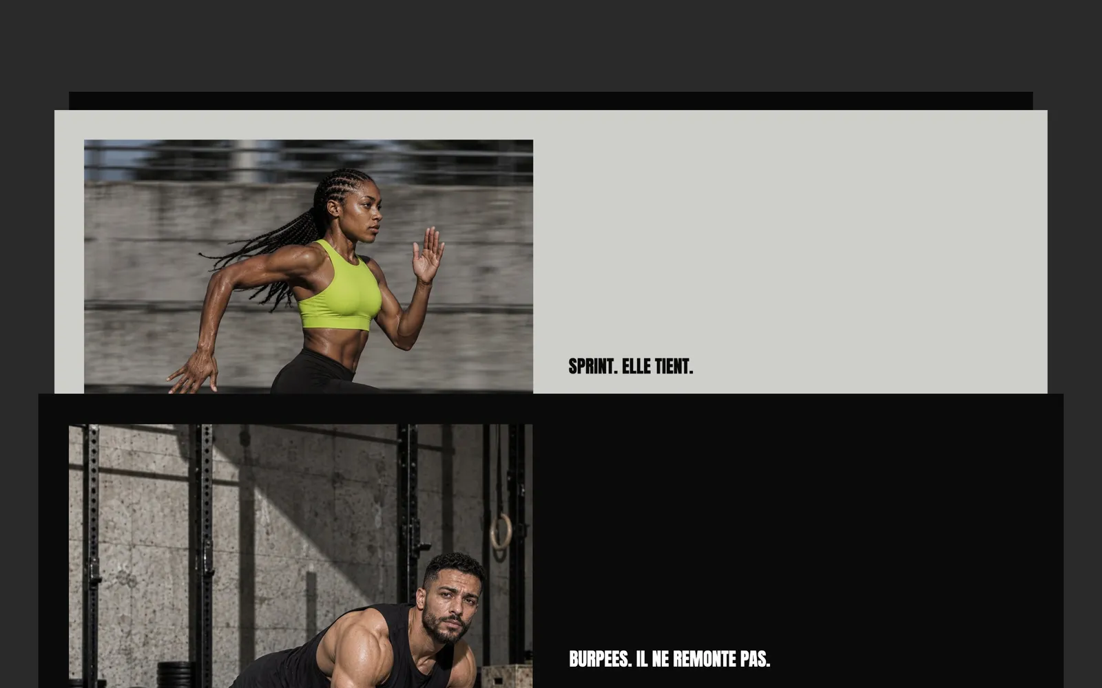
The Pulse demo uses it in a rawer way, with full-width black and gray cards and a single sentence per card:
Add the section
- In your Shopify admin, open Online Store > Themes and click Edit theme.
- Choose the template from the menu at the top (for example Home page).
- Click Add section, open the Scroll effects category and choose Stacking cards.
- In each Card block, click the image and the texts to replace them.
- For one more card, click Add block under the cards and choose Card.
- Click Save.
The section's blocks
| Block | What it's for |
|---|---|
| Heading | The heading above the cards (it scrolls normally). |
| Card | One card: a colored frame that holds an Image and a Group (subheading, heading, text, button). You can put any block from the theme in it. |
The Card block
A card is a group of blocks with its own background. Its settings:
- Layout group: Direction (Horizontal by default, Vertical), Stack on mobile (checked), Horizontal alignment and Vertical alignment, Gap (40 px) and Gap mobile.
- Minimum height (480 px by default) and Minimum height on mobile.
- Padding top, Padding bottom, Horizontal padding (and its mobile version).
- Color palette group: the card's Color palette, Corners (Theme or Custom with Corner radius), Shadow.
- Media group: Background image (the card's blocks show on top of it), mobile image, focal point and Image overlay opacity.
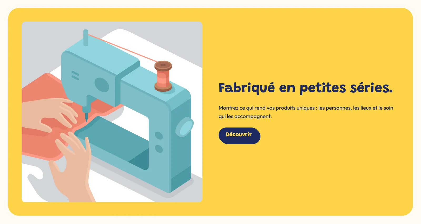
Give each card a different Color palette: that's what makes the stack easy to read.
The section settings
Stacking cards group:
- Distance from the top: where the card stops below the top of the screen (32 px). Increase it if your header stays visible while scrolling, so it doesn't hide the card.
- Offset between cards (24 px) and Offset between cards on mobile (12 px): the strip of the previous card that stays visible.
- Shrink and darken the card underneath (checked by default).
The rest is the frame shared by almost every section: Layout, Color palette (the background behind the cards), Separators and Animations, explained in Understand the theme editor.
Tips and pitfalls
- Keep each card shorter than the screen: otherwise the next one covers it before the customer has read the bottom. Short texts and a landscape image help, especially on mobile.
- Three to five cards are enough. Beyond that, the effect takes too long to scroll through.
- If the visitor has asked their device to reduce motion, the card underneath no longer shrinks or darkens.
- Alternate light and dark backgrounds, and check the contrast of the text and buttons on each palette.
- Don't place this section at the very top of the page: the effect reveals itself as you scroll, after a banner.