
Photo and video stories section: Instagram-style bubbles
Add photo and video stories to your store, link each one to a product, and set the bubble shape, size and display time.
The Photo and video stories section shows a row of bubbles, just like on Instagram. When clicked, the story opens full screen and the next ones play on their own. Each story can feature a product with a link to buy it: a lively way to show your behind-the-scenes, how to use a product or your new arrivals, on the home page as well as on a product page.
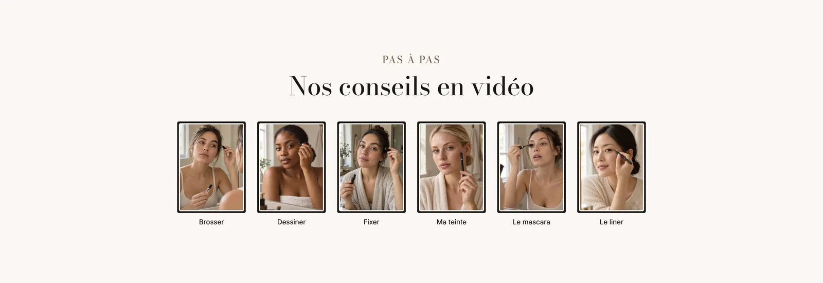
The presets
The section has only one preset, Photo and video stories: five centered round bubbles, with a gradient ring and a title under each bubble. Everything else (shape, size, ring) can be adjusted afterwards, as the demos below show.

On mobile, the bubbles are smaller (68 px by default instead of 84 px) and stay on one line:
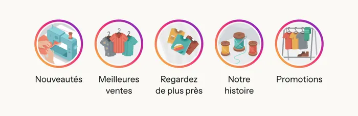
Three stores, three styles
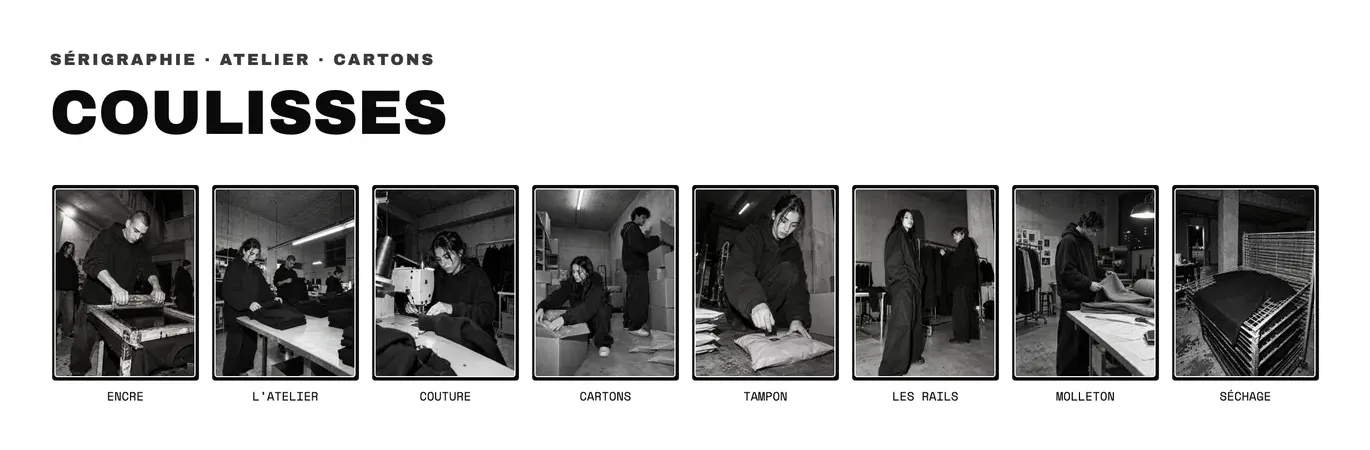
With the Portrait shape and a heading above, stories become a behind-the-scenes gallery. The Narvo demo uses them in black and white, left-aligned under a heading:
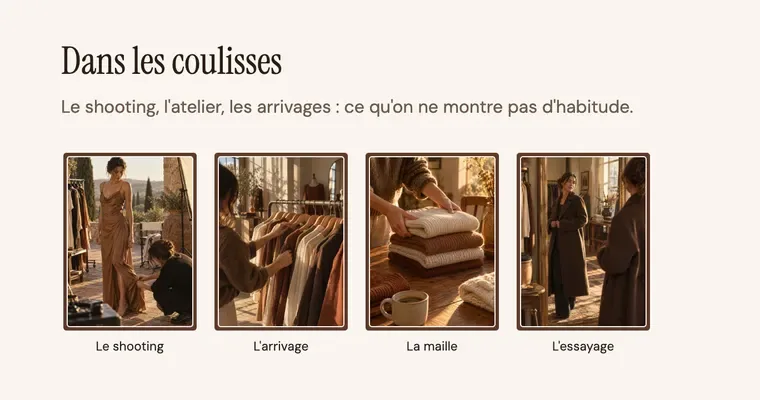
The Maison Mocha demo does the same with four stories about the photo shoot and the workshop:
The viewer
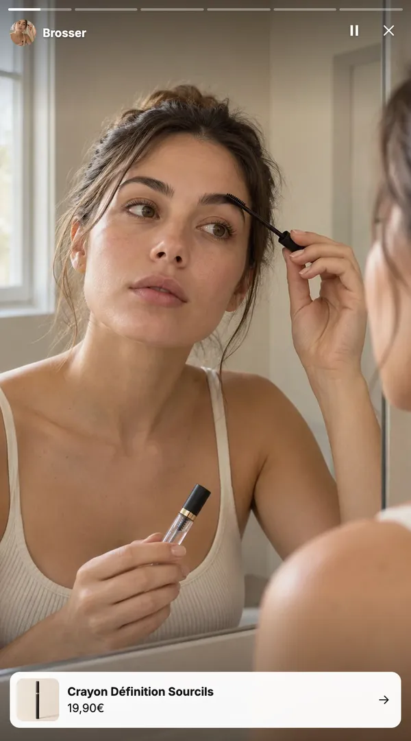
When clicked, the story opens large. One progress bar per story runs along the top, with a pause button and a close button. If you picked a product, a card with its image, name and price appears at the bottom and leads to the product page.
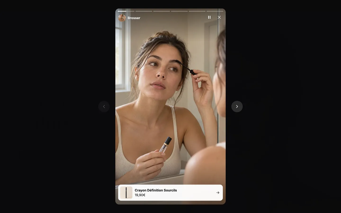
On a phone, visitors swipe left or right to navigate. They pause a story by keeping their finger pressed and close it by swiping down. On desktop, the keyboard arrows move from one story to the next. Stories already viewed are remembered on the visitor's device.
Add the section
- In your Shopify admin, open Online Store > Themes and click Edit theme.
- Choose the template from the menu at the top (for example Home page).
- Click Add section, open the Media category and choose Photo and video stories.
- Click each Story block to choose its image or video, its title and, if you like, a product.
- Click Save.
The section's blocks
| Block | What it's for |
|---|---|
| Photo and video stories | The row of bubbles and the viewer: shape, size, ring, duration. |
| Story | One story: its media, its title, a product and a button. Add as many as you need. |
| Heading, Text, Group… | The usual blocks, to add above or next to the stories with Add block. |
The Photo and video stories block
- Shape: Circle (default), Rounded or Portrait.
- Outline: the ring around the bubble, Gradient (default), Accent or None.
- Size (84 px) and Size on mobile (68 px), Gap between the bubbles (16 px).
- Alignment: Left, Center or Right.
- Show titles (checked by default).
- Duration: how long an image is shown, from 3 to 15 seconds (6 by default). Videos play to the end.
- Show on: desktop and mobile, or only one of them.
The Story block
- Image and Video: the image is used as the thumbnail and as the cover while the video loads.
- Title: the text under the bubble and at the top of the viewer.
- Product: shows the product card in the viewer.
- Button group: Button label and Link, to send visitors to a collection, a page or a blog post.
The section settings
The section itself only has the frame shared by almost every section in the theme: Layout (width, direction, spacing), Color palette, Separators and Animations. It's explained once and for all in Understand the theme editor.
Tips and pitfalls
- Keep videos short and filmed vertically: that's the format your customers know. A 10 to 20 second story is enough.
- Always choose an image, even for a video: that's what shows in the bubble.
- The viewer's content is only downloaded when it opens: stories don't slow down page loading.
- A short title (one or two words) fits under the bubble, especially on mobile.
- Link a product to the stories that show one: the card at the bottom of the viewer saves the customer from looking for it.
- With no image chosen, a colorful illustration shows instead: that's normal on a fresh theme.