
Before / after section: compare two images with a slider
Show what your product does with two overlaid photos that customers compare by dragging a slider, on desktop and mobile.
The Before / after section overlays two photos taken from the same angle. The customer drags the slider to reveal one or the other: it's the most convincing proof for skincare, makeup, a cleaner, a lamp or a renovation. It fits on the home page, a launch page or below a product page.
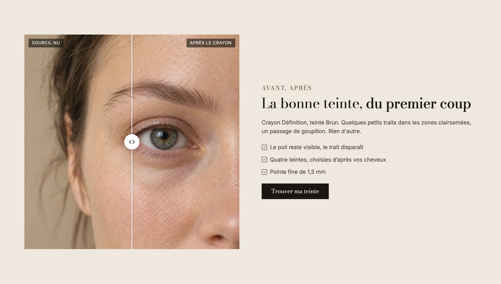
The presets
Before / after
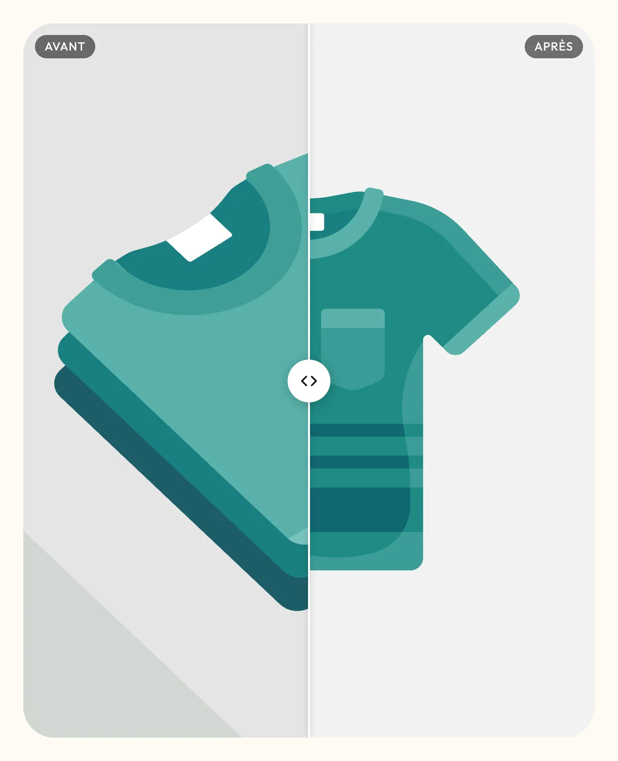
A centered heading above two comparison sliders side by side. Ideal to show two results, or the same product on two people. On mobile, the two sliders stack.
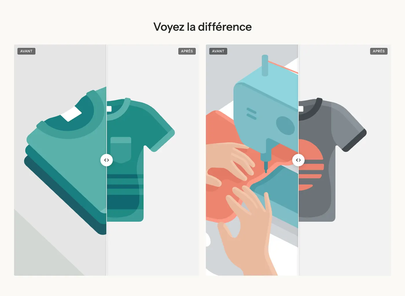
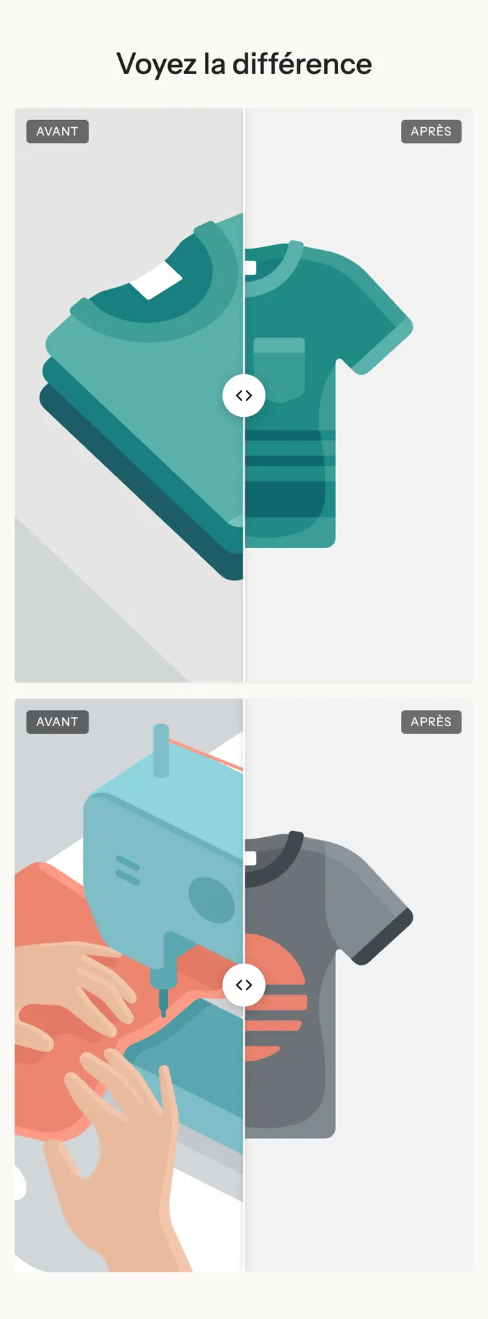
Transformation
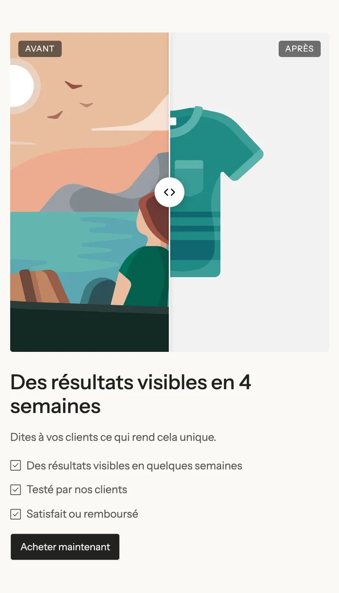
A square comparison slider on the left, and on the right a heading, a text, a bulleted checklist and a Shop now button. This is the preset to choose for selling: the image proves, the text explains, the button leads to the product.
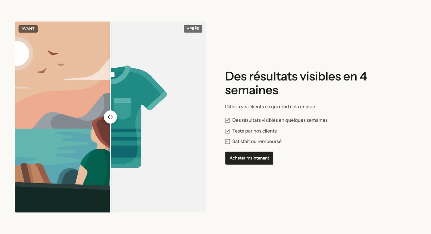
On mobile, the text moves below the image:
A full-width example
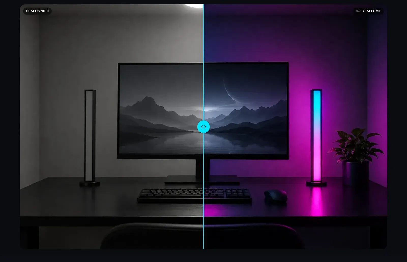
The Lumyx demo uses a single full-width slider, with custom labels ("Ceiling light" and "Halo on") and a slider in the brand's colors:
Add the section
- In your Shopify admin, open Online Store > Themes and click Edit theme.
- Choose the template from the menu at the top (for example Home page).
- Click Add section, open the Media category and choose Before / after or Transformation.
- Click the Before / after block and choose the Image before and Image after.
- Click Save.
The section's blocks
| Block | What it's for |
|---|---|
| Before / after | The comparison slider: the two images, the labels, the handle. |
| Heading, Text, Checklist, Button, Group | The content around the slider (included in the presets, freely editable). |
The Before / after block
- Image before and Image after. Use the same framing: with Adapt to image, the frame takes the shape of the Before image and the After image is cropped to fit it.
- Labels group: Before and After (the label text, for example "Bare brow" and "After the pencil"), Position (Top or Bottom).
- Layout group:
- Direction: Horizontal (handle slides left to right) or Vertical (top to bottom);
- Image height: Adapt to image, Small, Medium, Large, Square, Portrait or Landscape;
- Start position: where the handle sits when the page loads, 50% by default;
- Move the handle when it comes into view: the handle moves once to show it can be dragged;
- Corner radius and Bottom spacing.
- Design group: check Customize colors to choose the Divider color, the Handle background and the Arrows color. Otherwise, the handle follows the theme's style (white).
The section settings
The section only has the frame shared by almost every section in the theme: Layout (width, direction, spacing), Color palette, Separators and Animations. It's explained in Understand the theme editor.
Tips and pitfalls
- Take both photos in the same place, with the same lighting and framing. Otherwise the customer sees the difference between the photos, not the product's effect.
- Export both images at the same size: with Adapt to image, the After image is cropped to the shape of the Before image.
- Leave Move the handle when it comes into view checked on at least one slider: many visitors don't guess that it can be dragged.
- Be honest: no retouching on the After image. A believable comparison sells better than a spectacular one.
- Concrete labels ("Day 1" / "Day 28", "Ceiling light" / "Halo on") say more than "Before" and "After".