
Gallery section: image gallery, bento and lookbook
Show your photos and videos in a grid, masonry, bento or carousel layout, with captions, zoom on hover and a full-screen view on click.
The Gallery section brings several photos or videos together in one layout: a mood board, a seasonal lookbook, a behind-the-scenes look at your workshop. When clicked, each image opens large in a lightbox. It fits on the home page, a "Lookbook" page or an "Our story" page.
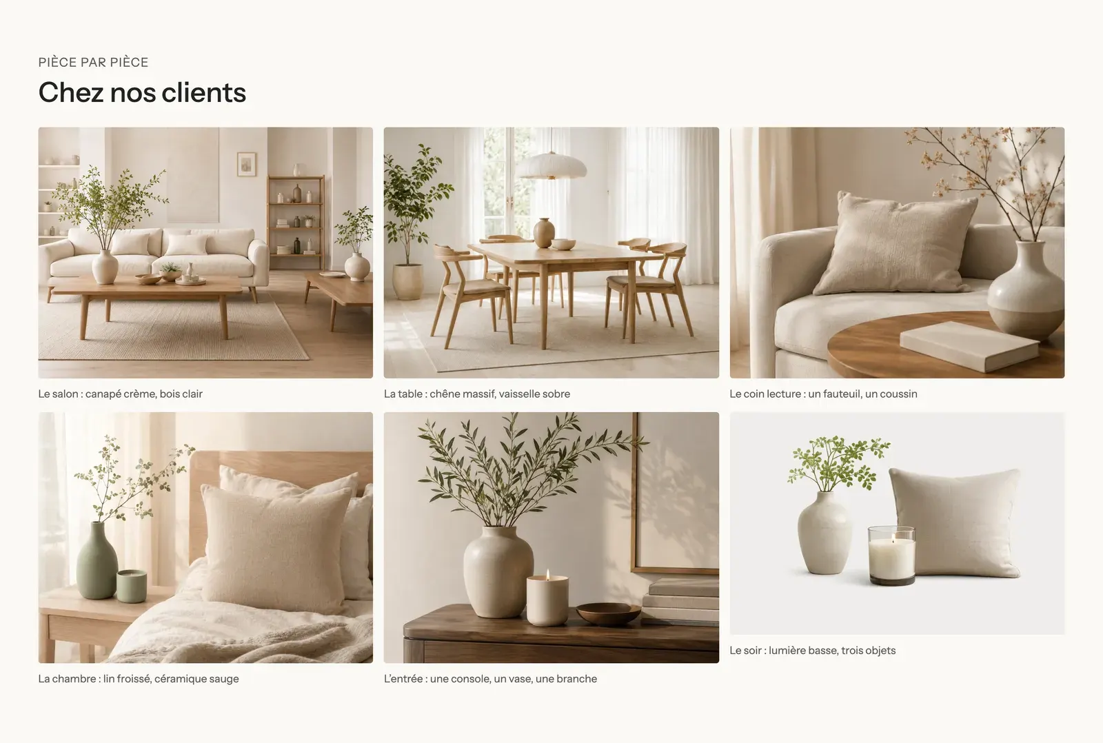
The presets
Image gallery
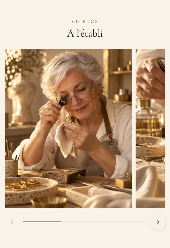
A centered heading above a Bento gallery: one large image and smaller ones fitted around it. On mobile, the gallery becomes a carousel where the next image peeks in from the edge to invite scrolling.
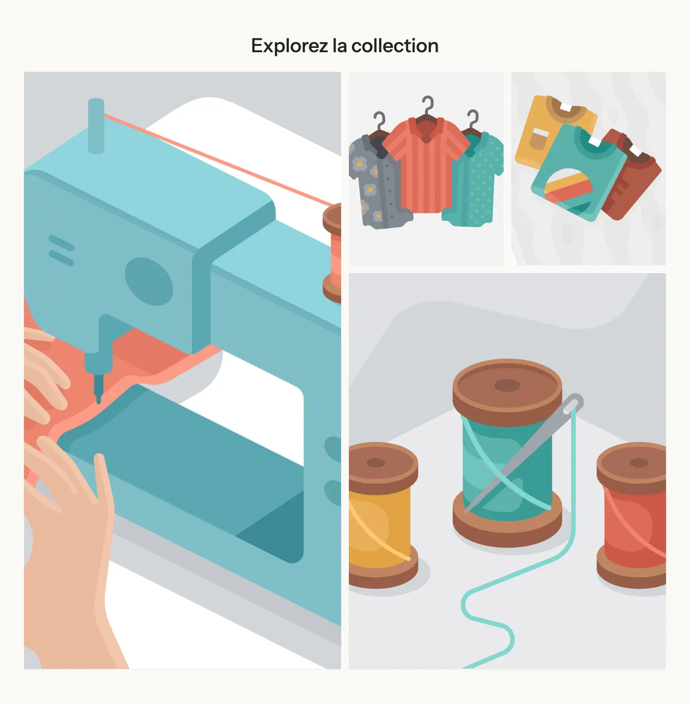
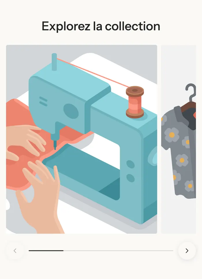
Lookbook
A text column on the left (heading, text, button) that stays visible while scrolling, and on the right a two-column Masonry gallery: the images keep their original shape and stack without gaps.
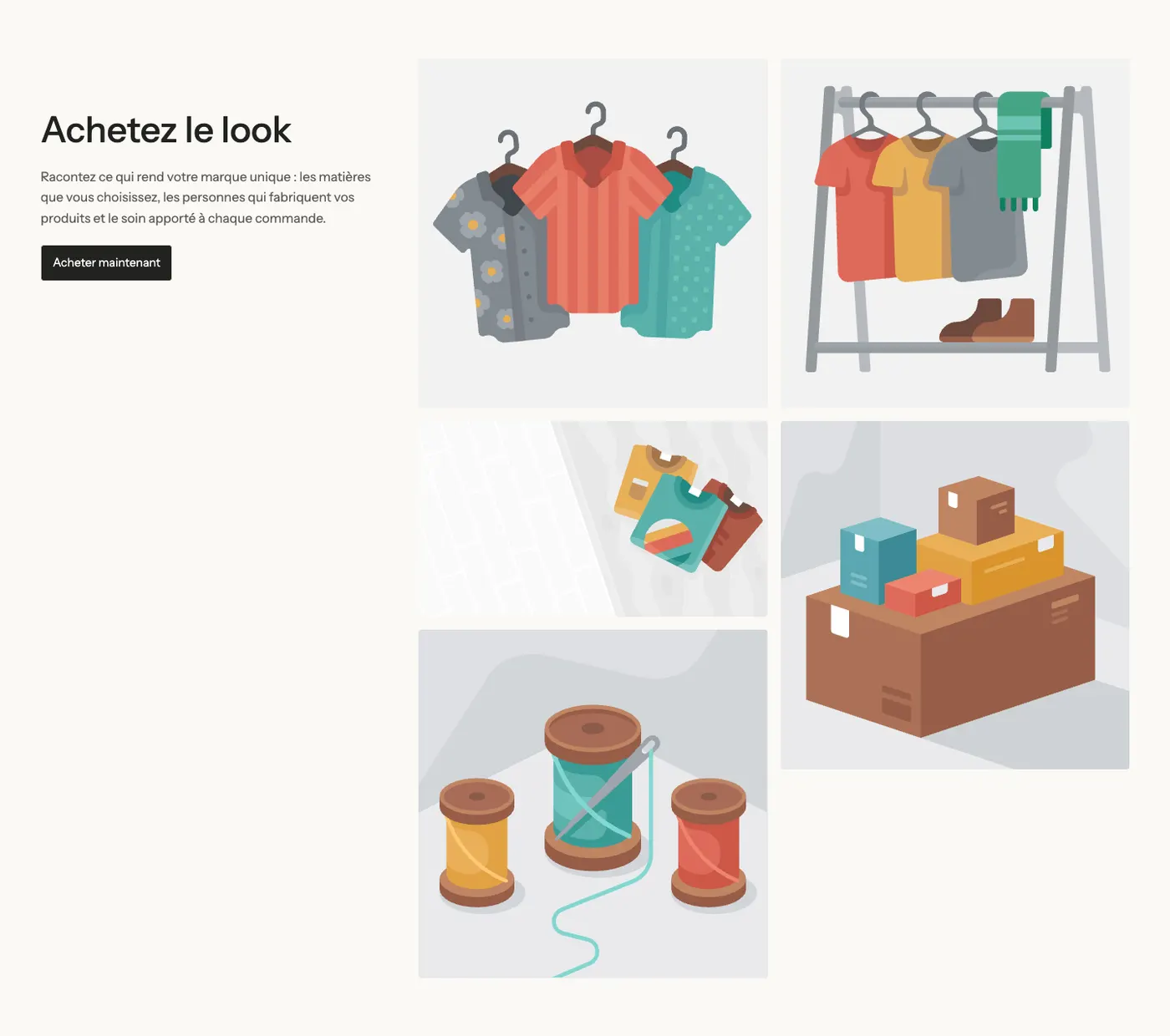
On the demos
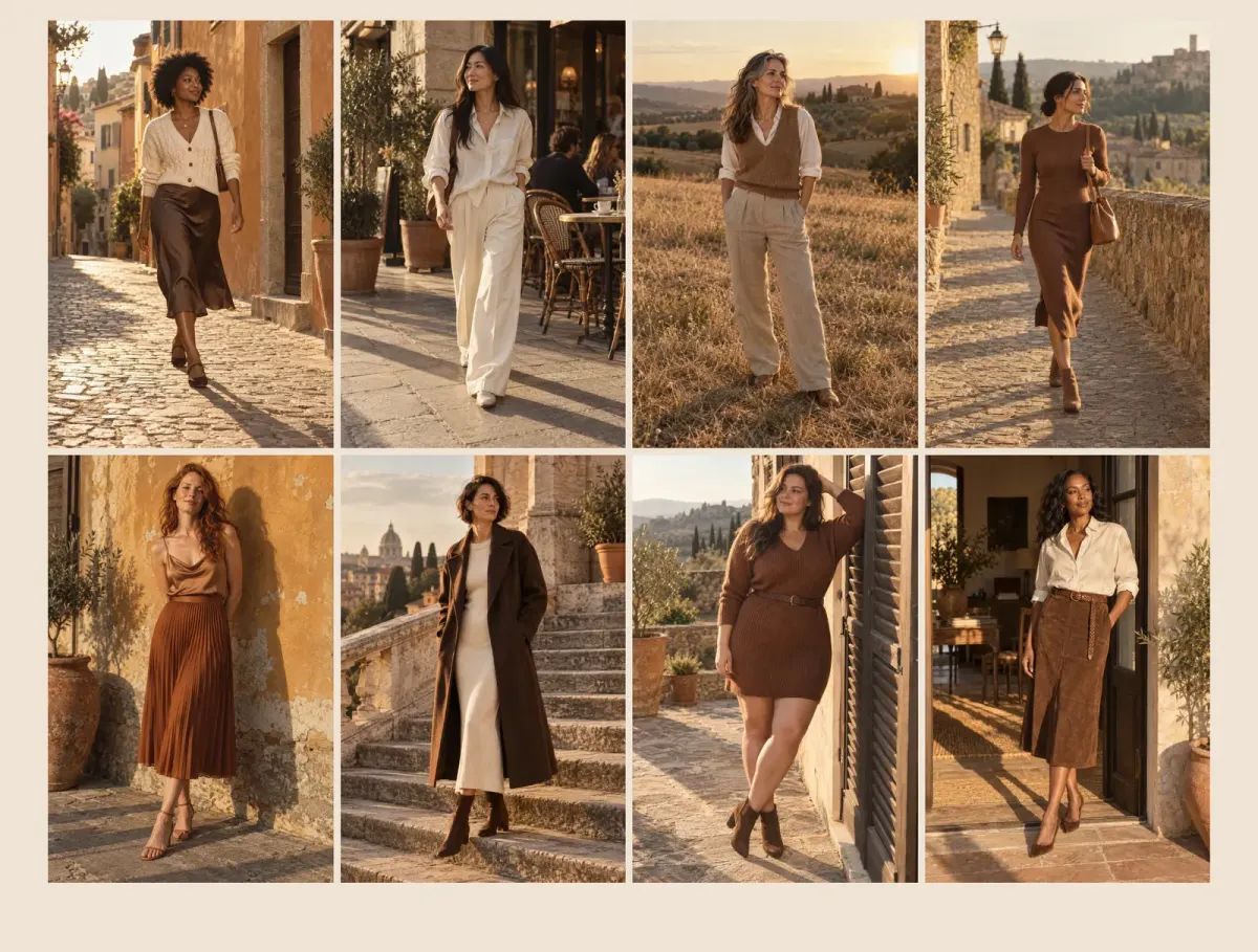
Maison Mocha dedicates a whole page to its lookbook, in a four-column grid with portrait images:
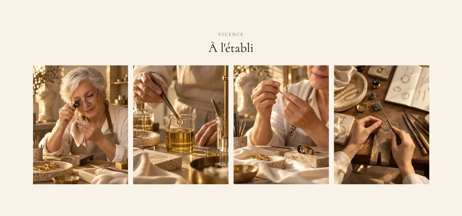
Darly shows its workshop in a row of four photos, which becomes a carousel on mobile:
Add the section
- In your Shopify admin, open Online Store > Themes and click Edit theme.
- Choose the template from the menu at the top (for example Home page).
- Click Add section, open the Media category and choose Image gallery or Lookbook.
- Click each Media block in the gallery and choose an Image or a Video. Add more with Add block.
- Click Save.
The section's blocks
| Block | What it's for |
|---|---|
| Heading, Group (heading, text, button) | The text above or next to the gallery. |
| Gallery | The layout of the media. Also available as a block in Add block > Media. |
| Media | An image or a video, with an optional caption and link. |
Media
- Image or Video (a Shopify video).
- Text: the caption, below the image or over it depending on the gallery's Text position.
- Link: makes the image clickable (to a product, a collection…).
Gallery
- Layout group:
- Layout: Grid, Masonry, Carousel or Bento;
- Carousel on mobile (checked by default);
- Columns on desktop (3 by default), Columns on tablet, Columns on mobile (1.25 by default: the next image peeks in);
- Space between columns, Space between rows, Use the full width of the screen.
- Controls group (carousel): Arrows, Move by, Navigation style, Pagination style, Auto-rotate slides.
- Media group:
- Image ratio: Adapt to image, Portrait (default), Square or Landscape;
- Text position: Bottom or Text over the image;
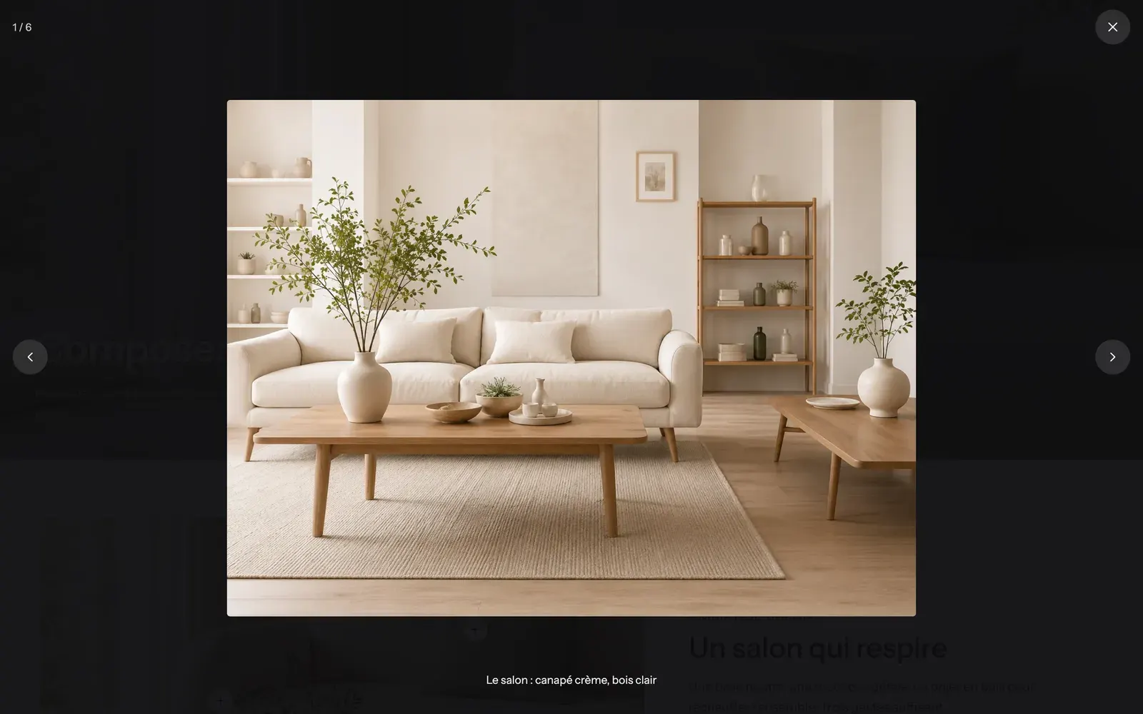
- Enlarge on click (checked by default): opens the full-screen lightbox;
- Zoom on hover (checked by default);
- Autoplay for videos, muted, as soon as they're on screen.
The section settings
The section has the frame shared by almost every section: Layout, Color palette, Separators and Animations. See Understand the theme editor.
Tips and pitfalls
- In Grid and Carousel, use images with the same shape: Image ratio crops them all the same way, and a face can get cut off. In Masonry, each image keeps its own shape.
- Compress your photos before uploading them (see Optimage): a gallery of twelve images gets heavy fast. The theme only loads the large lightbox versions when the lightbox opens.
- Write useful captions ("The living room: cream sofa, light wood"): they also appear in the lightbox.
- To make each product in a photo shoppable, use the Image with hotspots section instead. For customer photos with the matching product, use the Customer photos & videos section.