
Comparison table section: you vs the others, product by product
Compare your product with the competition, or your options with each other, in a clear table with check marks, a highlighted column, tooltips and a buy button.
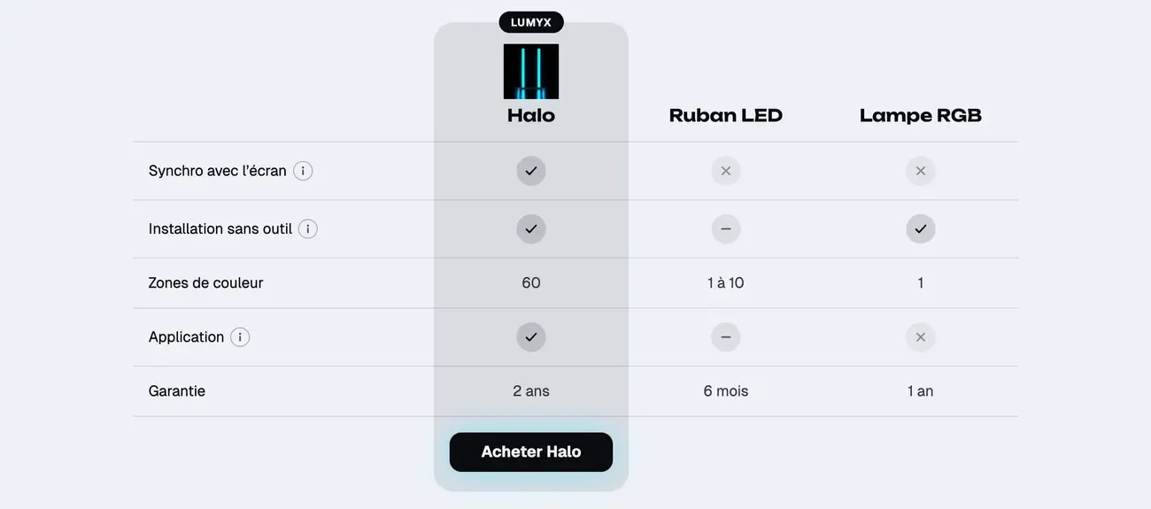
The Comparison table section puts your selling points in rows and your options in columns: your brand against the others, or your products side by side. Customers see at a glance what sets you apart. It fits on the home page, a launch page, an "Our commitments" page or below a product page.
The variants (presets)
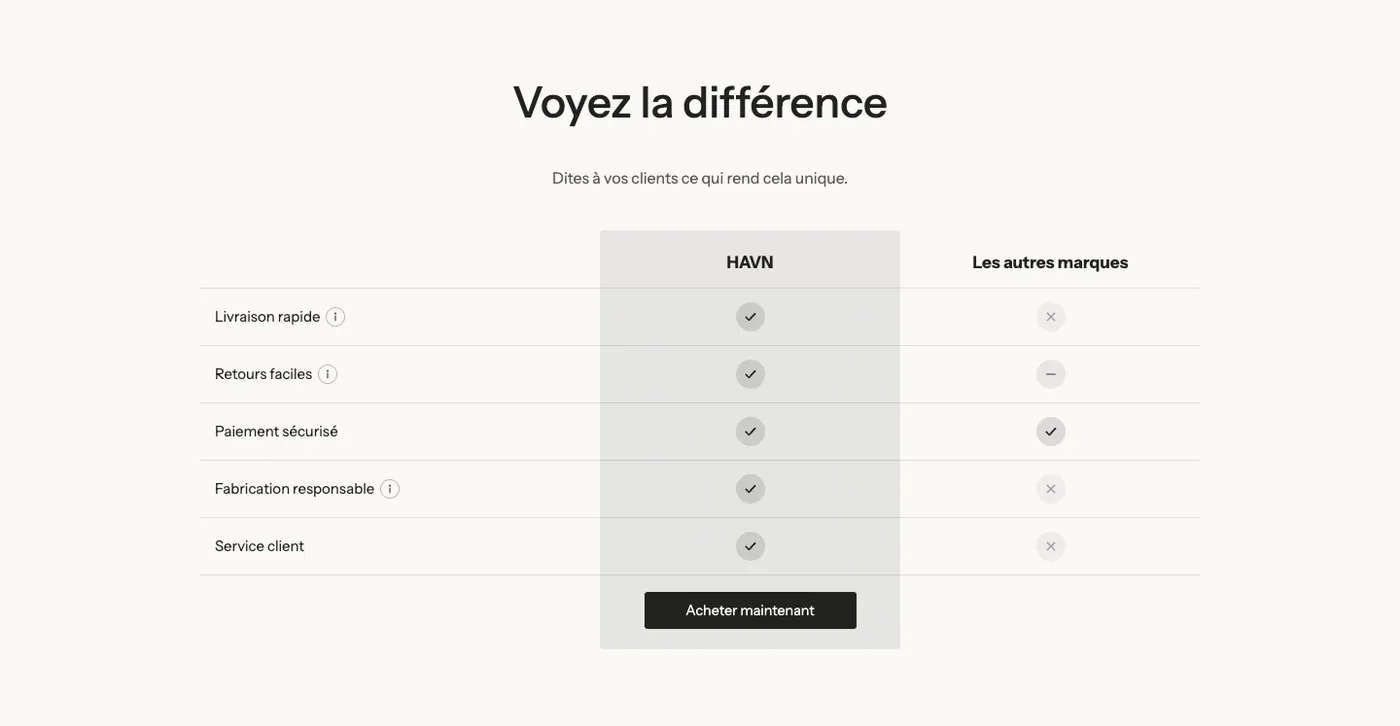
Us vs them
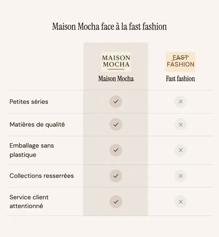
A heading, a short text and a two-column table: yours, highlighted, and "Other brands". The buy button sits below your column. It's the variant to choose to stand up for your brand against the competition or a habit ("fast fashion", "LED strips"…).
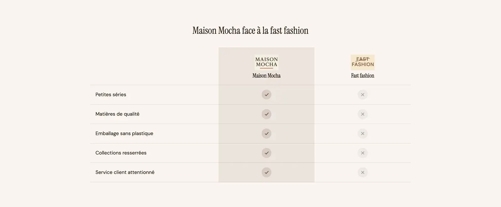
The Maison Mocha demo uses it with a logo in each column header:
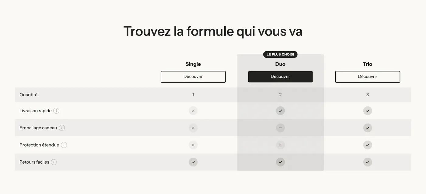
Product comparison
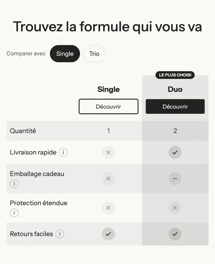
Three columns (Single, Duo, Trio) with a Discover button at the top of each, a "Most popular" badge on the middle column and striped rows. It's the variant to help customers choose between your options, bundles or models.
On mobile, this variant only shows two columns at a time: the highlighted column, against the one the customer picks with the Compare with buttons.
Add the section
- In your Shopify admin, open Online Store > Themes and click Edit theme.
- Pick the template in the top menu (for example Home page).
- Click Add section, open the Selling points category and choose Us vs them or Product comparison.
- Rename the columns, then replace the sample rows with your selling points.
- Click Save.
The section's blocks
| Block | What it's for |
|---|---|
| Heading, Text | The heading and introduction above the table. |
| Comparison table | The table itself, with its style and colors. |
| Columns > Column | One column per option compared (up to five). |
| Rows > Row | One row per selling point, or a category title. |
Column
- Name: when empty on the highlighted column, your store's name is shown.
- Product: fills in the name, image, price and button link automatically.
- Image and Subheading: a logo, a photo, a detail below the name.
- Highlight this column: the column gets a background tint. Check it on a single column, yours.
- Badge text: the pill above the column ("Most popular", the brand name…).
- Button group: Button label, Link, Button style.
Row
- Type: Feature (a row of values) or Category title (a subheading that groups the following rows).
- Label: the selling point, on the left.
- Information text: a detail shown in a tooltip behind the small "i".
- One group from Value 1 to Value 5, one per column in their order, with a Type: Checkmark, Cross, Partial (a dash), Custom (an icon from the library or your own image, with a text and a color) or Text ("2 years", "60"…).
The section settings
The table settings are in the Comparison table block:
- Layout group:
- Style: Minimal, Striped rows or Card;
- Label width (34% by default), Text size, Image height of the headers;
- Sticky header (checked by default): the column names stay visible while the customer scrolls through a long table;
- Mobile layout: Swipe sideways (the table slides horizontally) or Highlighted column against another one (the Compare with buttons shown above);
- Show info texts in a tooltip (checked by default).
- Button group: buttons Position, Top or Bottom of the table.
- Highlighted column group: Style (Tint, Solid or Outline) and Color.
- Icons group: Shape (Circle or None) and the Check mark, Cross and Partial colors.
- Colors group: Divider color between rows, or Background of the striped rows.
The section itself only has the frame shared by almost every section: Layout, Color palette, Separators and Animations, explained in Understand the theme editor.
Tips and pitfalls
- Five to seven rows are enough. Beyond that, group them with Category title rows and keep Sticky header checked.
- Mix value types: a Text row ("2 years" against "6 months") says more than one more check mark.
- Stick to facts when you mention competitors. Compare with a category ("Other brands", "An LED strip") rather than a named brand.
- On mobile, with more than three columns, use Highlighted column against another one: a wide table that scrolls sideways is hard to read.
- With the Product setting on each column, the name, price and link update automatically when you edit the product.