
Blog posts section: show your latest articles
Feature your blog posts on the home page or a product page, in a grid, a carousel, a journal layout or with a featured article.
The Blog posts section shows a selection of your articles, with their image, date, title and an excerpt. On the home page, it shows that your store is alive; below a product page, it points to your how-to tips. It comes in four presets.
The presets
Blog posts
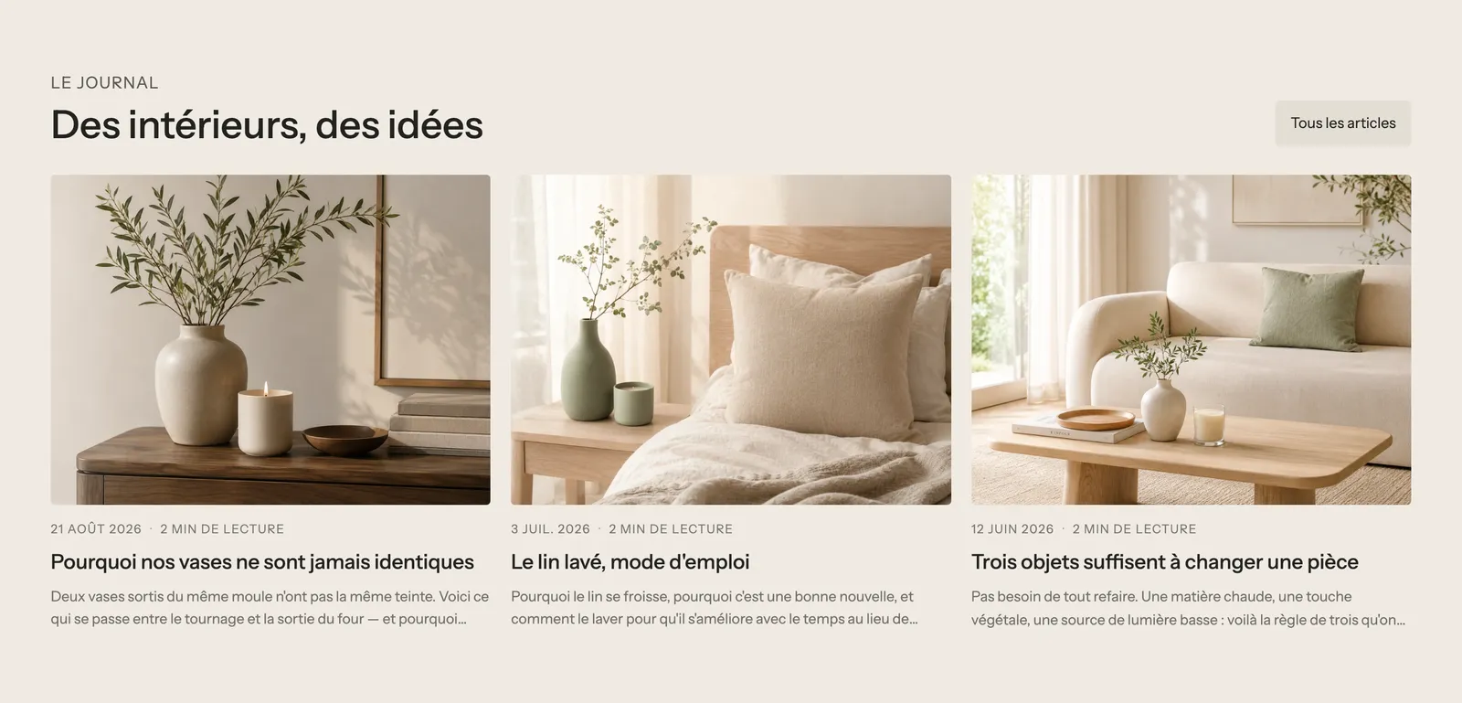
A heading on the left, a View all articles button on the right, and three articles in a grid. On mobile, the grid becomes a carousel. It's the classic preset for the home page.
Blog carousel
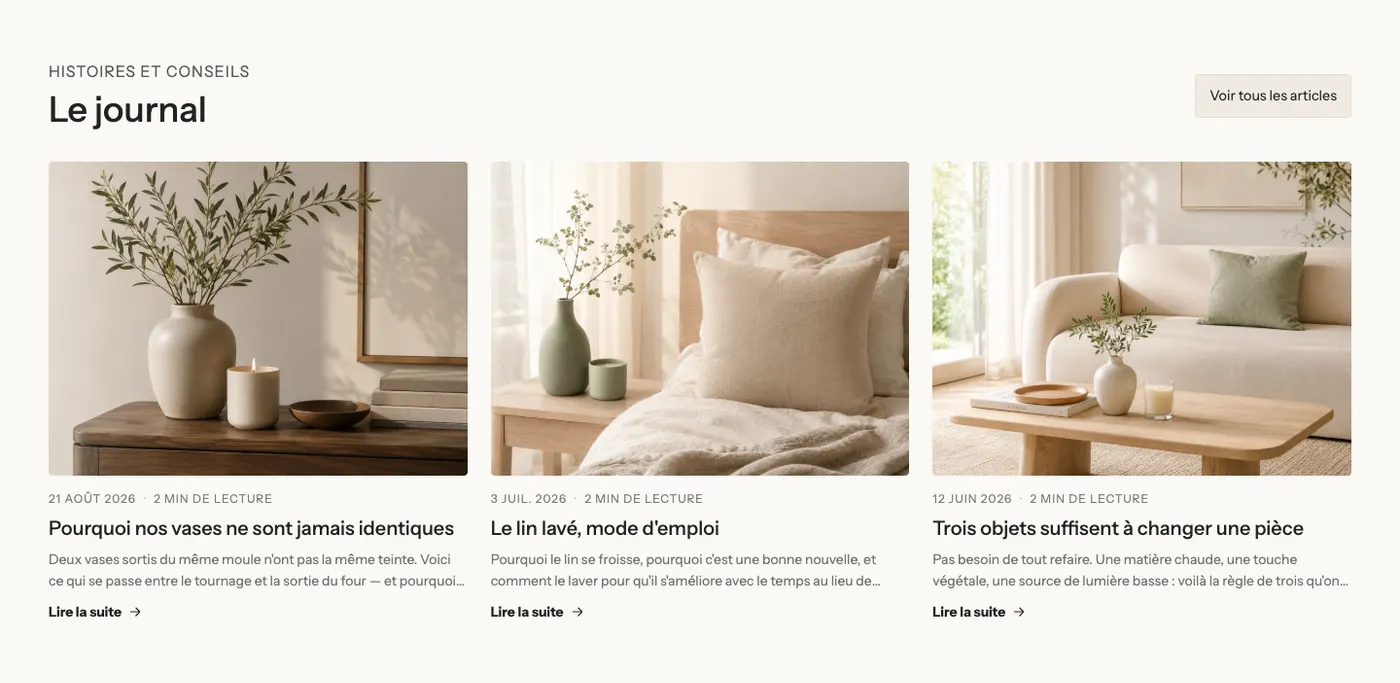
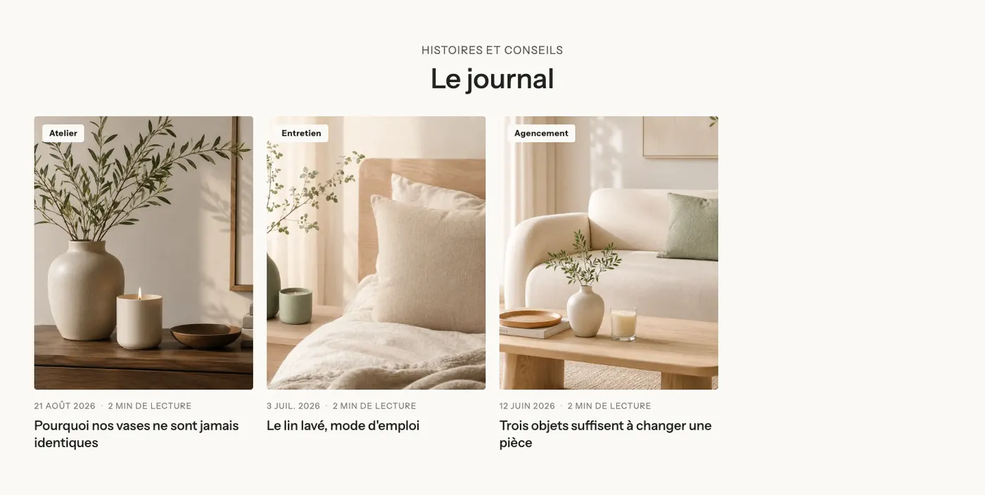
A centered heading above a carousel of eight portrait articles, with the article's tag as a badge on the image. Handy when you publish often.
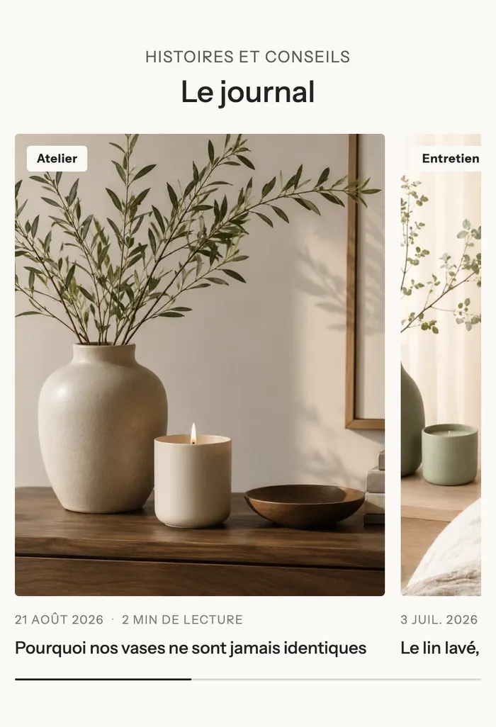
On mobile, part of the next article peeks in and a progress bar shows the position:
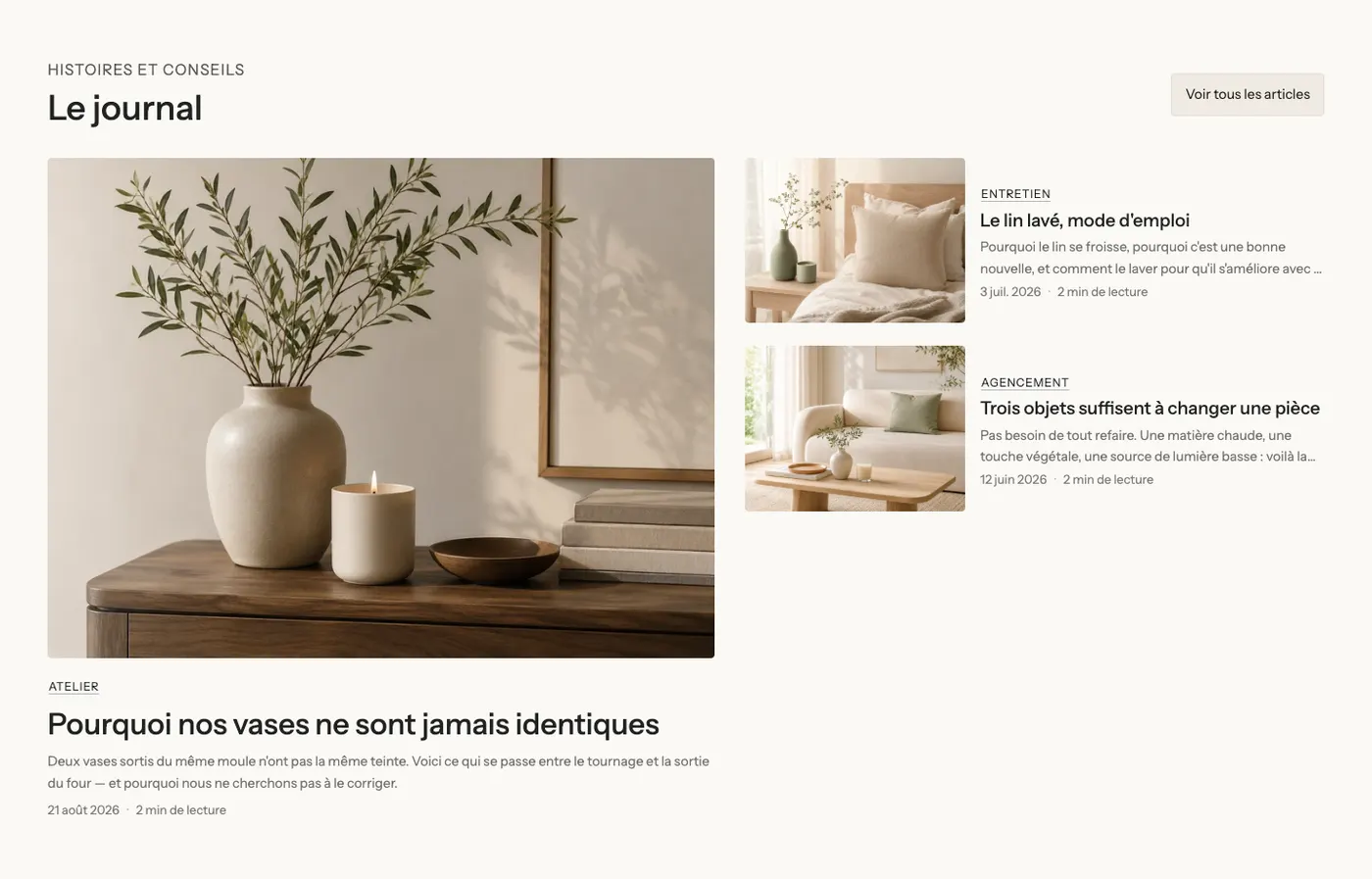
Featured article
The latest article large on the left, and the following ones smaller on the right. Ideal for highlighting an important article.
Journal
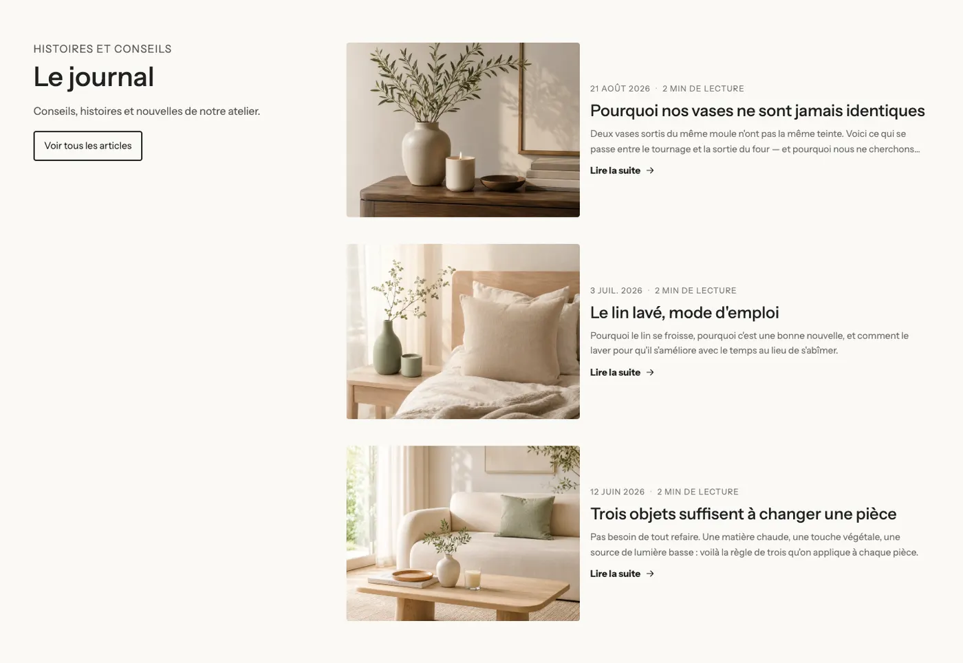
The heading, a text and a button in a column on the left that stays visible while scrolling, and on the right a list of articles with the image next to the text. A magazine layout, for a page dedicated to content.
Add the section
- In your Shopify admin, open Online Store > Themes and click Edit theme.
- Choose the template from the menu at the top (for example Home page).
- Click Add section, open the Blog category and choose the preset.
- Click the Blog posts block and choose the Blog to show.
- Click Save.
The section's blocks
| Block | What it's for |
|---|---|
| Blog posts | The heart of the section: which articles to show and how to lay them out. |
| Blog post card | The card template, shared by every article in the list. |
| Heading, Text, Button, Group | The heading and the "View all articles" link around the list. |
The Blog posts block
Articles group:
- Source: Blog (the latest articles of a blog) or Articles (the ones you pick one by one).
- Blog: left empty, the section uses the page's blog, otherwise the blog with the handle
news(the blog Shopify creates by default). - Only articles with this tag: to show, for example, only "Tips" articles.
- Number of items: from 1 to 24 (3 by default).
- Hide the article of the page (checked): on an article page, the article being read isn't suggested, and those that share its tags come first.
- Page navigation on the blog page: Numbers, Load more button or None. It's only used on the blog page.
- "View all" card: an extra card that links to the blog, with its own text and colors.
Layout group: Layout (Grid, Carousel, Bento, Featured article), Carousel on mobile, Columns on desktop (3), Columns on tablet (2), Columns on mobile (1.25: part of the next article stays visible), space between columns and rows.
Controls group (carousel): Arrows, Navigation style, Pagination style, Auto-rotate slides.
The Blog post card block
It sets the look of every card:
- Layout: Stacked (image above), Side (image next to it, like the Journal preset) or Text over the image.
- Style: Theme, Standard, Card or Custom (background, border, corners).
- Its sub-blocks, to add, remove or reorder:
- Media: Image ratio, Image fit, Zoom on hover, Badge (None, Tag or Date);
- Date and author: date, author, Show reading time, number of comments, date format;
- Title: level, size, Maximum lines, hover effect;
- Excerpt: Maximum lines (3);
- Tags: the article's tags, as Pills, Outline or Plain;
- Link: "Read more", as an Arrow, a Link or a button.
The section settings
The section only has the frame shared by almost every section in the theme: Layout, Color palette, Separators and Animations, explained in Understand the theme editor.
Tips and pitfalls
- Give each article a featured image in Shopify: that's what shows in the card.
- Write an excerpt for each article (the article's Excerpt field in Shopify): otherwise, the start of the text gets cut off.
- Reading time is calculated automatically from the word count.
- On a product page, filter by tag (for example the product's tag) to show only relevant articles.
- Three articles are enough on the home page: add the button or the "View all" card for the rest.