
Blog and Blog post sections: the blog page and the article page
Customize the page that lists your articles and the page where an article is read - table of contents, sharing, author box, reading bar and suggested articles.
Your Shopify blog is displayed with two theme templates: Blog, the page that lists all the articles, and Blog post, the page where an article is read. Each has its main section, made of blocks you can reorder, hide or add to. These sections can't be added elsewhere: to show articles on the home page, use the Blog posts section.
To open them: Online Store > Themes > Edit theme, then choose the blogs template or the blog posts template from the menu at the top.
Blog
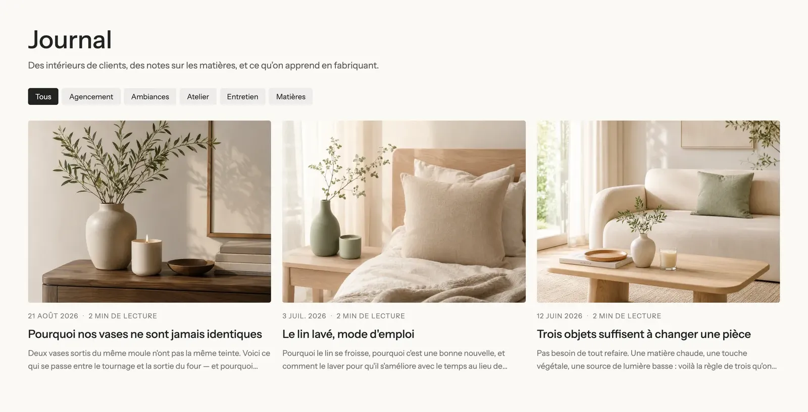
The Blog section shows the blog title, an intro text, the article tags as filters and the grid of articles, split into pages.
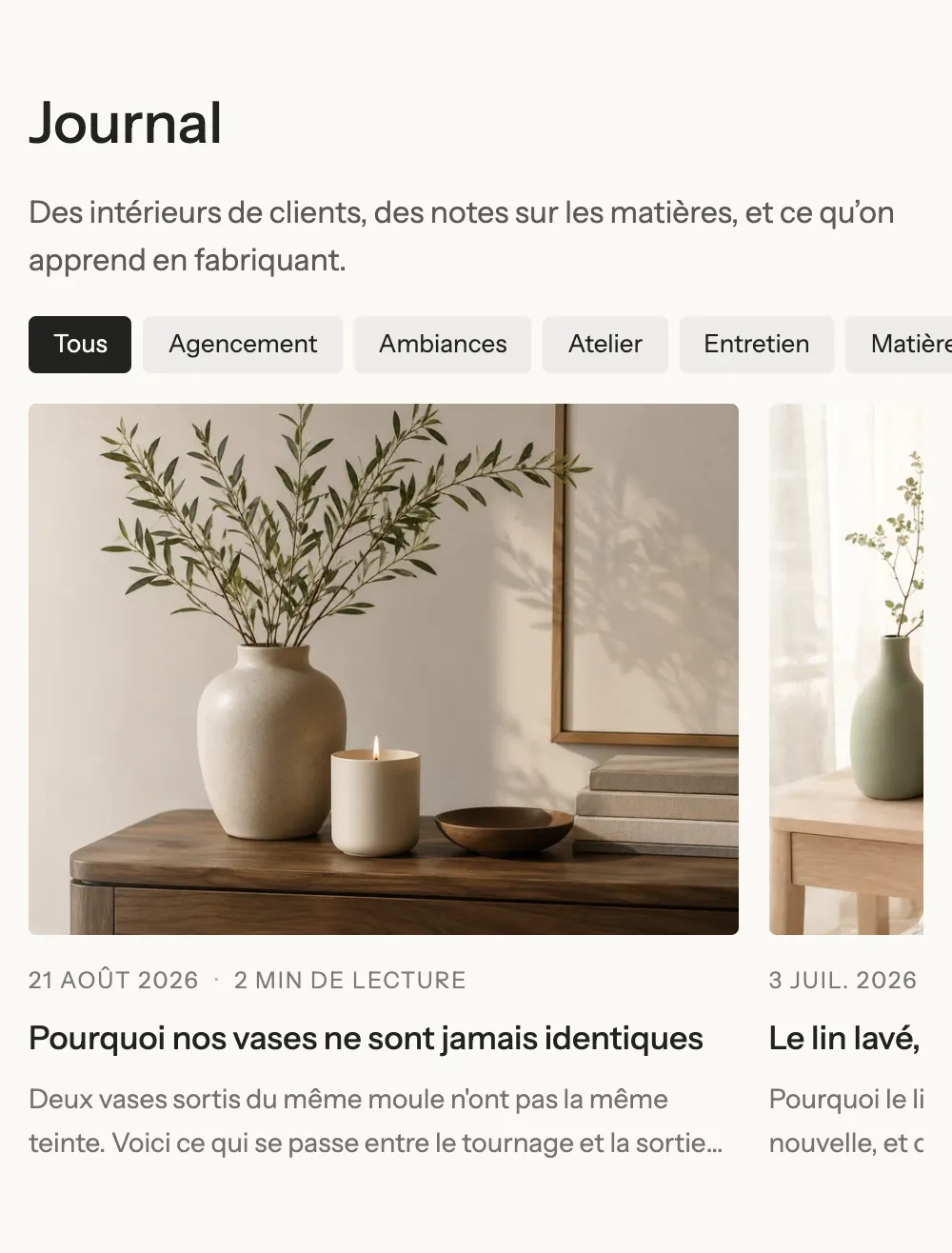
On mobile, the tag pills scroll on one line and the articles move to a single column:
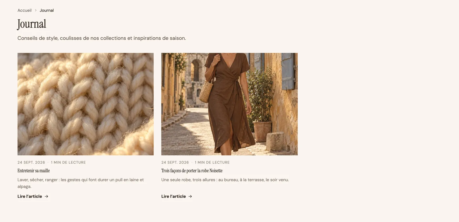
The Maison Mocha demo adds a breadcrumb above the heading and a "Read the article" link under each card:
The Blog section's blocks
| Block | What it's for |
|---|---|
| Group with Article title and Text | The blog title (the Article title block shows the title of the current page) and an intro sentence. |
| Article tags | Your article tags, as clickable pills that filter the blog. |
| Blog posts | The grid of articles (9 per page in the included template, 3 columns), with page navigation. |
The Blog posts block has the same settings as in the section of the same name: layout, columns, blog post card, and above all Page navigation on the blog page (Numbers, Load more button or None). Left empty, its Blog setting uses the page's blog. All the details are in Blog posts section.
Article tags is set with Label, Style (Pills, Outline, Plain), Text size, Uppercase and Carousel on mobile (the tags scroll on one line).
Blog post
The Blog post section builds the reading page. The included template shows, in order: the tags, the title, the date, the author and the reading time, the large image, then the table of contents on the left and the text on the right, followed by the share buttons, the author box, the article navigation and the comments.
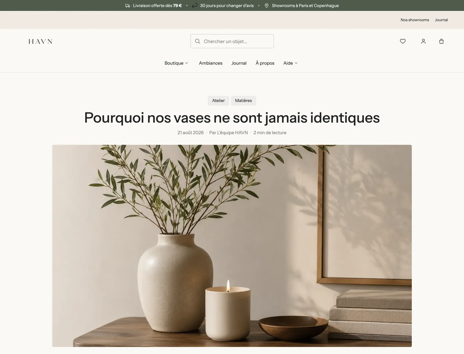
A thin reading progress bar runs along the top of the screen while the customer reads. Set it in the section's Reading progress bar group: checkbox, Color (Accent 1, Accent 2, Text) and Height (3 px).
The table of contents
The Table of contents block lists the article's subheadings and lets readers jump to them in one click. On desktop, it stays visible while reading and highlights the current part:
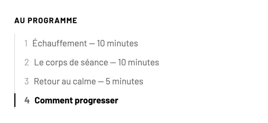
Settings: Heading, Headings listed (H2 or H2, H3), Style (Plain, Line, Card), Numbers, Text size, Keep visible while scrolling (checked) and On mobile (Collapsed by default, Expanded, can be collapsed or Always expanded). To give it something to list, structure your articles with subheadings in Shopify's text editor.
Sharing and navigation
Below the text, Article sharing offers Facebook, X (Twitter), Pinterest, WhatsApp, Email and Copy link, or share menu on phones (LinkedIn is available but unchecked). Article navigation shows the previous or next article with its image, and a Back to blog link.

Suggested articles
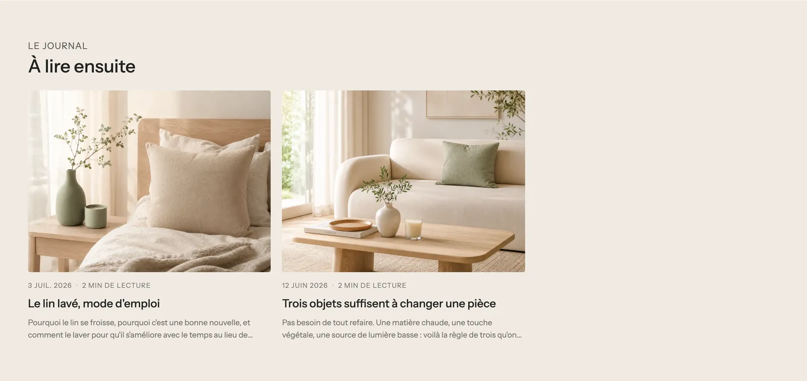
Below the main section, the included template adds a Blog posts section with three articles. The current article doesn't appear there, and those that share its tags come first.
The Blog post section's blocks
| Block | What it's for and key settings |
|---|---|
| Article title | The title (h1): Heading style, Show separator line, custom size, Heading color, alignment. |
| Article info | Show date, Show author, Show reading time (calculated from the word count), number of comments, Date format, Separator, icons. |
| Article image | The featured image: Image ratio (Wide (16:9) by default), Corners, Edge to edge on mobile. |
| Article content | The text: Maximum text width (720 px), custom font size, Large first letter, alignment. |
| Table of contents | The table of contents (see above). |
| Article sharing | The share buttons: networks offered, Display (Icons / Icons and names), Icon shape, Icon colors (Theme or Brand colors). |
| Article tags | The article's tags, clickable. |
| Author box | A photo and a text about the author. Left empty, they're taken from the staff account that published the article. Layout, Style (Plain / Card). |
| Article navigation | Previous and next article: Show featured image, Style, Show a back link. |
| Comments | The comments and the form to leave one: Number of items per page, Style, Button style. |
These blocks are arranged in Groups: in the included template, a horizontal group places the Table of contents (4/12 of the width) next to a group that holds the text and everything after it (8/12). On mobile, the two stack.
Shared settings
Both sections also have the frame shared by almost every section: Layout, Color palette, Separators and Animations, explained in Understand the theme editor. You can add any block from the theme to an article, for example a Product list to sell the products you're writing about.
Tips and pitfalls
- Comments only show if you've enabled them for that blog in Shopify (blog settings, in Online Store > Blog posts).
- The author's name comes from the account that published the article. To sign "The team" instead of a first name, change the article's author in Shopify.
- Tags are used both as filters on the blog page and to pick suggested articles: use only a few, and always the same ones.
- Give every article a featured image: without it, the blog grid and the article navigation lose their visual.
- The theme adds article structured data for search engines: take care with each article's title and excerpt.