
Collection, Search results and Collections list page sections
The three sections that build your collection pages, the search page and the list of all your collections: blocks, filters, grid and pagination.
Three Story Theme sections belong to a specific page template: Collection (the collection page template), Search results (the page shown after a search) and Collections list page (the /collections address, which lists all your collections). You won't find them in Add section: they're already in place in their template, and you adjust them block by block.
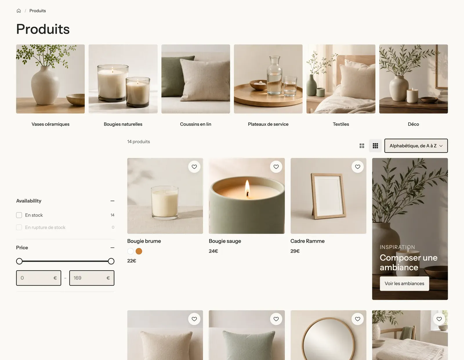
Collection
Open the section
- Open Online Store > Themes > Edit theme.
- In the dropdown at the top, choose Collections > Default collection.
- In the left-hand column, expand the Collection section.
What the included template contains
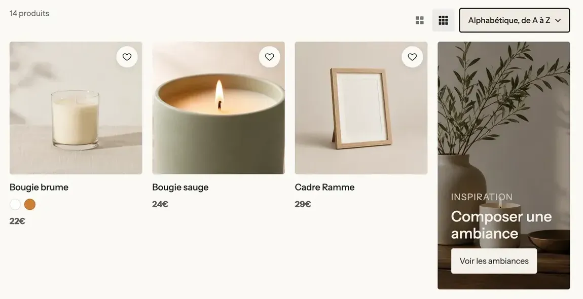
From top to bottom: Breadcrumb, Collection banner (title and description, no image), then a Group with the Filters in a column on the left and, on the right, a bar (Filter button, Product count, Grid density, Sorting), the Active filters and the Product grid. The section accepts other blocks: Havn added a row of collections above the grid (top screenshot).
The blocks
| Block | What it's for |
|---|---|
| Collection banner | The collection's title and description, with or without an image. |
| Filters | The filters created in the Search & Discovery app: Sidebar, Horizontal or Drawer. |
| Filter button | The Filter button that opens the filters in a drawer (hidden on desktop when the filters are already shown). |
| Active filters | The filters the customer chose, removable in one click. |
| Sorting | The sort menu (Field or Text). |
| Product count | "14 products". |
| Grid density | Two icons to switch from larger to smaller products; the choice is remembered on the customer's device. |
| Product grid | Where the products go, with its Promotion tile and No results blocks. |
| Product Card | How each product in the grid looks (see Product card blocks). |
| Breadcrumb | The Home / Collection trail. |
Collection banner
Image: None (title only, as in the included template), Content over the media or Media beside the content; left empty, the Image is the collection's. With content over the media: Height (360 px; 280 px on mobile), Overlay opacity (35%), Color palette. Then Alignment, Content max width (760 px). The Description sub-block limits the text to 3 lines by default.
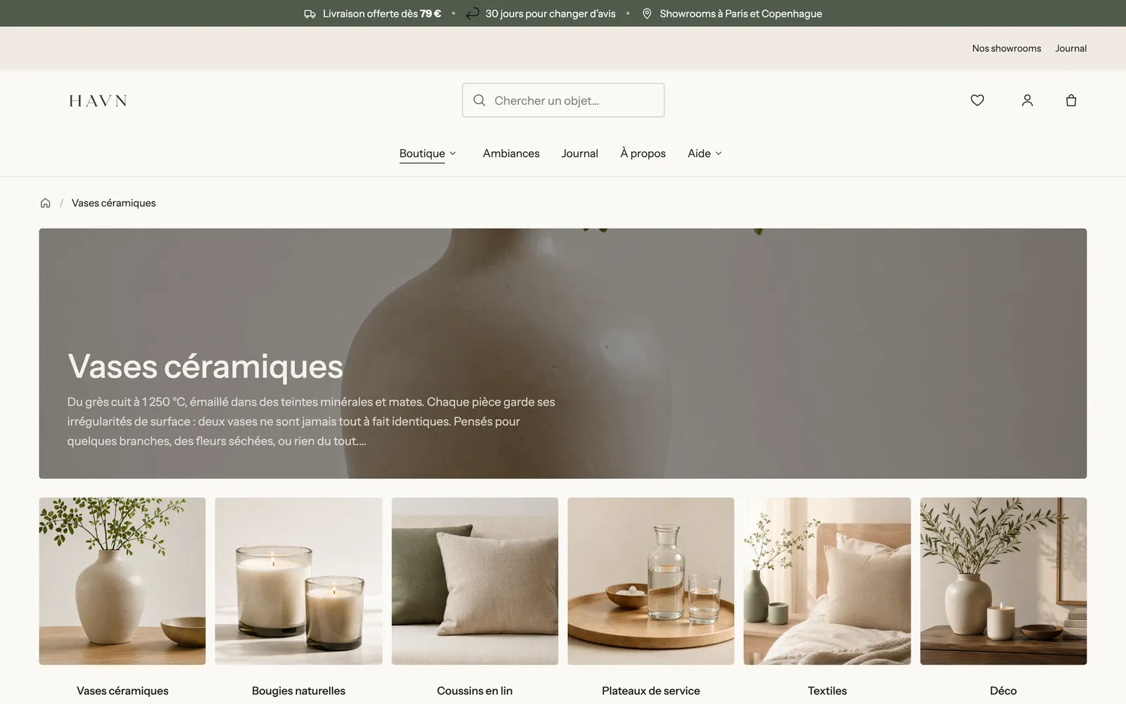
Filters, sorting and density
The Filters block: Layout (Sidebar by default; the drawer is always used on mobile), Keep visible while scrolling, Groups open when the page loads (3), drawer Position, Show sorting in the drawer, Show the count, Values shown before Show more (6), Swatch shape and Filters shown as buttons (for example Size, Shoe size).
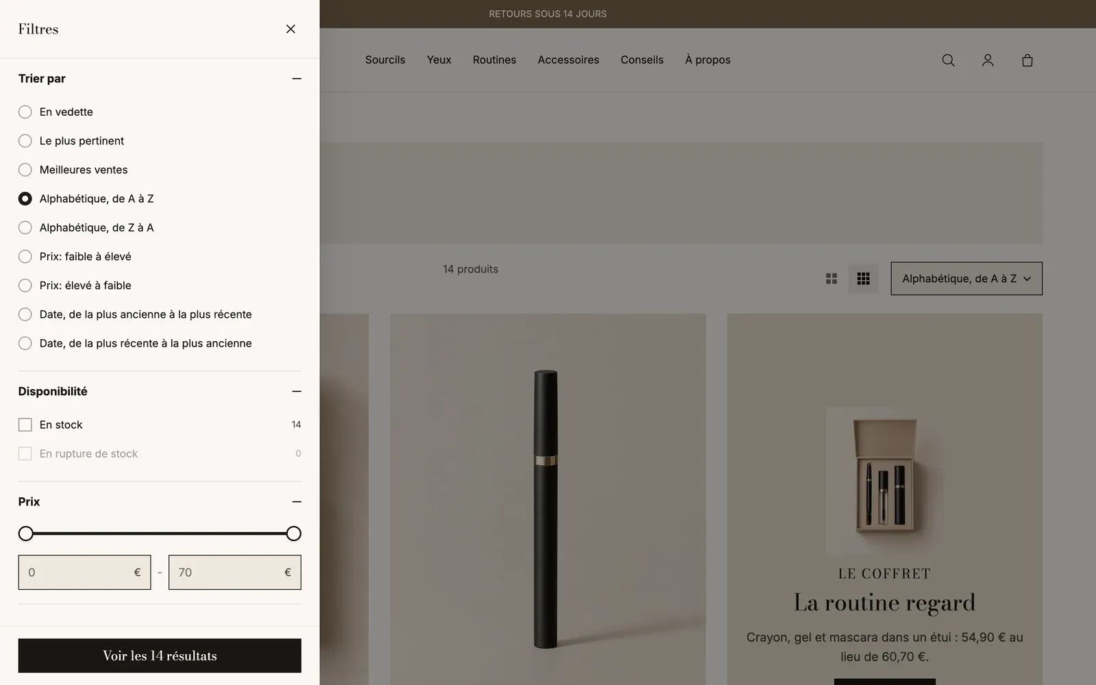
On mobile, the bar shrinks to the Filter button, the two density icons and sorting:
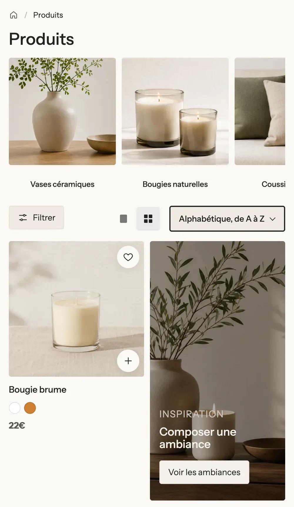
Product grid and promotion tile
The Product grid has almost no settings: the number of products, columns and pagination are set on the section, and the card on the Product Card block. It contains:
- Promotion tile: a content card (image, text, button) slipped into the grid, on the Row of your choice on the first page (2 by default), across 1 or 2 columns or Full width, on the Left or Right, optionally Two rows high.
- No results: what shows when the collection is empty. Check Preview in the editor to work on it.
Section settings
Product grid group:
- Products per page: 24 (from 8 to 48).
- Columns on desktop (4 by default; 3 in the included template), Columns on tablet, Columns on mobile (1 or 2), space between columns and rows.
- Pagination style: Numbers, Load more button (default) or Infinite scroll (four pages loaded as you scroll, then the button, so the footer stays reachable), and the Button style.
- Animation of the cards as they appear.
On top of that comes the shared frame (Layout, Color palette, Separators, Animations), explained in Understand the theme editor.
Search results
The Search results section works like the Collection section, with three extra blocks: Search title ("Results for …", with the number of results), Search form (the field, with Placeholder, Search in and Popular searches) and Result types (All, Products, Blog posts, Pages tabs, as Pills, Underline or Minimal). To open it, choose the search page in the dropdown at the top of the editor.
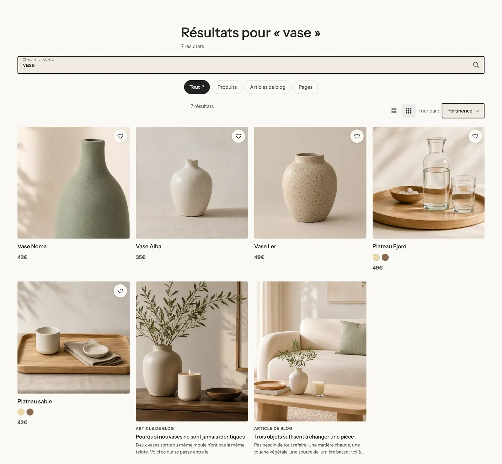
In the included template, the filters are in a Drawer and the No results block contains a heading and a product list: a customer who finds nothing leaves with ideas. Havn added the heading "Rien trouvé sous ce mot" and search suggestions:
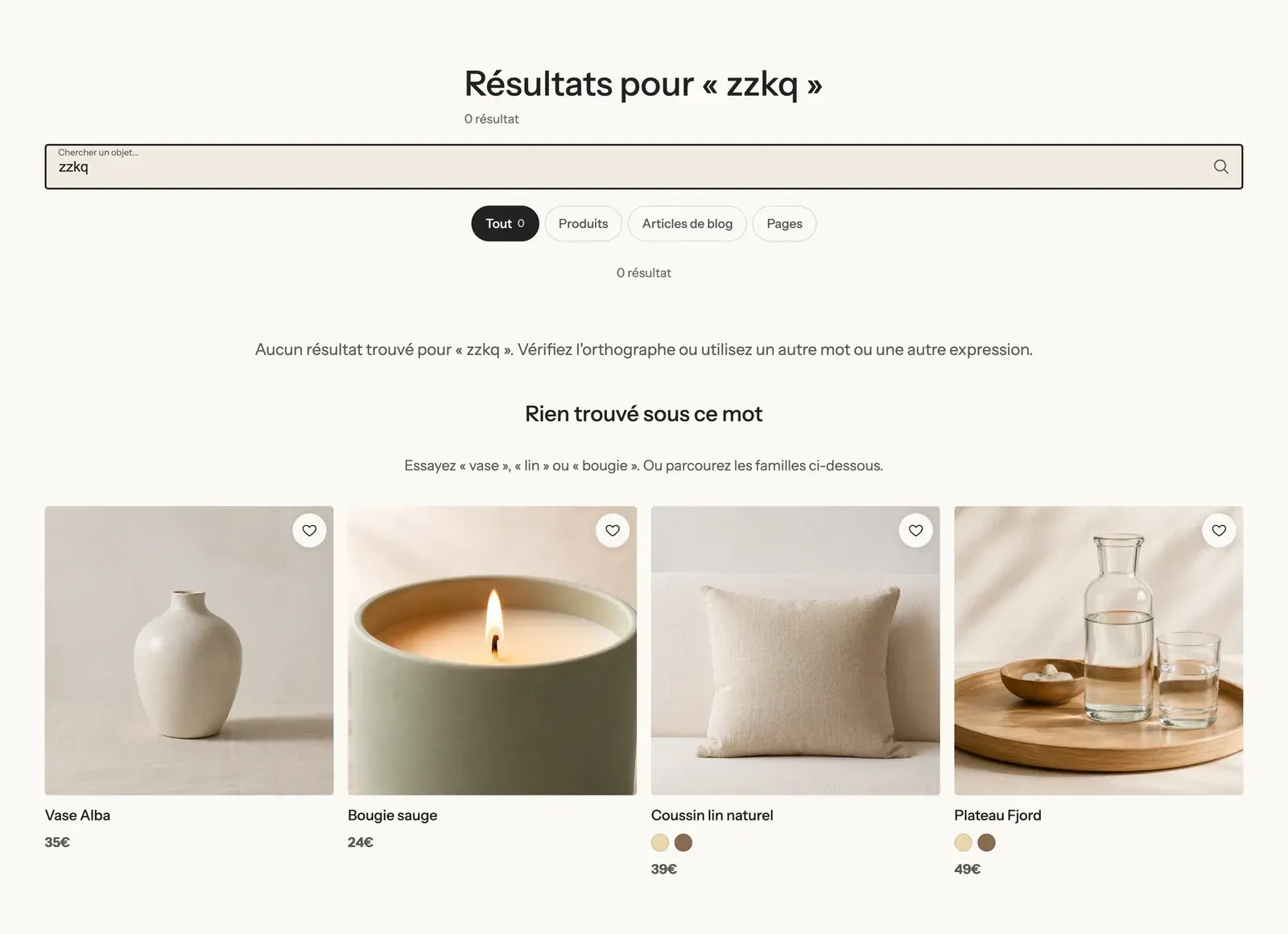
The section settings are the same as for the Collection (Products per page, columns, Pagination style…), with 4 columns on desktop in the included template.
Collections list page
The Collections list page section is the one at the /collections address. The included template contains a Breadcrumb, a Page title and a Collection list block set to All collections, sorted alphabetically, 24 per page with pagination, empty collections hidden. To open it, choose Collections list in the dropdown at the top of the editor.
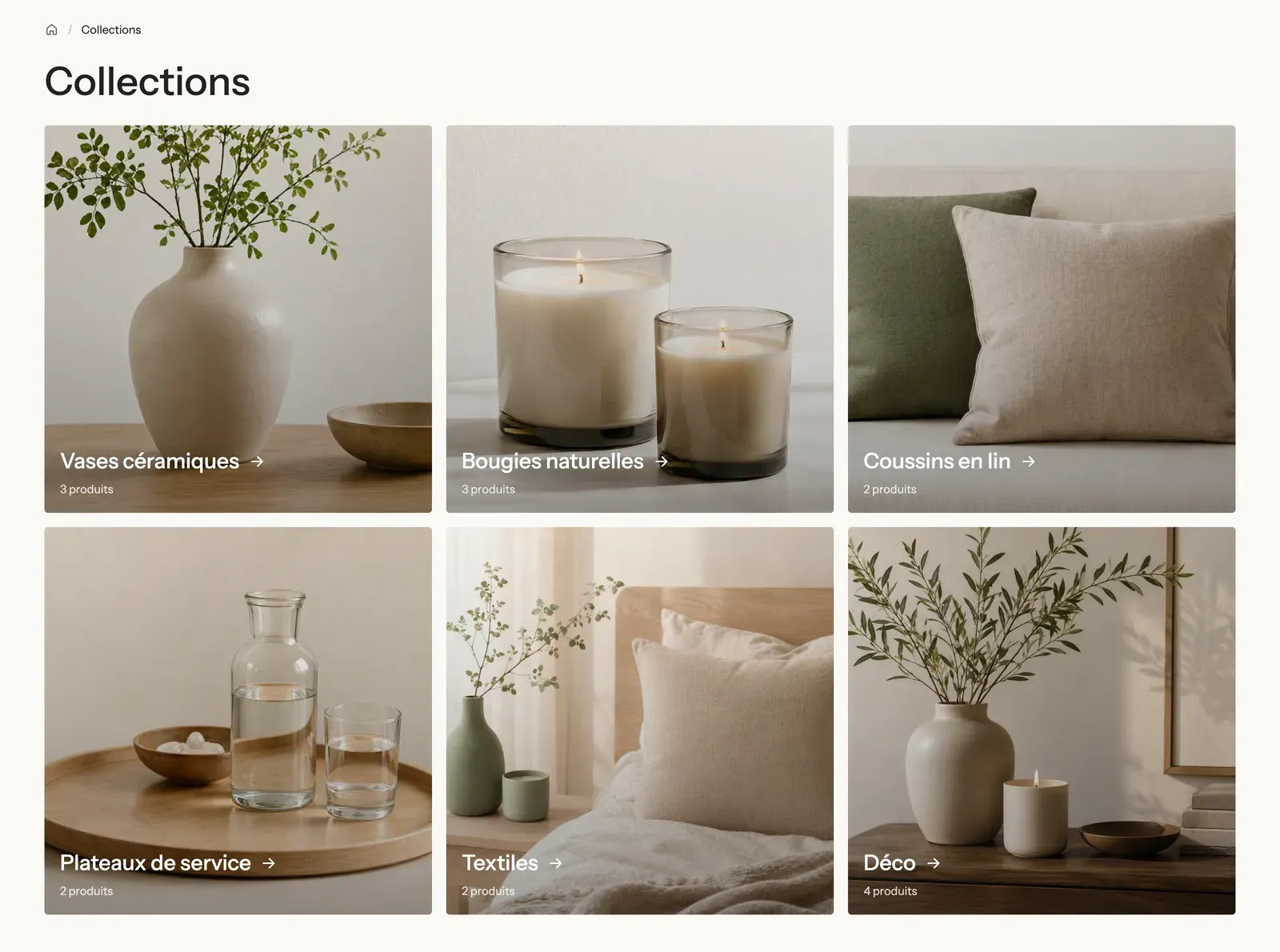
All the block settings (source, sorting, layout, collection card) are described in Collection list section. The section only has the shared frame.
Tips and pitfalls
- Filters aren't created in the theme: install Shopify's free Search & Discovery app and choose your filters there (availability, price, size, color…). Without filters, the Filters block and the Filter button stay empty or hidden.
- The included template holds sample English text in the No results block (empty collection, search with no results): check Preview in the editor and adapt it to your store's language and tone.
- With Infinite scroll, the footer stays reachable thanks to the button that appears after four pages. On a large catalog, Numbers works better for customers who want to return to a specific page.
- If your sizes are filters, enter their names in Filters shown as buttons: buttons are quicker to read than a list of checkboxes.
- Keep Product count and Active filters: customers always know what they're looking at.