Turn on quick view on your product cards and choose what its window shows: gallery, price, variants, buy button, position on screen.
Updated 17 November 20263 min read
Quick view opens a product in a window without leaving the page: the customer picks a variant and adds to cart from a collection or the home page. Its content is set up in the Quick view section, on a dedicated product template.
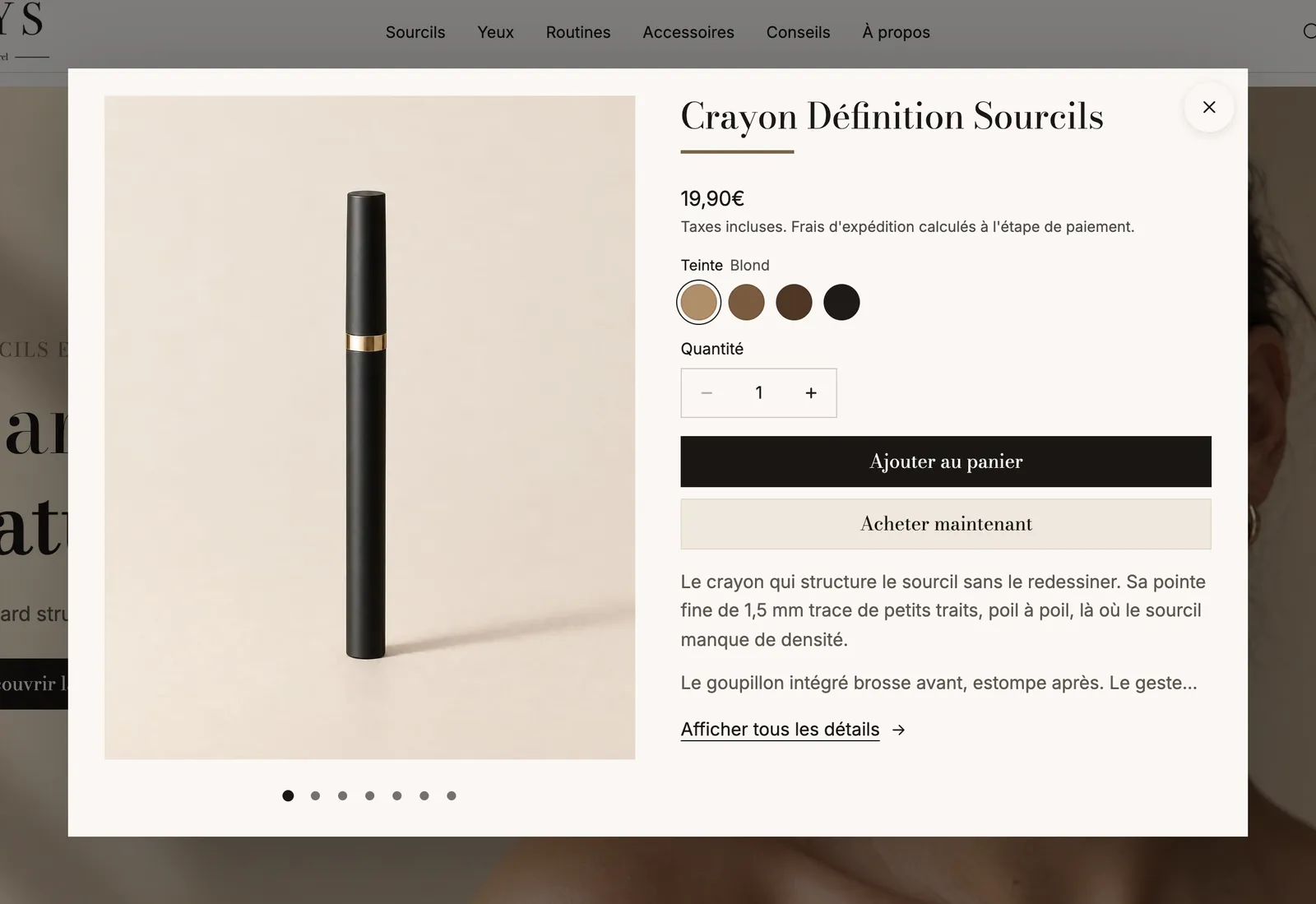
Quick view on the Sylys demo: centered window with the pencil photo, title, price, shades, quantity, buy buttons, a description excerpt and the View full details link
Two steps: the button, then the window
1. Show a quick view button on the cards
Quick view opens from a product card. In the section that shows your products (Product list, Collection…), open the Product Card block, then:
in the Media sub-block, turn on Quick view button (an icon on the image);
or in the Add to cart sub-block, choose Button type > Open the quick view, or Products with options > Open the quick view (the button adds products without variants directly and opens the window for the others).
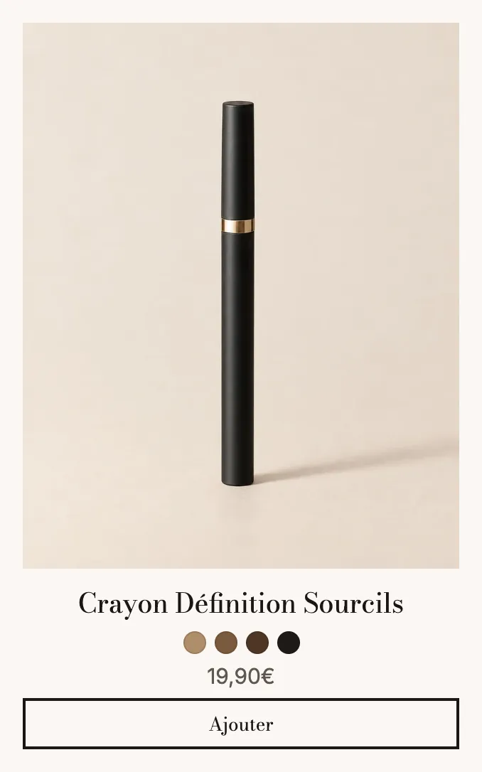
On Sylys, the card's Add button opens the window to pick the shade:
A Sylys product card: photo, title, shade swatches, price and an Add button that opens quick view
In the dropdown at the top, choose Products, then the quick-view template.
Select the Quick view section: add, remove or reorder blocks, and set up the window.
Click Save.
Screenshot to take — Theme editor > Products > quick-view template > Quick view section selected, sidebar with Product gallery and Product details expanded, Window group visible in the right panel
The section's blocks
Block
What it's for
Product gallery
The product images in the window.
Product details
The information column, which accepts product page blocks.
The shipped template puts these in Product details: Product title, Price, Variant picker, Buy buttons, Product description, Link to the product ("View full details"), Product rating, Stock, Delivery date and Quantity. You can add the other product page blocks (offers, add-ons, badges…).
The Sticky add to cart bar never shows in quick view.
The section settings
[Window] (applies to the quick view opened from cards):
Position: Center (default), Right or Left. On the right or left, the window becomes a side panel where blocks stack like on mobile.
Width: 1040 px by default when centered, 560 px by default as a panel.
Position on mobile: Bottom sheet (default) or Full screen.
Page behind: Dimmed, Blurred or Unchanged.
Corners (Theme, None, Custom), Shadow, Close button (Circle or Icon).
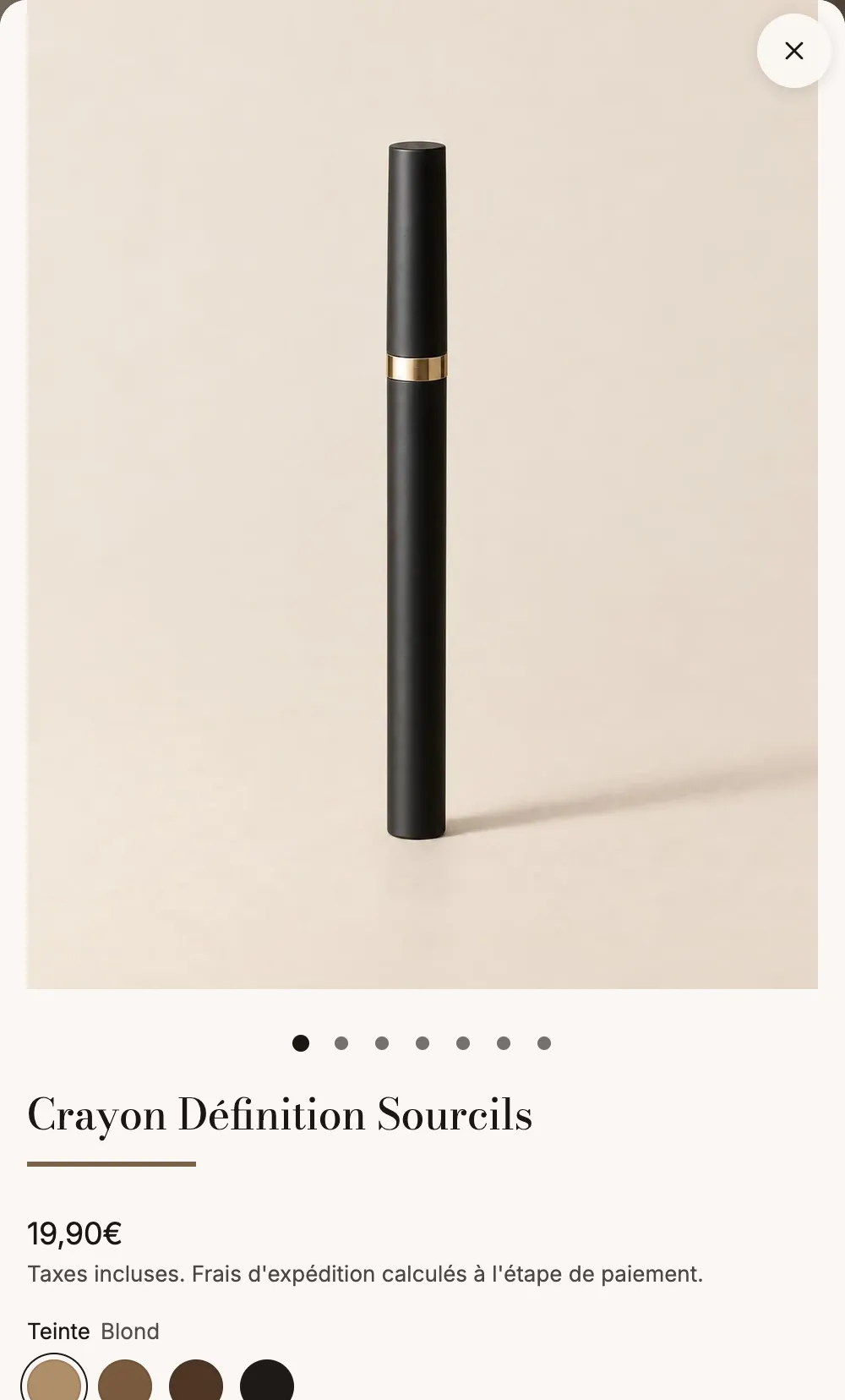
On mobile, the Sylys window shows the photo large, then the title, price and shades:
Sylys quick view on mobile, photo at the top, title, price and shade swatches below
Tips and pitfalls
Keep the window short: title, price, variants, button and a link to the full page are enough. Customers who want to read everything will go to the product page.
If a product page block is required to buy (for example a personalization field), add it to quick view too, or send that product to its product page.
Subscription-only products don't show the quick view button on the image.
Test on mobile: the bottom sheet closes with a swipe and leaves the collection in place.
This translation is provided for information only: in the event of any discrepancy, the French version prevails.
Legal Information
LEGAL NOTICE
In accordance with Articles 1-1 and 19 of French Law No. 2004-575 of 21 June 2004 on confidence in the digital economy (LCEN), users of the website story-theme.com are informed of the following.
1. Publisher and host of the website:
The website story-theme.com is published by NS GROUP, a French simplified joint-stock company (SAS) with a share capital of €500, which is its exclusive owner.
Registered office: 66 avenue des Champs-Élysées, 75008 Paris, France Registration: RCS Paris 903 894 467 (Paris Trade and Companies Register) SIREN: 903 894 467 – SIRET of the registered office: 903 894 467 00021 Intra-EU VAT number: FR10903894467 Email: [email protected]
Publication director: Théo Jehle, President of NS GROUP To contact the publication director: [email protected] Website design and development (webmaster): NS GROUP
Website host: Heroku, a platform operated by Salesforce, Inc., Salesforce Tower, 415 Mission Street, 3rd Floor, San Francisco, CA 94105, United States. Phone: +1 800 664 9073. Website: www.heroku.com. Servers located in the United States.
Data hosting: – database: MongoDB Atlas, a service of MongoDB, Inc., 1633 Broadway, 38th Floor, New York, NY 10019, United States (servers located in the United States); – files: Amazon Web Services (Amazon S3), Amazon Web Services EMEA SARL, 38 avenue John F. Kennedy, L-1855 Luxembourg (servers located in Frankfurt, Germany).
2. Introduction:
Any internet user who connects to and uses the website story-theme.com is considered a user of the website. The website story-theme.com offers several services, as is, made available to users. Users must act honestly and in good faith towards other users and towards the webmaster of story-theme.com. The website story-theme.com is regularly updated by NS GROUP. NS GROUP strives to provide information on story-theme.com that is as accurate as possible (subject to change), but cannot guarantee the accuracy or completeness of the information published on its website, whether or not it originates from NS GROUP. Consequently, users acknowledge that they use this information under their sole responsibility.
3. Website availability:
The website story-theme.com is in principle accessible to users 24 hours a day, 7 days a week, except in the event of an interruption, scheduled or not, for maintenance purposes or in the event of force majeure. If the service cannot be accessed, story-theme.com will do its utmost to restore access to the website and will endeavour to inform users in advance of the dates and times of the interruption. As it is bound only by an obligation of means, story-theme.com cannot be held liable for any inconvenience, whatever its nature.
4. Intellectual property:
NS GROUP is the exclusive owner of all intellectual property rights, or holds the rights of use, in all elements accessible on the website, including its structure, texts, graphics, logos, sounds, software, etc. Any reproduction, representation, modification, publication, update or adaptation, in whole or in part, of the website story-theme.com or of any of its elements, by any means or process whatsoever, is prohibited without the prior written authorisation of NS GROUP, to be requested at [email protected]. Failing this, it will be considered an infringement (contrefaçon) and may be prosecuted under Articles L. 335-2 et seq. of the French Intellectual Property Code.
5. Hyperlinks and cookies:
The website story-theme.com contains hyperlinks to other websites (partners, sources, etc.), set up with the authorisation of NS GROUP. However, NS GROUP cannot verify the content of the websites thus visited and therefore declines all liability for any risk of unlawful content. Users are informed that, when they visit story-theme.com, one or more cookies may be placed on their device through their browser. A cookie is a small file that records information about the user's browsing on the website. Browser settings allow users to be notified of the presence of cookies and, if they wish, to refuse them. Users may at any time configure their browser to refuse cookies, bearing in mind that refusing them may prevent access to certain services. To block cookies, search for "block cookies" in a search engine and follow the instructions for your browser.
6. Protection of persons and property – Personal data management:
In France, personal data is protected in particular by Regulation (EU) 2016/679 of 27 April 2016 (GDPR) and by amended French Law No. 78-17 of 6 January 1978 on information technology, data files and civil liberties.
On story-theme.com, NS GROUP collects personal information about users only as needed for the various services offered by the website. Users provide this information knowingly, in particular when they enter it themselves. They are then told whether providing this information is mandatory or optional. In accordance with the GDPR and Law No. 78-17 of 6 January 1978, every user has the right to access, rectify, erase, restrict, port and object to the processing of their personal data. To exercise these rights, send your request by email to [email protected] or by signed letter to the registered office of NS GROUP, stating the address to which the reply should be sent. If there is reasonable doubt about your identity, proof of identity may be requested. You may also lodge a complaint with the CNIL, the French data protection authority (www.cnil.fr).
No personal information about users of story-theme.com is published without their knowledge, nor exchanged, assigned or sold to third parties, on any medium whatsoever, apart from the technical service providers acting on behalf of NS GROUP (hosting, payment, email delivery). Only in the event of the sale of the website story-theme.com and its rights could this information be passed on to the potential buyer, who would in turn be bound by the same obligations of storage and modification of data with regard to users of story-theme.com.
Databases are protected by the French Law of 1 July 1998 transposing Directive 96/9/EC of 11 March 1996 on the legal protection of databases.
This translation is provided for information only: in the event of any discrepancy, the French version prevails.
GENERAL TERMS AND CONDITIONS OF SALE AND USE OF STORY THEME
----
ARTICLE 1 – PURPOSE
These General Terms and Conditions of Sale and Use (hereinafter "GTCU") define the contractual terms governing the use of the Shopify theme named "Story Theme" offered by NS GROUP through a monthly or annual subscription.
ARTICLE 2 – ACCEPTANCE OF TERMS
By subscribing to the Service, the user explicitly and unconditionally accepts all these GTCU.
ARTICLE 3 – SUBSCRIPTION TERMS
The subscription to the Service can be taken out for a monthly or annual period, with automatic renewal at each due date.
A 7-day free trial period is offered to every new user. This period can be extended at NS GROUP's discretion or by using a specific promotional code.
ARTICLE 4 – PRICING AND PAYMENT TERMS
Subscription prices are clearly indicated on the website in euros (€), including all taxes (VAT included). NS GROUP reserves the right to modify these prices with a reasonable notice of 30 days.
ARTICLE 5 – RENEWAL AND TERMINATION
The subscription is automatically renewed at each period (monthly or annual). Termination can be carried out without notice at any time through the user's member area. Deleting a Shopify store or domain name in the member area does not constitute a termination. Upon termination, the user retains access to services until the end of the current period, except in cases of refund for the last billing period.
ARTICLE 6 – NO RIGHT OF WITHDRAWAL
Pursuant to Article L221-28 of the French Consumer Code, the right of withdrawal does not apply to digital content immediately accessible after subscription.
ARTICLE 7 – REFUND POLICY
No refunds will be granted except in exceptional cases at NS GROUP’s discretion, particularly in cases of proven technical issues attributable to NS GROUP.
ARTICLE 8 – INTELLECTUAL PROPERTY
All elements relating to the "Story Theme" are protected by intellectual property rights exclusively owned by NS GROUP. Any unauthorized reproduction, modification, or use is strictly prohibited.
In particular, it is prohibited to bid on keywords containing the names "Story Thème", "Story Theme", "story-theme.com" or their variants, on Google Ads or any other advertising network, and to present oneself as the official Story Theme website. For members of the affiliate program, such use results in the suspension of the account and the cancellation of the commissions generated this way, including those not yet paid.
ARTICLE 9 – USER OBLIGATIONS
The user undertakes to provide accurate and up-to-date information, maintain account security, and use the Service in accordance with these GTCU.
ARTICLE 10 – AVAILABILITY AND MAINTENANCE
NS GROUP undertakes to ensure the availability of the Service, except in cases of force majeure, technical interruptions beyond its control, or scheduled maintenance operations.
ARTICLE 11 – LIMITATION OF LIABILITY
NS GROUP shall not be held responsible for indirect damages arising from the use of the Service or inability to access it.
ARTICLE 12 – PERSONAL DATA
NS GROUP processes personal data in compliance with applicable regulations, particularly GDPR. Users have the rights of access, rectification, deletion, and opposition, exercisable via [email protected].
ARTICLE 13 – COOKIES
The website uses cookies necessary for its proper operation, as well as statistical or performance cookies to improve the Service. Users can manage these preferences via their browser.
ARTICLE 14 – INDEMNIFICATION
The user agrees to indemnify NS GROUP, its affiliates, partners, directors, employees, and representatives against any claim or demand, including reasonable legal fees, arising from any violation of these GTCU or applicable laws.
ARTICLE 15 – SEVERABILITY
If any provision of these GTCU is deemed invalid or unenforceable by a competent court, such provision shall be severed without affecting the validity of other clauses.
ARTICLE 16 – TERMINATION OF CONDITIONS
Obligations prior to termination shall remain in force after termination. NS GROUP may terminate access to the Service without notice in case of a breach of these GTCU by the user, who remains liable for all amounts owed until the effective date of termination.
ARTICLE 17 – BANK DISPUTES
In the event of a banking dispute (chargeback, rejection, or payment dispute), services will be immediately suspended until the dispute is definitively resolved.
ARTICLE 18 – ENTIRE AGREEMENT
These GTCU constitute the entire agreement between NS GROUP and the user and replace all previous agreements relating to the Service.
ARTICLE 19 – MODIFICATION OF TERMS
NS GROUP reserves the right to modify these GTCU at any time, with prior notification to users. Continued use of the Service constitutes implicit acceptance of the modifications.
ARTICLE 20 – APPLICABLE LAW AND JURISDICTION
These GTCU are governed by French law. Any dispute will be submitted to the competent French courts after an attempt at amicable resolution.
ARTICLE 21 – CONTACT
For any questions regarding these GTCU, please contact us by email: [email protected].