
Timeline section: your story or your steps
Tell your brand's key dates or explain how something works in steps, on a vertical, alternating or horizontal line.
The Timeline section connects steps with a line: your brand's key dates on an "Our story" page, or the steps of an order in a "How it works". The line can fill as the customer scrolls, which guides the eye from one step to the next.
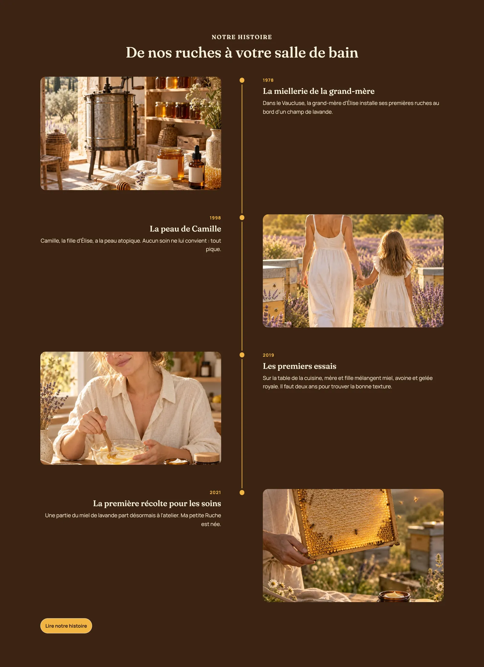
The variants (presets)
The two variants are in the Text category of the picker.
Our story
A heading, then four steps alternating on either side of a vertical line: the date on one side, the title and text on the other. Add an image to each step to get the Ma Petite Ruche look above.
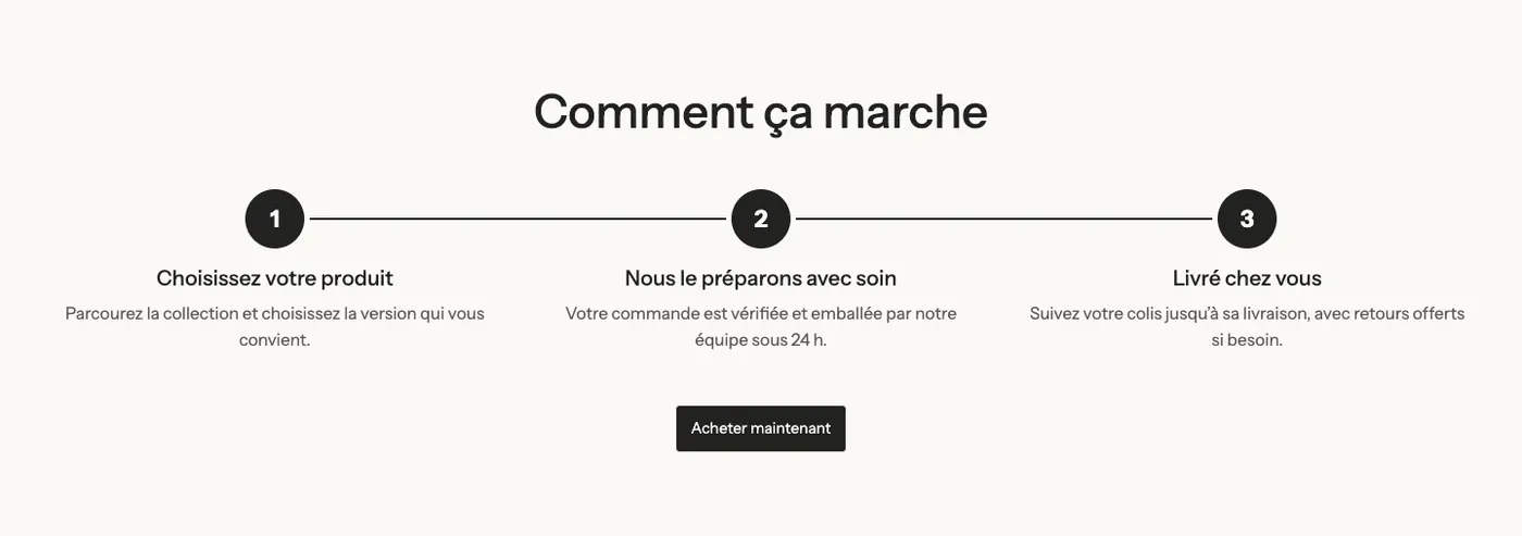
How it works
A heading, three horizontal steps marked by numbers in circles, and a button. To explain in three stages how to order, use a product or enjoy a service.
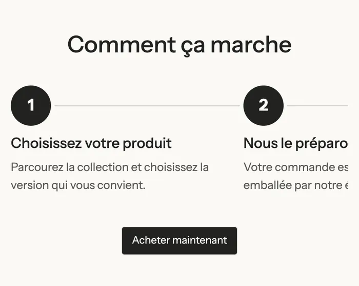
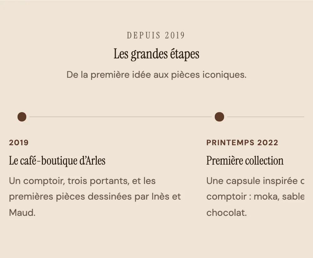
On mobile, the horizontal timeline becomes a swipeable row: the next step peeks in at the right edge.
Example on the Maison Mocha demo
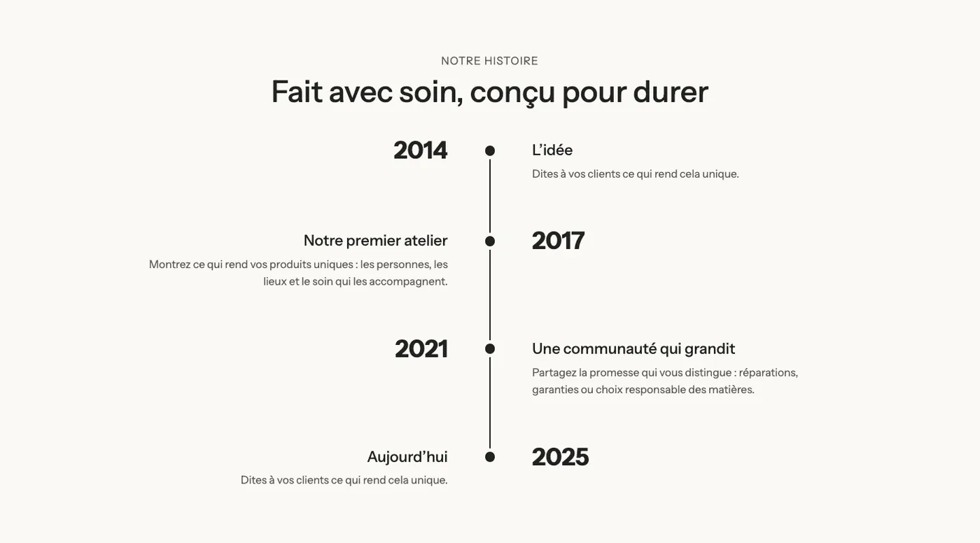
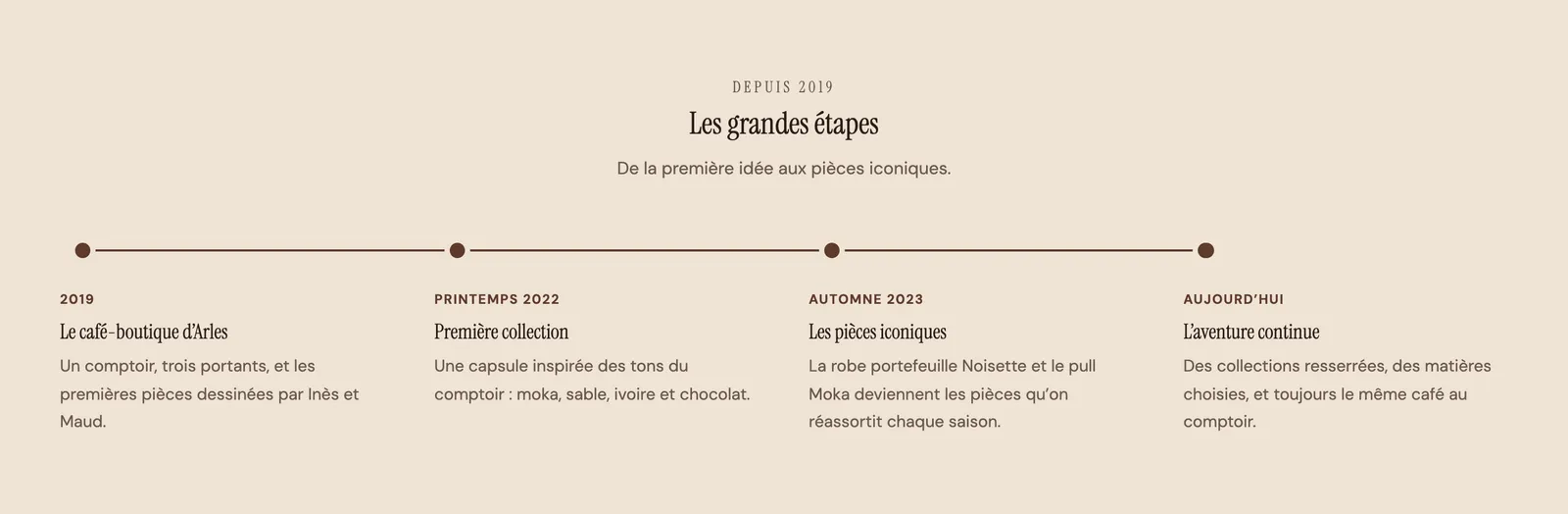
Maison Mocha tells its story with a horizontal dotted timeline, without images, on the beige palette of its "Our story" page:
On phones, the same timeline is swiped with a finger:
Add the section
- In your Shopify admin, open Online Store > Themes and click Edit theme.
- Pick the template in the top menu (for example the page that uses the story template).
- Click Add section, open the Text category and choose Our story or How it works.
- Click each Step to fill in the date, title, text and image.
- Click Save.
The section's blocks
| Block | What it's for |
|---|---|
| Heading | The heading above the timeline. |
| Timeline | The line and its layout: arrangement, markers, colors. |
| Step | One step of the timeline (inside the Timeline block). |
| Button | A link below the timeline (How it works variant). |
The Timeline block

- Layout: Vertical (default), Alternating or Horizontal.
- Mobile layout (horizontal timeline): Swipe sideways (default) or Stacked.
- Alignment (horizontal timeline): Left or Center.
- Media position (Top or Bottom) and Image ratio (Adapt to image, Portrait, Square, Landscape).
- Card style: None or Card (each step on a background).
- Step Title size (22 px by default).
- Marker group: Style (Dot, Numbers, Icon, Image) and Size.
- Line group: Line style (Solid, Dashed, Dotted), Thickness and Fill the line while scrolling (checked by default).
- Colors group: Line color, Progress color, marker Text color. Left empty, they follow the theme.
The Step block
- Subheading: the date or label ("2024", "Step 1").
- Title and Text.
- Image: a photo for the step.
- Icon: used when the marker is in Icon style, with an optional Custom icon.
A step also accepts other theme blocks (a button, a checklist) with Add block.
The section settings
The section only has the frame shared by almost every section: Layout, Color palette, Separators and Animations. Ma Petite Ruche picks a dark palette to make its golden photos stand out. The frame is explained in Understand the theme editor.
Tips and pitfalls
- Three to six steps are enough. A timeline with ten dates doesn't get read: keep the moments that explain why your brand exists.
- In Horizontal layout, keep texts short: each step only has the width of one column.
- Images with the same aspect ratio make a regular timeline: choose a fixed Image ratio (Landscape or Square) rather than Adapt to image.
- Fill the line while scrolling animates the line. Like every animation in the theme, it respects the visitor's device "reduce motion" setting.
- For steps without a line or markers, as cards, the Numbered steps variant of the Multicolumn section is simpler.