
Featured product section: sell a product outside its product page
Showcase a product on the home page or a landing page, with its gallery, variants, offers and buy button, without going through its product page.
The Featured product section brings the essentials of a product page (photos, price, variants, buy button) anywhere in your store. Customers can buy without leaving the page: perfect for a hero product on the home page, a launch or a campaign page.
Presets
Featured product
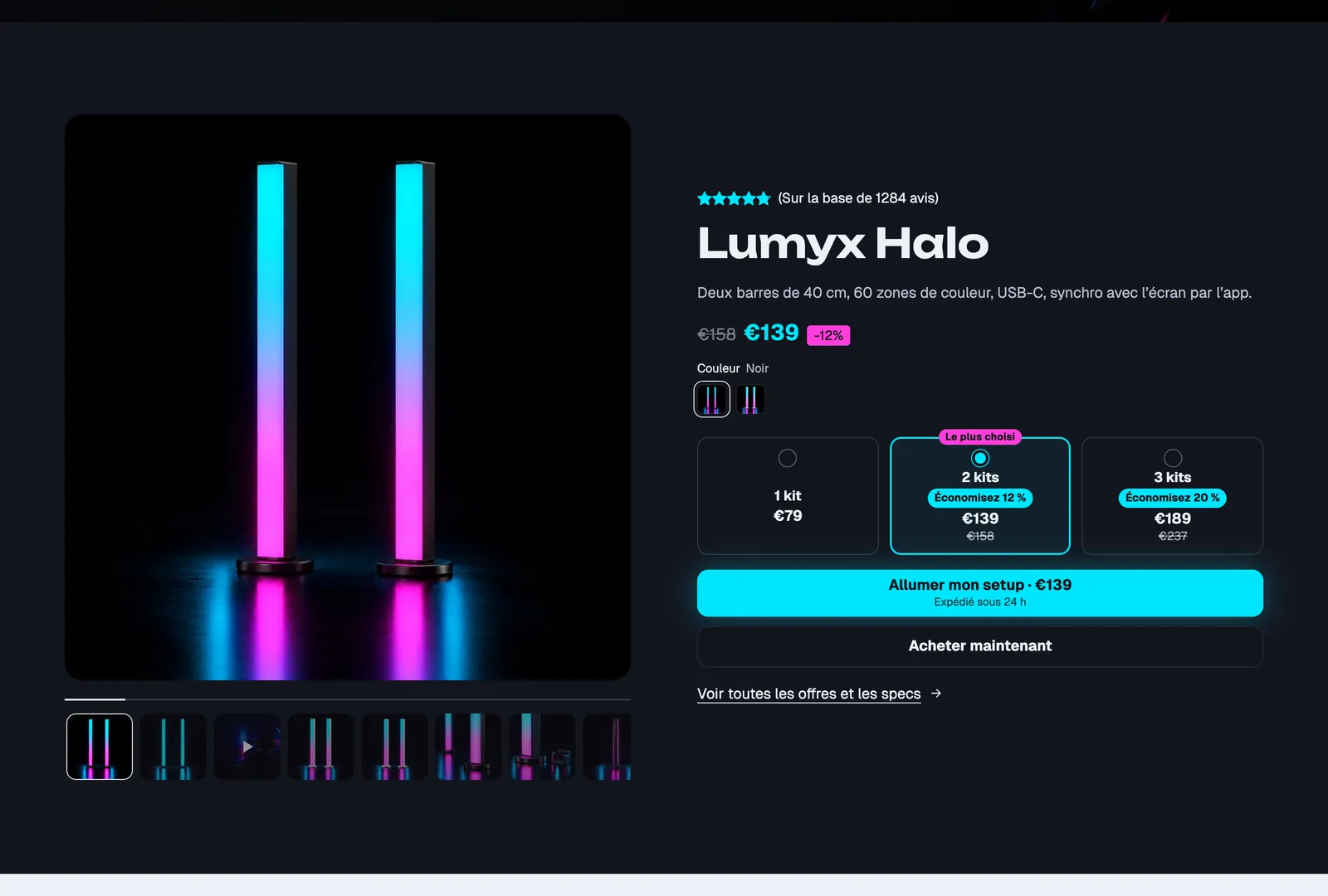
A real sales column, ready to use: a "Best seller" badge, title, price with a discount badge, variant picker with swatches, Offers block (1, 2 or 3 items), stock level, buy buttons with express checkout, delivery date, three trust badges, then three collapsible rows (description, care, shipping) and a link to the full product page. The gallery, on the left, takes up half the width.
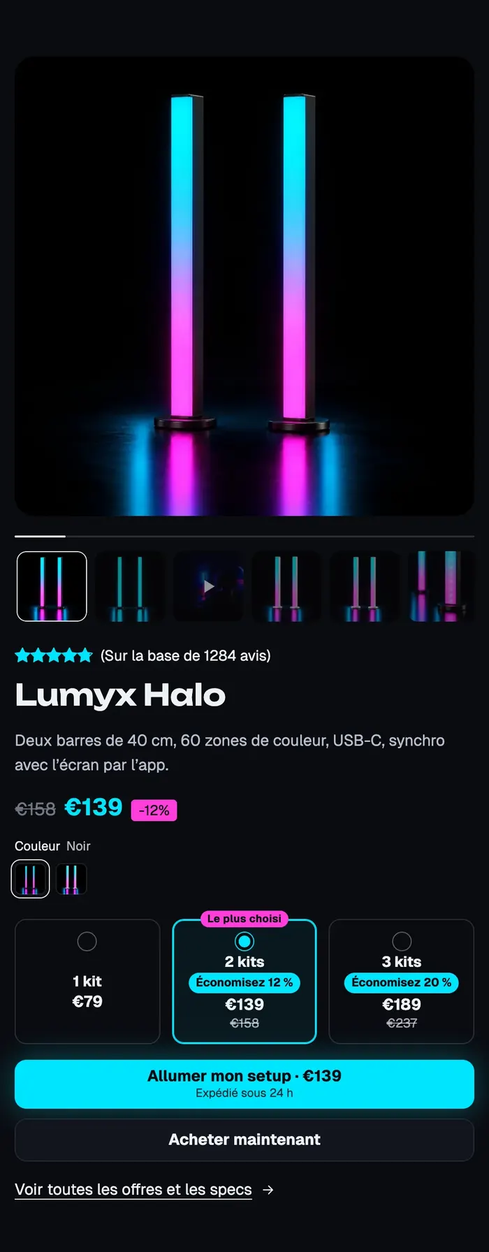
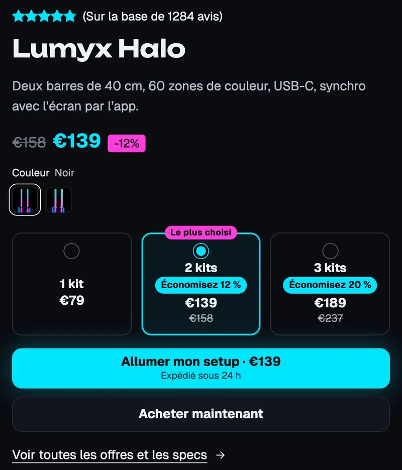
The Lumyx demo (top screenshot) starts from this preset: it keeps the rating, title, price, swatches, three kit offers, a two-line buy button and the link to the product page. On mobile, the gallery moves on top:
Product showcase
A short version that presents rather than sells: a "New in" badge, a large title, price, a description limited to three lines and a button to the product page, with no add to cart button. The gallery is square, without thumbnails, and takes up a bit more room (7 columns out of 12). Place it in the middle of an "Our story" page, a blog post or a collection page.
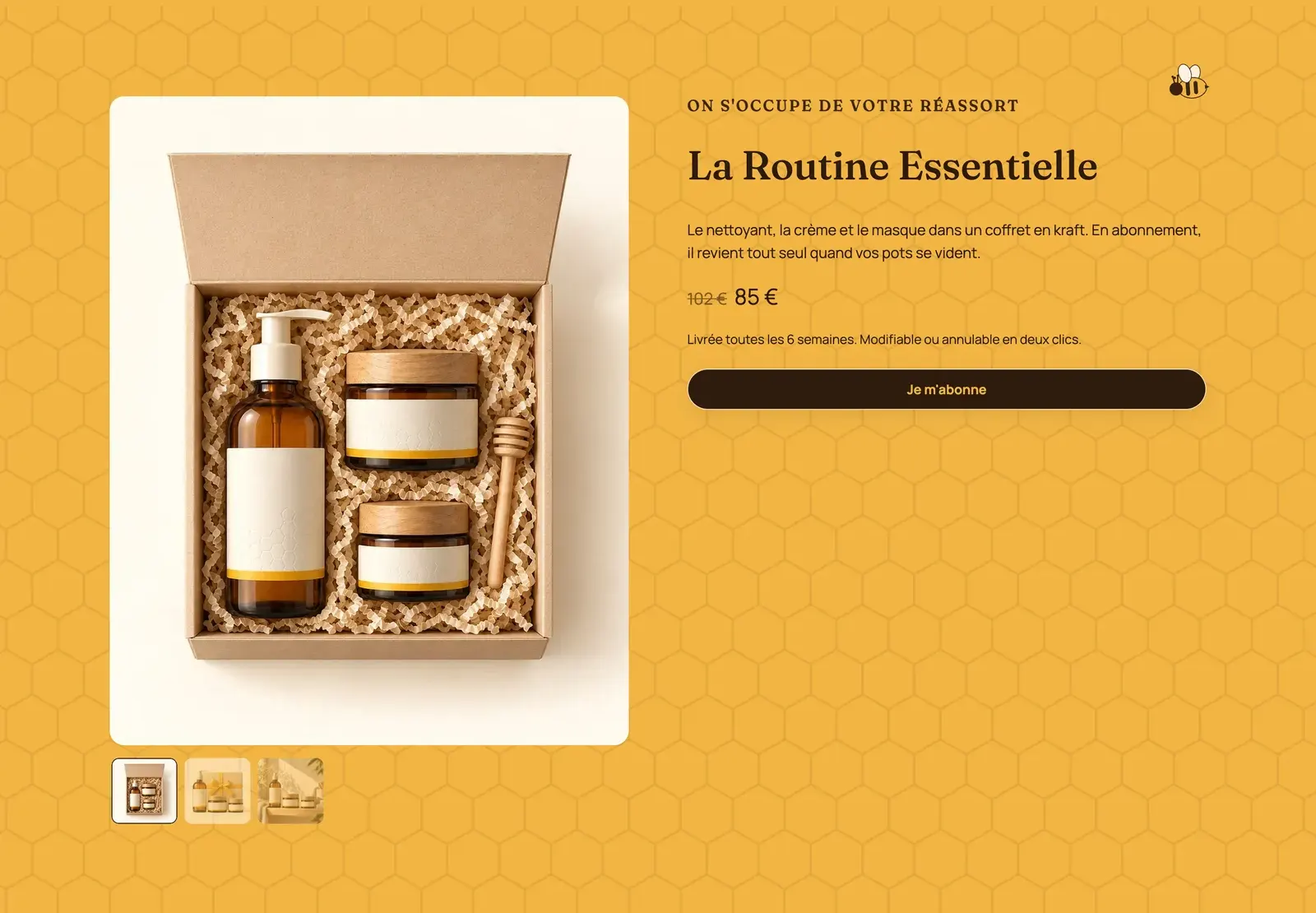
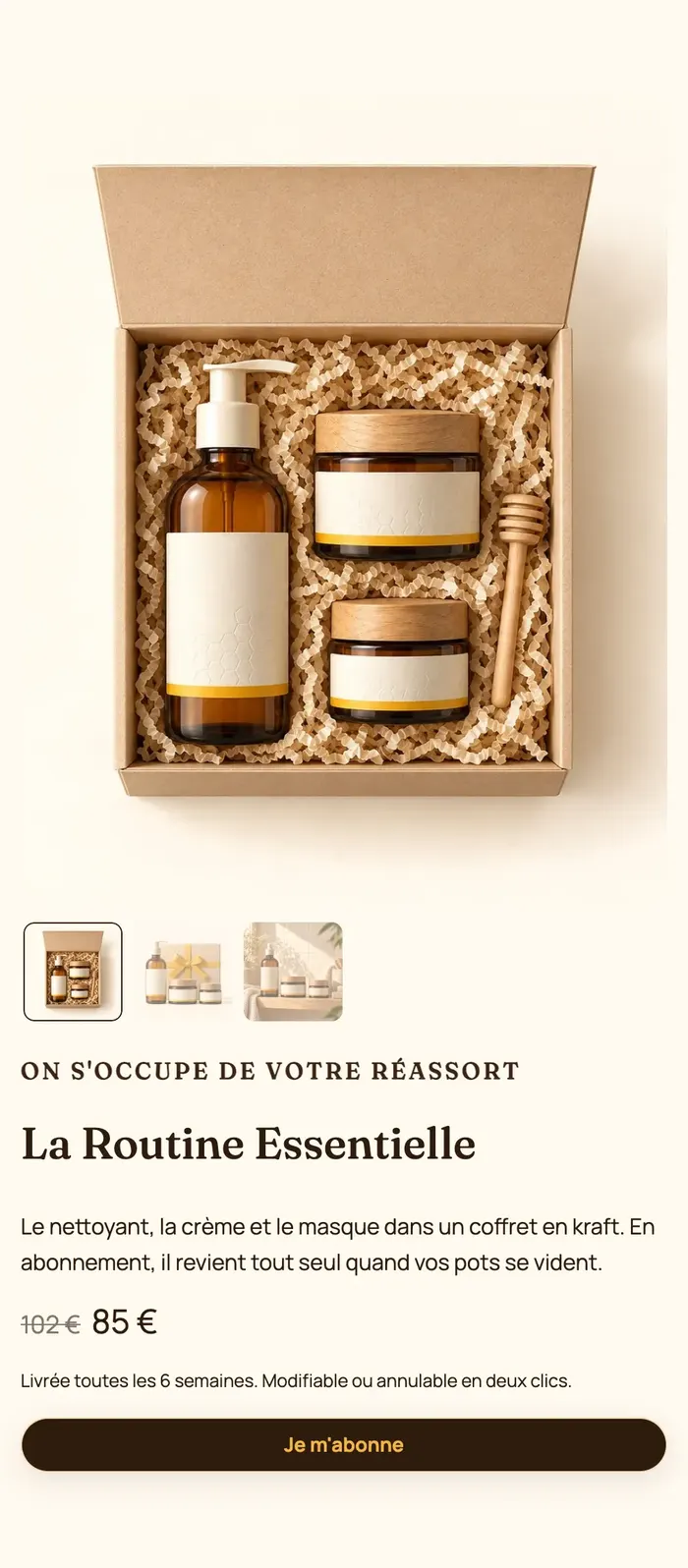
You can also build something in between. Ma Petite Ruche keeps only an eyebrow, the title, a text, the compare-at price, a sentence about shipping and a Je m'abonne button, on the brand's honeycomb pattern:
Add the section
- Open Online Store > Themes > Edit theme and choose the template (Home page, or your landing page template).
- Click Add section, Products category, then Featured product or Product showcase.
- In the section settings, choose the Product.
- Click Save.
The section's blocks
| Block | What it's for |
|---|---|
| Product gallery | The product's photos and videos, as a carousel or a grid. |
| Product details | The right-hand column. It accepts every product page block. |
| Link to the product | A link or button to the full product page, placed inside the details. |
Product gallery
- Image ratio: Adapt to image, Portrait (4:5) (default), Portrait (3:4), Square, Landscape (4:3); Image fit: Fill the frame or Show the whole image.
- Number of items (10 by default) and Show thumbnails.
- Layout: Carousel or Grid, with columns, arrows and pagination.
- Keep visible while scrolling (unchecked by default): on desktop, the gallery stays in place while the details scroll. Useful when the sales column is long.
Product details
A group in which you add, remove and reorder product page blocks with Add block: Product title, Price, Variant picker, Offers, Stock, Buy buttons, Delivery date, Trust badges, Collapsible row, Product description… They're the same as on the product page, described in Product page blocks: buying and Product page blocks: content.
Group settings: Direction, Horizontal alignment, Vertical alignment, Gap, Keep visible while scrolling, an optional Background image and a Color palette (Transparent background checked by default).
Link to the product
Button label (empty: translated default text) and Style: Link by default, or one of the theme's button styles. It's the "Voir toutes les offres et les specs" link on Lumyx.
Section settings
- Product group: Product. Every block in the section shows this product.
- The frame shared by almost every section: Layout (direction, stacking on mobile, spacing), Color palette (with a background image, like Ma Petite Ruche's honeycomb), Separators, Animations. See Understand the theme editor.
Tips and pitfalls
- The discounts in the Offers block are displayed by the theme but charged by Shopify: create the matching automatic discount, or the customer pays full price. See Quantity discounts.
- One main heading per page: in both presets, the Heading level of the Product title block is set to 2 so it doesn't compete with the page title. Keep it that way.
- For a campaign landing page, combine this section with Landing page mode, which hides the header and footer.
- On mobile, the gallery moves above the details. Check the editor's mobile preview: a column that's too long pushes the buy button far below the photos.
- The Purchase options block (subscription) only shows if a subscription app offers a plan for this product.