
Contact section: contact form and store details
Add a contact form built field by field, with your contact details and live opening hours, on the contact page or any other page.
The Contact section shows a form your customers fill in to write to you, and, depending on the preset, your contact details next to it (email, phone, address, opening hours). It's mainly for the Contact page, but you can also place it at the bottom of a product page or a help page.
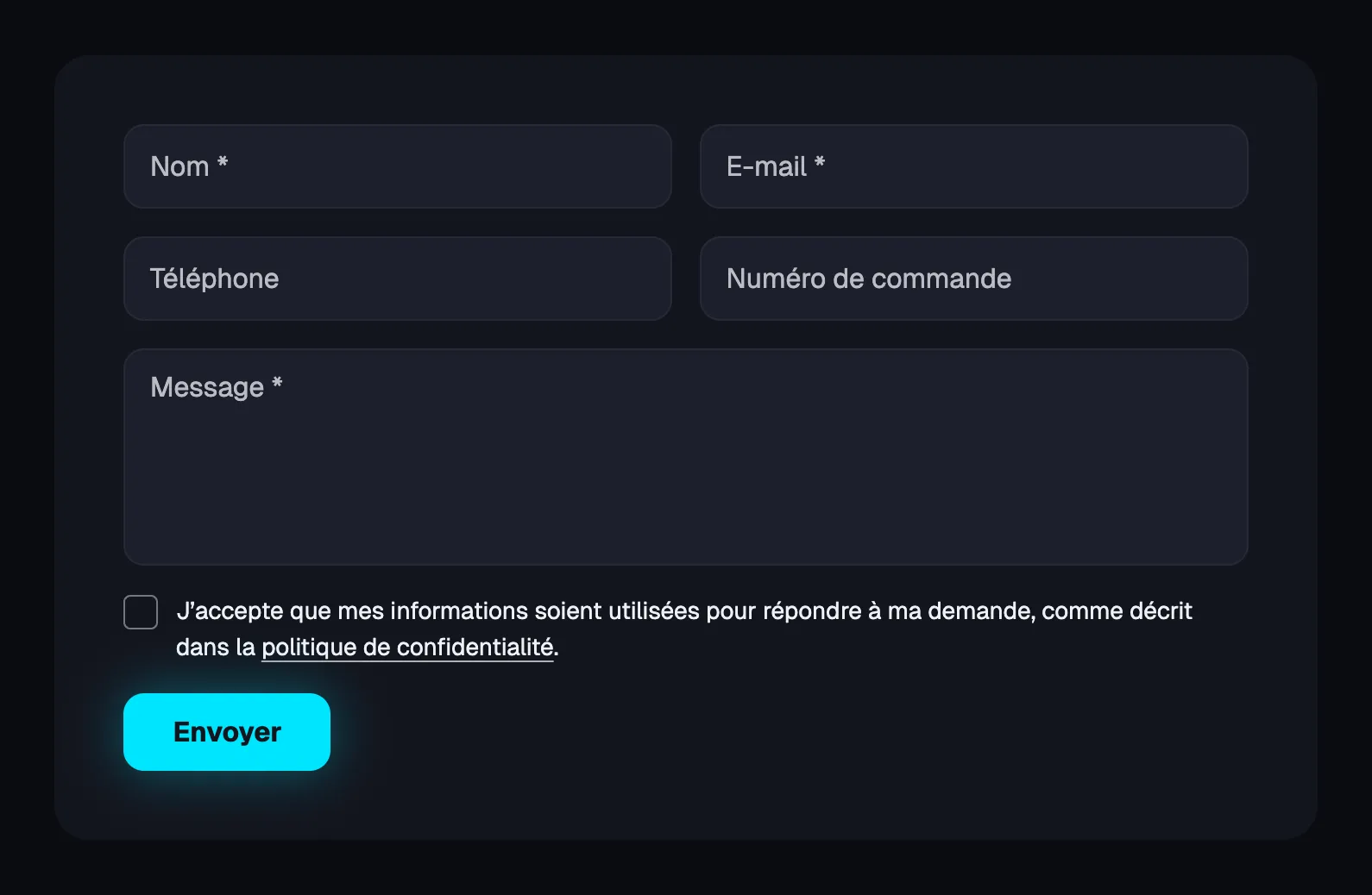
The presets
Contact
The heading, intro text and Contact information block on the left, the form on the right. It's the most complete preset: the customer immediately sees other ways to reach you besides writing.
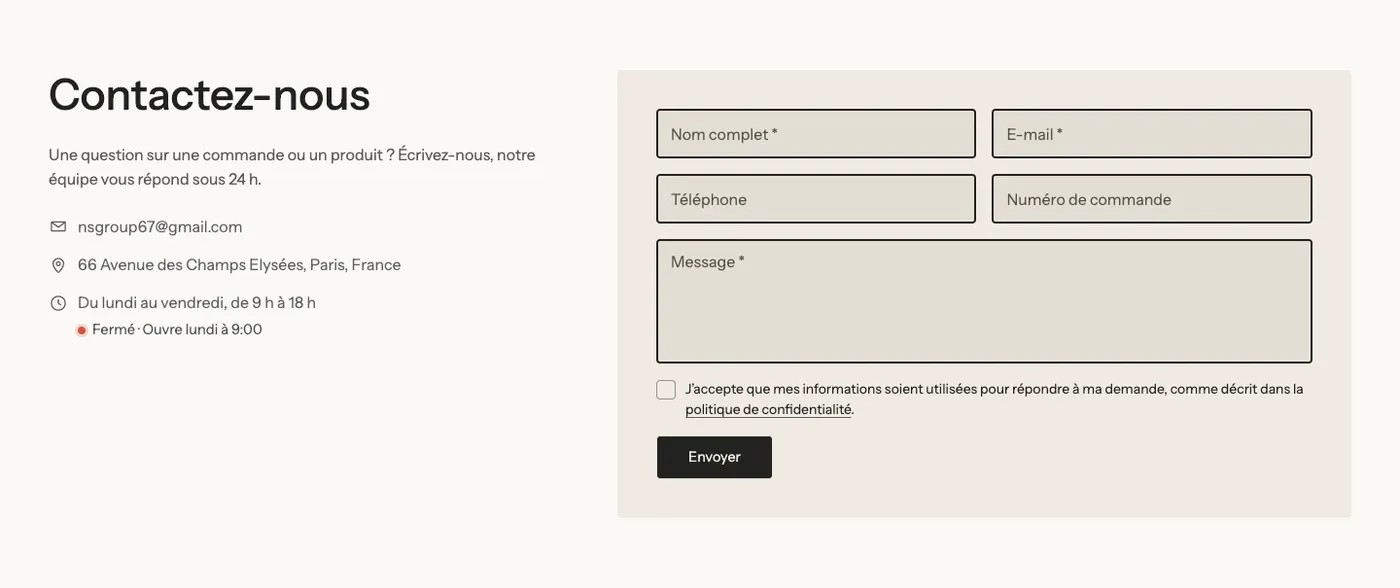
The Opening hours in the Contact information block show live whether the store is open or closed, based on the store's time ("Closed · Opens Monday at 9:00" in the screenshot).
Contact form
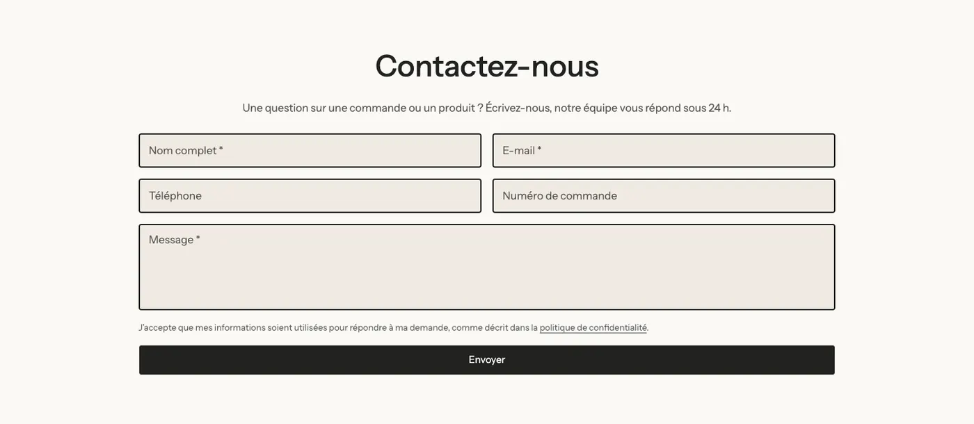
A heading, a text and the form on its own, centered. Choose it when your contact details are already elsewhere (footer, a nearby section) or for a specific request: quote, partnership, after-sales service.
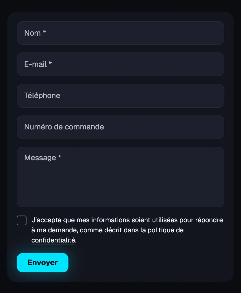
On mobile, the fields stack one below the other:
Add the section
- In your Shopify admin, open Online Store > Themes and click Edit theme.
- Choose the page where the form goes from the dropdown at the top (for example Pages, then the contact template).
- Click Add section, open the Forms and contact category and choose Contact or Contact form.
- Click Save.
To create a complete Contact page (Shopify page, template, address), follow the guide Create a contact page.
The section's blocks
| Block | What it's for |
|---|---|
| Contact form | The form itself, made of one sub-block per field. |
| Contact information | Email, phone, WhatsApp, address, opening hours, link or text, with icons. |
| Heading, Text, Group | The introduction and the layout (the Contact preset puts the text and contact details in a Group). |
Like every section in the theme, you can add any other block with Add block: a short FAQ, trust badges, an image.
The Contact form block
Each field is a sub-block you add, remove or move: Full name, First name, Last name, Email, Phone, Company, Order number, Subject, Message, Short text, Dropdown list, Single choice, Checkbox, Date, Number. The preset comes with Full name, Email, Phone, Order number and Message.
Main settings:
- Labels: Inside the fields (default) or Above the fields.
- [Consent] Display: None, Required checkbox (the Lumyx case above) or Information text.
- [Button]: Button label, Button style, Width (Fit content or Full width), Confirmation message shown after sending.
- [Design] Background: None or Color palette to place the form on a colored card, with Inner spacing and Corners.
For details on each field, see the form blocks.
The Contact information block
Its Email, Phone, WhatsApp, Address, Opening hours, Link and Text sub-blocks stack in the order you choose. Settings: Heading, Show icons, Direction (Horizontal or Vertical), Alignment.
The section settings
The section has no settings of its own: everything is set in its blocks. It shares the frame common to the theme's sections (Layout, Color palette, Separators, Animations), explained in Understand the theme editor.
Tips and pitfalls
- Keep the form short: name, email and message are often enough. The Order number field saves your customer service time.
- If you collect more data than strictly necessary, show a consent (Required checkbox or Information text) that links to your privacy policy.
- Check your store's email in Settings > General before launch, then send yourself a test message.
- Opening hours follow the store's time zone (Settings > General): set it correctly so "Open / Closed" is accurate.
- An FAQ right under the form reduces the number of messages: that's what the included contact page templates do.