
What's new in Story Theme 4.0
What changes with version 4.0 of the Story Theme: block-based building, header, product page, cart, collections, new sections and settings to check.
Version 4.0 of the Story Theme was rebuilt from the ground up. It brings many features that used to require an app, and a freer way to build your pages. Here's what actually changes for you.
Everything is built with blocks
In 4.0, a section is no longer a fixed template: it's a frame where you place the blocks you want (heading, text, button, image, group, carousel, tabs…). The sections offered in Add section are ready-to-use variants that you can edit freely. In total: 45 sections and more than 100 blocks.
Settings have also been made consistent. You'll find everywhere:
- Show on: Desktop and mobile, Desktop only or Mobile only, to build a different layout on mobile;
- Animation, always with a None option;
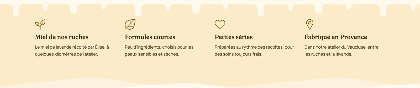
- Separators: shapes (wave, curve, clouds, torn paper…) between two sections;
- Button style: Theme, Style 1, Style 2, Style 3 or Custom.
See A tour of the sections. Every section and every family of blocks now has its own reference article, for example the Banner section or the text blocks.
Header and navigation
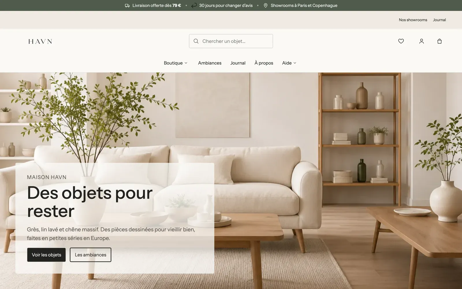
- A header with three rows of three areas each: you place the logo, menu, search and icons wherever you want, with a layout of its own on mobile.
- A transparent header over the first section, with a dedicated logo, and a sticky header that's Visible when scrolling up.
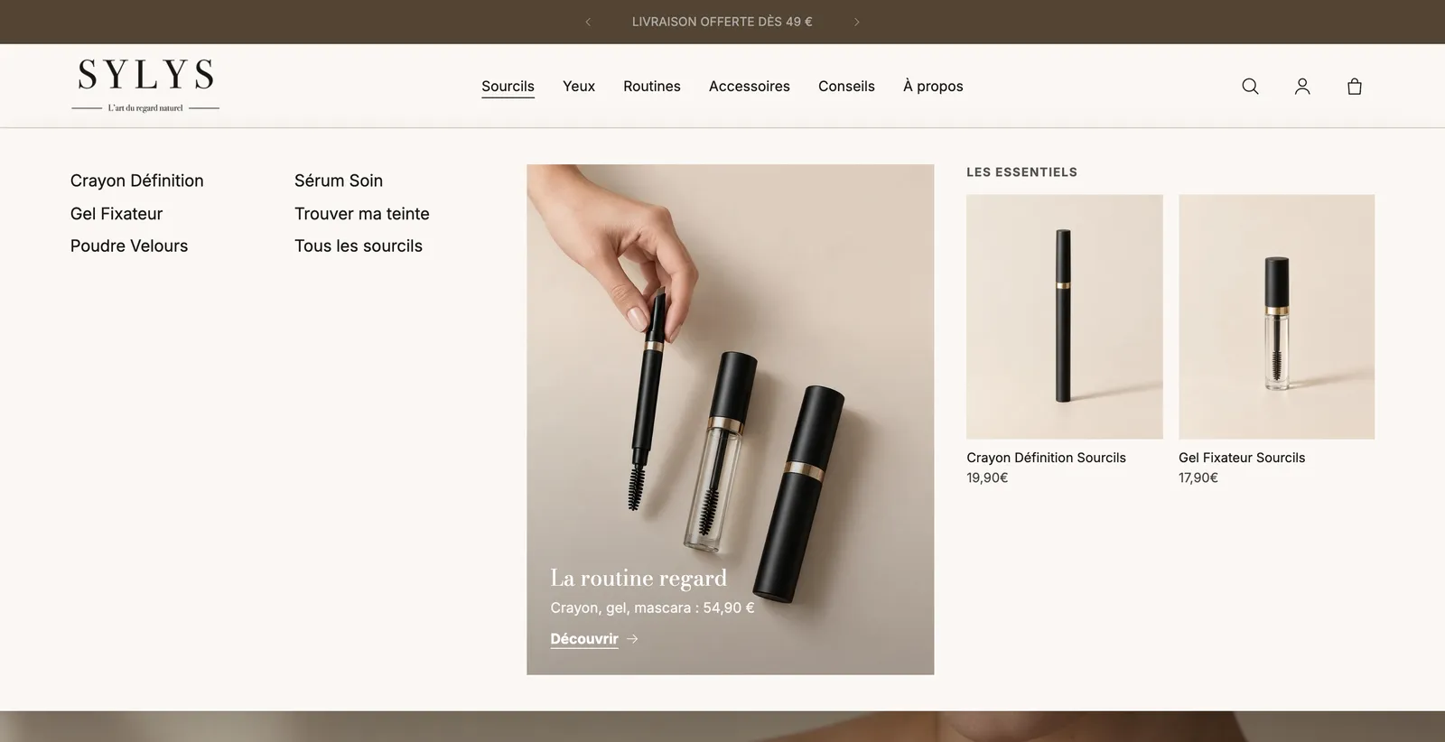
- Composable mega menus: promo cards, product and collection selections.
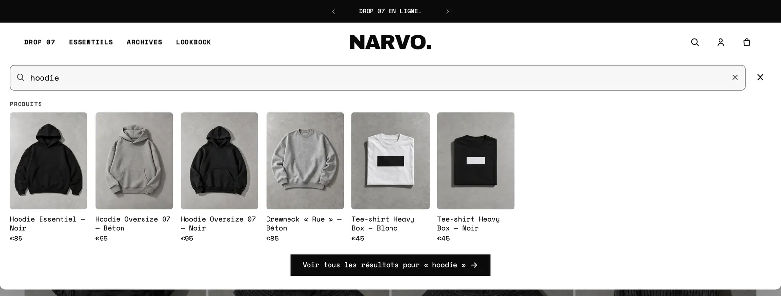
- A rebuilt search: suggestions from the first letters, popular searches, recently viewed products, animated placeholder text.
- Badges on menu links (for example "-50%" on "Sale").
- A three-area announcement bar, with scrolling, a typewriter effect, a countdown per message and a close button.
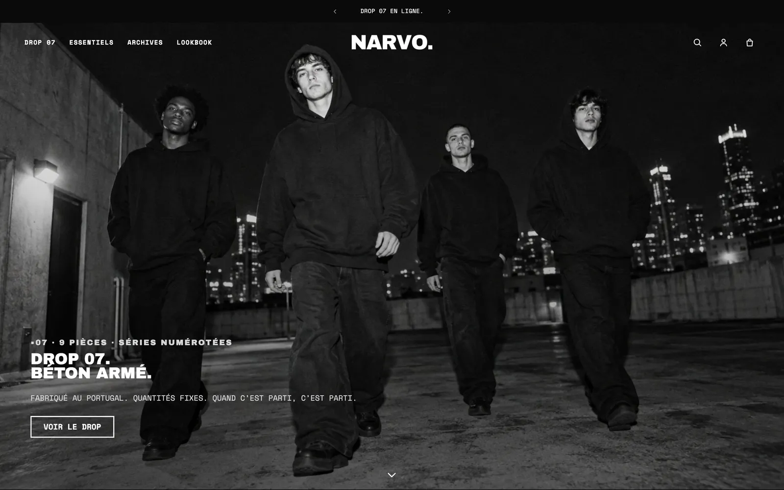
See Menus, header and footer, Announcement bar and scrolling marquee and the Header section.
Product page
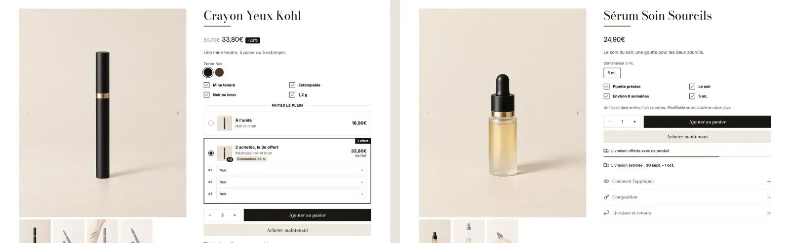
- A page built entirely from blocks, with three starting variants (Product page, Product with offers, Compact product page).
- An Offers block: quantity discounts, "Buy X, get Y", bundles, gifts. And an Add-ons block: products bought together, gift of choice.
- A rebuilt gallery (mosaic, grid, gallery that stays visible while scrolling, videos, 3D models).
- Estimated Delivery date, Stock, Free shipping progress, Rotating messages, Size guide, Personalisation field (engraving, photo, gift wrap), pre-orders, back-in-stock alerts.
- The buy bar that stays at the bottom of the screen becomes a block: Sticky add to cart.
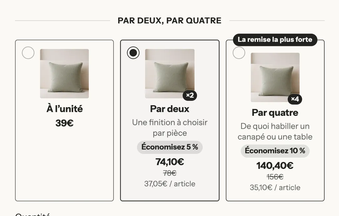
See Structure of the product page, Quantity discounts and the Product page section.
Cart
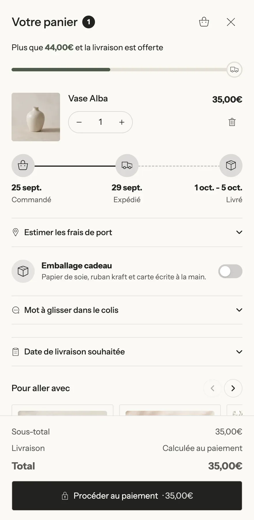
The cart is now a single block-based engine, whether you show it as a drawer, a page or a popup. Each block has its own Display rules: cart total, country, logged-in customers, products in the cart… Among the new blocks: Rewards progress (up to four tiers, with gifts added automatically), Upsells, Checkbox product, Delivery estimate, Cart countdown, Savings banner, Order field, Shipping estimate and Terms checkbox. Customers can also change variants and undo a removal right in the cart.
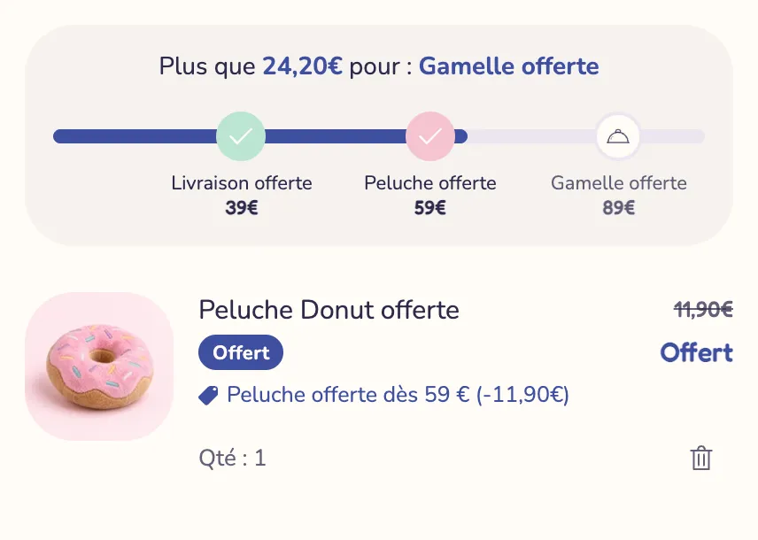
See Set up the cart, Free shipping bar and Cart blocks.
Collections and search
- Block-based collection and search pages: filters in a sidebar, a bar or a drawer, button-style filters for sizes.
- Promotion tiles in the middle of the grid.
- Grid density chosen by the customer, and Infinite scroll.
- Composed product cards: quick add, variant picker in the card, swatches, second image or video on hover, automatic badges.
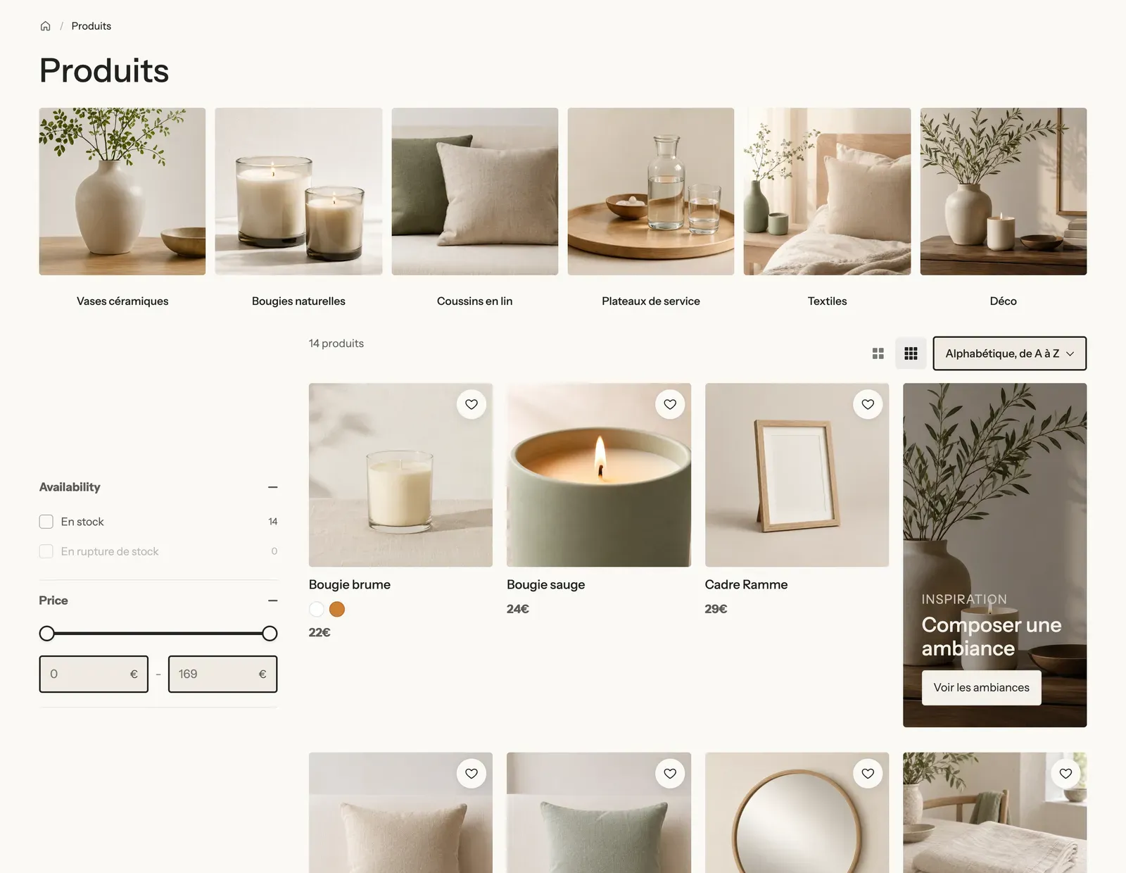
See Customize collection pages and search.
New content sections
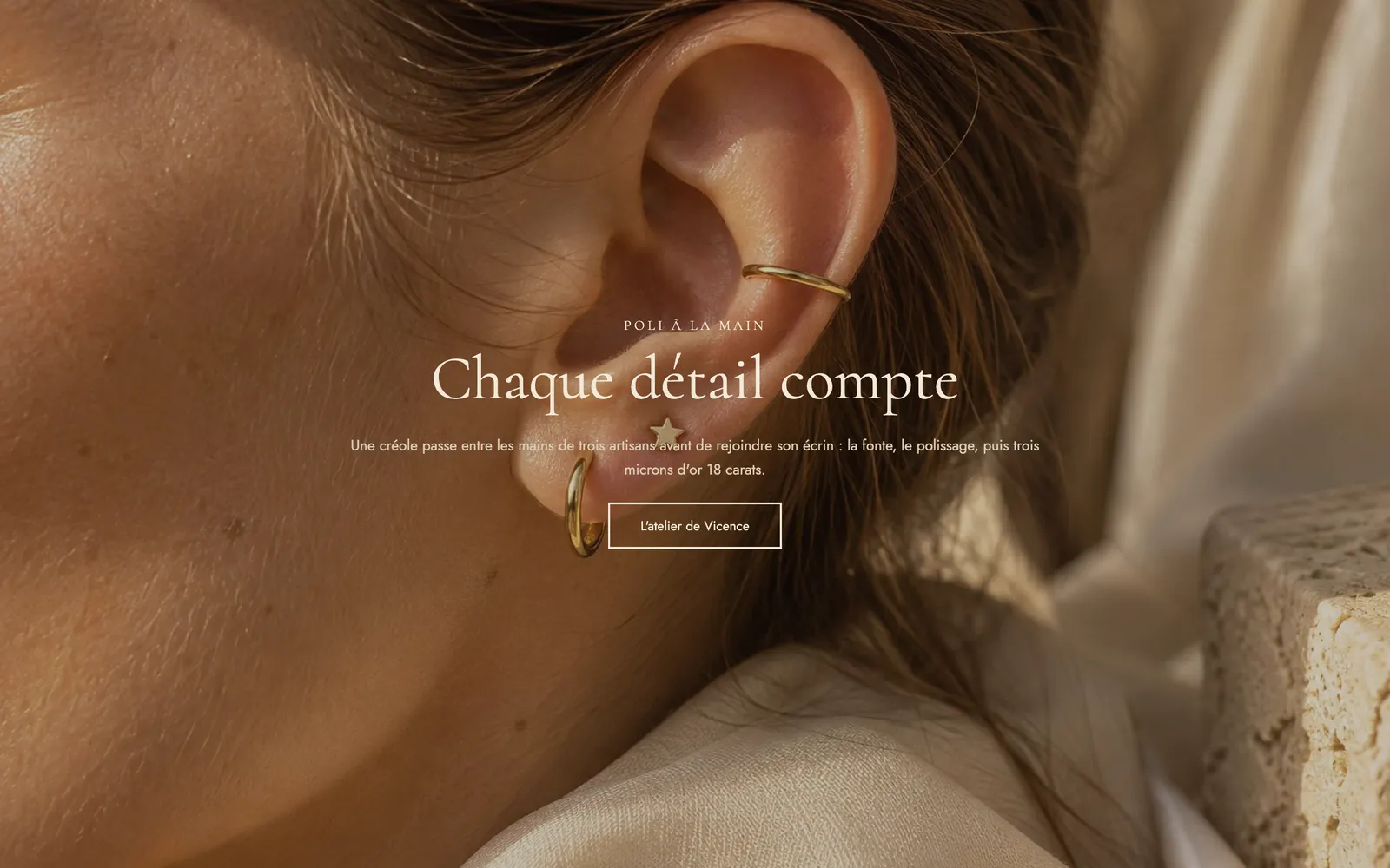
- Scroll effects: stacking cards, horizontal scroll, scrollytelling, expanding image, text reveal.
- Selling points: comparison table and before/after, savings calculator, statistics, "Shop the look" image with hotspots.
- Social proof: testimonials, rating summary, shoppable customer photos and videos, stories, press logos.
- Media: floating video, mosaic gallery, animated icons.
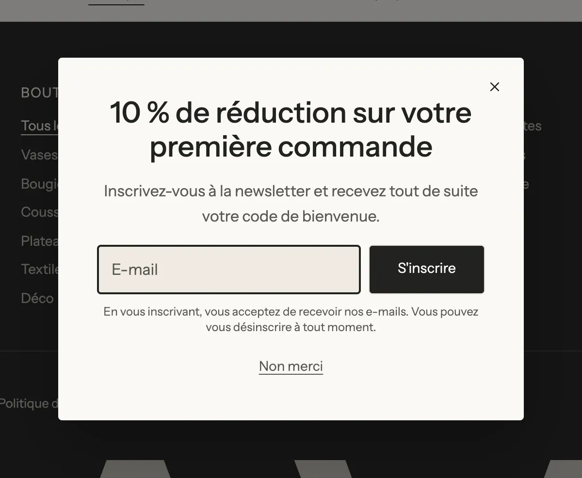
- Popups: newsletter, discount, age verification, opening when the visitor is about to leave the page. See Popups.
- Landing page mode: an ad landing page with no header or footer.
Ready-to-use pages
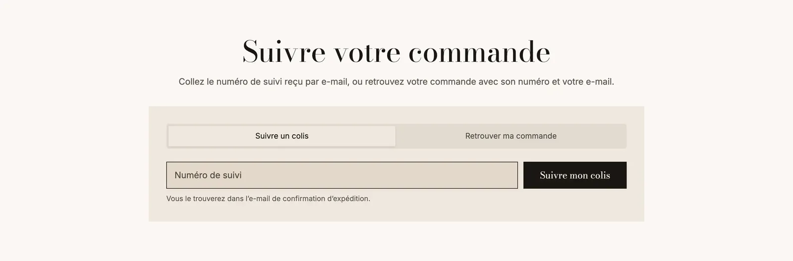
The theme comes with ready-built page templates to assign to your pages in Shopify: FAQ, help center, contact, order tracking, our story, wishlist and landing page.
Design, languages and speed
- A new default palette and six ready-made color palettes. See Color schemes.
- Your own Custom fonts (.woff2 files).
- 14 languages fully translated, in the editor as well as on the store. See Translate your store.
- Each feature only loads its code if it's on the page, and YouTube or Vimeo videos load nothing before the click. See Improve your store's speed.
To check after installing
A few elements ship turned off, so you can choose whether to use them:
- The sticky buy bar: on the Products > Default product template, the Sticky add to cart block ships hidden. Click the eye icon next to its name to show it.
- The newsletter popup: the footer's Popup section ships hidden. Show it the same way if you want it.
- The wishlist: check Enable wishlist in Theme settings > Wishlist to show the hearts on the cards.
- The mobile menu: view your store on a phone. If the menu icon doesn't show, add the Menu button block to the Left area of the header's Main row.