
Announcement bar section: messages, scrolling and countdown
Set up the Story Theme announcement bar: rotating or scrolling messages, link, icon, dated countdown, sticky bar and close button.
The Announcement bar section is the thin strip shown at the very top of the store, above the header. It belongs to the Header group, so it appears on every page. Use it for information every visitor should see: free shipping, free returns, a promo code, the end date of an offer.

Ways to display your messages
The section has only one preset (Announcement bar), but its Announcements block changes look completely with the Display setting.
One at a time
A single message is visible and gives way to the next one every few seconds. It's the most readable option, especially on mobile. Arrows let visitors move from one message to the next.


Scrolling
All messages scroll in a loop, like a news ticker, separated by a dot, a slash or your own icon. Ideal when you have three or four short selling points.

Typewriter and Side by side
Typewriter types each message out letter by letter. Side by side shows all messages at the same time, on one line: keep it for two very short messages on desktop. The Layout on mobile setting lets you use a different mode on phones (for example Side by side on desktop, One at a time on mobile).
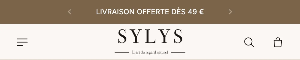
Show a countdown in a message
Each Message can show a real countdown to a specific date: the end of a sale, the last shipping day before Christmas, a product launch.
- Open the message.
- In Countdown end, enter the date in the
YYYY-MM-DD HH:MMformat, for example2026-11-30 23:59. The time is your store's time. - Choose the Position (Before the text or After the text) and the Format: Days and clock (2d 04:12:09), Clock (52:12:09) or Boxes.
- Fill in Text once ended if you want to show something else when the time is up. Left empty, the message disappears on its own when the countdown ends.

Add or edit the section
The announcement bar is already there on a fresh theme. To edit it:
- In Online Store > Themes, click Edit theme.
- In the left-hand column, under Header, click Announcement bar.
- Expand the Center area, then the Announcements block: each Message is listed there. Click Add block to create a new one.
If you deleted it, click Add section in the Header group and choose Announcement bar (Header category).
The section's blocks
The bar is split into three areas, Left, Center and Right, which accept the same blocks as the header.
| Block | What it's for |
|---|---|
| Announcements | Holds the messages and sets their animation (One at a time, Scrolling…) |
| Message | A text, a link, an icon and, if needed, a dated countdown |
| Country and language, Link, Social links, Text… | All the header blocks, for example to put a "Help" link on the right |
On a fresh theme, the Center area holds two rotating messages (free shipping and returns), and the Right area a hidden country and language selector.
The Announcements block
- Display and Layout on mobile: One at a time, Scrolling, Typewriter, Side by side.
- "One at a time" group: Transition (Fade, In from the bottom, In from the top, Slide sideways), Rotate automatically, Time per message (3 to 12 s, 5 s by default), Arrows, Show the pause button.
- "Scrolling" group: Scrolling speed, Direction, Pause on hover, Separator, Space between messages.
- "Text" group: Text size, Weight, Uppercase, Letter spacing, Link style (Underline, Arrow, None).
The Message block
- Text: the message itself (bold and italic allowed).
- Link: the whole message becomes clickable.
- Icon: Truck, Return, Box, Plane, Price tag, Stopwatch, Star, Heart, Lightning bolt, Lock… or Image for your own pictogram.
- Text color and Background color: to make a single message stand out.
- "Countdown" group: see above.
Section settings
- "Layout": Layout width (Page width or Full width), Vertical padding (8 px by default) and its mobile version.
- "Color palette": Color palette (on a fresh theme, the dark
inversepalette) and Line below. - "Text": Text size (13 px by default) and Uppercase.
- "Behavior": Behavior (Scrolls with the page, Always visible, Visible when scrolling up) and Close button. With the close button, visitors can hide the bar until the end of their visit; if you edit a message, it shows up again.
Colors are picked from your palettes: see color schemes.
Tips and pitfalls
- Aim for a message under 40 characters: on mobile, a longer text wraps onto two lines and pushes the whole site down.
- Two or three messages are enough. Beyond that, visitors won't see them all in One at a time mode.
- Keep Show the pause button checked whenever messages move on their own: it's recommended for accessibility.
- For a limited-time offer, prefer the Message countdown, tied to a real date. Only announce real deadlines.
- A promo code you announce must exist in Shopify: see Create a discount code.
- To hide the bar on an ad landing page, use the Landing page mode section.