
Image with text section: benefits, story and details
Put a photo next to a heading, a text and a button to present a product, tell your brand story or answer questions.
The Image with text section places a photo next to a block of text: heading, paragraph, list of selling points, button. It's the most used section to explain a product or tell your brand story, on the home page, a product page or an "Our story" page.
The variants (presets)
A variant (or "preset") is a ready-made section, with its blocks and settings. You pick it when you add the section, then edit it freely: add, remove or move any block.
Product benefits
The image on the left; on the right a Badge, a Heading, a Text, a Checklist of three selling points and a Button. It's the ideal variant to present a hero product: what it brings, in three lines.
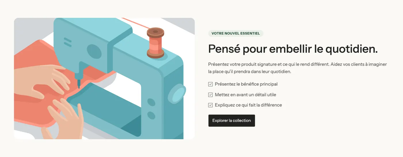
It sits in the Selling points category of the picker, not in Image and text.
Brand story
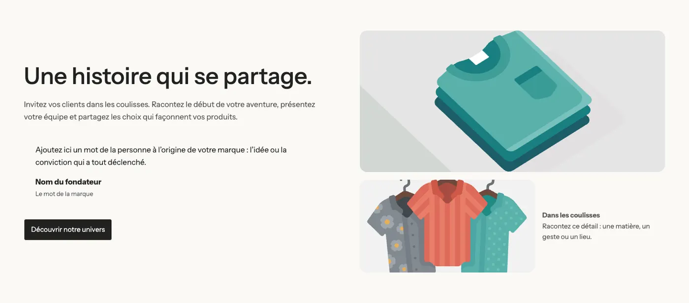
The text on the left (heading, paragraph, founder quote, button); on the right a large image and, below it, a small image with a caption. An editorial layout for an "Our story" page.
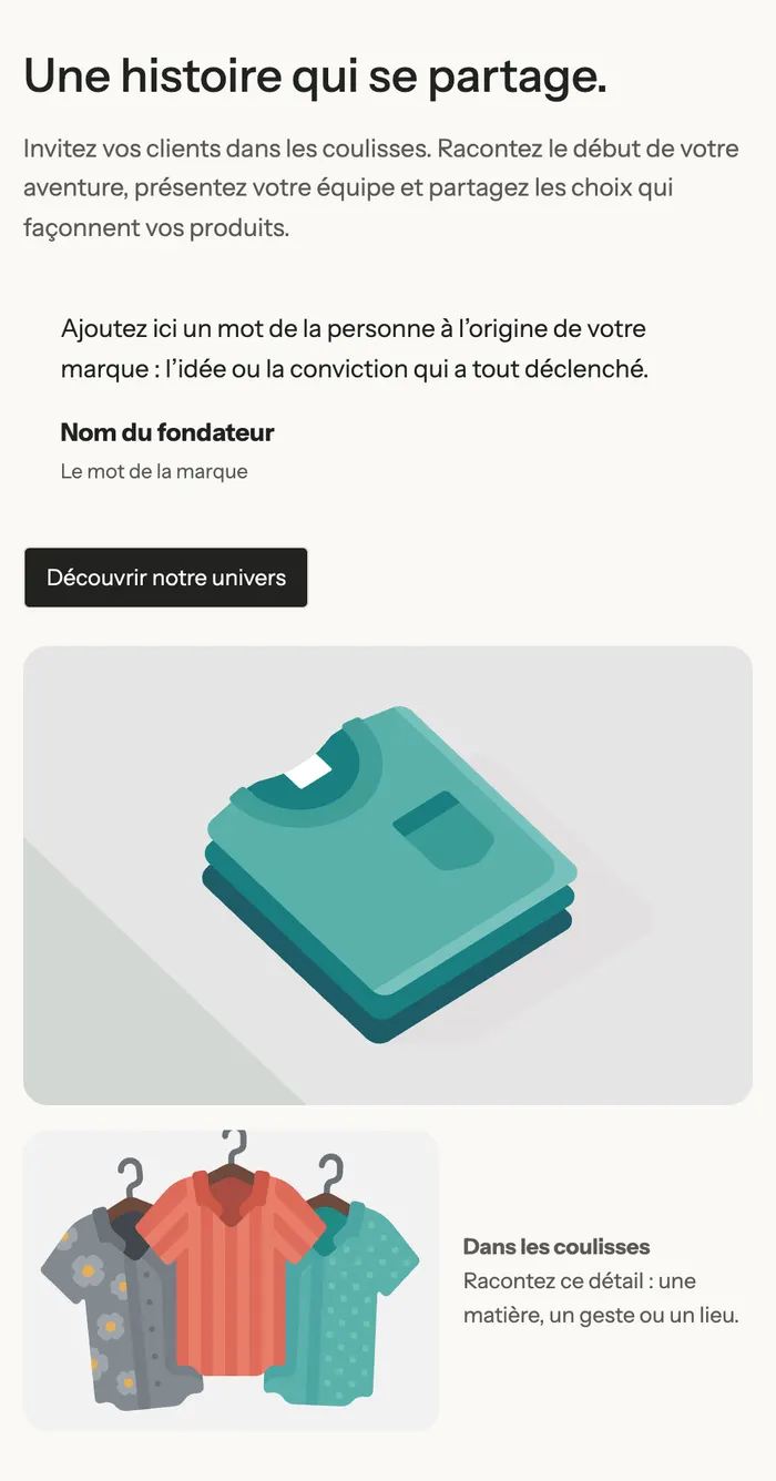
On mobile, the two columns stack: text first, then images.
Details that matter
The image on the left with a badge below it; on the right a heading, a text, three Accordion / FAQ (materials, how to use, care) and a button. It answers questions without making the page longer.
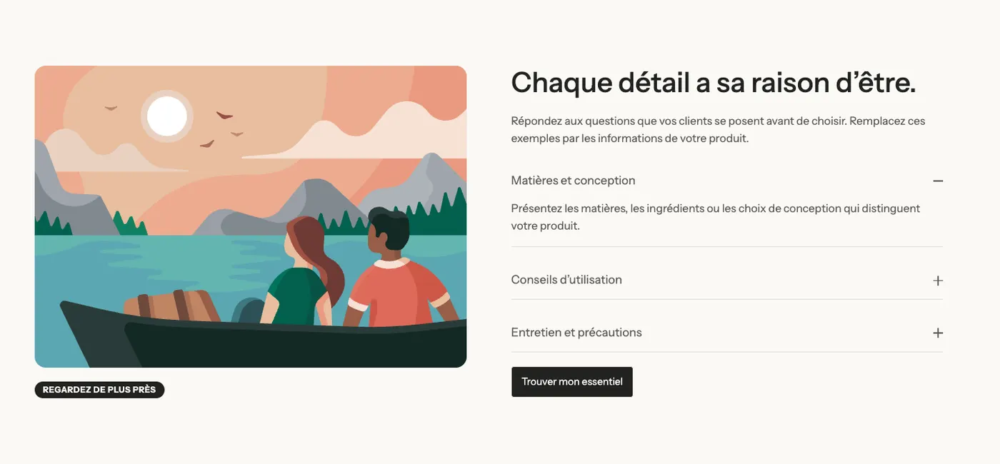
Examples from the demos
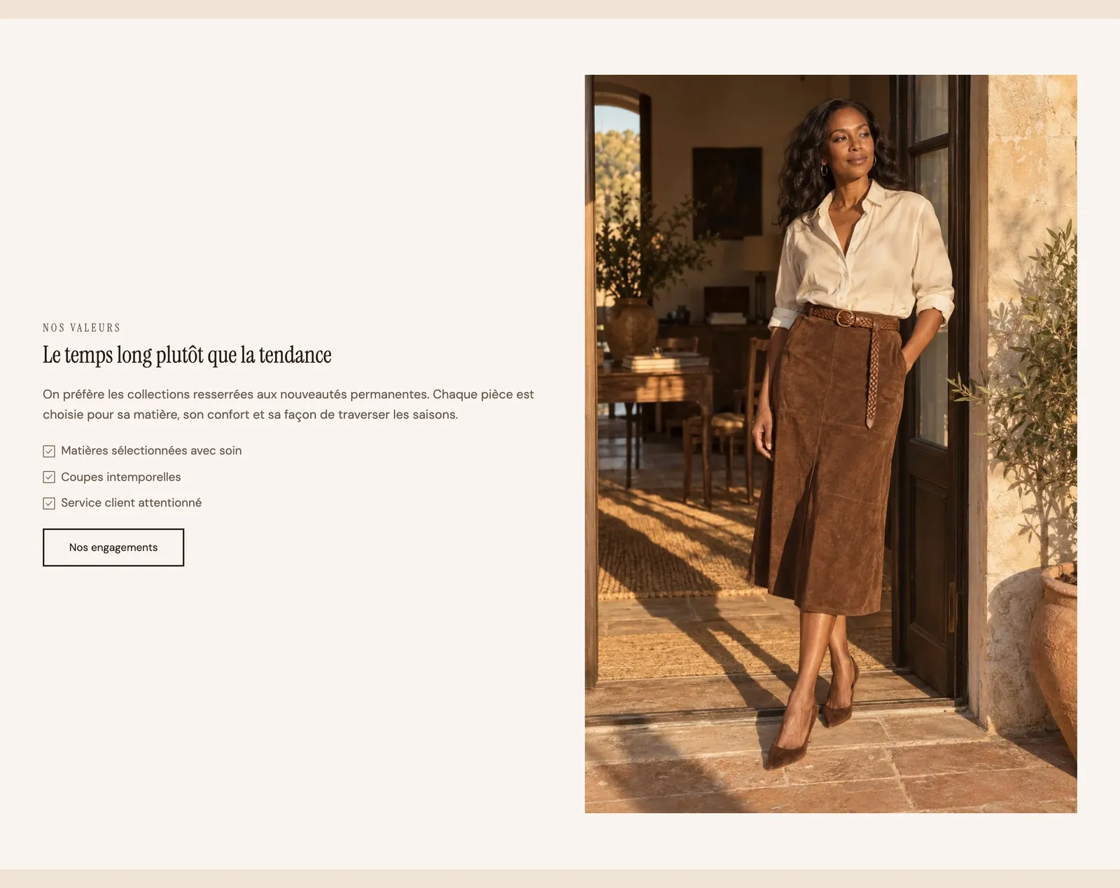
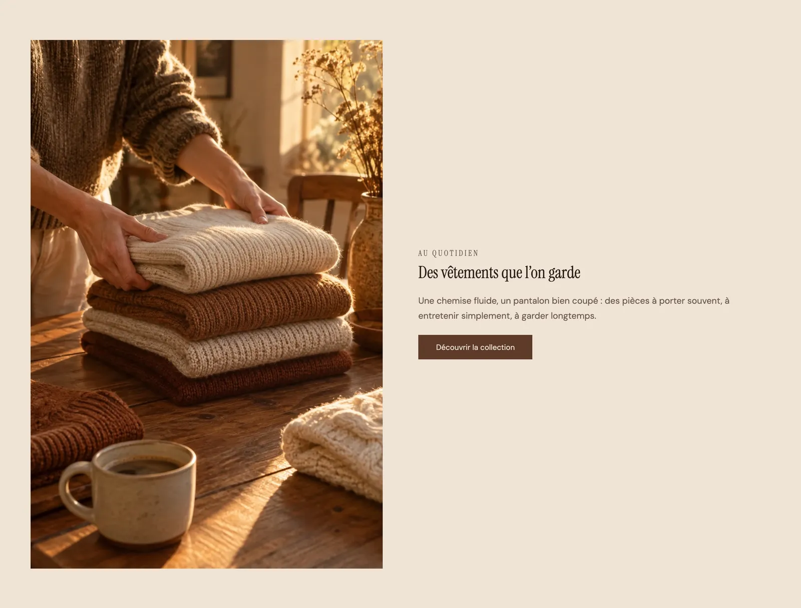
On the Maison Mocha demo, the same section switches the image side from one page to another. Here the image is on the left and the text is just a subheading, a heading, a paragraph and a button:
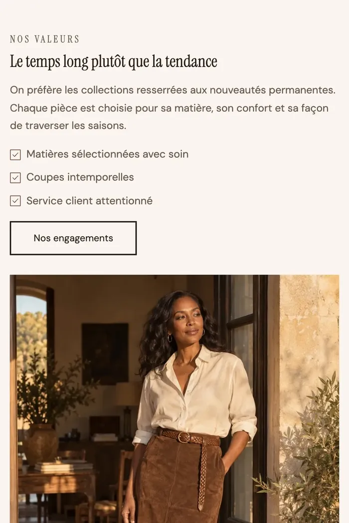
On phones, the text moves above the photo, which takes the full width:
Add the section
- In your Shopify admin, open Online Store > Themes and click Edit theme.
- Pick the template in the top menu (for example Home page).
- Click Add section, open the Image and text category (or Selling points for Product benefits) and choose the variant.
- Click the Image block and choose your photo, then replace the sample texts.
- Click Save.
The section's blocks
The section has no content of its own: everything is made of blocks, arranged in Group blocks (one column = one group).
| Block | What it's for |
|---|---|
| Image | The photo. Settings: Image height (Adapt to image, Small, Medium, Large), Corner radius, Link, Image loading. |
| Group | The text column. It sets the direction, alignment and spacing, and can stay visible while scrolling. |
| Heading, Text, Button | The main content. |
| Badge | A small label above the heading or below the image. |
| Checklist | Selling points, one per line, with an icon (a check mark by default). |
| Accordion / FAQ | A question that expands (Details that matter variant). |
| Testimonial | The founder quote (Brand story variant). |
You can add any other block from the theme with Add block: star rating, trust badges, a video instead of the image…
The Checklist block
- Items: one selling point per line, in rich text (bold, link).
- Icon: Check mark by default, the whole icon library, or a Custom icon.
- Icon Size (16 px by default) and Color (empty = accent color).
- Align the icon with the first line: useful when a selling point runs over two lines.
The section settings
The section only has the frame shared by almost every section of the theme:
- Layout: Layout width, Direction, Stack on mobile, alignments and spacing. This is where you set the space between the two columns (the image side is changed by moving the blocks).
- Color palette: the section background and, with Enable background cut, a block of color that covers only part of the section.
- Separators: a shape (wave, curve, scallops…) at the top or bottom.
- Animations: how the section appears on scroll.
This frame is explained once and for all in Understand the theme editor.
Tips and pitfalls
- To alternate image on the left and image on the right from one section to the next, simply move the Image block before or after the text Group in the block list.
- Use photos with the same aspect ratio on a given page: the section height follows the image when Image height is set to Adapt to image.
- If the section is the first one on the page, leave Image loading on Automatic: the image then loads right away, which speeds up the display.
- Keep three or four selling points in the Checklist: beyond that, nobody reads them.
- On mobile, check the order: the first block in the list shows at the top. The Order on mobile setting of the Group lets you change it without affecting desktop.