
Multicolumn section: icons, features, steps and benefits
Present your commitments, your strengths or your ordering steps in several columns, with icons, images or numbers.
The Multicolumn section lines up several columns side by side: an icon, a heading and a text; an image and a button; a step number. It presents your commitments (shipping, returns, payment), your strengths or how an order works, at a glance.

The variants (presets)
Each variant is a ready-made section. You can then add a column, remove one or change its content.
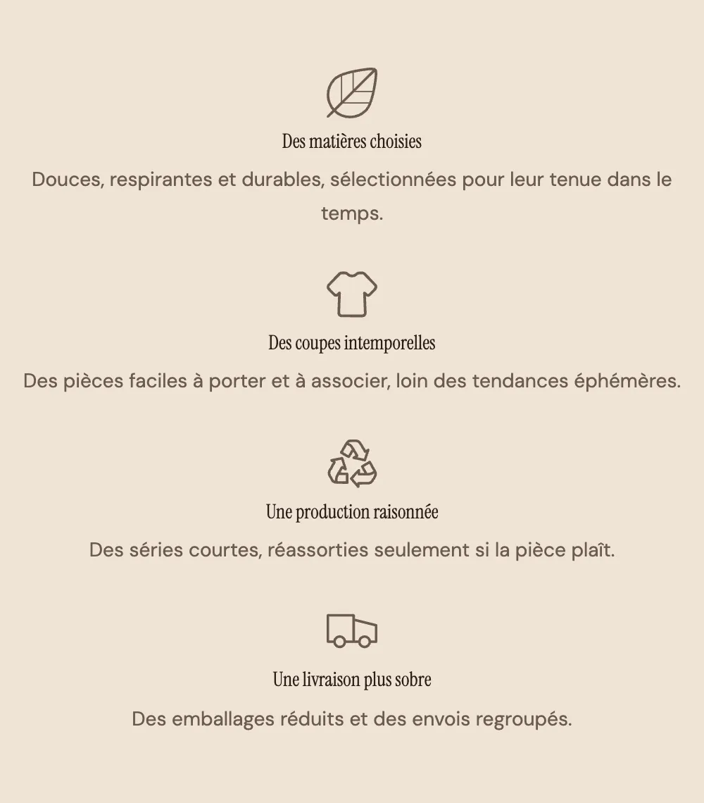
Icons with text
Four centered columns: an Icon, a Heading, a Text. The classic trust variant (free shipping, returns, secure payment, customer care).

On mobile, the columns stack one below the other, as here on the Maison Mocha demo:
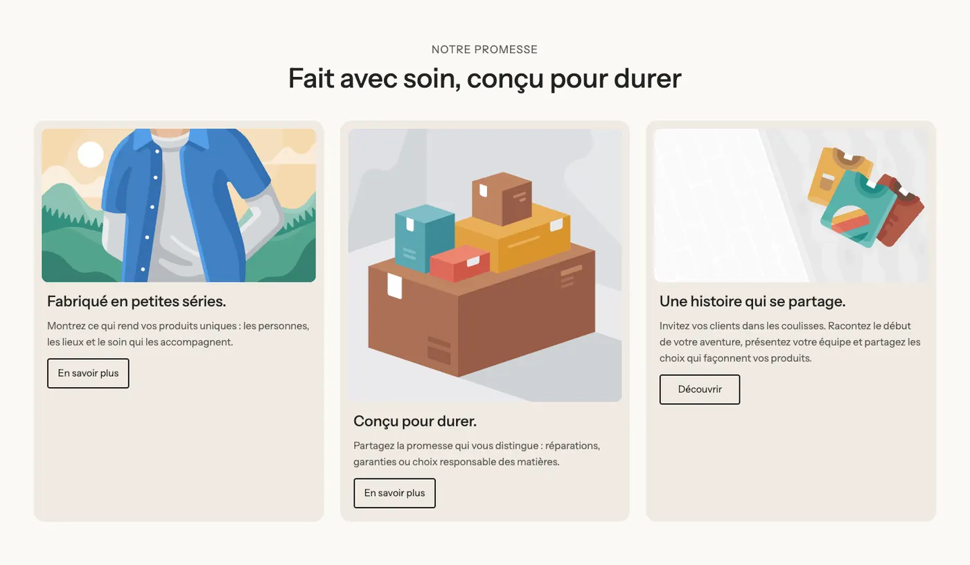
Features with images
A section heading, then three cards: an Image, a heading, a text and a button. To present three product lines, three illustrated commitments or three articles.
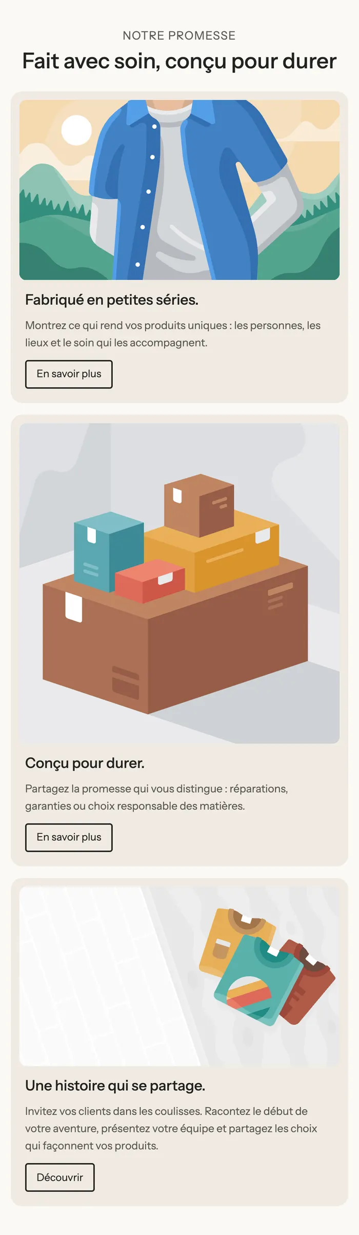
On mobile, the cards stack and keep their image on top:
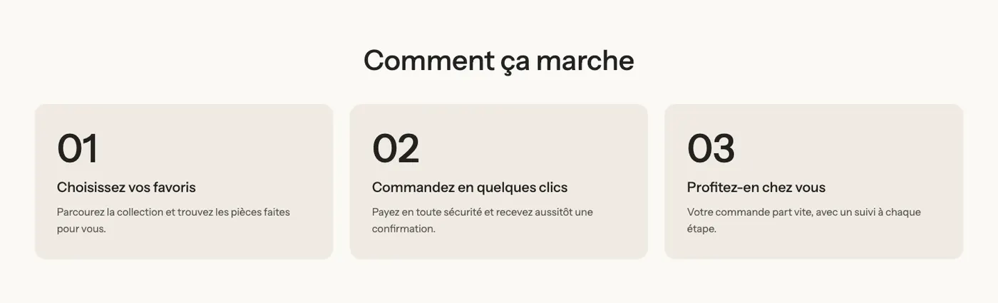
Numbered steps
Three cards with a large number (01, 02, 03), a heading and a text. Ideal for "How it works": choose, order, receive.
Benefits
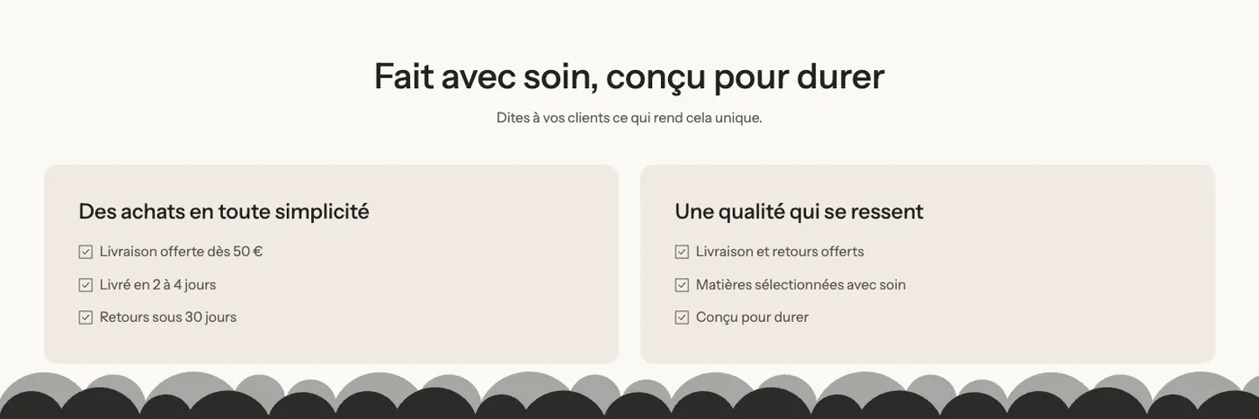
A heading and a subheading, then two cards, each with a heading and a Checklist. It sits in the Selling points category of the picker. To compare two families of benefits (shopping, quality) in little space.
Add the section
- In your Shopify admin, open Online Store > Themes and click Edit theme.
- Pick the template in the top menu (Home page, Products > Default product…).
- Click Add section, open the Image and text category (or Selling points for Benefits) and choose the variant.
- Click each column to change the icon, the image and the texts.
- Click Save.
The section's blocks
Each column is a Group block that holds its own blocks. To add a column, duplicate an existing group (right-click or the "…" menu on the block in the sidebar): it keeps the same formatting.
| Block | What it's for |
|---|---|
| Group | A column (or the row of columns). It sets the direction, alignment, background and rounding, and can become fully clickable with Link. |
| Icon | The column's pictogram. |
| Image | The card photo (Features with images variant). |
| Heading, Text, Button | The column's content. In Numbered steps, the number is a second Heading. |
| Checklist | The selling points of the Benefits variant. |
The Icon block
- Icon: a library of pictograms (truck, lock, return, leaf, heart, star…), Leaf by default.
- Custom icon: your own image, ideally an SVG or a square PNG. It replaces the chosen icon.
- Size (40 px by default) and Color (empty = text color).
- Link: makes the icon clickable.
The section settings
The section only has the frame shared by almost every section: Layout (width, direction, Stack on mobile, spacing), Color palette (background, background cut), Separators and Animations. It's explained in Understand the theme editor.
The card background and rounded corners are set in the Color palette group of each Group block (Transparent background, palette, Corner radius).
Tips and pitfalls
- Three or four columns read well on desktop. Beyond four, the texts get narrow: make two sections.
- Keep texts of similar length from one column to the next, otherwise the cards won't have the same height.
- To make a whole card clickable, fill in Link on its Group rather than adding a button.
- Place an Icons with text section right below the product page or above the footer: that's where commitments (shipping, returns) reassure the most.
- Use the same icon family everywhere: mixing your images with the theme's icons looks uneven.