
Zoom on scroll section: an image that expands to full screen
Grow an image or video from a rounded frame to full screen as the customer scrolls, and reveal your text on top of it.
The Zoom on scroll section shows an image (or a video) in a frame smaller than the screen. As the customer scrolls, the frame grows until it fills the whole screen, and your heading appears on top. It's a spectacular opening effect to present your craftsmanship, a new collection or a hero product, in the middle of the home page.
On the Darly demo, the image of an ear adorned with jewelry starts in a frame in the middle of the page:
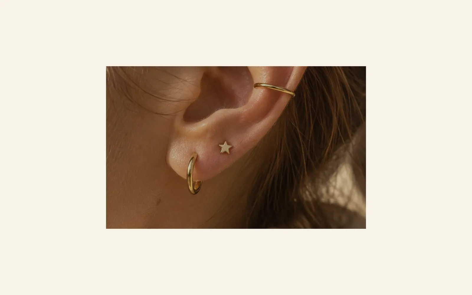
Halfway through, the frame has almost filled the screen and the text starts to appear:

At the end, the image is full screen and the text is readable, with its button:

The presets
Expanding image
The only preset: an image that starts at 60% of the screen width, with a subheading, a large centered heading, a text and a Discover button on top. A 30% black overlay keeps the text readable.

On mobile, the image starts at 85% of the width: the effect is more subtle, and the text wraps onto several lines.

Here is the Darly section on mobile, at the end of the effect:

Add the section
- In your Shopify admin, open Online Store > Themes and click Edit theme.
- Choose the template from the menu at the top (for example Home page).
- Click Add section, open the Scroll effects category and choose Expanding image.
- Click the section and choose the Image in the Media group (or a Video).
- Edit the heading, text and button by clicking their blocks.
- Click Save.
The section's blocks
| Block | What it's for |
|---|---|
| Heading | The subheading and the large heading placed on the image. |
| Text | A paragraph under the heading. |
| Button | The link to a collection, a page or a product. |
You can add other blocks from the theme (badge, checklist, countdown…) with Add block: they all appear on top of the image.
The section settings
Media group:
- Image: it also covers the video while it loads; its focal point keeps the subject framed on every screen.
- Video: a video instead of the image.
Media on mobile group: an Image and a Video specific to mobile, optional (the desktop media is used when they're empty).
Scroll effect group:
- Starting size: the frame size at the start of the effect, from 30 to 95% (60%), and Starting size on mobile (85%).
- Corners: Custom by default with Corner radius at 24 px, or Theme: the frame's rounding at the start of the effect.
- Scroll length: how far the page scrolls while the image grows, as a % of the screen height (150%). The larger it is, the slower the effect.
- Text effect: Appears as the media grows (default), Fades as the media grows or None.
Content group:
- Horizontal alignment and Vertical alignment of the text (centered by default).
- Content max width (760 px), Space around the content and its mobile version.
- Overlay opacity (30%) and Overlay colour (black).
Section group: Color palette, which sets the background color around the image at the start of the effect (Darly's beige). Then Separators (Understand the theme editor).
Tips and pitfalls
- Choose a wide, very sharp image, at least 2000 px wide: it ends up full screen.
- Place the subject in the center or set the image's focal point: at the start of the effect, only the center is visible in the small frame.
- Check the text contrast on the image at the end of the effect; increase the Overlay opacity if the heading is hard to read.
- Only one section of this kind per page: the effect loses its impact if it repeats.
- If you choose a video, add an image too: it shows while the video loads.
- Avoid putting it as the very first section: the effect reveals itself as you scroll.